Art history has had its particular pedagogical format for nearly a century: the paired slides in the darkened room, the voice of the lecturer trying to speak with enough energy and excitement to keep the students awake. As other disciplines experienced the new adventure of PowerPoints, we merely jettisoned glass-encased slides in favor of digital images and grumbled about the smaller projection area. After decades of posting glossy photographs on bulletin boards for our students to study, we moved to digitized study collections and websites in the 1990s and congratulated ourselves that we were far ahead of the rest of the humanities in embracing technology. Then they caught up. And as both research and pedagogy moved to encompass something called the “Digital Humanities,” art historians realized that our models were poorly suited to the demands of this new age. What was our “data” and did students ever study it? How many students had ever been asked to do group work? How many professors had practiced “project-based learning”? Only a few years ago, my campus proposed to convert all the art history lecture spaces into “smart classrooms,” with screens on every wall and seating that could be grouped at stations; my department, in horror, protested that in art history, we used one screen and the students sat in rows!
For the past year, I have taught in a smart classroom. My students have gathered data and done group work. Everything has been based on projects. This has not been an easy transition. With encouragement and a teaching grant from my campus’s Digital Humanities program, I taught two courses under that rubric: a freshman seminar called “Humanists on the Move” and an advanced course for juniors and seniors with the less catchy title “Digital Travels: Images and Texts ca. 1600.” The former class involved very little art history, and while a third of the latter was devoted to an art history project, I do not feel that unit went terribly well. This is not to say that it is impossible to teach digital art history effectively. It merely suggests that my own comfort zone in the digital world as allied to the history of art was difficult to transfer to pedagogy. It also might indicate that specialization, such a help in lecturing, can be an actual handicap in this kind of work: the material about which I knew relatively little was more effective in a project-based context than that in which I was an expert. The fact that I had developed a website dedicated to the study of Jan Brueghel (1568–1625) and had written a book on the topic at once made student projects on the Brueghel workshop possible, and problematic.
Project-based pedagogy was in many ways a shock. You cannot control either process or outcomes the way you can in a lecture course. It is very challenging to plan the sequence of work carefully enough: while in theory, every project is a new and exciting adventure in which professor and students engage jointly, in practice this works better if you have taught the same project previously. Thus although I had carefully crafted my “Digital Travels” syllabus, and spent a week studying “Digital Pedagogy” at the Digital Humanities Summer Institute in Victoria, Canada to refine my assignment sequence, the students rightly complained that the course was disorganized and the projects were hard to understand. The only project that worked really well in that class was one I had taught in the freshman seminar the semester before—and it was not about art history. In what follows here, I will explain the DH work in art history that I had my students undertake, consider some reasons why the outcomes were not fully satisfactory, and suggest how the pitfalls I encountered might be avoided by others wishing to engage in this kind of teaching.
In the field of renaissance art history, it is well known that within workshops, the master and his assistants often repeated basic elements of pictorial imagery. Artists replicated and re-purposed textile patterns, landscape elements, figures, even entire compositions using a wide variety of ingenious techniques (for an outstanding study of these techniques see Bambach 1999). Some were notorious for excessive repetition, and contemporaries criticized them for this. Vasari reports that when an altarpiece by Pietro Perugino (ca. 1446–1523) was unveiled, “it received no little censure from all the new craftsmen, particularly because Pietro had availed himself of those figures that he had been wont to use in other pictures” (Vasari [1550; 2nd ed., 1568] 1912–14, 4: 44). Yet overall, an early modern buying public seems to have had a less rigid notion of uniqueness and originality than later generations would develop. The repetition of forms is not something I spend a lot of time on in my normal lecturing on this period because it is rather dry and technical to an undergraduate audience. However, I thought that the mobility of patterns across renaissance workshops could be rather interesting to trace through a digital and collaborative project.
One artist of this period whose work is particularly marked by repetition is Jan Brueghel, son of the more famous Pieter Bruegel (ca. 1525–1569). Sometimes on his own and sometimes with the help of studio assistants he produced multiple copies and variants of many of his own compositions. He also borrowed from and revised works by his renowned father. The replication may be quite close, but more often the works are subtly different from one another. Bits of imagery are shuffled and recombined across images: the same windmill looks out over rolling hills in one composition but over a riverside town in another; a group of cattle wander down a village street and then reappear on a rural mountain path; the same man carries his sack through a woodland here and over a bridge there; a monkey climbs a tree in paradise and then shambles through a gigantic fruit garland. Drawings and oil sketches, most now lost, enabled this mix-and-match of fragmentary elements to be drawn together into hundreds of individual works of art.
But how were these various works actually created, how did they really relate to one another, and who was doing this work—Brueghel, his studio, later copyists, or imitators? In my book on Brueghel, I wrote that ideally one would have a map that located all the pictures at a greater or lesser distance from Jan himself and indicated their relationships to one another (see Honig 2016, 23–35). But mapping is not the right digital tool for this job: network analysis is the best tool to visualize data about these webs of artistic relation. Creating and refining that data and then visualizing it through network analysis tools was the task that I set the students in “Digital Travels.”
“Digital Travels” was cross-listed in the departments of English and Art History. Officially a lecture course, the class met four times each week over fourteen weeks. Since it was a project-based class, I only really lectured once or twice a week, providing the background information that the students needed to pursue each of three projects; for the remainder of our sessions, class time was devoted to discussion and group work. The student projects centered on renaissance mobility and allowed them to practice three types of digital work: mapping, network analysis, and text analysis (“distant reading”). For each project, it was important to me that the students generate original data as well as visualizing and analyzing it. Thus in the first unit they each researched the travels of a single historical figure, geocoded all the locations, combined their data with that of the other students working on related figures (rulers, artists, scientists, etc.), and then produced a map of historical travels. In the third unit, each group created a text corpus of a single continent covered in the Voyages by Richard Hakluyt (1553–1616), and used Voyant to analyze it.[1] The second unit focused on the Brueghel material and was the only art-historical assignment. About half of the students in the class had little or no art-historical background. They had five weeks, slightly over a third of the semester, to work on this project.
The raw data that I provided for the students consisted of hundreds of paintings and drawings from the Brueghel workshop, which I had further subdivided into what we called “series” or “clusters” of related images. The students were divided into groups of 3–6 students, and each group worked on a body of between 25 and 60 related works produced by Jan Brueghel, his father Pieter, and the studios of both masters. As an example, I illustrate here works from the cluster of paintings by Pieter and Jan showing the Adoration of the Magi (Figures 1 and 2).
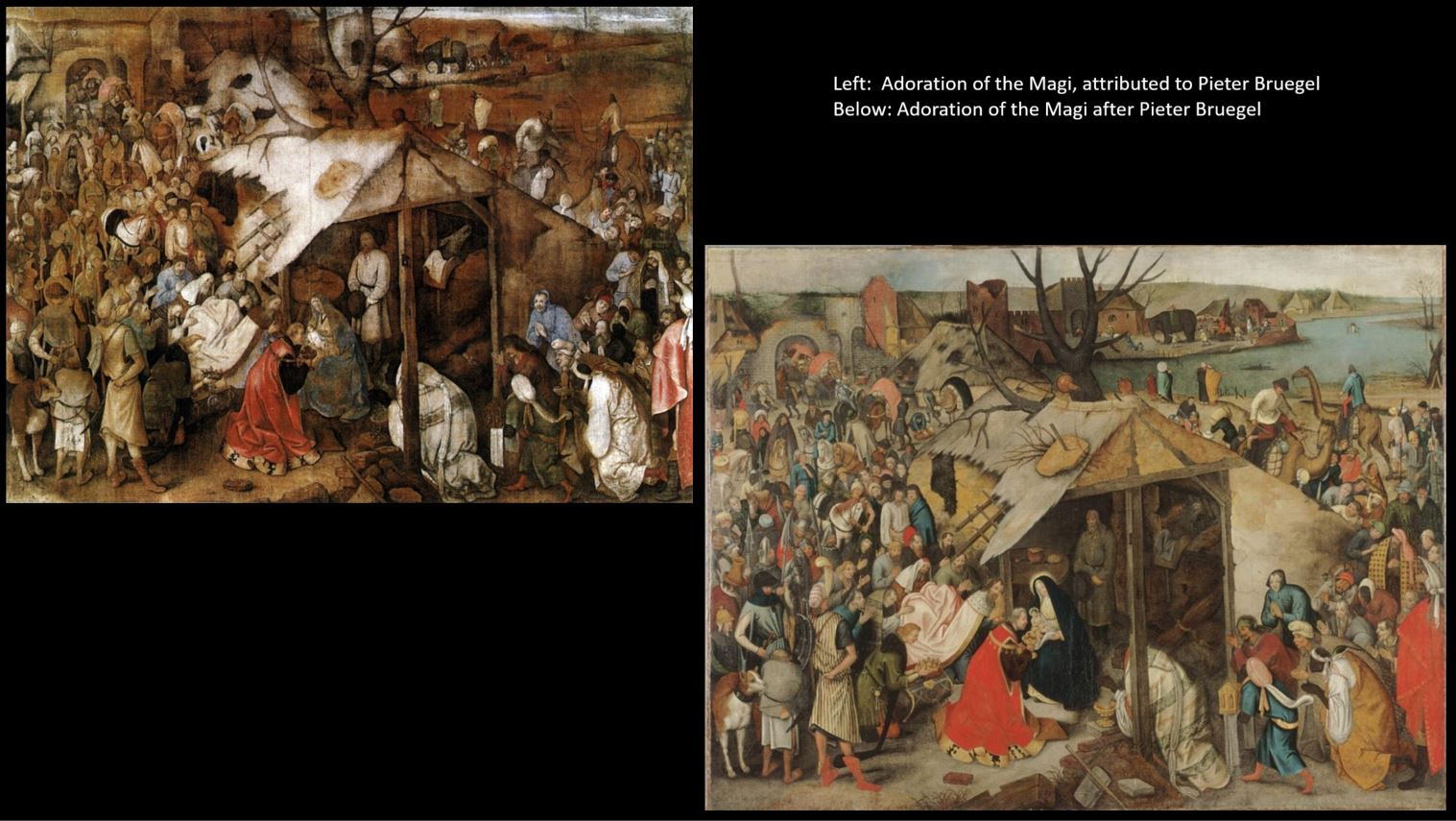
Figure 1. Two very similar paintings by or after Pieter Bruegel, showing the Adoration of the Magi.
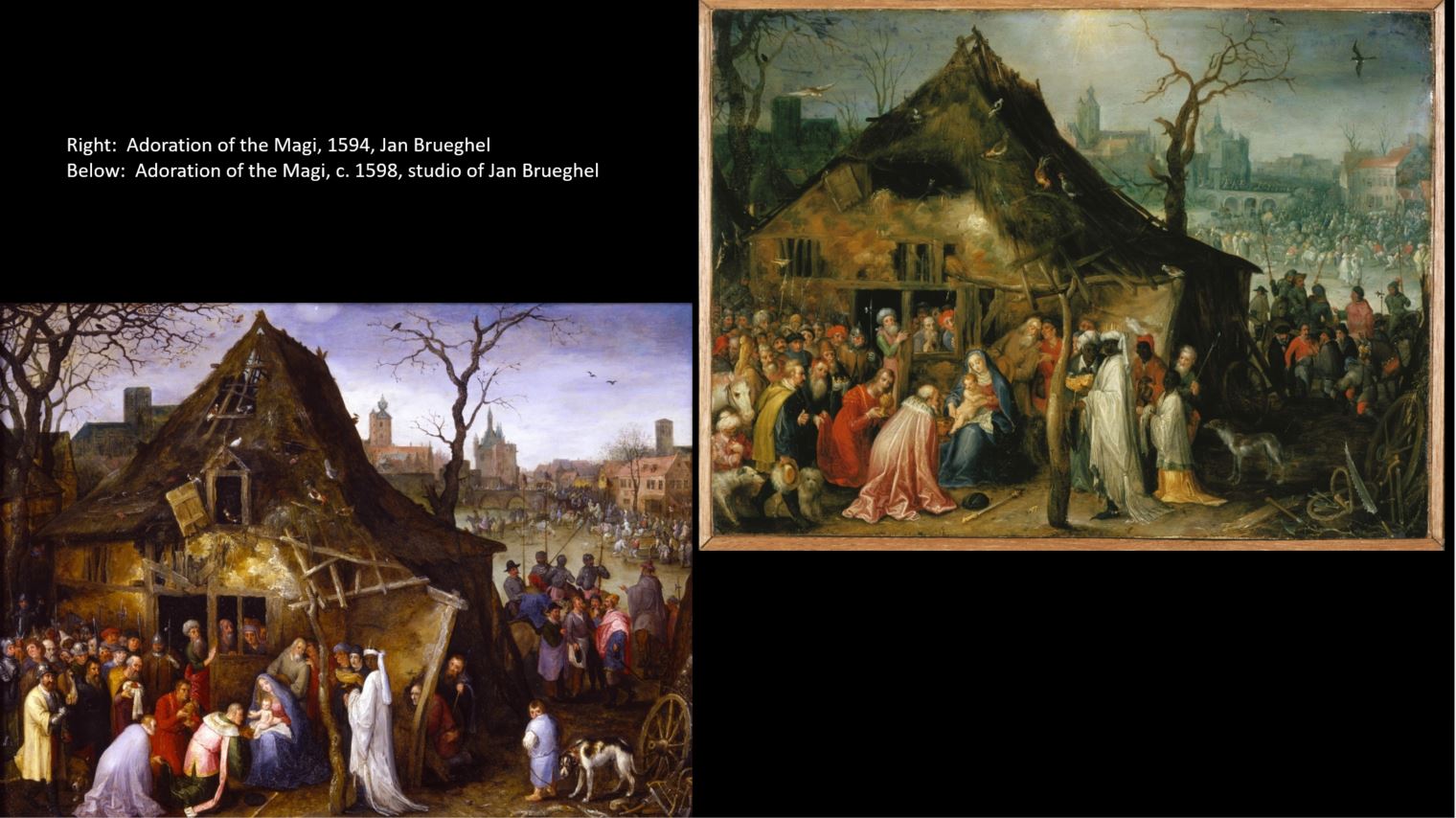
Figure 2. Two very similar paintings by Jan Brueghel or his studio, showing the Adoration of the Magi.
In this cluster, the works are closely related to one another within the sub-groups of “Pieter works” and “Jan works” but are never truly identical, although the earlier Pieter group is more closely interrelated than the later Jan works. It is unclear how the two sub-groups are related to one another.
To prepare the students to think about this material, I lectured on the replication of imagery through prints and studio patterns; on painting techniques and methods of copying in the early modern period; on the development of the art market in this period and the value of originals vs. replications; and on the Brueghel family as artists within this world. We read and discussed texts about workshop practice as well as conceptual material on imitation, originality, and aura. Students spent one meeting looking at prints in the Berkeley Art Museum and Pacific Film Archive and thinking about reproductive images. They also visited the De Young Museum in San Francisco, looked at trompe l’oeil paintings there, and wrote a short paper comparing the visual experience of an illusionistic painting to the visual information that a digitized version (on Google Art) provided. Since they would be working with digital images when considering issues of artistic facture and manufacture, I wanted them be conscious of what information they received, and lost, through digital viewing. This, I thought, was a very successful assignment that both art history and English majors engaged with well.
For the core unit work, the students operated both on their own and in their groups to study the cluster they had been assigned, break it down into segments of imagery, and compare that imagery among all the paintings. Once each student in the group had assumed responsibility for a specific type of imagery—the lions in Paradise, for example, or the kneeling king in a representation of the Adoration of the Magi—they began using a digital tool that I had designed, the “Image Investigation Tool” (IIT), to compare pairs of pictures and their details (Figure 3).
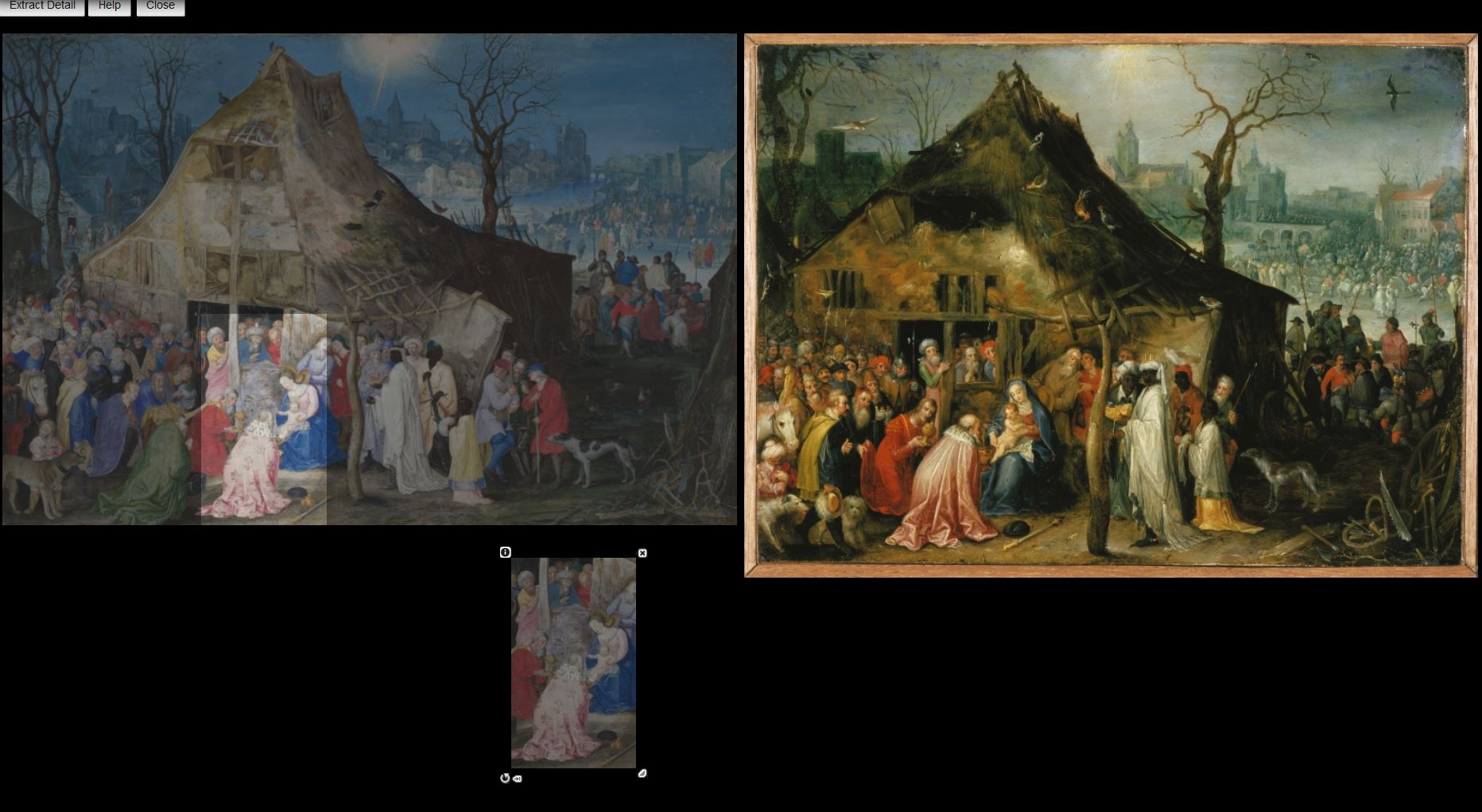
Figure 3. Illustration of the Image Investigation Tool.
Some students assessed the similarity of entire compositions—i.e. had they been duplicated exactly or were small changes introduced?—but most extracted particular details repeated in some or all of the works and created overlays to see whether imagery had been exactly transferred or approximately copied. In order to describe these relationships, the groups discussed the criteria by which they could assign numerical values to types of similarity.
The students then made individual spreadsheets of linked data with a first sheet listing attributes of each individual image (scale, support, attribution) and a second describing relationships between those images (Figures 4 and 5).
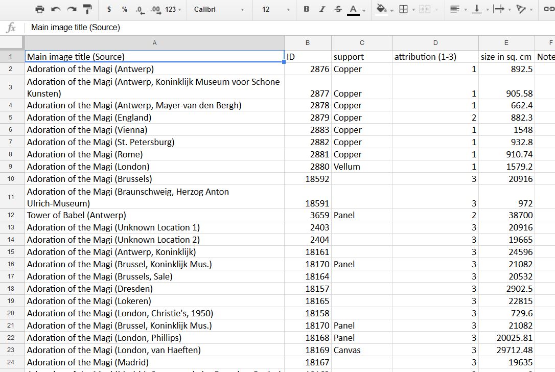
Figure 4. Spreadsheet of node (object) properties.
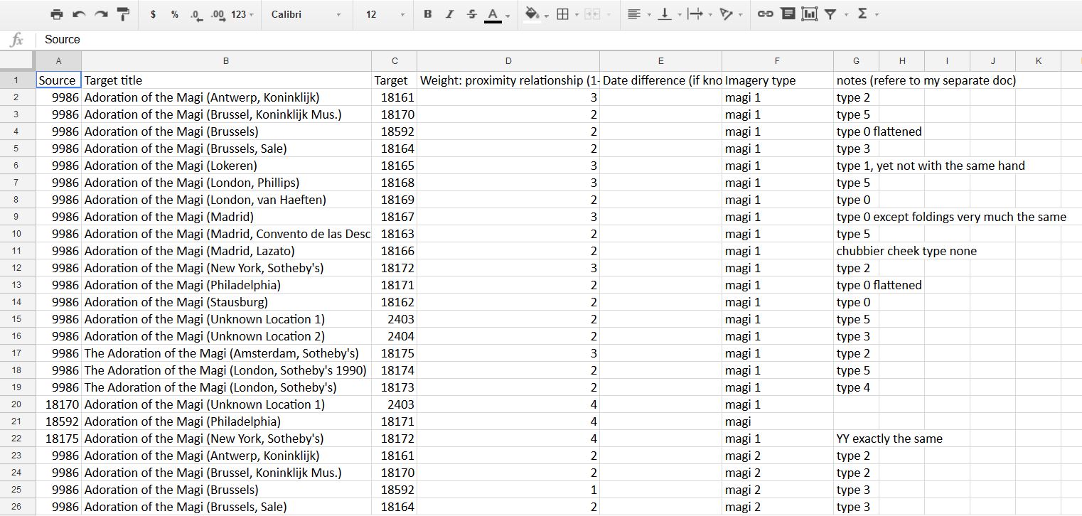
Figure 5. Spreadsheet of edge (relationship) properties of the same Adoration of the Magi paintings.
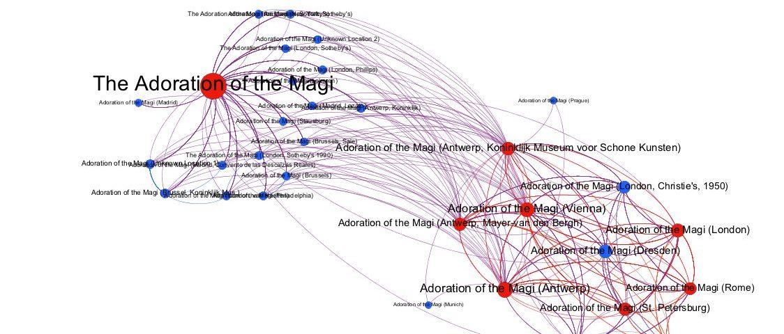
They then combined these into one spreadsheet for the whole group, cleaned up the data using OpenRefine, and used the resulting spreadsheet to visualize the interconnections between the artworks in their cluster.[2] First, they used Palladio, an open-source tool set available from the Humanities & Design Research Lab at Stanford University.[3] Palladio is extremely simple to use. Although its visualizations are not elaborate and colorful, it does have a surprising number of capabilities and students who were comfortable with exploring digital tools found ways to visualize different aspects of the network of imagery (Figure 6).
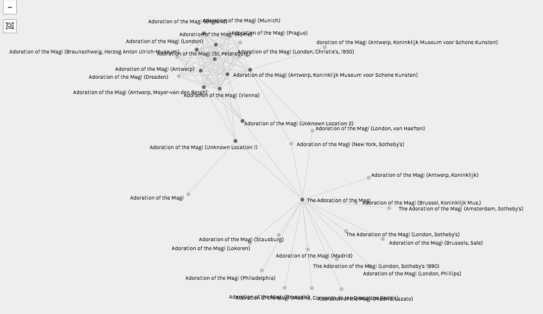
Figure 6. Visualization of the relationships between Adoration of the Magi paintings made using Palladio.
Some students had been learning in another course to use Gephi, a more complex network visualization tool, and they led the groups in uploading data to display more attributes of both nodes (paintings) and edges (relationships).[4] Edge colors could now be used to visualize what type of imagery connected two works, node colors to indicate whether works were autograph or studio versions, and the closeness of relationship (edge weight) could be shown at the same time (Figure 7).
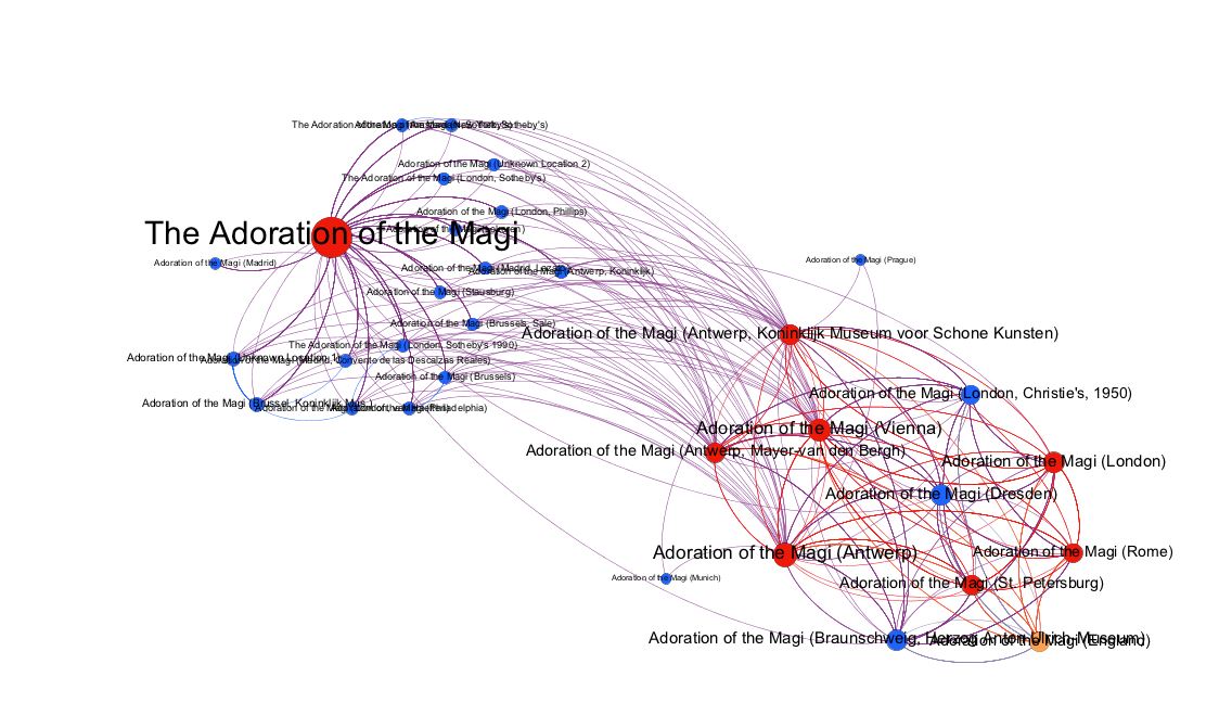
Figure 7. Visualization of the same data made using Gephi.
When the groups presented their results to the class, it was clear that the Brueghel studio had operated very differently depending on the kind of image they were producing. For instance, paintings depicting the scene of the Adoration of the Magi were divisible into tight clusters connected in terms of overall composition although varied in details, while images of Paradise were mish-mashes of bits of imagery that moved across all the paintings rather than falling into distinct sub-groups.
This was very interesting to me, but when I read the papers each student wrote about their group’s results, I realized that many of them did not have the art-historical background to make sense of the data they had generated. Even the art history students were not always able to see the implications of their own work, and the students from the English department were, I suspect, frustrated by the entire exercise. There were too many layers to the problem: studio practice, originality, and market value were meeting data creation and analysis and the use of new digital tools. There were certainly students for whom all these pieces came together and who wrote wonderful papers, but other papers showed a level of plain confusion that I am not used to seeing in an upper-level class. This project truly separated out the students willing to put in extra time, thought, and effort from those accustomed to doing rather well just by coasting. Those students were lost.
I would argue that it is good for students to be confused sometimes. Faculty frequently complain that students today need, and receive, excessive amounts of guidance on each assignment, often resulting in prompts and grading rubrics that are longer than the assignment itself. Such assignments for which successfully ticking off each box results in an “A” grade is one cause of the grade inflation that also infuriates faculty. It is healthy for students to have to feel their own way through material, to ponder what kinds of evidence can be mobilized, how data can be interpreted, how to create an argument that synthesizes disparate threads. Beyond simply learning to deal with “messy data,” they should learn how to deal with messy problems and not expect neat paths to historical knowledge. Yet to work this way effectively and without excessive guidance, they need to have enough knowledge—or the means of acquiring it—to make informed assessments of their material. Project-based learning allows us to plunge students into more open-ended ways of learning but it also challenges us to provide them with a different kind of scaffolding for their work.
This is doubly difficult in a Digital Humanities context because in addition to providing a context for interpretation we are also guiding the students through both theoretical and practical questions pertaining to a way of working digitally that is itself probably new to most of them. Before my class embarked on their art history project, they had already done a more straightforward mapping project in the course for which they had read some key theoretical texts about DH, and they read a few others during this second unit.[5] Yet to ask them to think critically about the practice of DH at the same time as they were engaging in a digital art history project was indeed asking a lot. A handful of my students were concurrently taking other DH classes, and they had a huge advantage over the rest of the group. They already knew tools and concepts the way that the art history majors already knew about theories of the copy. Some of these DH specialists also had a very advanced grasp of how to think about linked data and how it could be visualized using different tools to reveal new insights into the material. They understood the implications of what they were doing. Because the students were working in groups, and I had been careful to distribute these students among the groups, they were able to share their expertise with their peers and most of the group spreadsheets, visualizations, and presentations were excellent. In the individual papers, however, it was very clear who had understood the digital work they had engaged in—and who had just been going along for the ride.
One important takeaway from this experience, for me, was that if you are too much of an expert on a subject, it is hard to see how complex a “project” really is. A good lecturer can organize, simplify, interpret, and explain even very advanced and subtle material. But it is much more difficult to put together a coherent project about a tough, multi-leveled subject with both historical and theoretical implications involving data-gathering and digital-tool-using in such a way that students can comprehend it and feel that they have made a contribution to knowledge, which is the ultimate goal of any project-based learning experience. The class’s other projects, in non-art-historical areas about which I knew rather little, worked better for the very reason that I was not asking, nor expecting the students to ask, very sophisticated questions about their data. To teach on your own material through projects and digital tools, you need to slow down the pace at which the students proceed; make sure they have time to digest all the facets of the project (historical content, art-historical theory, digital tools); and guide them in synthesizing their work so that they fully understand its implications.
The class’s final assignment asked each student to write a paper designing a DH project for another class they were taking, and then positioning themselves within the field of the Digital Humanities. The students seemed to enjoy this assignment and did well on it: their projects for other classes were smart and imaginative and their self-positioning was very thoughtful. I might try extending that assignment in smaller pieces over the course of the semester, allowing students to connect it more directly with their art-historical work as they are completing that project. In addition, were I to teach this material again, I would want to give the students a bit more time to process the implications of what they were doing, either by preparing more of the visual data myself, or by having fewer projects in the semester so that the art-historical one would be emphasized.
So was this class, with its digital art-historical section, a success? Measured in terms of the dreaded course evaluations, no. From my normal lecture course average of about 6.5 out of 7, I went down to about 5.5—a precipitous drop that made me glad that I already had tenure. Many students shared my dislike of the out-of-control feeling of the class, the lack of smooth trajectory, and the unfamiliar types of outcome. In the end, however, those reactions were compensated for by people who wrote, “This class really allowed for me to think—some classes show you what to learn, but this class taught and encouraged me how to learn, how to think: I loved that,” and “I did more reading, analysis, and just plain thinking than I’ve ever done in any other Berkeley course, and through it I’ve grown as a writer and as a scholar.”[6] Two students have asked me for recommendations to go on to graduate school in digital art history, and one wrote an article for a student magazine about DH and her experiences in this class (Buyukakbas 2017). Teaching at the edge of a new field, a new methodology, is incredibly challenging but it also has great rewards.
'Teaching Renaissance Workshop Practice as Network Analysis' has 2 comments
February 21, 2018 @ 12:01 pm Table of Contents: Issue Twelve /
[…] Teaching Renaissance Workshop Practice as Network Analysis Elizabeth Alice Honig […]
February 21, 2018 @ 10:48 am Introduction: Re-viewing Digital Technologies and Art History /
[…] been left behind by the digital turn in the humanities (see Greenhalgh 2004, Zorich 2012, and the essay by Elizabeth Honig in this issue). According to many researchers and educators, the field of Digital Art History (DAH) […]