Art and architectural historians have long relied on image-based reproductions of their primary source material to produce scholarship. However, film-based photography and digitization, the reproduction techniques most often used for these purposes, do more than simply convey an object from one mode to another. They create significant remediations, composed of a variety of processes and materials. Photography and digitization are also different technologies from one another, and their use has been implemented fitfully and heterogeneously over time within the field. Thus, generations of art and architectural historians have not only become familiar with the process of embedding technologies into the humanities but also gained field-wide experience with the impact such technologies’ presence and obsolescence can have on research processes. This article argues that art and architectural history can serve in some ways as a model for the adoption of new technologies into the humanities, but it can also offer objective lessons on the risks of taking both the technical and social affordances of these tools for granted. Technologies can create rupture, but they can also participate in, and even engender, a mindful continuity with thoughtful and effective past practices. The lessons of art and architectural history can show that engaging with technologies in the humanities is best done mindfully, with a commitment to bringing their full socio-technical environments into view—periodically and over time.
Since the early days of the field in the late nineteenth century, art and architectural historians have relied on image-based reproductions of primary source material to do our work, a practice that has given the discipline significant experience with using technologies to do the work of the humanities. Photography and digitization—the two main image-reproduction technologies of the twentieth and twenty-first centuries—do not duplicate their subjects uncritically, however. They do not simply convey an object from one mode to another; they are transformative technologies. The reference images they produce are, and have always been, significant remediations of our objects of study, composed of a variety of processes and materials that we allow to stand in for what is not present. They have actively shaped our disciplines in sometimes overt, sometimes covert, ways.
That said, photography and digitization are also different technologies from one another, and their use has been implemented fitfully and heterogeneously over time within the field. Art and architectural historians have thus not only become familiar with the process of embedding technologies into the humanities, we have also gathered hard-won, field-wide experience with the impact that their presence and obsolescence over time can have on our research processes. The story is not always one of success. Our discipline has occasionally permitted the technical and social affordances of these shifting technologies to become invisible to us. We have often chosen to elide, ignore, or take for granted the ways that the socio-technical environments of these remediations have transformed the daily operations and rituals of our discipline.
Because of this time-tested relationship, I wish to argue that art and architectural history offers the Digital Humanities approximately 115 years of experience with being attuned (or not attuned) to the impact of relying on technologically mediated representations of the phenomenal world to perform humanities research. This type of scholarship, that is, one not directly reliant on primary sources but instead on remediations of those sources, is the fundamental, originary condition of the Digital Humanities. Art and architectural history can serve in some ways as a model for the mindful adoption of technologies into the humanities, but it can also offer objective lessons on the risks of taking both the technical and social affordances of these tools for granted.
Herman Grimm and His Skioptikon
Throughout history, works of art and architecture have been reproduced and distributed via paper-based media, whether by drawings or printing technologies. However, the rise of modern art-historical study, which took place over the course of the late nineteenth century in Germany, was concomitant with the rise of a set of photographic technologies that would transform the discipline profoundly. Around 1890, the art historian Herman Grimm normalized the use of the lantern slide projector—the Skioptikon—in the classrooms of the University of Berlin (Figures 1 and 2).
Figure 2. Lantern Slide of Amiens Cathedral produced by the Chicago Transparency Company. Handwritten notes include “9. Amiens Cath. Lec[ture] 9” and the code “431.” Collection of the Department of History of Art and Architecture, University of Pittsburgh. Photo: Author.
In his 1892 work, “Transforming University Lectures on Modern Art History Through the Use of Skioptikons,” Grimm noted that what attracted him most to this technology was that the slides allowed him to move away from a focus on the contextual, literary, and historical texts about the art, and move towards a study of what was actually visible in the art.[1] Before this period, to bring the visual object into the classroom, lecturers might have passed around printed reproductions or they might have employed verbal descriptive techniques such as ekphrasis—a highly personalized narrative used to evoke the experience of looking at a work of art or architecture. Instructors may have also suggested that students remember their last encounter with the object, or recommend they go and see it on their own in their travels. These images allowed Grimm to lecture much more effectively in class about the visual forms of the work itself by means of large, black-and-white projections that the entire class could see communally.[2] Absent objects could be made shimmeringly present by patterns of shadow and light on the wall.
Wölfflin: Thisness-and-Thatness
Just a few years later, the research and presentation practices of the art historian Heinrich Wölfflin would not only transform the way the discipline operationalized these representations, they would also fundamentally change the way the field approaches its very subject material. Wölfflin is credited with standardizing the use of, not just one, but two, lantern slide projectors in the classroom, lecturing consistently in front of simultaneous pairs of images at the University of Berlin between 1901 and 1912 (Figures 3 and 4). This technological tweak was small, but its effect was mighty. Shifting the field from a focus on single objects to a comparative mode of analysis was truly transformative, as it asked historians to move away from a consideration of synchronicity to diachronicity. His approach was quite rapidly taken up field-wide. Objects, once dutifully considered in isolation, were now expected to be brought into conversation with one another across time and space.
Nevertheless, this transformation was not solely technical. According to accounts of his lecture style, Wölfflin’s classroom was also a type of full-body infotainment experience—a bit like the phantasmagoric Magic Lantern shows, popular since the eighteenth century, that used similar technologies. He would turn off the lights, fire up the projectors, and instead of lecturing from the front of the room, he would sit out in the crowd of his students, sharing with them the view on the pairs of images as they came up, set after set, image after image in succession. It is said that when each new pairing would come on the screen, he would pause dramatically, as if to give the objects a chance to shine on their own before submitting them to his piercing comparative analyses.[3]
This use of paired reproductions and vivid, spoken rhetoric was not simply an expression of early twentieth-century Germanic ed-tech melodrama. With this approach, Wölfflin profoundly influenced both the style of argumentation and scholarly expression in the field of art and architectural history to this day. His art history was one based not only on comparison, but also on the communal experience of looking and listening, and the socio-technical affordances of image reproduction that brought these practices together were at its heart.
Indeed, Robert Nelson and Dan Karlholm have argued that Wölfflin and Grimm were both radically experimenting with a style of academic argumentation that proceeded first from the image and the voice, rather than the more traditional written text.[4] This approach was designed to display rhetorical and oratorical skill, a tactic that takes full advantage of the medium of speech and the performativity of the slide lecture.[5] It allowed art historians to call on any number of rhetorical techniques that work primarily in the performative vein, such as deixis, or the ability to call on one’s physical human relationship to an object while explicating a point, as in, “over here we see Les Demoiselles d’Avignon…” Art and architectural historians, then as now, could also deploy the use of “anchor slides” in their lectures—images to which one might return frequently, each time making a more nuanced and fully formed argument. This technique easily allows for circular, spiraling, or recursive arguments. Even retractable arguments are more permissible as oral rhetoric. The slide lecture, a foundational methodology to the field of art and architectural history, was and is a multi-modal, embodied experience. Unlike the process of reading, the audience can both listen and see at the same time, rather than needing to shift its gaze from text to image and back again. They also experience the argument synchronously and communally. These techniques are difficult to reproduce in writing, yet they remain at the core of our training and profoundly influence the way we interpret our primary sources.
This Technology Changed Us
The technology of image reproduction at the heart of this disciplinary shift, the glass lantern slide, was soon made obsolete. 35mm Kodachrome slide production began in 1936, and this photographic technique fully solidified the ubiquity of the paired, projected image in the art-historical classroom. Kodachrome was, of course, a color process, offering obvious chromatic improvements over the older black-and-white lantern slides. 35mm slides were also smaller and far easier to make and store than the older technology (Figures 5 and 6).
Figure 6. The “Sarcophagus of the Spouses,” Etruscan, ca. 520 BCE. Terracotta. Jenna Ashton, Slides from the Department of Art History and Visual Studies, The University of Manchester, September 2012. https://archiveinterventions.files.wordpress.com/2012/09/100_2435.jpg. This is an Ektachrome slide, as revealed by the shift to magenta tones, the telltale signs of color degradation in this format.
While their technical affordances were considered improvements over the older technologies, their arrival did not cause a reconsideration of the role of the reproduced image in discipline. The field swallowed them into its practice and kept them pinned to the early twentieth-century use case offered by Wölfflin and Grimm. The technological armature of these slides remained hidden from the audience, and possibly from the field itself, as part of the performative rhetoric of the art-historical classroom.
However, this technology did transform the discipline in its own way. The most demonstrable impact made by 35mm slide technology was perhaps to be found outside the classroom. The millions and possibly billions of 35mm slides produced for the discipline of art and architectural history over the course of the twentieth century created, quite literally, a weighty mark on the field. Such vast quantities of these slides were produced globally for each department of art and/or architectural history that they created a physically massive, disciplinary-specific, information infrastructure not shared by many other fields of the humanities—that is, the slide room (Figure 7).[6]
Figure 7. The former slide library at the University of Pittsburgh, Frick Fine Arts Building, June 2011. Photo by the author./
Figure 8. Slide sorter as made available for sale by Lauren Busiere (@madebylaurenb) on Etsy in 2009. Image permission granted by the creator.
While easier to make than glass lantern slides, 35mm slides still remained a bit of a hassle to produce, and their creation, organization, and storage was a capital-intensive endeavor that encouraged the creation of common repositories. Whether called the slide library, the visual resources collection, or the slide room, this socio-cultural environment often became the “town square” for departments of art and architectural history.[7] It was an information commons, a resource shared by a community of inquirers, and a physical location that drew members of the department together in one place for a shared purpose. Scholars certainly had their own personal collections, but the slide room was a central location where people not only went to access image resources but also to meet and discuss their scholarship and the more mundane things of life. Some, if not most, departments also had communal slide sorters in these spaces, allowing patrons to walk by and see the growing image-focused networks of argumentation being made by their colleagues and teachers. A smattering of slides across one of these sorters could have a multitude of possible meanings (Figure 8).[8]
Yet, the changes wrought by the influx of 35mm slides were not all social, they impacted habits of scholarship as well. This information commons operated within a form of information scarcity. Because 35mm slides were not quite a dime-a-dozen, they could also become “quasi-unique” to scholars.[9] These types of views showed just what one needed to make a point, and were prized. It is worth reflecting back on the day when it was normal to walk into the slide room, hoping that one, single, small, colored piece of plastic was there to allow us to make a point in a lecture. Because, if not, the hassle of making a slide was significant, requiring finding a book or a vendor, getting to a copy stand, having a camera loaded with slide film (and possibly taking only a few slides off that roll), having it developed through a process that took time, money, and often great effort, etc. Even if not directly responsible for producing slides, there was always a significant time delay between needing and image and finding it in hand.
If the desired slide was not in the slide room, a scholar could also simply choose not to make that point, or to make a totally different point. In this way, the availability of the technical infrastructure could—and often still does—change the shape of art-historical scholarship.[10] But often, the slide was blissfully there, because these collections were carefully perfected for particular departments and faculties by a cadre of trained information professionals (“slide librarians” or “visual resources curators”) during the course of nearly a century. Nowadays, these collections, each containing tens of thousands of 35mm slides, often look more like piles of junk than the massively capital-intensive information commons they once were (Figures 9 and 10).
We Study What We Can See, But We Can Also Elide What We Wish
We do not usually think of our research and teaching images as these rampaging, obnoxious piles of disorder, although it is easily possible to imagine that this is exactly how they are currently organized on the Internet. Instead, when projected, these images were used as evidence for our arguments, as surrogates for an original, or, rhetorically, even as the object itself. It is rare to find a lecturer in art history who has not elided the gap between the image on the screen and the object under consideration. We say things like:
Here on the screen is the Demoiselles d’Avignon, painted by Pablo Picasso in 1907, although it was not displayed publically until 1916. It is a work in oil on canvas, and measures 243.9 x 233.7 centimeters. That is around 8-foot-square in old money. (Figure 5)
No such thing is actually on the screen. The projection is not that size; it was not made on that date. Such is the permitted use of the oral rhetoric that is so fundamental to our field. It is a seemingly innocent illusion/elision between the represented and its representation, but it is an elision none the less. Hiding the imaging technologies as we do, both verbally and physically, allows the discipline to fulfill the Wölfflinian ideal of presenting an argument that seamlessly combines a spoken explication alongside a display of relevant image evidence, audible and visible to all.[11]
Given that the particular technological affordances of glass lantern slides, and the 35mm slides that followed them, were at the very heart of the normalization of this method of art-historical inquiry, it seems somehow unsatisfying to consider this elision entirely innocent. This discipline, the one that studies representation theory itself, has had numerous opportunities to be more mindful of this approach. Artists have certainly done so. Mark Tansey’s enormous oil painting, the Innocent Eye Test from 1981, pokes a little fun at such behavior (Figure 11).[12]
Here we see a cow being shown a painting of other cows by a group of men in suits. The men peer at the cow, seemingly wondering what her (necessarily non-verbal) response will be to what she sees, an act that begs the question of whether the scene depicts an “innocent” having a vision test or instead an experiment about a scientifically “innocent eye.” The man on the extreme right dressed in a white lab coat, takes notes on a clipboard, while the man with a mop on the extreme left stands as testimony to the embodied reality of having a cow in a gallery space. In a way, art and architectural history has been performing a variation of this silly experiment on our audiences for more than a century.
Yet even beyond the human tendency to use this rhetorical sleight-of-hand to elide the relationship between the represented and its representation, the technologies used to remediate the objects of our study have themselves had a fundamental impact on what we have chosen to study at all. It is not only the case that we choose to study those objects for which we can find a representation—whether in a slide room or on the Internet. It is also a well-known, field-wide trope that art and architectural history has traditionally focused on those aspects of visual culture best represented by the most advanced image reproduction technologies available at the time.[13] The early black-and-white lantern slides, for example, allowed scholars, including Wölfflin himself, to focus on line, shading, composition, planarity/surface, even content/iconography over materiality, all without the “distraction” of color information (Figure 12).
Figure 12. Different representations present objects differently. Digital image of a lantern slide representing Élisabeth Louise Vigée Le Brun (1755–1842), “Portrait of Marie Antoinette,” 1783. Oil on canvas, 113 x 87 cm. Collection of the Palace of Versailles, Versailles. Digitization from the Morris Wachs Collection, W. T. Bandy Center for Baudelaire and Modern French Studies, Vanderbilt University./
The addition of color to the slides did not magically erase the ways that the technological affordances of our reproductions shape our scholarship (Figure 13). It has never been the quality of the representation that asks us to compromise on our interactions with the object, it is the very act of reproduction itself. The introduction of color to these images may have allowed for the study of more image features, but the colors studied remain steadfastly those of the reproduction. Maintaining a color match between a representation and its referent was, as it continues to be, difficult at best. Representation is a form of interpretation and remediation, from the framing chosen, to the color balance used, to the precise technology selected. It is not a neutral act; it is materially transformative.[14]
Digital Images Are Numbers
Over 100 years after projected image technologies transformed the field of art and architectural history, the use of film-based slides came to an end. In 2004, Eastman Kodak stopped making 35mm slide projectors. In 2012, Eastman Kodak stopped making 35mm slide film, an act that ceded the playing field definitively to digital imaging. But just as at the moment of transition between lantern slides and 35mm slides, art and architectural historians, as a group, did not hasten to probe the affordances of this new technology for possible transformative impacts on our methods and approaches.[15] Instead, the decline of film-based image reproduction technologies was simply matched by a rise in the use of digital images within software presentation packages such as Microsoft PowerPoint.[16] That is, the discipline chose to adopt digital images as “digital slides,” surrogates of the surrogates we had already been using.
This strong focus on only those affordances of digital images that simulated the historical use of film-based images skimmed over fact that this newer form of reproduction was, and is, produced by an extremely different set of technologies. Digital images and film-based images are not made up of same materials, and they do not function internally in anything like the same manner. Digital images are not colored pieces of plastic or glass. They are, like every other thing that can be represented within a digital computer, made up solely of numbers (Figures 14 and 15).
Figure 15. Detail of the red channel of the digital image in Figure 14 made in MATLAB. Image courtesy Thomas Lombardi. Used with permission of the creator.
The matrices used by the computer to produce images on the screen can easily be made visible, but to do so does require an act of intention.[17] In Figure 15a, we see a detail, in the red channel only, of the right corner of the mouth as represented by the digital image that is Figure 15. Looking closely, one can see that very shape of this detail is just visible to the human eye by tracing the triangular pattern of the larger numbers, indicating a greater amount of red, against the ground of smaller numbers, indicating a lesser amount of red (Figure 15a).
Figure 15a. Detail of the red channel of the digital image in Figure 14 made in MATLAB, colored to highlight the location of the detail (right side of the mouth). Image courtesy Thomas Lombardi. Used with permission of the creator.
But the mouth, whose pattern is thus barely visible in this set of numbers, is not truly there at all, not even as a smear of red chemicals on a piece of plastic. Computers must enact these numbers—perform them—in order to provide us with a rendering that looks like an image. While it is possible to use these matrices of numbers in a manner that is functionally equivalent to film-based slides, it remains true that digital images are built on an entirely different model of representation, one in which treating color as numbers is a fundamental, inescapable reality.[18]
The Social Effects of the Digital Turn
The demise of film-based imaging and the concomitant rise of digital imaging also caused a radical shift in the social environment surrounding the use of image reproductions in the field of art and architectural history. In the twenty-first century, the ways in which we collect, search for, retrieve, and disseminate our images are utterly different than they were throughout the twentieth. For one thing, the act of creating and distributing a reproduction of an image in a book now has a fundamentally different relationship to copyright law than it did in the days of the physical slide library.[19] However, one of the most prominent social ramifications of the digital imaging revolution within the field may in fact have been the demise of the slide library itself, along with the “town hall” space that it afforded. The integration of digital images into our disciplinary workflow dissolved the need for this communal room, and sent art and architectural historians back to their individual desks, pinning them in relative isolation to their screens and keyboards.
As scholars in this particular historical moment, we are essentially each responsible for finding and organizing our own image resources in our own personal digital world. Whether using Google, ArtSTOR, or some other digital service, art and architectural historians nowadays tend to create collections by hunting down images using textual search terms rather than by proceeding to a specific physical drawer carefully arranged within a much larger assemblage of cabinets, all professionally organized hierarchically by period, location, creator, and then object. Like direct searches, browsing for images is also now much more likely to happen on the basis of the results offered by a textual search algorithm than the tactile perusing of a carefully-curated, highly-intentional sequence of 35mm slides. This said, within art and architectural history itself, the impact of this move from a centrally catalogued set of canonical images has not always been a detrimental one. Our monolithic, Western-centric tradition of cataloging told a very particular story about what was and was not valued in our disciplines, and the massive physicality of these collections did not easily allow for the types of reconfigurations of interconnections that are now possible in the digital environment.
From every angle, this shift from a physical system of search and browse to an algorithmic one has profoundly changed the way our discipline interacts with, and attends to, the image reproductions we rely on. We look for pictures with words, wade through search results of varying responsiveness, and we tend to do so in isolation. Indeed, the transformative impact of this search-based shift in scholarly attention has also been noted by other fields in the humanities, such as the discipline of history, as they too begin to rely more heavily on digitizations of their primary source material.[20]
More Than Doubling Down on the Index
Art and architectural history has more than once shown itself to be relatively uninterested in re-thinking the use of changing technologies in our field, and even perhaps slightly resistant to considering the socio-technical armature of our profession as an active agent that shapes our teaching and research.[21] We have absorbed, taken for granted, and in many ways “un-seen,” the full disciplinary scaffold that we have built on top of the original introduction of film-based, photographic slides in the classroom—from the performative nature of its basic mode of argumentation to the socio-technical impacts of the massive, professional image information management systems that constituted the slide libraries.[22] The field has also chosen not to dwell, up to a point, on the ways that digital imaging has transformed technologically and socially the very act of image representation yet again.
Each time we have adopted a new type of image reproduction technology, we have tended to focus on retaining the results of the last transformation rather than initiating a deep understanding of the current impetus for change and its potential impact on our field. For example, the penchant for veering into showmanship that accompanied Wölfflin’s approach to lecturing has been more strongly retained by the discipline than the memory of why communally visible images in the classroom were so revolutionary in the first place. The discipline has, along these lines, shown quite a bit of fascination with the creation of digital virtual environments, some of which run on platforms like the Unity gaming engine. This love of producing engaging, absorbing images is certainly part of a long-standing tradition in the discipline, but cleaving to this habit has had a field-wide impact not only on the types of research we do but also on the ways we are perceived outside our discipline. Our field began by adopting the infotainment technology of the Magic Lantern show, and we can use digital gaming platforms in similar ways now if we like.[23] But we should do so mindfully, and with full understanding of what these approaches offer us in the twenty-first century.
Similarly, we have had a long-standing disciplinary habit, noted above, of rhetorically eliding the distance between representations and what they represent, and digital images can certainly be used to this end. But no matter how indexical, suitable, or numerous the representations of an object are, what is on the screen will always resolutely remain a representation that stands in for something else. Using the ease and flexibility of digital imaging to multiply the number of images present, or to make these representations seem more immersive, or any other approach that simply doubles down on the indexicality of these images, will never change this state of affairs.[24] Multiplying representations can even have the effect of drawing increased attention to the very absence the scholar is trying to cover up as the diminishing returns on adding yet one more image, one more angle, one more point-of-view become ever more conspicuous.[25]
Digital images have more to offer the field than their often jaw-dropping visual appearance. In the digital studies community, studying only the screen-facing aspects of a digital object risks a pitfall known as “screen essentialism.”[26] That is, it is not enough to assume that what is most important about a digital object is what it looks like when displayed, because digital objects always include an armature of numerically-encoded information and behaviors that enact what becomes visible. Other affordances of digital imaging and its socio-technical infrastructure can provide ways to interrogate the role of remediation in the study of material culture and the built environment. By extension, this work may have much to offer to the study of any digitized object, transformed into numbers as they all are by the encoding process.
The discipline of art and architectural history has only just begun to confront the possibilities inherent to this new model of representing an object as a matrix of numbers—that is, we are just now considering the possibility that computing over these representations could be part of our acceptable disciplinary methodologies. Scholars such as Lev Manovich are approaching digitized and born-digital images in this manner, producing provocative results.[27] The computing and information sciences have also shown great interest in using representations of our primary source material in their own investigations of computer vision and image analysis, implementing a mixture of their methodologies and what they have gleaned of ours through the literature.[28] Further direct collaborations between these fields may result in new knowledges that benefit us all.
It is critical to our field, however, that we not take up these encoding-focused approaches without first considering our contemporary reasons for doing so, as well as the ways that they are best situated within our long-standing technological historiography. We introduced the use of image reproductions in order to facilitate an understanding of our primary sources, not to supplant them or take their place. And yet, the digital approaches that focus on computing over these matrices of numbers can only delve ever more deeply into the innards of the surrogates themselves. To commit to this line of inquiry, the field of art and architectural history will need to accept fully that the results of this computational process, one that can only work on the representation, may be used to interpret the original object it represents successfully. This is not just an innocent elision between the object and its remediation, this is a potential collapse. Working directly with the matrices of our digital images strives, perhaps, to uncover information within these encodings that the human eye cannot otherwise perceive in the “real” world, whether because of a change of scale, from microscopic to immense, or technique, whether experimental or mathematical. This method seeks information about the experiential world in a place entirely divorced from it—a central characteristic of the digital turn itself.[29] Great things may come from this approach, but only if it is done mindfully and with full knowledge of the costs and benefits.
Taking Different Cues from a History of Working with Technology in the Humanities
While diving ever deeper into the foundationally representational nature of the digital image is one path forward for a digitally-engaged history of art and architecture, it is also conceivable that there could be explorations that do not partake of a narrative of technological rupture, but instead one of mindful, engaged continuity with both the technical and socially-based disciplinary traditions that still work for us. Perhaps in a manner akin to Wölfflin’s shift from projecting one sole image to a pair, thinking deeply about the affordances of our changing technologies can provide a sense of intellectual parallax, enabling art and architectural historians to separate the useful interpretive techniques that are important to retain from the framing of the technical affordances that originally facilitated them.
One such behavior, ripe with possibility in the digital era, is the traditional art-historical mode of argumentation rooted in oral, rather than written, rhetoric. More than just an act of showmanship, Wölfflin taught an experience. In his classrooms, he created an environment of shared potential. In his argumentation, his reasoning did not always unfold linearly, instead it moved back and forth, in zig-zags, towards his conclusions. Even if many of his interpretations are no longer considered convincing, his remarkable style of presentation made a fundamentally lasting mark on the field. Art-historical knowledge produced in this way has always been best taught, shared, and understood as an engaged performance rather than as the recitation of a linear, written text.
This type of performative knowledge can find an easy home in, and a deep connection to, the world of digital interactivity, especially in the era of the Internet. Numerous scholars, especially in the field of digital preservation, are exploring the importance of conceiving of the networked, digital environment not as a static object that can be directly preserved, but instead as a lived performance that is constantly unfolding and changing over time.[30] Users issue commands that are interpreted by the machines at a given time and in a given context, and while the computer will always perform the same operations when asked, the results it produces will always be both contingent and dependent on the data available at that time.[31] The interaction between the user and the computer can thus produce new performative knowledge together.
Art and architectural historians can take advantage of this happy congruence, not only by drawing our deep understanding of this type of embodied, interactive knowledge production but also by allowing the technological affordances of this new digital environment to push us to think more deeply about this interpretive act. The Visual Media Workshop at the University of Pittsburgh (VMW) has been investigating such a set of digitally focused, performative, art-historical methodologies using large-scale, lab-based projects like Itinera (http://itinera.pitt.edu and Figures 16a-b).
Figure 16a. Screenshot from Itinera’s splash page. Screenshot: Author.
Figure 16b. Screenshot from Itinera’s back-end data entry form. Screenshot: Author.
Itinera is a digital project that focuses on collecting, arranging, and visualizing data about culturally-motivated travel in the eighteenth and nineteenth centuries. At its heart, the project is a complex data model designed to represent what we know about past behaviors, actions, movements, and collections in a particular historical context. In practice, it is far more than this particular technology. Itinera serves as a continuous point of interaction between the data model, the visualizations that activate the data, and the students and faculty who work so carefully to input information gleaned from historical primary sources. It has been thrilling to participate in the ways that the site engenders new performative knowledge. Undergraduates come to learn the slipperiness of historical materials as they come to grips with the specific requirements of Itinera’s data model. Every year, the project gets a new graduate student for a project manager, and every year that project manager interacts with the system differently, asking new questions of the system, creating new data, and new ways of looking at that data.[32]
The project team has found that Itinera produces new knowledge, not because it is heading towards a conclusion, but because it will always be in a state of creation and enactment. To be sure, it can also be used for more directive purposes. Itinera can help train students on the specific techniques and approaches of the Digital Humanities, from the principles of information visualization to the hows and whys of normalizing historical data. Yet it is also a continual performance between computers, programmers, users, and inquirers. It asks the team to focus on the impact of our historical storytelling, and it points out the gaps in our knowledges as well as the presences. It is never finished, always lacking, but therefore open to the possibilities of the next interaction, the next performance.
But it is not only in the technical sphere that connections can be made and explored between the disciplinary traditions of art and architectural history and contemporary digital infrastructures. Such linkages can also occur in the social sphere.[33] Spaces such as the Visual Media Workshop can work to counter-balance the trend of isolated search-and-retrieval behaviors, drawing on the history of our discipline and re-instantiating some of the “town square” functions made possible by the former slide library. The Itinera team not only works together physically in the communal space that is the VMW—a space that, importantly, was the former location of the University of Pittsburgh’s slide library (Figures 7 and 17)—but it also works together virtually, in the space carved out by the project’s digital environment, complete with its interfaces, visualizations, and technological infrastructures.
Figure 17. The Visual Media Workshop in October 2017. Photo: Author.
Moreover, Itinera is also not the only project housed in the VMW. Students and technologists work together in this space collaborating across a number of projects, taking lessons from one arena and applying it to another. Because of our physical and intellectual collocation, there is space for chance conversations and for serendipitous findings produced within the interactions of a community.[34] The project teams of the Visual Media Workshop consistently note that the importance of embodied contact with other scholars cannot be underestimated when working on a shared technological infrastructure. Working with digital tools, and staying mindful of our full socio-technical environments, helps us produce knowledge that is as much a social and performative act as an intellectual one.
Using Technologies to Study the Humanities
Art and architectural history has long-standing experience with transforming an academic discipline through technologically engaged practices, and it can offer its findings fruitfully to the Digital Humanities writ large. Our field has always been multimodal, experiential, and performative—even to the point of theatricality. Its members have used technologies actively and mindfully both to expand scholarly opportunities and to change the way we study our primary sources. Yet we have also enacted the less-advantageous practice of coming to take the socio-technical affordances of these technologies for granted. We know what it is like to absorb these tools into a discipline so completely that the formative effects they once offered become seemingly invisible and replaced only by their results. When this happens, the technologies at the heart of fantastic innovation can also become the handmaidens of a field-wide, scholarly inertia.
The technologically engaged traditions of the field of art and architectural history demonstrate that the power of these tools does not, and should not, end with their initial novelty and impact. Engaging with technologies in the humanities is best done mindfully, with a commitment to bringing their full socio-technical environments into view—periodically and over time. These affordances need to be kept in sight not only so they do not ossify but also so that they can continue to prompt us to do our best work. Using technologies to help study the humanities need not always be about rupture and beginnings. Technologies can participate in, and even engender, a mindful continuity with thoughtful and effective past practices.
Appendix: Presenting “Art and Architectural History and the Performative, Mindful Practice of the Digital Humanities”
Editors’ Note (5/4/18): During February of 2018 the author of this piece, Alison Langmead, presented this paper at the Maryland Institute for Technology and the Humanities (MITH). As a journal that looks to enable multiple perspectives on the pieces we publish and due to the fact that questions of performativity and performative research that are present in the piece we welcomed the request of the author to include a video of that presentation/performance in the journal and within her article. You will find the video below.
[archiveorg id=AlisonLangmeadMITHPresentationIssue12 width=960 frameborder=0 webkitallowfullscreen=true mozallowfullscreen=true]
Notes
[1] A fantastic description of Grimm and his approach to the use of projected images in the classroom can be found in Karlholm 2010. [2] Although the underlying photographic technology was resolutely black-and-white, numerous glass lantern slides were also hand-colored to enhance their appearance and create a greater illusion of naturalism. [3] Robert Nelson has presented a relatively lengthy translation of a description of Wölfflin’s presentation style that was offered in the 1920s by one of Wölfflin’s former students, Franz Landsberger: “Wölfflin, the master of extemporaneous speaking, places himself in the dark and together with his students at [his] side. His eyes like theirs are directed at the picture. He thus unites all concerned and becomes the ideal beholder, his words distilling the experiences common to everyone” (Nelson 2000, 419 citing Landsberger 1924, 93–94). Karlholm 2010 also explicates Landsberger’s discussion of the experience. [4] Nelson’s thoughtful piece was produced at the very height of the disciplinary transition between the film-based 35mm slide and the digital image, and it stands as one of the most powerful statements of this socio-technical transition. It is both filled with nostalgia for the performativity of the old slide lecture, and also affection for the discipline in the face of its potential transformation. Karlholm’s piece was written a bit later and focuses on a more strictly historical evaluation of the role of spoken rhetoric in the formation of the traditions of the discipline. [5] This is a tradition with which I am playing here. The current paper has been delivered twice, once in draft form at the 2015 ACH meeting in Ottawa, and again later that year, in a final form, as an invited lecture for the University of Alabama. This written text, however, departs dramatically from the original spoken presentation, especially in the number of words needed to convey the same information and the reduced number of images acceptable given the format. [6] Other fields of the humanities that do not take textual content as their core subject matter, such as those focused on music and/or spoken language, have also produced similarly disciplinary-specific, technologically rich information resources over time. For an example from a historical perspective, see Schwartz 1995, and for a contemporary example looking at audio recordings held by music libraries, see Hooper and Force 2014. [7] The chattiness of this space depended on the department, of course. Beth Harris and Steven Zucker presented the slide library as a “town square” in their fantastic piece (2008). Spaces like these were also often called “Visual Resource Collections” because they contained more than just 35mm slides. Numerous art history departments also had photo study collections well before the advent of 35mm slides that contained printed photographs used for both reference and teaching. Over the course of the twentieth century, any number of different image-based media could have been collected in these spaces, such as moving images or larger-scale transparencies. [8] As Johanna Drucker recently noted, with digital technologies, “we could situate a work within the many networks from which it gains meaning and value, and then present the results within complex visual arguments—the kind that were elaborately constructed on slide tables before being reduced to side-by-side comparisons for lectures or standard print publications” (2013, 6). [9] Harris and Zucker present the concept of the “quasi-unique” slide (2008, 35). [10] That there are millions of images available to us on the Web, accessible via search engines, does not always mitigate the disappointment of not being able to find an image of the one object needed to make a point. [11] Stephen Murray points out a few ramifications of this elision (2009). Nelson also uses scenes from Wendy Wasserstein’s play, The Heidi Chronicles, as evidence of the art-historical ability to use a representation as an effective replacement for the original object (2000, 417–18). [12] It is perhaps worth noting that Mark Tansey’s mother, Luraine Tansey, was the originator, along with Wendell Simons, of the first “Universal Slide Classification System” for visual resource collections. For a description of their system that, as the title notes, was produced with computer automation in mind, see Simons and Tansey 1970. [13] Some argue that Wölfflin’s mode of argumentation was as much a product of his paired projections as it was the result of the fact that his projections were in black-and-white. An excellent assessment of the impact of reproduction quality on the study of the history of art, especially in Wölfflin’s time, can be found in Karlholm 2010. See also Witcombe 2008 and Nelson 2000. [14] Drucker eloquently describes the interpretive act of photographic reproduction in the context of the choices inherent to the process (2013). [15] Since the arrival of the digital computer, of course, there have always been a handful of art and architectural historians interested in investigating every corner of this tool for its possible uses in the field. Many of the earliest studies, of course, arrived before the ability to digitize images directly, and tended, therefore, to focus on metadata and textual information. In a manner that parallels Grimm’s transformation from a scholar focused on text to one focused on images, the history of using computers in the field of art and architectural history begins with the use of supporting texts as well. For an example this early metadata-focused work see Prown 1966. For an overview of a number of the earliest Digital Art History projects, see Zweig 2015. [16] Although, as Stephen Carroll notes: “Replacing the slide projector with an LCD projector and a computer running PowerPoint doesn’t significantly alter the pedagogy, but it does create a host of new technological problems (e.g., creating and managing a digital archive, coping with the technical limitations of PowerPoint, interface problems, etc.)” (2008, 27). [17] Opening any still image file in a basic hex editor such as HEXEdit (http://www.hexedit.com/) or Hex Fiend (http://ridiculousfish.com/hexfiend/) will reveal a representation of the image encodings quite quickly. To see the image matrices channel by channel, as well as other modes of digital image re-presentation, the tool of choice would be the much more complicated analytical software package, MATLAB (https://www.mathworks.com/products/matlab.html?s_tid=hp_products_matlab). [18] For more on digital computing and “functional equivalence,” see Josh Ellenbogen and Alison Langmead, “Forms of Equivalence: Bertillonnage and the History of Information Management,” forthcoming. [19] For a fascinating, action-research-style project on the relationship between copyright and digital imaging in the fields of art and architectural history, see Wallace and Deazley 2016. For a more technical introduction to these issues, see the College Art Association’s “Code of Best Practices in Fair Use in the Visual Arts.” [20] A 2013 volume of the journal Visual Resources was given over to the discussion of the impact of the digital on the field of art history, and a number of articles published therein address this gap, some even going so far as to decry that “Digital Art History” is lagging terribly far behind the other fields of the Digital Humanities. Drucker presents a particularly forceful argument of this kind, including a distinction between “digitized” and “digital” art history (2013). Nuria Rodríguez Ortega also offers a call for the field to see the entire digital ecosystem as a power structure not to be ignored or treated lightly (2013). In a more boosterist vein, Anne Collins Goodyear, Paul B. Jaskot, and Pamela Fletcher have all written commentary for the College Art Association asserting that Digital Art History is instead finally finding its feet; see Goodyear and Jaskot 2014 and Fletcher 2015. [21] There are, it should be noted, digital art history projects that take as their core idea to recreate the old armature of our reproductions. See, for example, the Virtuelles Kupferstichkabinett of the Herzog-Anton Ulrich Museum in Braunschweig (http://www.virtuelles-kupferstichkabinett.de/) which skeuomorphically reproduces the appearance of a slide table. For a discussion of this project in the context of a disciplinary notion of “framing” within digital art history projects, see Doulkaridou 2015. [22] Consider, for example, the Virtual Hadrian’s Villa (http://idialab.org/virtual-hadrians-villa/), a fantastic project out of the IDIA Lab at Ball State University and the Virtual World Heritage Laboratory at the University of Indiana that uses the Unity gaming engine to provide their audience with the ability to imagine walking through this ancient Roman environment. [23] For a description and analysis of a mode of art-historical presentation designed around the use of six projected images at a time, and also for a view point on the use of digital imaging in the field different from the one presented in the current paper, see Bligh and Lorenz 2010. [24] Murray has also noted that image reproduction technologies allow art and architectural historians to spend much of their time talking resolutely about what is not there (2011). Interestingly enough, although Nelson also argues convincingly that the field’s use of reproductions has fundamentally shaped our discipline in ways we do not always admit, he concludes his piece with the assumption that virtual environments will “further [collapse] the distinction between object and subject” (2000, 434). This will only be the case if we, the discipline, allow it to be the case. [25] On the subject of screen essentialism, see Kirschenbaum 2008 and Montfort [2004] 2005. On the use of glitching to appreciate the impact of screen essentialism, see Owens 2012. [26] See Manovich 2012. Manovich 2015 discusses data analytical approaches to works of art at a more general level. The author has also posted a number of his projects online at http://manovich.net/index.php/exhibitions/display:thumb. [27] Computer scientists are eagerly using digital representations of material culture to perform their own research, sometimes producing papers with titles that also suggest pretentions to art-historical knowledge. See Ginosar, Haas, Brown, and Malik 2015; and Kovashka and Lease 2010; Shamir 2012; and Elgammal and Saleh 2015. For a discussion of the ways that computer vision and art history could possibly find fruitful spaces of an interdisciplinary collaboration, see Spratt and Elgammal 2015. [28] Wendy Hui Kyong Chun has explored this aspect of computing in the most adroit of manners, identifying a general tendency to fetishize the belief that computing can reveal invisible forces that generate visible effects in the world (2011). Also on the ways in which humanities scholars have long been acquainted with the desire to make the invisible, visible, see Nowviskie 2015. [29] On the connection between preserving digital objects and preserving performances, see Hedstrom, Lee, Olson, and Lampe 2006 or Boutard 2015. I owe the second citation to the work of Aisling Quigley. [30] Take, for example, every user’s unique experience with the homepage of Amazon.com on any one given visit. This webpage changes almost constantly, partly because its algorithms are designed to produce variety, but also because it displays different data based on any number of contextual factors, including the user’s clicking and purchasing behavior. It is thus hard to “preserve” a copy of Amazon.com, as it is not a static thing. It can be said that the user and the computer carry out an interactive, behavioral dance together to produce the ephemeral performance that is http://www.amazon.com during any one given session. [31] To read about a few of these project managers’ approaches, see Christopher Drew Armstrong et al., “Itinera’s Displacements: A Roundtable,” Journal18, forthcoming. [33] In suggesting a multi-phase chronology of the impact of the digital on the field of art history, Murtha Baca and Anne Helmreich have provided a number of excellent technological impacts made by the digital, but do not focus on the social. See Baca and Helmreich 2013. [33] For more on the current projects of the Visual Media Workshop, see https://haa.pitt.edu/visual-media-workshop.
Bibliography
Baca, Murtha, and Anne Helmreich. 2013. “Introduction.” Visual Resources 29, nos. 1–2 (March–June): 1–4.
Bligh, Brett, and Katharina Lorenz. 2010. “Vorsprung durch Technik: Multi-Display Learning Spaces and Art-Historical Method.” Computers and the History of Art Conference Proceedings 13, edited by Anna Bentowska and Jeremy Pilcher. http://eprints.nottingham.ac.uk/27983/.
Carroll, Stephen. 2008. “Dangerous Romances: The Rhetoric of Teaching (Art History) with Technology.” In Teaching Art History with New Technologies: Reflections and Case Studies, edited by Kelly Donahue-Wallace, Laetitia La Follette, and Andrea Pappas, 23–32. Newcastle: Cambridge Scholars Publishing.
Chun, Wendy Hui Kyong. 2011. Programmed Visions: Software and Memory. Cambridge, Mass.: MIT Press.
Drucker, Johanna. 2013. “Is There a ‘Digital’ Art History?” Visual Resources, special issue on Digital Art History, edited by Murtha Baca and Anne Helmreich, 29, nos. 1–2 (Spring): 5–13.
Elgammal, Ahmed, and Babak Saleh. 2015. “Quantifying Creativity in Art Networks.” In Proceedings of the Sixth International Conference on Computational Creativity, 39–46. Provo, Utah: Brigham Young University.
Ginosar, Shiry, Daniel Haas, Timothy Brown, and Jitendra Malik. 2015. “Detecting People in Cubist Art.” In Computer Vision – ECCV 2014 Workshops. ECCV 2014. Lecture Notes in Computer Science 8925, edited by Lourdes Agapito, Michael M. Bronstein, and Carsten Rother, 101–16. Cham: Springer International Publishing. https://doi.org/10.1007/978-3-319-16178-5_7.
Grimm, Herman. (1892) 1897. “Die Umgestaltung der Universitätsvorlesungen über Neuere Kunstgeschichte durch die Anwendung des Skioptikons.” In Beiträge zur deutschen Culturgeschichte, 276–395. Berlin: Verlag von Wilhelm Herz.
Harris, Beth, and Steven Zucker. 2008. “The Slide Library: A Posthumous Assessment for Our Digital Future.” In Teaching Art History with New Technologies: Reflections and Case Studies, edited by Kelly Donahue-Wallace, Laetitia La Follette, and Andrea Pappas, 33–41. Newcastle: Cambridge Scholars Publishing, 2008.
Hedstrom, Margaret L., Christopher A. Lee, Judith S. Olson, and Clifford A. Lampe. 2006. “‘The Old Version Flickers More’: Digital Preservation from the User’s Perspective.” American Archivist 69, no. 1 (Spring/Summer): 159–87. http://americanarchivist.org/doi/pdf/10.17723/aarc.69.1.1765364485n41800.
Hooper, Lisa, and Donald C. Force. 2014. Keeping Time: An Introduction to Archival Best Practices for Music Librarians. Middleton, Wisconsin: A-R Editions.
Kirschenbaum, Matthew. 2008. Mechanisms: New Media and the Forensic Imagination. Cambridge, Mass.: MIT Press.
Kovashka, Adriana, and Matthew Lease. 2010. “Human and Machine Detection of Stylistic Similarity in Art.” Proceedings of the 1st Annual Conference on the Future of Distributed Work: CrowdConf 2010 (October 4, 2010). https://people.cs.pitt.edu/~kovashka/ut/kovashka-crowdconf10.pdf.
Landsberger, Franz. 1924. Heinrich Wölfflin. Berlin: Elena Gottschalk.
Manovich, Lev. (2012) 2013. “Media Visualization: Visual Techniques for Exploring Large Media Collections.” In The International Encyclopedia of Media Studies, edited by Kelly Gates, vol. 6. Malden, Mass.: Blackwell Publishing, Inc.
Montfort, Nick. (2004) 2005. “Continuous Paper: The Early Materiality and Workings of Electronic Literature.” Web-text of talk given at the Modern Languages Association. http://nickm.com/writing/essays/continuous_paper_mla.html.
Murray, Stephen. 2009. “Art History and the New Media: Representation and the Production of Humanistic Knowledge.” In Working Together or Apart: Promoting the Next Generation of Digital Scholarship: Report of a Workshop Co-Sponsored by the Council on Library and Information Resources and The National Endowment for the Humanities, 57–61. Washington, D.C.: CLIR (March).
Nelson, Robert S. 2000. “The Slide Lecture, or The Work of Art ‘History’ in the Age of Mechanical Reproduction.” Critical Inquiry 26, no. 3 (Spring): 414–34.
Prown, Jules David. 1966. “The Art Historian and the Computer: An Analysis of Copley’s Patronage, 1753–1774.” Smithsonian Journal of History 1 (Winter): 17–30.
Putnam, Lara. 2016. “The Transnational and the Text-Searchable: Digitized Sources and the Shadows They Cast.” The American Historical Review 121 (2) (April): 377–402.
Shamir, Lior. 2012. “Computer Analysis Reveals Similarities between the Artistic Styles of Van Gogh and Pollock.” Leonardo 45, no. 2: 149–54.
Simons, Wendell, and Luraine Tansey. 1970. A Slide Classification System for the Organization and Automatic Indexing of Interdisciplinary Collections of Slides and Pictures. Santa Cruz: University of California.
Spratt, Emily, and Ahmed Elgammal. “Computational Beauty: Aesthetic Judgment at the Intersection of Art and Science.” In Computer Vision – ECCV 2014 Workshops. ECCV 2014. Lecture Notes in Computer Science 8925, edited by Lourdes Agapito, Michael M. Bronstein, and Carsten Rother, 35–53. Cham: Springer International Publishing. https://link.springer.com/chapter/10.1007/978-3-319-16178-5_3.
Wallace, Andrea, and Ronan Deazley. 2016. “Display at Your Own Risk.” Accessed October 21, 2017. http://displayatyourownrisk.org.
Witcombe, Christopher L.C.E. 2008. “Bye bye, slides / Bye bye, carousels / Hello Internet / I think I’m a-gonna cry-y.” In Teaching Art History with New Technologies: Reflections and Case Studies, edited by Kelly Donahue-Wallace, Laetitia La Follette, and Andrea Pappas, 14–22. Newcastle: Cambridge Scholars Publishing.
Alison Langmead teaches and researches in the fields of art history and information studies, focusing especially on the mindful application of digital methods therein. Dr. Langmead serves as the Director of the Visual Media Workshop (VMW), whose mission is to encourage the exploration of methods for producing, disseminating, and preserving academic work using digital technologies. She is also the principal contact for the DHRX: Digital Humanities Research at Pitt initiative, which represents a transdisciplinary network of scholars who use digital methods to study the ways in which humans interact with their environments, whether social or cultural, natural or human-created.
Manual thread counts are widely used in the technical analysis of a painting’s canvas (Franken 2017). When the average thread counts of two canvases are similar, this suggests that the two canvases are derived from the same bolt; conversely, if they differ substantially, they cannot have originated from the same roll. Yet average thread counts alone, no matter how close, are not enough to establish that two canvases were manufactured together. With the advent of computer methods, it is now possible to “count” the threads at every location in a canvas. Transforming this numerical procedure into an image produces weave maps such as in Figure 1, which display values of the thread count as colored dots. Striped patterns in the colors are local thread count variations attributable to the mechanics of the weaving process. When two canvases have similar patterns of stripes, such as the two by Vermeer in Figure 1, they can be presumed to have a common origin, thus placing the canvases (and the paintings) in the same place at the same time. This paper describes an organized procedure for carrying out the search for weave matches, includes a summary of the findings of the Counting Vermeer project, and introduces a new match between two of Johannes Vermeer’s canvases.
Figure 1: Johannes Vermeer, The Geographer (top), ca. 1668–1669, Oil on canvas, 53 x 46.6 cm. Städelsches Kunstinstitut und Städtische Galerien, Frankfurt am Main and Johannes Vermeer, The Astronomer (bottom, rotated 180◦), ca. 1668, Oil on canvas, 50 x 45 cm. Musée du Louvre, Paris (artwork from Wikimedia Commons), and corresponding vertical weave maps (at right). Each pixel in the weave map represents the value of a thread count at a single evaluation point, which is carried out automatically over the complete canvas. To convert the similarity assessment into a visual task, the density values for each evaluation tile are transformed into colored squares that indicate the densities of the vertical threads. The immediately obvious defining feature in these two maps is the pattern of stripes. As this pattern is the result of the manufacturing process, it will be shared by bolt mates. This match was first presented in “Canvas Weave Match Supports Designation of Vermeer’s Geographer and Astronomer as a Pendant Pair” (Johnson and Sethares 2016).
Background
In March 2006, Ella Hendricks, head of painting conservation at the Van Gogh Museum, agreed to tutor Rick Johnson (the first author of this article) in the activities of a conservator with the goal of expanding the use of computer-based tools in painting analysis. At the time, thread counting was typically accomplished using x-radiograph film of a canvas posted on a light box and measured with a magnifying headset. After shadowing the department for fifteen months, the author recognized that thread counting could serve as a candidate for automated analysis via Fourier methods. Fourier analysis is a common tool taught to undergraduate electrical engineers that is useful for estimating the periodic components in a signal. In the thread counting application, the “signal” is the greyscale intensity fluctuations visible in the x-radiograph corresponding to the threads. Once the potential of Fourier analysis to automate canvas thread counting was confirmed, the Thread Count Automation Project (TCAP) was formed in 2007 to coordinate teams of experts in digital signal processing. The teams tested a variety of procedures and a variety of ways of presenting the results. One fruitful method visualizes the thread count data over a complete canvas using color to represent the varying thread densities. The resulting weave maps (such as in Figure 1) are often striped, and offer a detailed view of the small variations in the density pattern of the weave. These variations often extend over the width and breadth of the roll originally containing the canvas. A weave match occurs when the weave maps from two different canvases have the same pattern of stripes. This has become compelling forensic evidence in establishing rollmate status between two separate canvases.
When combined with information about a painter’s studio practice, material data (e.g. the range of ground layer materials used by the artist), and documentation (e.g. in letters, financial transactions, and memoirs), canvas weave matches can assist in authentication, dating, and inference of artist’s intent, as Liedtke, Johnson, and Johnson recognized in 2012 for paintings by Vermeer. That same year, document-rich studies incorporating weave matches appeared of paintings by Vincent van Gogh (Tilborgh et al. 2012) and Diego Velázquez (Pérez d’Ors, Johnson, and Johnson 2012). In the case of Vermeer, for whom substantial studio documentation is lacking, the eight weave match pairs discovered so far (Johnson Counting 2017) from among Vermeer’s thirty-four paintings on canvas (Liedtke 2008) potentially offer additional insight into unanswered questions, in particular those regarding dating. When a weave match is made between canvases that stylistic analysis dates as several years apart, this can challenge the prevailing sense that an artist would be unlikely to hoard canvas for a long period. Assembling a weave match study across the entire oeuvre of a painter can provide valuable data regarding chronology. A comparison of weave maps for paintings by different artists from the same period and place could help to establish patterns of interaction among the artists.
In the decade since the creation of the first automated thread counting procedures, researchers have used weave maps of thread density and angle to analyze Old Master European paintings from the fifteenth to the early twentieth centuries. Striped weave maps have also been produced for twelfth and thirteenth-century Chinese silk painting supports. The extension to other fabrics with periodic weave patterns can be envisioned as long as they can be imaged with resolution sufficient for a human to count the threads, this might include clothing, flags, and other woven cultural heritage objects. Thus, this decade-long project to develop procedures that use tools from digital signal processing as aids to art historical analysis of paintings on fabric demonstrates the potentials of technology and the trans-disciplinary collaboration between art historians, signal processing engineers, and the institutions that provide the support and data that enable collaborations. The objective of the present paper is to document the procedure employed in the study of Vermeer’s canvases (Johnson Counting 2017) as it advances from scanned x-radiographs, through weave maps, and onto the hunt for weave matches. The audience for this document is presumed to be the end users of the weave match reports; no knowledge of digital signal processing or computer programming is presumed, and therefore, mathematical language is avoided.
A Procedure for Finding Weave Matches
Hunting for Weave Matches presents the complete procedure for comparing possible weave matches and attempting to locate matched pairs. The procedure is accomplished in several stages. First, it is necessary to gather appropriate x-radiographs and transform them into digitized form. Second, manual thread counting is needed both to provide a ground truth and to initialize the computer methods. Third, computer methods draw the weave maps of the individual canvases. Fourth, the weave maps must be compared to each other, and plausible matches detected. Finally, possible matches must be studied by referring back to the x-ray images, to the paintings, and to the incorporation of art historical knowledge. Though it may not be immediately obvious, many of these steps require interaction between the eye of the conservator (or art historian) and the computational algorithm, between the expert and the machine.
The success of the automated thread counting project provides an example of collaboration between art history and computational science where software tools were developed to target a basic problem of interest to art historians and conservators. The human expert is an inherent part of the decision process and a crucial participant in the application of such tools. In the creation of Counting Vermeer (Johnson 2017), x-radiographs providing full-painting coverage of all thirty-four of Vermeer’s works on canvas were digitized, stitched, hand counted, weave mapped, and compared. In documenting the result of the interactions between art historians and signal processing engineers over the course of the Counting Vermeer project, and by formalizing the procedures developed in this collaboration, this paper hopes to show how such interactions can be mutually beneficial.
Compiling a formalized procedure may appear somewhat pedantic; after all, given software for drawing weave maps, what else needs to be done but to press the “run” button? There are several issues, however. First, how is the basic data to be gathered? For example, if an x-ray is scanned at too low a resolution, the evidence for existing stripes may be ambiguous or lost entirely. Secondly, when conducting the manual count, where and how many locations should be counted? Finally, when comparing weave maps, how should stripes be assessed as aligned and a match declared? By following the procedure outlined in this paper, and diagrammed as a “flow chart” in Figure 2, it is possible to carry out the procedure in a reproducible manner. This does not mean that interpretations of weave maps are indisputable; rather, it demonstrates that the basic data on which arguments are based can be re-derived in a systematic manner by any researcher. Yet the interpretation of that data will always require an experienced eye.
Figure 2: Schematic flow chart of the complete “hunting for weave maps” procedure.
The Hunt
Digitizing
A key parameter in the study of digital x-radiographs is the size of each pixel, which is typically specified in terms of dots per inch and abbreviated dpi.
Step 1: For all canvases to be studied and compared, obtain x-radiographs digitized (scanned) at sufficiently high resolution. Ten dots (pixels) per thread is the recommended resolution.
For 10 dots per thread, the dpi is 25.4 times the thread count in threads per centimeter (th/cm). For canvas with a thread count of 12 th/cm a dpi of 300 will provide 10 dots per thread. For a thread count of 24 th/cm a resolution of 600 dpi provides 10 dots per thread. Fewer than 10 dots per thread can sometimes provide an adequate image. But fewer than 5 dots per thread typically produces images that are difficult to hand count. A simple rule of thumb is that the chosen resolution needs to be high enough to make manual thread counting feasible.
Stitching
When the canvas is too large to be covered by a single x-radiograph, it is necessary to take multiple images.
Step 2: Construct a composite of the full painting with the constituent digitized x-radiographs using computational stitching.
In order to reassemble these segments, some overlap is necessary (at least 10%) between all adjacent x-radiographs. The re-assembly process can be done in two different ways. The weave maps can be calculated first and then a drawing program (such as Photoshop) can be used to align the stripes in the constituent images, or a stitching algorithm can be used to reconstruct a full x-radiograph, from which the weave map is then calculated (Johnson, Erdmann, and Johnson 2011; Conover, Delaney, and Loew 2013). Since the stitching process is somewhat complicated, there is the possibility that a discontinuity in the stitching may introduce artifacts into the weave maps (for example, a feature may be distorted or may appear doubled). For smaller canvases where a single x-radiograph can cover the complete canvas, skip this step.
Manual Thread Counting
Given the repetitive nature of the thread counting task, it is tempting to delegate all the tedious tasks to the computer. However, there are two good reasons to conduct an initial manual count. The first is that computer-based calculations of “thread count” do not literally count individual threads the way a person might. Rather, they carry out a numerical procedure whose result closely approximates the thread count (Sethares “Automated” 2017). The second reason to conduct manually-assisted thread counts is that all current software methods for thread counting need to be initialized or trained. For example, the Fourier method (Sethares “Automated” 2017) needs to be told “approximately” what the thread count is, and it can then quite reliably fine-tune this answer. Yet if the initial guess the software is given is far from the correct value, then the resulting computed result may well also be incorrect. Thus, a manual thread count is needed to ensure that the computer-generated counts are plausible.
Step 3: For each canvas, perform a manual thread count in several (5 to 15 are suggested) patches (1 to 2 cm squares are suggested) across the painting (with no two counting the same threads as they continue through the painting canvas) of threads in both the horizontal and vertical directions (relative to the painting orientation). Software is available to assist and document this manual thread counting (Sethares “Computer-Assisted” 2017).
Automated Counting
Weave maps compute “thread counts” in square tiles of size x by x centered on a grid of points that are the same distance d apart in the vertical and horizontal directions. The separation should be no larger than the edge length of the square evaluation tiles. For example, it is common to maintain a simple integer relationship x = n d between x and d where n = 1, 2, 3, or 4. Typical choices for x range from 0.5 to 2 cm. Since radiographs are in one to one correspondence with the canvas, these blocks can be visually mapped directly onto the canvas.
Step 4: For a suitable range of values of x (e.g. 0.5, 1.0, 1.5, and 2 cm) and a suitable range of values for d (e.g. 1, 2, 3, and 4) compute the thread counts in tiles covering the composite x-radiograph.
Counting software using Fourier spectral analysis is available (Sethares “Computer-Assisted” 2017). The details of extracting accurate thread counts from peaks in the spectrum depend on the weave type, e.g. simple (also known as tabby) and twill (Johnson, Johnson, and Erdmann 2013). Most Old Master paintings are on simple weave canvas. This spectral method works well in approximating the thread count only if the threads are sufficiently regularly spaced. If the spacing is too irregular and not approximately periodic, the spectral information, while no longer necessarily providing a close match to the actual thread count, can still be used as an image feature allowing weave comparison.
Match Plausibility via Scatter Plot
If the average counts in two paintings of these manual thread counts are too different, i.e. they differ by more than 2 th/cm in both directions, then they cannot be rollmates and continuing to draw weave maps is unnecessary if the only issue to be determined is if they are rollmates. One way to organize the data from a large number of paintings is to draw a scatter plot as in Figure 3. This shows all the computed counts in both directions for all thirty-four Vermeer paintings on canvas, labeled by L number (Liedtke 2008). Canvases that are far apart need not be considered for possible matching. On the other hand, canvases that are nearby in the scatter plot deserve further consideration.
Step 5: Given the computed thread count averages (both horizontal and vertical directions) for each canvas under examination, draw the scatter plot by plotting the smallest value on the horizontal axis and the largest value on the vertical axis.
Figure 3: Scatter plot of average thread counts. Each small circle plots the thread count (smaller direction vs. larger direction) and are labelled with the adjacent L numbers. Tight count matches of a specific painting are within a 2 cm square box centered on coordinates of a given painting.
Weave Maps
Step 6: For each painting under examination, map the thread count values into a color image using a colorbar to associate the numbers to colors. Construct one weave map for the horizontal threads and another for the vertical threads.
Software for converting the computed thread counts from each tile into weave maps is available (Sethares “Automated” 2017). The average of the computed thread counts in one thread direction should be used as the center of the colorbar for the corresponding weave map. The range of the colorbar should extend from 3 th/cm below the center value of the color bar to 3 th/cm above it. (These numerical suggestions are for the typical canvas thread counts of fifteenth to early twentieth-century European canvases, which typically range from around 6 th/cm up to the low 20s.) The weave map puts the color for the computed thread count value for each evaluation tile in a d by d sized square centered on the point on which the evaluation tile is centered.
Tiling Selection to Reveal Stripes
If the square evaluation tile side dimension x is too small (which is relative to the degree of count variability across the painting), a weave map will appear random (e.g. speckled, without stripes) and will not be useful for weave matching. If x is too large, the weave map will have a blob-like appearance with no apparent stripes. This is illustrated in Figure 4, which shows a single canvas analyzed with a variety of x and d values.
Step 7: Examine the resulting weave maps for various x and d. Select an x and a d that allow the weave maps of each canvas being counted to exhibit stripes in both of its two thread directions, if possible.
Sometimes the x-radiograph image can be of such poor quality that stripes appear in only one weave map direction— horizontal (H) or vertical (V)—no matter how x and d are chosen. The weave match hunting procedure can continue in such a case but this limits the matching test orientation options.
Figure 4: Using different-sized regions (parameter d) examine the canvas at different scales (parameter x) and can lead to different results for thread density maps. Weave maps drawn in various color schemes display the same information, but the stripes may be easier to see in some color schemes.
Re-Coloring the Weave Maps
When comparing any two (or more) weave maps, it is necessary that they be plotted with the same color bars. This is one of the reasons why the weave-map data must be maintained in numerical form (rather than as static jpeg images, for instance).
Step 8: For the x and d chosen in the previous step (that cause stripes to appear in at least one of the two weave maps—with one of horizontal threads and the other of the vertical threads—of each canvas) use the same color bar to compose weave maps drawn to the same scale for all of the paintings to be compared for possible weave matches.
The color bar should be centered on a value that is near either the horizontal (H) or vertical (V) average count of the two canvases. If one canvas is to be compared to multiple canvases with which it has a count match, i.e. in one comparison of H to H and V to V or H to V and V to H the average thread counts computed across the entire images are close to one another, the average H and V thread counts of the one canvas to be compared to several others should be used as color bar centers. Weave maps to the same physical scale should have the same relative sizes as the (composite) x-radiographs of the canvases.
This process is illustrated in the accompanying video demonstration (at about 40 seconds, when the title is “Visually compare L13 with”). Subtle recoloring of the weave maps, originally colored about their individual average counts, occurs when they are collated to compare with L13. The group of paintings chosen for comparison to L13 have average counts within 1 th/cm of each other in both directions. Such “tight” count matches, within 1 th/cm in both directions for a H to H and V to V or H to V and V to H comparison, were chosen because the first six weave matches among Vermeer’s paintings on canvas were found to be within this degree of similarity (Johnson “Exploiting” 2017).
Looking for Matches
Step 9: Compare the horizontal thread stripe patterns of the weave maps of each pair of canvases to see if for some relative positioning the stripe patterns align. Repeat for weave maps of the vertical threads.
These weave maps must use the same x and d, the same procedure for extraction of thread counts from the spectra of the evaluation tiles, and the same color bars. Various orientations should be considered, including one on the right and one on the left of images with horizontal stripes and the reverse left-right pairing. In addition, right-left and left-right orientations should be investigated after rotation by 180 degrees of one of the maps. Furthermore, the right-left and left-right orientations should be considered after one of the weave maps has been right-left flipped. Flipping will be necessary if the ground has been applied to opposite sides of the original canvas.
This procedure is shown in the accompanying video demonstration (0:49–1:26, when comparing L13 with L07, L08, and L09). Slide the images around in all orientations until a match appears, often seeming to suddenly “lock in.” For the vertical thread weave maps of the canvases being compared, above-below and below-above configurations (rather than right-left and left-right configurations) should be examined for vertical stripes, along with the corresponding rotation and flip.
Rotating Weave Maps for Cross-Comparison
Step 10: Repeat the visual matching of Step 9 to compare the horizontal threads weave map of one canvas and the vertical threads weave map for the second canvas rotated by 90 degrees. Similarly, repeat for the vertical threads weave map of one canvas and the horizontal threads weave map for the second canvas rotated by 90 degrees.
Only one (or none) of these four orientation comparisons outlined in Steps #9 and #10, i.e. H to H, V to V, H to V, and V to H, can reveal matching stripe patterns. Stripe alignment is a judgment call to be made by the art expert.
A New Match
The accompanying video demonstration presents the process of looking for matches for L13 (Figure 5). This visual comparison procedure must be repeated for each of the plausible candidates that are nearby in the scatter plot of Figure 3. In the end, the video shows that L09 provides a good match for L13!
Figure 5: A screen shot of the accompanying video demonstration shows the comparison procedure, which requires the eye of an expert.
These two weave matching paintings are Girl Interrupted at Her Music, The Frick Collection (L09) and Young Woman with a Water Pitcher, The Metropolitan Museum of Art (L13) (Figure 6). This discovery was welcomed by the staff of The Frick Collection as the painting surface has suffered from pigment degradation and overcleaning prior to its purchase by the institution, a situation that complicates efforts to date the painting. This match was discovered in June 2017 (after the completion of the text for Counting Vermeer (Johnson 2017)) by the process described here and illustrated in the video. If weave matching pairs among Vermeer’s paintings are assumed to imply that the two paintings were painted at around the same time, this may challenge the range of datings by various catalogers of Vermeer’s paintings based solely on stylistic analysis (Janson).
Figure 6: Recent weave match of Girl Interrupted at Her Music, The Frick Collection (L09) and Young Woman with a Water Pitcher, The Metropolitan Museum of Art (L13). L09 is rotated 90 degrees to match its vertical thread map with the horizontal thread map of L13, as shown in the accompanying video.
Concluding Remarks
This paper presents an organized procedure for canvas analysis resulting from a decade of intense collaboration between art museum curators, conservators, and signal processing engineers (Johnson “Thread Count”). The discovery and utilization of striped weave maps required an immersion by engineers in the problems and techniques of art experts; a willingness (unusual at the start of the project in 2007) by participating museums to share high resolution scientific data with researchers outside the museum community; visualization of the numerical results in a form suited to the advanced close-looking skills of art experts; the commitment of the computational and art experts to find a common (non-mathematical) cross-disciplinary language necessary to sustain the collaboration and move into uncharted territory; and the immersion of the art experts in the interpretation of the results (rather than a futile attempt to displace experts with computer-generated “knowledge”). The results have far exceeded the preconceptions of all parties involved.
Bibliography
Conover, Devin M., John K. Delaney, and Murray H. Loew. 2013. “Automatic Registration and Mosaicking of Conservation Images.” Proceedings of the Society of Photo-Optical Instrumentation Engineers (SPIE) 8790, Optics for Arts, Architecture, and Archaeology IV. 87900A. DOI:10.1117/12.2021318.
Franken, Michiel. 2017. “Sixty Years of Thread Counting.” In Counting Vermeer: Using Weave Maps to Study Vermeer’s Canvases, edited by C. Richard Johnson, Jr. and William A. Sethares. The Hague: RKD-Nederlands Instituut voor Kunstgeschiedenis. http://countingvermeer.rkdmonographs.nl.
———. 2017. “Exploiting Weave Maps.” In Counting Vermeer: Using Weave Maps to Study Vermeer’s Canvases, edited by C. Richard Johnson, Jr. and William A. Sethares. The Hague: RKD-Nederlands Instituut voor Kunstgeschiedenis. http://countingvermeer.rkdmonographs.nl.
Johnson, C. Richard Jr., and William A. Sethares. 2017. “Canvas Weave Match Supports Designation of Vermeer’s Geographer and Astronomer as a Pendant Pair.” Journal of Historians of Netherlandish Art 9, no. 1 (Winter). DOI: 10.5092/jhna.2017.9.1.17.
Johnson, C. Richard Jr., and William A. Sethares, eds. 2017. Counting Vermeer: Using Weave Maps to Study Vermeer’s Canvases. The Hague: RKD-Nederlands Instituut voor Kunstgeschiedenis. http://countingvermeer.rkdmonographs.nl.
Johnson, Don H., Robert G. Erdmann, and C. Richard Johnson, Jr. 2011. “Whole-Painting Canvas Analysis Using High- and Low-Level Features.” Proceedings of the International Conference on Acoustics, Speech, and Signal Processing. DOI: 10.1109/ICASSP.2011.5946567.
Johnson, Don H., C. Richard Johnson, Jr., and Robert G. Erdmann. 2013. “Weave Analysis of Paintings on Canvas from Radiographs.” Signal Processing (Special Issue on Image Processing for Art Investigation) 93 (March): 527–40.
Liedtke, Walter, C. Richard Johnson, Jr., and Don H. Johnson. 2012. “Canvas Matches in Vermeer: A Case Study in the Computer Analysis of Fabric Supports.” Metropolitan Museum Journal 47: 99–106.
Pérez d’Ors, Pablo, C. Richard Johnson, Jr., and Don H. Johnson. 2012. “Velázquez in Fraga: a New Hypothesis about the Portraits of El Primo and Philip IV.” The Burlington Magazine CLIV (September): 620–25.
Sethares, William A. 2017. “Automated Creation of Weave Maps.” In Counting Vermeer: Using Weave Maps to Study Vermeer’s Canvases, edited by Johnson, C. R. Jr. and W. A. Sethares. The Hague: RKD-Nederlands Instituut voor Kunstgeschiedenis. http://countingvermeer.rkdmonographs.nl.
———. 2017 “Computer-Assisted Manual Thread Marking.” In Counting Vermeer: Using Weave Maps to Study Vermeer’s Canvases, edited by Johnson, C. R. Jr. and W. A. Sethares. The Hague: RKD-Nederlands Instituut voor Kunstgeschiedenis. http://countingvermeer.rkdmonographs.nl.
Van Tilborgh, Louis, Tieo Meedendorp, Ella Hendriks, Don H. Johnson, C. Richard Johnson, Jr., and Robert G. Erdmann. 2012. “Weave Matching and Dating of Van Gogh’s Paintings: An Interdisciplinary Approach.” The Burlington Magazine CLIV (February): 112–22.
From October 2016 to April 2017, the Institute for the Study of the Ancient World (ISAW) at New York University was the venue for the exhibition Time and Cosmos in Greco-Roman Antiquity. Among the objects on display were ancient sundials, some of which were accompanied by digital animations that illustrated how such devices worked. The purpose of the current article is to place these digital resources in the context of the collaborative environment that created them and to show how they can continue to be effective in communicating the sometimes complicated operation of ancient sundials, including examples that were not on display in the gallery due to size constraints. After an introduction to the workings of the objects themselves, we discuss the role of this digital content in the visitor’s experience and as a museum education resource for docents.
Figure 1: Installation view of a visitor and the Roofed Spherical Sundial with Greek Inscription with an animation running at its side, 2016. The operation of this sundial is discussed and illustrated with animation in the text.
Introduction
From October 19, 2016 to April 23, 2017, the Institute for the Study of the Ancient World (ISAW) at New York University was the venue for the exhibition Time and Cosmos in Greco-Roman Antiquity (Jones 2016).[1] Twenty-seven lenders contributed more than one hundred objects ranging from sundials and calendars to ancient works of art that placed these time-tracking devices in their cultural context. Among the many goals of this international loan exhibition was to communicate to general audiences how Greek and Roman sundials functioned and were read in antiquity. We accomplished this in part by displaying digital animations that simulated the passage of light and shadow on the surfaces of three of the sundials that were on display. Figure 1 (above) shows the close association of physical object with its digital surrogate and indicates that visitors were able to take in both as they moved through the gallery. Additional animations allowed virtual incorporation of sundials that were not on display due to size or other practical constraints.
The purpose of the current article is to place these digital resources in the context of the collaborative environment that created them and to show how they are effective in communicating the sometimes complicated operation of ancient sundials. After an introduction to the workings of the objects themselves, we discuss the role of this digital content in the visitor’s experience and as a museum education resource for docents. The last section discusses the work to incorporate ancient sundials that could not be brought into the gallery because they are inscribed on a large building in Athens, Greece. Physical objects, the creation and use of their digital surrogates, and the interaction of visitors and guides with this material are the underlying focus throughout. Anecdotal feedback from visitors suggests that the animations were compelling and we hope that this aspect of the work is apparent in the current presentation. We also hope that placing these digital resources within a discussion of our goals is itself a pedagogic and professional resource for anyone considering similar work.
The exhibition Time and Cosmos drew on the expertise of many members of the ISAW community, and where possible we relied on open-source or free software and freely licensed content to create the digital resources that appeared in the galleries.[2] We believe these aspects of the work mean that our approach is repeatable in other institutional contexts. The authors of the current article are respectively a member of the faculty at ISAW, a member of the ISAW exhibitions staff, and an ISAW graduate student studying ancient science and its transmission in the Medieval and Early Modern periods. Our collaboration is founded on interactions that occurred within our academic context. In the spring of 2016, as the Time and Cosmos exhibition was in the planning stages, Heath taught the graduate seminar “Computational Photography and 3D Tools for the Ancient World.” An emphasis of the course was the use of open-source and free software and the potential for 3D animations to communicate visual aspects of scholarly work, including student initiated research (Heath 2015). Roughan, at the time in her first year of graduate work, enrolled in the course and chose as her project a virtual reconstruction of the Tower of the Winds, a Hellenistic-era octagonal monument in Athens well known for its sculpted personifications of winds that also had a sundial on each of its eight walls (Figure 14). Heath and Alexander Jones had already begun to collaborate on the animation of ancient sundials, inspired in part by the growing use of virtual tools to simulate ancient solar observations (Frischer et al. 2017), and it was clear that this work could have a role in the upcoming exhibition. Roughan’s student work on the Tower of the Winds also fit perfectly with the overarching theme of placing ancient technology in its cultural context. Heath’s seminar used the open-source animation suite Blender (2017) as its default digital tool. Accordingly, all the animations and renderings in this article were made, at least in part, with that software package. Herschman worked with both Roughan and Heath to develop the narrative aspects of the animations so that they would work effectively in the gallery and contribute to the educational mission of the exhibition (Wyman et al. 2011). We can say with confidence that digital pedagogy at the graduate level encouraged collaboration between many components of our small institution. We emphasize the collaborative nature of our effort for the very practical reason that it allowed all the work shown to be accomplished at low cost. In the past, such animations might have required a budget of tens of thousands of dollars at least. By taking advantage of open-source software, existing digital content where possible, previously purchased iPads, and our combined digital skills, the total incremental cost of including animations in the gallery was well under that amount.
An Animated and Illustrated Introduction to Ancient Sundials
[archiveorg id=fig02 width=960 height=720 frameborder=0 webkitallowfullscreen=true mozallowfullscreen=true]Figure 2: Animation of shadow on the Pompeii Horizontal Sundial at Winter Solstice
Animations running on iPads were an important component of the Time and Cosmos exhibition. Accordingly, we include five animations in this section and six in the article overall. Figure 2 animates the passage of shadow across a Roman-period horizontal sundial from Pompeii in Italy as it would have appeared on the winter solstice, or December 21 or 22 in our modern calendar.[3] That is the shortest day of the year when the sun is low in the sky and shadows are long. Readers are encouraged to click on the image to initiate playback.[4] Achieving the combination of physical object and an animation showing how it worked was the main goal in creating these digital resources. It is of course the case that we cannot replicate that combination in this article. We can, however, place animations in the context of a narrative explanation of how sundials were used, which is what follows immediately here. The combination of viewing and reading is loosely analogous to the experience of listening to a gallery docent, a role explored further below. While an article is fundamentally different from what happens in a gallery, we hope readers are able to approach a more intimate understanding of these objects and then bring that perspective to our further discussion.
The principles that allowed an ancient sundial to be an effective time-keeping device can be expressed in straightforward terms.[5] As the sun is perceived to move during any given day from its rising in the east to its setting in the west, shadows cast by objects in the path of the sun’s rays will also move. A thin rod can cast a well-defined shadow and the movement of that shadow across a marked surface will indicate the passage of time. Additionally, the time of year also causes the length of cast shadows to change from day to day. At midday on the summer solstice, which often occurs on June 22 in our modern calendar, the sun will be at its highest point in the sky and shadows will be short on a sundial whose surface is oriented parallel to the ground. Six months later, at the winter solstice on or about December 22, the sun will be relatively low at noon, meaning that shadows will be long. These, then, are the two major cycles that many ancient sundials utilized: a daily cycle for telling time, and an annual cycle used to indicate progression through the year.
Horizontal Sundial from Pompeii
Figure 3: Rendering of shadow on the Pompeii Horizontal Sundial at three Roman hours before midday on the winter solstice, the shortest day of the year when the sun is low and shadows are long. The viewer is looking towards the south.
Figure 4: Rendering of shadow on the Pompeii Horizontal Sundial at three Roman hours after midday on the winter solstice.
Just as animations in the gallery helped visitors understand the operation of the sundials they were viewing, the static illustrations and embedded animations in this article are intended to make the above description more accessible. Complementing the animation in Figure 2, Figure 3 renders shadow at three Roman hours before noon on the winter solstice as it would have appeared on the same horizontal sundial from Pompeii, the city in Italy most famous for having been destroyed by the volcano Vesuvius in 79 CE. A so-called horizontal sundial consists of a flat surface onto which a shadow is cast by a gnomon, which is the technical term for the pyramidal rod restored in Figures 2–6. This is the simplest form of ancient sundial and the most easily understood. Figure 4 shows the same sundial six Roman hours later, or three Roman hours after midday. In combination with Figure 2, Figures 5 and 6 show animations of shadow passing over the Pompeii sundial on the winter solstice (Figure 2 above), the spring equinox (Figure 5)—approximately March 22nd on our modern calendar when the day and night are of essentially equal length—and the summer solstice (Figure 6), when the sun is highest at noon and the shadow cast by the sundial’s gnomon is short. In combination with the still renderings, we intend that these digital surrogates for the physical object effectively communicate the way this sundial worked.
[archiveorg id=fig05 width=960 height=720 frameborder=0 webkitallowfullscreen=true mozallowfullscreen=true]Figure 5: Animation of shadow on the Pompeii Horizontal Sundial at Spring equinox[archiveorg id=fig06 width=960 height=720 frameborder=0 webkitallowfullscreen=true mozallowfullscreen=true]Figure 6: Animation of shadow on the Pompeii Horizontal Sundial at Summer Solstice
A Double Sundial from Delos, Greece
Figure 7: Rendering of the Delos Double Spherical Sundial shortly after sunrise on spring equinox. In this rendering, the sun is low on the eastern horizon. As the sun rises in the sky, the shadow of the right-hand gnomon will move down the right-hand quarter sphere until midday, when the left-hand quarter-sphere will become readable.
The operation and reading of the Pompeii Horizontal sundial are relatively straightforward to represent in digital form, and the same basic principles are at work for all the sundials shown in this article. Figure 7 uses a simplified virtual space to show a so-called double-spherical sundial dated to the 3rd to 2nd century BCE and from the Aegean island of Delos.[6] Figure 7 shows the shadows cast by two virtually restored horizontal gnomons as they would have appeared early in the morning on the spring equinox. The sun is rising to the viewer’s right and the right-hand gnomon casts its shadow onto the right hand quarter sphere. Figure 8 shows the shadow approximately an hour before midday. Figure 9 is an animation of the shadow during the entire spring equinox, and readers may want to play that before reading further. The key movement the animations shows is that the readable shadow passes to the western curved surface after midday, meaning to the left of the rendered perspective. As noted, the basic principle is the same as seen on the Pompeii Horizontal Sundial. The Delos sundial is nonetheless a very clever arrangement of surfaces and gnomons and there is license to think that its designers enjoyed their work, though this is a purely speculative modern reaction.
Figure 8: Delos Double Spherical Sundial before midday on spring equinox. The right-gnomon is still casting the readable shadow, but this will change after midday as the sun moves to the left and casts the readable shadow on the left-hand quarter sphere.[archiveorg id=fig09_201801 width=960 height=720 frameborder=0 webkitallowfullscreen=true mozallowfullscreen=true]Figure 9: Animation of the Delos Double Sundial showing the passage of shadow during the spring equinox.
“Roofed” Spherical Sundial
The next sundial we discuss here is a so-called roofed sundial said to be from Carthage in North Africa, but more likely intended to have been set up near Rome in Italy. This is a remarkable piece of ancient technology. Instead of having an upward-facing readable surface onto which a gnomon casts a shadow, a so-called roofed sundial is a downward-facing curved surface with a hole near its top. The light of the sun passes through the hole, or “oculus,” creating a bright spot in a field of shadow. The path that the spot travels serves the same purpose as the tip of the shadow of the gnomons in the previous two examples. Figure 10 renders the appearance of the working surface at one Roman hour before midday on the summer solstice.[7] The sun is very high so that much of the sundial is in shadow. The readable dot is just to the left of the lowest point. In this rendering, the viewer is looking north and the sun is both behind and slightly to the right, or east. Figure 11 is an animation of the path of the bright dot on the spring equinox.
Figure 10: Roofed Spherical Sundial showing the hour before midday on the summer solstice.[archiveorg id=fig11_201801 width=960 height=720 frameborder=0 webkitallowfullscreen=true mozallowfullscreen=true]Figure 11: Animation of Roofed Spherical Sundial showing approximate movement of shadow and the bright spot indicating time during the spring equinox.
We have noted that the essential principle by which any sundial operates, the casting of shadow, is straightforward. The particulars can be complex and the gridlines on individual objects are difficult to understand without seeing shadows moving over them. We again encourage readers to play these animations and to see them as an essential—and we hope enjoyable—complement to our descriptions. By doing so, the role of these digital surrogates in the gallery experience is accessible. That experience is the topic of the next section.
Installation, Presentation, and Experience
Figure 12: Installation view from Time and Cosmos in Greco-Roman Antiquity, 2016. The Delos Double Spherical Sundial is at the left, with animation running on nearby iPad.
The exhibitions program at ISAW is a powerful, public-facing visual expression of the research that takes place here. In addition to serving a scholarly community, the galleries are open to the public and admission is free of charge. Time and Cosmos was featured in high-circulation news publications, and attracted a broad audience (Wilford 2016; Rothstein 2017). Showcasing academic work to diverse audiences, ISAW exhibitions aim to make rigorous scholarship accessible and engaging to the varied communities that it serves.
For gallery visitors unfamiliar with Greco-Roman timekeeping instruments, the diversity of ancient sundial styles presented in the exhibition was often a surprise. To a general audience, the word “sundial” is often associated with an image of a flat disk and triangular, finlike gnomon, similar to what one might find in a garden. Time and Cosmos presented a range of differently shaped sundials that were understood in antiquity not only as tools to measure time’s passage but also as a representation of the cosmos, since the movement of the sun provided the organizing structure for the division of hours and seasons.
Contemporary clocks and watches do not reveal the science and math behind their functioning as ancient sundials do. Introducing this concept to visitors required not only an explanation of the many differently shaped sundials but also an efficient primer on Greco-Roman cosmology. Incorporating digital animations for a strategic selection of sundials was an important curatorial approach for showing how these instruments worked, as well as how they depicted the movement of the heavens in miniature. The video of the Double Spherical Sundial with Greek Inscriptions (Figure 9) illustrated how sundials reflected the two-sphere model of Greek cosmology—its shape is an inverted copy of the celestial sphere—and allowed visitors to understand quickly how all other sundials were different geometric representations of a spherical cosmos.
Representing movement was key to presenting these artifacts in an accessible way. Ancient sundials were not static or merely decorative objects, but performance instruments. Since all are missing their gnomons and were presented in a gallery with regulated artificial lighting, it was impossible to show visitors how the sundials would have worked using the artifacts alone. Even a scale replica with a recreated gnomon exhibited outdoors would not have been accurate: each sundial is calibrated to a particular latitude, one different from New York City.
The animations were a way to overcome the static nature of the exhibition space, making it engaging for a general visitor while at the same time presenting a specific and idealized representation of how these artifacts would have been used by the ancients, down to the correct latitude. We were also able to optimize the shadows by drawing them darker than they would have appeared under natural sunlight, for example.
The animations also allowed us to accelerate the sun’s movement over the course of a day, compressing the sunrise-to-sunset cycle into a sequence approximately thirty seconds long. The same sequence was repeated for the winter solstice, spring equinox, summer solstice, and autumn equinox—each time showing the day getting longer or shorter according to the season. It was often a discovery for visitors that ancient sundials not only showed the hour of the day but also indicated the season of the year (or in the case of the Pompeii Horizontal Sundial, the zodiacal cycle of the sun). From a practical standpoint, animating a day in fast-forward meant each video had a total runtime of approximately two minutes, which ensured visitors kept moving through the gallery space without bottlenecks or overcrowding around certain works.
ISAW offered free guided gallery tours to the public every Friday evening, and interested groups could also prearrange private tours outside of the regular schedule. Led by qualified scholars and PhD candidates with expertise in ancient science or art, docents engaged visitors with interactive, inquiry-based tours. The animations provided useful tools to the docents and helped prompt questions about the artifacts on view. As visitors observed the network of lines carved into a sundial’s face, the docents could direct their attention to the animation below and point out how the shadow crossed them during the course of a day and year.
In addition to a general visitor’s expectations of what constitutes a sundial in the first place, there was the additional challenge that all of the sundials on display were missing their metal gnomons. The animations helped to call visitors’ attention to this absence from the physical objects. Showing a sundial indoors is a bit like showing a stopped clock, and to an untrained eye, looking at one without a gnomon can seem like looking at a clock face with no hands. The animations not only helped overcome these exhibition challenges by recreating the gnomon but also drew visitors’ attention back to the artifact itself. Pairing a real sundial with an animation, gallery guests would compare the two and this often prompted questions about the specific sundial: Why is the gnomon missing? What is the history of this specific artifact? On guided tours, docents could discuss the widespread recycling of metals in antiquity and comment on how the mathematical and calculable path of the sun (as viewed from earth) allows scholars today to reconstruct exactly the gnomon necessary for the given sundial lines and latitude.
The animations were successful because they not only illustrated the larger principles of Greco-Roman timekeeping and cosmology but also illuminated the specific artifacts on view, inviting a consideration of their individual object histories. In a gallery setting, next to a real work of art, the animations pointed back to the thing itself. Rather than serving as a substitute or competing with the object for a visitor’s attention, the digital animations enhanced the experience of the stone sundials.
One example is our presentation of the Roofed Spherical Sundial with Greek Inscriptions. This sundial marked a change from the other sundials included in the exhibition: it told time using a moving spot of light within a shaded bowl (Figure 11). The underlying cosmology is consistent with the other videos, yet it was important to demonstrate how to read this unique dial, and that the hole at the top was actually an oculus and an important part of how the sundial functioned. The video clearly illustrated the distinctiveness of this instrument’s operation, while echoing the same daily and seasonal patterns as the other sundial videos.
Understanding the unique history of an individual sundial also helped reveal the larger cultural view of time in antiquity and the greater context for such instruments. Again, the Roofed Spherical Sundial offers a case in point. Although this piece is precisely calibrated for the latitude of Rome—it is described by the exhibition’s curator Alexander Jones as a display of “mathematical virtuosity” (Jones 2016: 25)—its findspot is recorded as Carthage, indicating that it was moved at some point in ancient history. At this different latitude it would not have told time as precisely as it would have in Rome, but it does reveal that even in antiquity the sundial was valued as an art object as well as a timepiece. Elegantly carved to resemble a skyphos drinking cup with oak leaves and acorns (similar to first-century CE luxury silverwork) the artifact is a masterpiece of science and art.
The Roofed Spherical Sundial, presented on the same table and at the same height as the other sundials, often prompted questions from visitors about how it would have been installed in antiquity. To view the interior of the sundial, visitors would have to lower their heads and look up into it (Figure 1). The docent could direct gallery guests to the animation, which displays the correct viewing angle (from below the sundial) before drawing their attention to the depiction of a sundial atop a column in the Roman Mosaic Depicting the Seven Sages (“Plato’s Academy”) on the gallery wall across from the sundial (Figure 13). The mosaic shows a sundial mounted above the heads of the assembled philosophers in a symposium-style setting. Bridging the presentation of a scientific instrument with an interpretation for other artworks, the animations helped unite different curatorial themes, including a sundial’s association with wisdom, by emphasizing its actual position.
Figure 13: Installation view showing carved exterior of the Roofed Spherical Sundial with Greek Inscription (right) and Roman Mosaic Depicting the Seven Sages (“Plato’s Academy”) on opposite wall (left), 2016.
The Tower of the Winds
Figure 14: A rendering of the model of the Tower of the Winds, situated in a model of Athens. To the right the Roman Agora in Athens is visible (situated west of the tower). To the left is one wall of the so-called Agoranomion and beyond it the Acropolis of Athens (located south of the tower).
There were several visualizations in the exhibition that brought in relevant material that could not be physically present in the galleries. An animation was the vehicle that presented a masterpiece of ancient architectural and scientific design: the Tower of the Winds. This construction, also known by the name the Horologion of Andronikos, is a 13.5-meter tall marble octagonal tower located beside the Roman Agora of Athens. Its eight walls each face a cardinal or intercardinal direction and are topped by friezes depicting the personified wind deity of that direction. Its relevance to the exhibition however is as a horologium: the tower itself is a monumental and multifaceted sundial. Carved into each of the eight walls is a vertical sundial calibrated for the direction in question.
While the tower could not be situated in the gallery space for obvious reasons, an iPad with the animation was paired with one of the other gallery objects. The Double Vertical Sundial from Delos provided another model of a vertical sundial, this one with its faces directed southeast and southwest (Figure 15). The museum visitor could observe that the layout of the sundials on these faces matched those on two walls of the Tower of the Winds.
Figure 15: Double Vertical Sundial from Delos.
The Tower of the Winds animation required the most original work and has its origins in a graduate seminar on 3D technologies taught at ISAW. As noted in the introduction to this article, that seminar was taught by Heath in Spring of 2016 and attracted PhD students from ISAW, NYU’s Institute of Fine Arts, and the Anthropology Department. Its focus was on using 3D tools to communicate aspects of students’ own research so that rendering the movement of shadow on the Tower of the Winds was a very suitable project to take on during the term. The final realization of the animation, and the following discussion, is the work of C. Roughan. 3D model data for the Tower of the Winds did not exist so the model was built using the comprehensive measurements presented by Stuart and Revett (1762) and the updated and more precise numbers in Kienast (2014). This data encompassed architectural components on a large scale and down to details such as the moldings. More significantly, a chapter by Karlheinz Schaldach in Kienast (2014) measured the angles of the octagonal walls and the layout of the sundials to a high degree of precision. The 3D modeling software SketchUp was used to build the model of the tower from this data, while textures for the model were produced from photographs of the tower in the open source image editor GIMP.
Like the other sundials, the animation for the Tower of the Winds was created using Blender. The Tower of the Winds did present two challenges to its animation: it was desirable to depict the tower as a work of architecture in its surrounding city and it was necessary to present to the viewer the operation of eight different sundials on one piece. The former goal was accomplished by placing the Tower of the Winds model into a CC-BY-NC model of second century CE Athens which was available in Blend Swap, a repository for open source Blender models (Aguirre 2014). The latter was accomplished with a moving camera, which circled around the tower and followed the sunlight as it illuminated and cast shadows on the eight walls and sundials of the structure.
[archiveorg id=fig16 width=960 height=720 frameborder=0 webkitallowfullscreen=true mozallowfullscreen=true]Figure 16: Animation of the Tower of the Winds at the Spring Equinox
The moving camera guides the viewer’s understanding of the Tower of the Winds. The full animation opens with a shot of the full tower before circling and panning to present it in the context of the surrounding city of Athens. With this accomplished, the camera then zooms in to circle the tower itself and display the workings of all eight sundials (Figure 16). These choices aimed to acquaint the viewer with the tower in its entirety and in its public setting—details that were key because the tower could not be physically present.
In the exhibition the Tower of the Winds animation joined harmoniously with the other pieces to tell the story of the many and varied sundials in antiquity. The positioning of the iPad with the Tower of the Winds meant that most tours approached it after previous works had prompted discussion about typical settings for sundials, the varying sundial faces, the sundial as an artistic object, and the sundial as a display of ancient cultures’ mastery over the cosmos. All of these themes prove very relevant to any discussion of the Tower of the Winds. As the tour came to the animation of the tower, members of the public—already introduced to sundials situated in public contexts, to sundial faces calculated for different projections and directions, and to sundials which boasted of both artistic and scientific skill—could appreciate these elements in a single and monumental work.
Conclusion
We close by re-emphasizing the collaborative nature of our work. It is not new to place animations in a gallery setting. In 2017, however, it was possible to use relatively low-cost tools and openly licensed data to achieve the digital manifestation of ISAW’s in-house expertise that appear above. Faculty, exhibition staff, and graduate students worked together closely on this project. While the proximate intended beneficiaries of this effort were the members of the public who visited the galleries while the Time and Cosmos exhibition was installed, presenting the animations in this publication allows its results to reach a wider audience.
Notes
[1] The exhibition was curated by curated by Alexander Jones, Professor of the History of the Exact Sciences in Antiquity (ISAW); the acknowledgements on pp. 12–15 of Jones 2016 directly credit all those who had a role in its success. The authors of this article are grateful to the JITP editors and to the anonymous readers for their comments. [2] ISAW is constituted as a separate academic unit within New York University, but is analogous in scale to an individual department. There are eleven full-time faculty, approximately twenty graduate students, and twenty staff. Additional information about ISAW is available online at http://isaw.nyu.edu/ [3] Brief catalog information of all the objects discussed here follows the main text. The underlying model for the animation in Figure 2 was prepared in Blender using photography by Guido Petruccioli. The shadows were animated using the “Sun Position” Blender add-on. [4] The exact interface for initiating playback will depend on which browser a reader is using. As of this writing, most browsers display a small set of controls below the video that have the familiar “play” right pointing triangle icon [5] A more detailed discussion of the principles behind ancient sundials appears in the exhibition catalogue (Jones 2016, 23–7) [6] The model used to create this image and related animation is available via the Berlin Sun Dial Project (2012). BSDP data is available under a Creative Commons Attribution Non-Commercial Share-Alike license, which very much simplified our ability to integrate the Delos Double Spherical Sundial model into the gallery experience and into this article. [7] This model was prepared by Alexander Jones by compiling multiple photographs into 3D data using a technique known as photogrammetry that is becoming very common in art-historical and archaeological studies (Olson et al. 2013).
Catalogue
Horizontal Sundial with Greek Inscriptions. Marble, H. 53 cm; W. 34.5 cm; D. 3 cm, Pompeii, before 79 CE. Museo Archeologico Nazionale di Napoli: 2476. (Figures 2–6). Jones 2016, no. 7.
Double Spherical Sundial with Greek Inscriptions. White marble, H. 45 cm; W. 32 cm; D. 19 cm, Gymnasium, Delos, 2nd century BCE. Archaeological Museum, Delos: B4367. (Figures 7–9). Jones 2016, no. 2.
Roofed Spherical Sundial with Greek Inscriptions. Marble, H. 54 cm; Diam. 74 cm; D. 34 cm, Carthage (?), ca. 1st–2nd century CE. Musée du Louvre, Paris, Département des Antiquités grecques, étrusques et romaines: MNE1178/MA 5074. (Figures 10–11). Jones 2016, no. 6.
Double Vertical Sundial. White marble, H. 29.6 cm; W. 21 cm; D. 14 cm, Oikos of Dionysos, Delos, ca. 100 BCE. Archaeological Museum, Delos: B594. (Figure 15). Jones 2016, no. 8.
Frischer, Bernard, and John Pollini. 2017. “New Light on the Relationship between the Montecitorio Obelisk and Ara Pacis of Augustus.” Studies in Digital Heritage 1:1. DOI: 10.14434/SDH.V1I1.23331.
Heath, Sebastian. 2015. “Closing Gaps with Low-Cost 3D.” In. Visions of Substance: 3D Imaging in Mediterranean Archaeology, edited by Brandon
Olson and William Caraher, 53–61. Digital Press at The University of North Dakota: Grand Forks.
Jones, Alexander, ed. 2016. Time and Cosmos in Greco-Roman Antiquity. New York and Princeton: ISAW/Princeton University Press.
Kienast, Herman J. 2014. Der Turm der Winde in Athen. Wiesbaden: Reichert Verlag Wiesbaden.
Olson, Brandon, Ryan Placchetti, Jamie Quartermaine, and Anee Killebrew. 2013. “The Tel Akko Total Archaeology Project (Akko, Israel): Assessing the suitability of multi-scale 3D field recording in archaeology.” Journal of Field Archaeology 38.3: 244–62.
Rothstein, Edward. 2017. “Time and Cosmos in Greco-Roman Antiquity’ Review: Sundials and Stargazing.” Wall Street Journal, January 3.
Stuart, James, and Nicholas Revett. 1762. The Antiquities of Athens. Vol I. London: John Haberkorn.
Wilford, John. 2016. “A Manhattan Exhibit With Antiquity on the Clock.” The New York Times, October 25.
Wyman, B., Scott Smith, Daniel Meyers, and Michael Godfrey. 2011 “Digital Storytelling in Museums: Observations and Best Practices.” Curator: The Museum Journal 54: 461–68.
About the Authors
Sebastian Heath is Clinical Assistant Professor of Ancient Studies at the Institute for the Study of the Ancient World, New York University. His teaching and research focus on computational approaches to Mediterranean archaeology and material culture as well as Digital Humanities.
Rachel Herschman is Curatorial Assistant at the Institute for the Study of the Ancient World, New York University. Previously, she was Curatorial Assistant for Publications at the Jewish Museum and prior to that, an Educator at the Lower East Side Tenement Museum. She is currently completing her PhD on the history of puppets and puppetry in twentieth-century Germany.
Christine Roughan is a graduate student at the Institute for the Study of the Ancient World, New York University studying the transmission and use of ancient mathematical and scientific texts across cultural boundaries.
Elizabeth Alice Honig, University of California, Berkeley
Abstract
In this essay I recount my own experience in transitioning to a project-based, data-driven teaching of art history within a Digital Humanities context. I focus in particular on the art-historical module of my DH class “Digital Travels,” taught in the Spring of 2017. I suggest that having students work on material about which I knew a great deal was not optimal, because it lead me to expect a level of sophistication in creating, visualizing, and especially interpreting data that could not be achieved by most non-experts in five weeks. However, I also suggest that putting students into complicated and messy learning situations is valuable and, for the students willing to engage at this level, can teach them how to think in ways that more traditional, bounded learning experiences often fail to do.
Art history has had its particular pedagogical format for nearly a century: the paired slides in the darkened room, the voice of the lecturer trying to speak with enough energy and excitement to keep the students awake. As other disciplines experienced the new adventure of PowerPoints, we merely jettisoned glass-encased slides in favor of digital images and grumbled about the smaller projection area. After decades of posting glossy photographs on bulletin boards for our students to study, we moved to digitized study collections and websites in the 1990s and congratulated ourselves that we were far ahead of the rest of the humanities in embracing technology. Then they caught up. And as both research and pedagogy moved to encompass something called the “Digital Humanities,” art historians realized that our models were poorly suited to the demands of this new age. What was our “data” and did students ever study it? How many students had ever been asked to do group work? How many professors had practiced “project-based learning”? Only a few years ago, my campus proposed to convert all the art history lecture spaces into “smart classrooms,” with screens on every wall and seating that could be grouped at stations; my department, in horror, protested that in art history, we used one screen and the students sat in rows!
For the past year, I have taught in a smart classroom. My students have gathered data and done group work. Everything has been based on projects. This has not been an easy transition. With encouragement and a teaching grant from my campus’s Digital Humanities program, I taught two courses under that rubric: a freshman seminar called “Humanists on the Move” and an advanced course for juniors and seniors with the less catchy title “Digital Travels: Images and Texts ca. 1600.” The former class involved very little art history, and while a third of the latter was devoted to an art history project, I do not feel that unit went terribly well. This is not to say that it is impossible to teach digital art history effectively. It merely suggests that my own comfort zone in the digital world as allied to the history of art was difficult to transfer to pedagogy. It also might indicate that specialization, such a help in lecturing, can be an actual handicap in this kind of work: the material about which I knew relatively little was more effective in a project-based context than that in which I was an expert. The fact that I had developed a website dedicated to the study of Jan Brueghel (1568–1625) and had written a book on the topic at once made student projects on the Brueghel workshop possible, and problematic.
Project-based pedagogy was in many ways a shock. You cannot control either process or outcomes the way you can in a lecture course. It is very challenging to plan the sequence of work carefully enough: while in theory, every project is a new and exciting adventure in which professor and students engage jointly, in practice this works better if you have taught the same project previously. Thus although I had carefully crafted my “Digital Travels” syllabus, and spent a week studying “Digital Pedagogy” at the Digital Humanities Summer Institute in Victoria, Canada to refine my assignment sequence, the students rightly complained that the course was disorganized and the projects were hard to understand. The only project that worked really well in that class was one I had taught in the freshman seminar the semester before—and it was not about art history. In what follows here, I will explain the DH work in art history that I had my students undertake, consider some reasons why the outcomes were not fully satisfactory, and suggest how the pitfalls I encountered might be avoided by others wishing to engage in this kind of teaching.
In the field of renaissance art history, it is well known that within workshops, the master and his assistants often repeated basic elements of pictorial imagery. Artists replicated and re-purposed textile patterns, landscape elements, figures, even entire compositions using a wide variety of ingenious techniques (for an outstanding study of these techniques see Bambach 1999). Some were notorious for excessive repetition, and contemporaries criticized them for this. Vasari reports that when an altarpiece by Pietro Perugino (ca. 1446–1523) was unveiled, “it received no little censure from all the new craftsmen, particularly because Pietro had availed himself of those figures that he had been wont to use in other pictures” (Vasari [1550; 2nd ed., 1568] 1912–14, 4: 44). Yet overall, an early modern buying public seems to have had a less rigid notion of uniqueness and originality than later generations would develop. The repetition of forms is not something I spend a lot of time on in my normal lecturing on this period because it is rather dry and technical to an undergraduate audience. However, I thought that the mobility of patterns across renaissance workshops could be rather interesting to trace through a digital and collaborative project.
One artist of this period whose work is particularly marked by repetition is Jan Brueghel, son of the more famous Pieter Bruegel (ca. 1525–1569). Sometimes on his own and sometimes with the help of studio assistants he produced multiple copies and variants of many of his own compositions. He also borrowed from and revised works by his renowned father. The replication may be quite close, but more often the works are subtly different from one another. Bits of imagery are shuffled and recombined across images: the same windmill looks out over rolling hills in one composition but over a riverside town in another; a group of cattle wander down a village street and then reappear on a rural mountain path; the same man carries his sack through a woodland here and over a bridge there; a monkey climbs a tree in paradise and then shambles through a gigantic fruit garland. Drawings and oil sketches, most now lost, enabled this mix-and-match of fragmentary elements to be drawn together into hundreds of individual works of art.
But how were these various works actually created, how did they really relate to one another, and who was doing this work—Brueghel, his studio, later copyists, or imitators? In my book on Brueghel, I wrote that ideally one would have a map that located all the pictures at a greater or lesser distance from Jan himself and indicated their relationships to one another (see Honig 2016, 23–35). But mapping is not the right digital tool for this job: network analysis is the best tool to visualize data about these webs of artistic relation. Creating and refining that data and then visualizing it through network analysis tools was the task that I set the students in “Digital Travels.”
“Digital Travels” was cross-listed in the departments of English and Art History. Officially a lecture course, the class met four times each week over fourteen weeks. Since it was a project-based class, I only really lectured once or twice a week, providing the background information that the students needed to pursue each of three projects; for the remainder of our sessions, class time was devoted to discussion and group work. The student projects centered on renaissance mobility and allowed them to practice three types of digital work: mapping, network analysis, and text analysis (“distant reading”). For each project, it was important to me that the students generate original data as well as visualizing and analyzing it. Thus in the first unit they each researched the travels of a single historical figure, geocoded all the locations, combined their data with that of the other students working on related figures (rulers, artists, scientists, etc.), and then produced a map of historical travels. In the third unit, each group created a text corpus of a single continent covered in the Voyages by Richard Hakluyt (1553–1616), and used Voyant to analyze it.[1] The second unit focused on the Brueghel material and was the only art-historical assignment. About half of the students in the class had little or no art-historical background. They had five weeks, slightly over a third of the semester, to work on this project.
The raw data that I provided for the students consisted of hundreds of paintings and drawings from the Brueghel workshop, which I had further subdivided into what we called “series” or “clusters” of related images. The students were divided into groups of 3–6 students, and each group worked on a body of between 25 and 60 related works produced by Jan Brueghel, his father Pieter, and the studios of both masters. As an example, I illustrate here works from the cluster of paintings by Pieter and Jan showing the Adoration of the Magi (Figures 1 and 2).
Figure 1. Two very similar paintings by or after Pieter Bruegel, showing the Adoration of the Magi.
Figure 2. Two very similar paintings by Jan Brueghel or his studio, showing the Adoration of the Magi.
In this cluster, the works are closely related to one another within the sub-groups of “Pieter works” and “Jan works” but are never truly identical, although the earlier Pieter group is more closely interrelated than the later Jan works. It is unclear how the two sub-groups are related to one another.
To prepare the students to think about this material, I lectured on the replication of imagery through prints and studio patterns; on painting techniques and methods of copying in the early modern period; on the development of the art market in this period and the value of originals vs. replications; and on the Brueghel family as artists within this world. We read and discussed texts about workshop practice as well as conceptual material on imitation, originality, and aura. Students spent one meeting looking at prints in the Berkeley Art Museum and Pacific Film Archive and thinking about reproductive images. They also visited the De Young Museum in San Francisco, looked at trompe l’oeil paintings there, and wrote a short paper comparing the visual experience of an illusionistic painting to the visual information that a digitized version (on Google Art) provided. Since they would be working with digital images when considering issues of artistic facture and manufacture, I wanted them be conscious of what information they received, and lost, through digital viewing. This, I thought, was a very successful assignment that both art history and English majors engaged with well.
For the core unit work, the students operated both on their own and in their groups to study the cluster they had been assigned, break it down into segments of imagery, and compare that imagery among all the paintings. Once each student in the group had assumed responsibility for a specific type of imagery—the lions in Paradise, for example, or the kneeling king in a representation of the Adoration of the Magi—they began using a digital tool that I had designed, the “Image Investigation Tool” (IIT), to compare pairs of pictures and their details (Figure 3).
Figure 3. Illustration of the Image Investigation Tool.
Some students assessed the similarity of entire compositions—i.e. had they been duplicated exactly or were small changes introduced?—but most extracted particular details repeated in some or all of the works and created overlays to see whether imagery had been exactly transferred or approximately copied. In order to describe these relationships, the groups discussed the criteria by which they could assign numerical values to types of similarity.
The students then made individual spreadsheets of linked data with a first sheet listing attributes of each individual image (scale, support, attribution) and a second describing relationships between those images (Figures 4 and 5).
Figure 4. Spreadsheet of node (object) properties.
Figure 5. Spreadsheet of edge (relationship) properties of the same Adoration of the Magi paintings.
They then combined these into one spreadsheet for the whole group, cleaned up the data using OpenRefine, and used the resulting spreadsheet to visualize the interconnections between the artworks in their cluster.[2] First, they used Palladio, an open-source tool set available from the Humanities & Design Research Lab at Stanford University.[3] Palladio is extremely simple to use. Although its visualizations are not elaborate and colorful, it does have a surprising number of capabilities and students who were comfortable with exploring digital tools found ways to visualize different aspects of the network of imagery (Figure 6).
Figure 6. Visualization of the relationships between Adoration of the Magi paintings made using Palladio.
Some students had been learning in another course to use Gephi, a more complex network visualization tool, and they led the groups in uploading data to display more attributes of both nodes (paintings) and edges (relationships).[4] Edge colors could now be used to visualize what type of imagery connected two works, node colors to indicate whether works were autograph or studio versions, and the closeness of relationship (edge weight) could be shown at the same time (Figure 7).
Figure 7. Visualization of the same data made using Gephi.
When the groups presented their results to the class, it was clear that the Brueghel studio had operated very differently depending on the kind of image they were producing. For instance, paintings depicting the scene of the Adoration of the Magi were divisible into tight clusters connected in terms of overall composition although varied in details, while images of Paradise were mish-mashes of bits of imagery that moved across all the paintings rather than falling into distinct sub-groups.
This was very interesting to me, but when I read the papers each student wrote about their group’s results, I realized that many of them did not have the art-historical background to make sense of the data they had generated. Even the art history students were not always able to see the implications of their own work, and the students from the English department were, I suspect, frustrated by the entire exercise. There were too many layers to the problem: studio practice, originality, and market value were meeting data creation and analysis and the use of new digital tools. There were certainly students for whom all these pieces came together and who wrote wonderful papers, but other papers showed a level of plain confusion that I am not used to seeing in an upper-level class. This project truly separated out the students willing to put in extra time, thought, and effort from those accustomed to doing rather well just by coasting. Those students were lost.
I would argue that it is good for students to be confused sometimes. Faculty frequently complain that students today need, and receive, excessive amounts of guidance on each assignment, often resulting in prompts and grading rubrics that are longer than the assignment itself. Such assignments for which successfully ticking off each box results in an “A” grade is one cause of the grade inflation that also infuriates faculty. It is healthy for students to have to feel their own way through material, to ponder what kinds of evidence can be mobilized, how data can be interpreted, how to create an argument that synthesizes disparate threads. Beyond simply learning to deal with “messy data,” they should learn how to deal with messy problems and not expect neat paths to historical knowledge. Yet to work this way effectively and without excessive guidance, they need to have enough knowledge—or the means of acquiring it—to make informed assessments of their material. Project-based learning allows us to plunge students into more open-ended ways of learning but it also challenges us to provide them with a different kind of scaffolding for their work.
This is doubly difficult in a Digital Humanities context because in addition to providing a context for interpretation we are also guiding the students through both theoretical and practical questions pertaining to a way of working digitally that is itself probably new to most of them. Before my class embarked on their art history project, they had already done a more straightforward mapping project in the course for which they had read some key theoretical texts about DH, and they read a few others during this second unit.[5] Yet to ask them to think critically about the practice of DH at the same time as they were engaging in a digital art history project was indeed asking a lot. A handful of my students were concurrently taking other DH classes, and they had a huge advantage over the rest of the group. They already knew tools and concepts the way that the art history majors already knew about theories of the copy. Some of these DH specialists also had a very advanced grasp of how to think about linked data and how it could be visualized using different tools to reveal new insights into the material. They understood the implications of what they were doing. Because the students were working in groups, and I had been careful to distribute these students among the groups, they were able to share their expertise with their peers and most of the group spreadsheets, visualizations, and presentations were excellent. In the individual papers, however, it was very clear who had understood the digital work they had engaged in—and who had just been going along for the ride.
One important takeaway from this experience, for me, was that if you are too much of an expert on a subject, it is hard to see how complex a “project” really is. A good lecturer can organize, simplify, interpret, and explain even very advanced and subtle material. But it is much more difficult to put together a coherent project about a tough, multi-leveled subject with both historical and theoretical implications involving data-gathering and digital-tool-using in such a way that students can comprehend it and feel that they have made a contribution to knowledge, which is the ultimate goal of any project-based learning experience. The class’s other projects, in non-art-historical areas about which I knew rather little, worked better for the very reason that I was not asking, nor expecting the students to ask, very sophisticated questions about their data. To teach on your own material through projects and digital tools, you need to slow down the pace at which the students proceed; make sure they have time to digest all the facets of the project (historical content, art-historical theory, digital tools); and guide them in synthesizing their work so that they fully understand its implications.
The class’s final assignment asked each student to write a paper designing a DH project for another class they were taking, and then positioning themselves within the field of the Digital Humanities. The students seemed to enjoy this assignment and did well on it: their projects for other classes were smart and imaginative and their self-positioning was very thoughtful. I might try extending that assignment in smaller pieces over the course of the semester, allowing students to connect it more directly with their art-historical work as they are completing that project. In addition, were I to teach this material again, I would want to give the students a bit more time to process the implications of what they were doing, either by preparing more of the visual data myself, or by having fewer projects in the semester so that the art-historical one would be emphasized.
So was this class, with its digital art-historical section, a success? Measured in terms of the dreaded course evaluations, no. From my normal lecture course average of about 6.5 out of 7, I went down to about 5.5—a precipitous drop that made me glad that I already had tenure. Many students shared my dislike of the out-of-control feeling of the class, the lack of smooth trajectory, and the unfamiliar types of outcome. In the end, however, those reactions were compensated for by people who wrote, “This class really allowed for me to think—some classes show you what to learn, but this class taught and encouraged me how to learn, how to think: I loved that,” and “I did more reading, analysis, and just plain thinking than I’ve ever done in any other Berkeley course, and through it I’ve grown as a writer and as a scholar.”[6] Two students have asked me for recommendations to go on to graduate school in digital art history, and one wrote an article for a student magazine about DH and her experiences in this class (Buyukakbas 2017). Teaching at the edge of a new field, a new methodology, is incredibly challenging but it also has great rewards.
[3] http://hdlab.stanford.edu/projects/palladio/. Palladio also has a mapping functionality that we had used in Unit 1, so the students were already familiar with how its data functions worked.
[5] Texts they had read up to and during this unit included Kramer 2012; “Day of DH: Defining the Digital Humanities” 2012; Drucker 2011 and 2012; and Moretti [2003] 2005 and 2013.
[6] Quoted from course evaluations written in April 2017.
I would like to thank the Mellon Foundation, Tony Cascardi, and Claudia von Vacano for their support of Digital Humanities at U.C. Berkeley; Jess Bailey, who was my invaluable teaching assistant for this course; and all the people who advised me and gave guest lectures, particularly Scott McGinnis, Rebecca Levitan, and Justin Underhill.
Bibliography
Bambach, Carmen. 1999. Drawing and Painting in the Renaissance Workshop: Theory and Practice, 1300–1600. Cambridge and New York: Cambridge University Press.
“Day of DH: Defining the Digital Humanities.” 2012. Debates in the Digital Humanities, ed. Matthew K. Gold. Accessed January 31, 2018. http://dhdebates.gc.cuny.edu/debates/text/40.
Drucker, Johanna. 2011. “Humanities Approaches to Graphical Display.” Digital Humanities Quarterly 5, no. 1. http://digitalhumanities.org/dhq/vol/5/1/000091/000091.html.
———. 2012. “Humanistic Theory and Digital Scholarship.” In Debates in the Digital Humanities, edited by Matthew K. Gold, 67–71, 85–95. Minneapolis: University of Minnesota Press.
Honig, Elizabeth A. 2016. Jan Brueghel and the Senses of Scale. State College: Pennsylvania State University Press.
Elizabeth Honig teaches the art of early modern Europe at U.C. Berkeley. She is the author most recently of Jan Brueghel and the Senses of Scale (2016) and manages the websites janbrueghel.net, pieterbruegel.net, and the forthcoming brueghelfamily.net.
This article describes the methodologies and outcomes of a digital imaging project implemented at the University of Miami that analyzes and documents the historical architecture of Coral Gables, Florida. The project consists of the integration of traditional and innovative approaches to art-historical research in an activated learning environment where students determined the project’s content. Students in small groups gathered visual and documentary materials to create comprehensive dossiers for eight historical buildings in Coral Gables, structures that were built in a distinctive Mediterranean style at the time of the city’s foundation in the 1920s. Complementing the art-historical data collected are 3D models created using photogrammetry that can be viewed and manipulated on an interactive website in conjunction with the comprehensive materials collected about each structure. This project emphasizes collaboration and interdisciplinarity in the novel application of computational methods to address questions and issues within the realm of visual culture. It highlights the importance of students as active participants in the conceptualization and implementation of the project’s goals. It has also been highly successful in creating bridges between the university and the community around it, promoting awareness of cultural heritage sites and their preservation through the use of a set of advanced and innovative art-historical tools.
Project Description
This 3D modeling project of historic architecture in Coral Gables, Florida began as a module in a lower-level course on Spanish art taught at the University of Miami. The course material addressed the impact of Spanish architectural styles on the artistic production of Spain’s colonial possessions. The Spanish heritage of “La Florida,” a possession of Spain from 1513–1763 and again in 1783–1819, is evident in numerous colonial and colonial style structures, and the city of Coral Gables, where the university is located, presents particularly good examples of this type of architecture. Coral Gables was founded by George Merrick in 1925 with the vision of recreating “Castles in Spain” in its architectural style.[1] The earliest structures in the city consist of an eclectic mix of Spanish, Spanish colonial, and Italian cultural references through which Merrick and his architects created a distinctive Mediterranean ambience in the city. Coral Gables, then, presents the ideal visual laboratory to study the influence of historical European architecture on early twentieth-century urban planning in the United States.
What began as a classroom experiment in the use of new imaging technologies to visualize architectural structures has developed over the past two years into a full-fledged research project. This study of historic Coral Gables architecture now consists of eight monuments: three structures that are addressed in detail below (The Congregational Church of Christ, the Church of the Little Flower, and the Biltmore Hotel) as well as the Coco Plum Woman’s Club, the Colonnade Hotel, the Fink Studio, the Douglas Entrance, and the Coral Gables Preparatory Academy. Their documentation is recorded on an interactive website that includes textual and visual resources, historical and contemporary photographs and visualizations of the structures employing new technologies [http://historiccoralgables.ccs.miami.edu]. The website aims to be a compendium of knowledge about these buildings, searchable from a variety of perspectives that can provide information for a broad spectrum of users and viewers—the general public, tourists, city officials and administrators, academics, students, and historic preservation professionals. The project has been defined from the outset as an ongoing one given its broad scope, and additional data will be incorporated as part of successful grant applications. The article’s authors are the project team. Dr. Mathews was responsible for generating the website’s content, historical documentation, and standard digital photography. Mr. Mader and Dr. Sarafraz conducted the drone photography and digital photography and processed the data for the creation of the point clouds. Students were responsible for digital photography and art-historical research as well as the creation of the audio tour for the eight historical monuments. An initial version of the website provides general information on George Merrick’s vision for Coral Gables and the artistic and intellectual influences that inspired the city’s unique style. It currently focuses on one monument, the Congregational Church of Christ, as an example of the type of content to be incorporated into the interactive site. The authors will continue working on the project and will collaborate with groups or individual students on its research and implementation during the coming years. We envision that in future art history classes, students will gain expertise in creating 3D models, employing photogrammetry to formulate models of small-scale artworks within the structures themselves. The same approach to modeling space can be applied to modeling objects, and the students will collect data and refine 3D models on a micro scale using modeling software available at the university.
The digital imaging project for the early Mediterranean style structures in Coral Gables consists of three interconnected parts: art-historical research dossiers, 3-D models, and an interactive website. In the context of the Spanish art course, students conducted photographic surveys and art-historical research for three 1920s buildings in the city: The Church of the Little Flower, the Congregational Church of Christ, and the Biltmore Hotel (Figures 1–3).
Figure 1. Church of the Little Flower, Coral Gables, Florida, 1926Figure 2. The Congregational Church of Christ, Coral Gables, Florida, 1923Figure 3. The Biltmore Hotel, Coral Gables, Florida, 1926
The photographs serve as documentation of the structures’ state of preservation as of 2016, almost one hundred years after the buildings were constructed. Combined with the thousands of photographs taken to construct 3D models using photogrammetry (a technique that will be described in detail below), the photographic campaign resulted in the creation of a comprehensive digital archive for each structure. Students consulted the extensive resources available on early Coral Gables history in the Special Collections Department of the University of Miami’s Richter Library in order to create detailed art-historical dossiers that chronicled each structure’s history and analyzed the visual elements that connected the buildings to Mediterranean structures across Europe. The contemporary photos can be juxtaposed with historical ones, documenting the evolution of these structures for almost a century (Figures 4 and 5).
Figure 4. The Congregational Church of Christ in 1925 (image courtesy of City of Coral Gables, Department of Historical Resources and Cultural Arts)Figure 5. The Congregational Church of Christ in 1970 (image courtesy of City of Coral Gables, Department of Historical Resources and Cultural Arts)
The overarching goal of this project is the combination of traditional art-historical methodologies with innovative digital imaging technologies to bring these buildings to life.
The images and documents gathered by students will be presented in a web-based interactive map of the city of Coral Gables. From the map, users/viewers can select a particular structure and navigate to a page that presents comprehensive information about that specific building. The website will display both modern and historical photographs of the monument, and provide access to documentation related to the building’s construction, preservation, and history. These documents include newspaper articles, advertisement campaigns, designation reports, plans, elevations, and architectural drawings. It will also incorporate in-depth art-historical information about the structure and its relationship to historical architecture of the Mediterranean region to trace the cultural origins of the references that were so inspirational for Merrick and his architects. Complementing the digital photographs will be 3D animated models created through the use of photogrammetry techniques and modeling software. Visitors to the website can select a specific monument and gain access to a wealth of information on that building, including visual and textual materials from the 1920s to the present day. The data presented on the site is comprehensive, but can be experienced from various perspectives depending upon the interest of the viewer.
Funding has been provided by the Coral Gables Community Foundation and a City of Coral Gables Cultural Development Grant to document five additional structures, bringing the total to eight public buildings created in the first decade of the city’s existence.[2] The website will be actively curated to incorporate crowdsourced photographs and audio files that document personal experiences related to each historic structure.[3] The participatory aspect of the site helps highlight the living nature of these buildings and the role that they play in the Coral Gables community today. Crowdsourced and publicly available photographs also have the potential to serve as an extraordinary research tool; if sufficient images can be gathered from a particular time period, it is then possible to create a 3D model to document the appearance of the building in the past as a comparison to its current state of preservation.[4]
To complement the data provided on the website, students from the University of Miami’s Computer Science course “Introduction to Software Engineering” have created an Android application for a virtual tour of these Coral Gables monuments (available for download on the Google Play Store). The app allows the user to select a specific monument and then view photographs of the structure, read historical background about the building, and listen to audio files addressing different elements of the building. The use of an application on a smart device essentially activates and mobilizes the website content. Users can access the content to enrich their experience when they visit the historic building itself or they can take a virtual visit.
Implementation of Imaging Technologies
Photogrammetry revolutionized the way we study historic architecture in this project; photogrammetry is the science of extracting quantitative and qualitative information from photographs (digital imagery). The American Society of Photogrammetry and Remote Sensing (ASPRS) defines photogrammetry as:
The art, science, and technology of obtaining reliable information about physical objects and the environment through the processes of recording, measuring, and interpreting photographic images and patterns of electromagnetic radiant energy and other phenomena. (ASPRS, 1980)
This technology embraces two broad categories of practice: qualitative and evaluative. In the first, classical category, quantitative measurements are used to compute ground positions and elevations, distances, areas, or volumes. The output of conventional photogrammetry is typically a map, drawing, or a 3D model of some real-world object or scene. The second evaluative category involves the evaluation and interpretation of photographs for practical applications in such fields as topographic mapping, architecture, engineering, archaeology, manufacturing, quality control, police traffic crash and crime scene investigations and geology, and meteorology. Modern photogrammetry overlaps extensively with Computer Vision (CV) and employs systems that acquire data through non-conventional photographic systems, for example, radar imaging, x-ray imaging, LIDAR, etc.
One particular CV concept that has become very popular and accessible over the past ten years is called Structure from Motion (SfM).[5] SfM is an approach for recreating a 3D scene from a set of 2D photographs. SfM is not an individual algorithm, but instead relies on the application of a pipeline of CV methods to produce results. As such, this approach is highly flexible and offers customized options to suit individualized and specific needs. This flexibility has brought about a rapid expansion in both open source and commercial implementations of the pipeline. The output of SfM is an unscaled (generally) 3D model called a “point cloud” (Figure 6).
Figure 6. Point Cloud of the Church of the Little Flower
Once the point cloud is created, software tools that were developed initially for processing LIDAR data can be used to construct a fully textured 3D model.
Point clouds produced by SfM are by themselves compelling and useful tools for viewing and interacting with art-historical objects and architecture.[6] Point clouds can also be processed into derivative digital products, of which the two most common are: 1) orthoprojected imagery (Figure 7); and 2) fully textured 3D models.
Figure 7. Orthophoto of the Church of the Little Flower
Unlike a perspectival photograph, an orthophoto has been geometrically corrected for image displacements caused by the tilting of the camera and terrain relief (topography). In an orthophoto, the perspective effect has been removed, resulting in a photograph with a uniform scale. It can thus be utilized in the same manner as a map to measure distances and angles between the features within the photograph. Orthophotos can often be created automatically as an extension of the SfM pipeline, and are easily scaled if physical measurements have been made of the physical context. A classic application of orthophotos is the creation of scaled drawings and maps. Like orthophotos, fully textured 3D models can be created from point clouds automatically, but the quality still needs to be improved and refined through the use of modeling software tools (Figures 8 and 9).
Figure 8. Point cloud rendering of the interior apse of the Congregational Church of ChristFigure 9. Interior apse in the Congregational Church of Christ
We also utilized small, unmanned aircraft systems (sUAS) in conjunction with the photogrammetry. These small “drones” are mounted with an inexpensive camera (e.g., GoPro) and used to capture both aerial photos and photos of hard-to-reach elements of buildings or other large structures (Figure 10).
Figure 10. Drone beginning its flight over the Congregational Church of Christ
During the past two to three years, these systems have become highly reliable and relatively inexpensive, with a combined cost (generally) less than $1,500 for the system, camera, spare parts, and other incidental equipment (e.g., carrying case). When used with the photogrammetry methods described above, high-resolution composite aerial photos (orthophotos) can be produced for an architectural site. Since these photos are captured at low altitude, they have much higher resolution than typical satellite imagery or traditional aerial photography. Pointclouds can be created for entire structures or can focus on individual, difficult-to-reach elements like a gargoyle, bell tower, or dome lantern (Figure 11).
Figure 11. Decorative architectural elements on the roofline of the Church of the Little Flower
There is great potential for the application of photogrammetry in the study of historic monuments given its low cost, high resolution, and great flexibility for employing the imagery generated. The use of (sUAS) or drones allows for a comprehensive photographic campaign that can provide images of architectural elements that are hard to reach or virtually impossible to view. Easily and inexpensively captured, the photographs can be used to create a complex point cloud and serve as a valuable documentary archive. The images are thus important documents unto themselves, but once meshed to form the point cloud, they can be deployed in a variety of different applications to provide significant information about a structure. The orthophoto produced from such images provides a view of the building that cannot be experienced from the ground. The orthophoto is also highly accurate, and can be used in historic preservation campaigns to provide the detailed documentation required to meet governmental standards [https://www.nps.gov/HDP/habs/index.htm]. The 3D nature of the point cloud and its interactive capability make it well suited to open source platforms like Sketchfab that enable the viewer to manipulate images to better understand and experience the modeled space. Point clouds can be created for both interior and exterior spaces and, in situations where LIDAR is prohibitively expensive or impractical, photogrammetric techniques can render all aspects of an architectural monument—interior, exterior, general, and detailed views—in an accurate but also visually compelling manner. The 3D models can also be re-rendered in physical form with 3D printers. The buildings can thus be recreated physically for study, research, and community education and outreach, providing an additional format for the viewer to explore the space, form, and details of the structure.
Our experience has shown that photogrammetric techniques provide a valuable addition to the art-historical documentation toolbox. One challenge posed by this technique, however, is that it requires a new way of thinking about taking photos—for photogrammetric techniques to be effective, there must be sufficiently redundant coverage of a structure for SfM to work well. Though the actual acquisition of the images is rapid, several hundred overlapping photos may be needed to create a satisfactory point cloud (probably a twenty-minute process) rather than the dozens one might have taken previously. Since this method can produce scaled models and images (orthophotos), it can be particularly useful in cases where time on site is limited. Under such circumstances, a sufficient number of both aerial and ground-based photos can often be obtained within a single day (depending on the size of the site) to create detailed models and site plans. These digital resources can then be used off-site to aid in creating or finalizing sketches and other types of documentation made on-site. Photos and other digital objects can also be reused when new methods become available or combined with new data collected in subsequent campaigns.[7] Other imaging systems like LIDAR, for example, may be a better option for capturing data where there is insufficient light or large interior areas to be modeled. The main disadvantage of LIDAR, however, is the cost of the system itself. The equipment can be quite expensive while SfM provides the opportunity to capture data about architectural structures and make high-quality 3D models at a much lower cost. This approach does not require special cameras, and for small datasets, there are numerous open source and commercial options available to process the imagery.
As an example, a point cloud and orthophoto for the Church of the Little Flower (Figure 6) was created using an inexpensive drone and a GoPro camera. The drone (3D robotics IRIS+) was programmed to fly a survey pattern that spanned the church and a small part of the surrounding area. This aerial survey produced several hundred overhead photographs from different perspectives. We then applied a set of CV algorithms to correct lens distortion and otherwise prepare the images for an SfM pipeline (research that will be addressed in another publication). The SfM pipeline was then run to produce the point cloud and orthophoto. We worked with open source systems including Bundler, VisualSfM and OpenDroneMap, and experimented with several commercial offerings. SfM pipeline development is a highly active area of research for both academic and commercial organizations, with available options changing frequently. We regularly review the current state of the field and often apply multiple pipelines on projects to evaluate performance and new features. As new photographic methods for creating and processing 3D images develop, we believe that the application of these techniques and use of the resultant products will become standard elements in art-historical documentation, preservation, and interpretation.
Outcomes and Implications
Classroom applications and pedagogy
The use of 3D modeling techniques to create rich interactive and immersive built environments has far-reaching implications for art-historical pedagogy and research as well as community-based historical preservation. The project outlined above employs activated learning and the flipped classroom models in defining the role played by students. The students actively engaged in the collection of data by photographically documenting the historical buildings while conducting research on other structures (those that have not been the object of in-depth study). Thus, the students were instrumental in determining the project’s content, populating the website with data that includes text, primary documents, historical and contemporary photographs, ephemera (e.g., postcards, brochures, advertising posters, newspaper articles), audio files, and a detailed bibliography. The class conducted fundamental art-historical research that has the added benefit of being accessible to the public through an interactive website. In future iterations of this classroom project, students will gain even more hands-on experience with photogrammetry as they themselves conduct the photographic survey to create interior 3D models from point clouds. They will also create models of decorative and small-scale objects within the structures, using photogrammetry on a micro scale to complement the larger-scale architectural implementation. In this way, the students will be involved in every step of the project—gathering data, creating a point cloud, and refining a model for display and study.
3D modeling techniques also allow for a compelling and immersive experience of architectural structures in the classroom. An extremely challenging aspect of teaching architectural history is the attempt to configure and analyze a 3D space with 2D media. In studying an architectural structure, one generally shows several different interior and exterior views, fragmenting the space into constituent parts that never quite add up to a whole. A 3D model of a building, however, allows viewers to experience a structure holistically, to understand how parts relate to the whole, and to get a real sense of what it means to occupy that space. Advancements in AR, MR, and VR (augmented, mixed, and virtual reality) further enhance these experiences, and the goal of this project is to make the modeled environment deeply engaging and rich in color, texture, and detail.[8] In the classroom space, students can travel to places they have never seen, visiting monuments in distant locations or experiencing reconstructions of lost structures. Employing these new approaches to understand and experience architectural space could also encourage students from other disciplines to take courses in art history. Innovative technologies, then, could serve as the “hook” that introduces students to a completely different field of study, expanding the purview of art history and promoting more cross-disciplinary interaction on campus. This modeling project also deepens the interaction of the students with the community by establishing an urban classroom. Students bring the classroom to the city by conducting research on the monuments themselves, implementing the skills of the discipline in a new environment. The interaction with and analysis of the completed interactive models furthers this connection in the opposite direction, incorporating the city into the classroom. As a result of this bi-directional movement, students may appreciate the differences in their perception of the architectural space as they alternate between real and virtual viewing modes.
Finally, introducing students to new imaging technologies teaches them skills that will be essential for their success in the professional world of art history, either in an academic or museum setting. Digital visualization provides the promise of universal access to international art treasures, and young professionals need to be familiar with imaging techniques and tools that can be used in teaching, in the creation of virtual museums and immersive exhibitions, and in the preservation of historical monuments. Knowledge of new technologies will also encourage experimentation and collaboration so that they themselves can create innovative applications for imaging techniques. For example, in this project, the computer science students working on the virtual tour app gained knowledge about art-historical practice and cultural heritage, while the art history students learned about new digital imaging technologies. This cross-disciplinary approach will lead to further collaborations and the sharing of knowledge and expertise between students at the University of Miami that they can implement when they enter the professional world.
The incorporation of technology into the art history classroom exemplified by this 3D modeling project provides tangible learning outcomes that are practical, intellectual, and theoretical. Students actively participate in the generation of knowledge, and they gain important skills to advance professional training in art history related fields. This project promotes community engagement by raising awareness of cultural issues that challenge us now and will continue to do so in the future. For example, how do communities balance an interest in historic preservation with urban development? How can cities and their inhabitants be informed and empowered concerning the safeguarding of civic structures and what role can technology play in addressing these questions? The introduction to new technologies can serve as a springboard for students to apply their skills in novel ways and can attract new students to art history. Interactive 3D models visualize space in an innovative fashion and therefore raise questions about the efficacy and implications of new visual forms. They broaden the art-historical toolkit, fostering debate about their interpretive potential. They also offer the promise of revolutionizing the field with a working method that highlights collaboration, innovation, and interdisciplinarity.
Research applications
The use of digital technologies in art-historical studies also has a profound effect on the research process and its published results. Art-historical research is usually a solitary affair, where an individual researcher devises a project, its methodology, and goals. However, the mastery of advanced imaging techniques—photogrammetry, LIDAR, 3D modeling software—requires the expertise of scholars both within and outside art history. The creation of immersive and interactive built environments, then, is a collaborative project that brings together experts in software engineering, computer vision, historic preservation, and architectural history. Such interdisciplinary projects are inherently creative as new technologies and knowledge are brought to bear on traditional questions and problems, with a result that is often greater than the sum of its parts. The use of technology can and does encourage the posing of new questions about visual culture and can only enrich the field with all the possibilities that exist to enhance the experience of visual imagery and 3D spaces.
Technological advances will also change the dissemination of knowledge and pose great challenges to the manner with which the academy assesses scholarly output. Academic presses are only beginning to publish monographs in an interactive digital format [http://www.sup.org/digital/] in which a web-based interface allows readers to consult a scholarly publication while simultaneously interacting with visual materials that can be manipulated, zooming in and out of images, rotating 3D models, and entering immersive built environments. Readers/viewers thus have extraordinary autonomy to determine how they wish to navigate the publication—reading only the text, concentrating on the visual imagery, or defining their own path that integrates the two components in an individualized and non-linear way. The potential of web-based scholarship is extraordinary, but the academy needs to be open to expanding what it deems original scholarly work, particularly when scholarly publications are such an essential part of the tenure and promotion process.
Cultural heritage and preservation
Ultimately, architectural structures are grounded in a community, and the study of historical monuments in Coral Gables encourages collaborations that connect the city to the university that is located within its confines. Students have the opportunity to participate in community outreach, see the impact that these buildings have in an urban setting, and experience the importance of their research for cultural development and historical preservation. The partnership between communities and academic institutions in cultural patrimony and preservation is a potentially fruitful one as academic innovators can apply their research methods and advanced technologies to real-world situations outside the university. Municipalities are often challenged by lack of funding for cultural development and historical preservation, and projects like the one outlined above for Coral Gables can be instrumental in enhancing public knowledge about historical buildings and supporting cultural heritage initiatives. The technologies and methodologies developed here to study historical monuments in Coral Gables can be assembled easily into a toolkit of sorts, applicable to the study of historical architecture in other locales. Beyond the immediate context of Mediterranean style architecture in the city of Coral Gables, these digital imaging approaches, with their relatively low cost, high quality versatile images, and applicability for a variety of platforms and formats, offer the opportunity for other cities to highlight and promote their own rich cultural heritage and preserve it for the future.
Conclusion
In his 1935 essay “The Work of Art in the Age of Mechanical Reproduction,” Walter Benjamin famously noted “that which withers in the age of mechanical reproduction is the aura of the work of art” (Benjamin [1935] 1968, 221). An element of Benjamin’s “aura” would be the multisensory experience of an architectural space, its tactile and olfactory elements and acoustic qualities, all absent in a 3D model that highlights the visual. However, a significant difference between a standard photographic reproduction of a building and an interactive model is the model’s incorporation of an essential spatial dimension that reintroduces the element of time. Modeled architectural spaces have the potential to deepen our understanding of the built environment, especially when they are used in tandem with the actual structures themselves. Students can visit the historical building and its reproduction, analyzing the differences inherent in the real and virtual space and considering what advantages and disadvantages each mode of presentation poses. The advent of photography and film occasioned great anxiety concerning the efficacy and implications of mechanical reproduction, but Benjamin was not universally negative about the profound effects of new media on the perception and understanding of artworks. In fact, with the loss of aura that resulted from the emancipation of art from ritual came increased public access to art and therefore greater participation in the construction of meaning (Benjamin [1935] 1968, 220–21, 224–25). Benjamin appreciated the revolutionary potential of technology and the application of these new visual tools holds similar promise. What is gained and lost by experiencing a structure virtually, and how can that experience be enhanced? Such questions could form the basis of instructive class discussions as the visual simulacra we produce in our contemporary society become increasingly sophisticated and tantalizing. Unless the teaching environment is at a museum or monument, most art-historical study is conducted through reproductions. Our reliance on simulacra, then, invites us to consider how more complex and visually compelling images can change the way that we practice the discipline and approach the essential tools for the study of art and architecture. We may indeed lose the aura of the object, but what we gain is the facility and immediacy of access to places we might never have the chance to visit and experience firsthand.
Thus, the use of photogrammetry techniques and modeling software tools provides an innovative approach to the study of architecture in a university setting. These techniques are highly effective with great potential for development and improvement. They form part of a growing body of digital documentation for art history and the humanities that will become standard in the next few years as they provide unparalleled documentation as well as instructional and interpretive tools for visual and material culture. Experimenting with these techniques now will help refine and improve them so they can play an even greater role in the study of architecture for research, teaching, and historical preservation in the future. Technology, however, is just one component in these forward-looking art-historical practices that emphasize collaboration, interdisciplinarity, activated learning, and community interaction. Digital imaging technologies hold extraordinary potential to revolutionize the way we study, interpret, and interact with the built environment in both physical and virtual modes.
Notes
[1] See the works by Parks (2006; 2015) cataloguing the early history of the city and its distinctive Mediterranean architectural style. See also the City of Coral Gables website for a brief overview of the city’s history.
[2] The documentation of these five structures is currently ongoing.
[3] The University of Miami Center for Computational Science will be hosting the project website and is committed to ongoing hosting of the project as an aspect of its Smart Cities Program.
[4] For the use of crowdsourced photos to create 3D models, see Frahm, Heinly, Zheng, Dunn, Georgel, and Pollefeys (2013). Snavely, Seitz, and Szeliski (2006) provide an early interesting example of the potential for this concept. See also the discussion below about the creation and application of point clouds.
[7] Data collected through photogrammetry and LIDAR can be combined: once the data is integrated into a point cloud, the means through which it was generated is not particularly significant. The two sets can be brought together either manually (with a tool like Autocad) or computationally; see the open source project “Point cloud library” that outlines this process <http://pointclouds.org/documentation/tutorials/registration_api.php>.
[8] For some examples of immersive historical environments, see Hogarty and Ferguson (2014) and Sierra, De Prado, Ruiz Soler, and Codina (2017).
Bibliography
Benjamin, Walter. (1935) 1968. “The Work of Art in the Age of Mechanical Reproduction.” In Illuminations: Essays and Reflections, edited by Hannah Arendt, translated by Harry Zohn, 217–51. New York: Schocken.
Frahm, Jan-Michael, Jared Heinly, Enliang Zheng, Enrique Dunn, Pierre Georgel, and Marc Pollefeys. 2013. “Geo-registered 3D Models from Crowdsourced Image Collections.” Geo-spatial Information Science 16, no. 1: 55–60. https://www.cs.unc.edu/~jheinly/publications/geo2013-frahm.pdf.
Snavely, Noah, Steven M. Seitz, and Richard Szeliski. 2006. “Photo Tourism: Exploring Image Collections in 3D.” ACM Transactions on Graphics (Proceedings of SIGGRAPH 2006). http://phototour.cs.washington.edu/Photo_Tourism.pdf.
About the Authors
Karen Mathews is an Assistant Professor in the Department of Art and Art History at the University of Miami. She specializes in Spanish and Spanish Colonial Art, and has been conducting a research project employing 3D imaging to analyze the historical architecture of the city of Coral Gables since 2016. She is also employing photogrammetric techniques in a classroom setting, where students are creating 3D models (using photogrammetric techniques and 3D modeling software) of Spanish Colonial objects in the Lowe Art Museum at the University of Miami and designing a virtual, web-based, exhibition of the artworks.
Chris Mader is the Director of Software Engineering at the University of Miami Center for Computational Science. He and his team have been working to apply new and emerging techniques in photogrammetry and image processing with a number of collaborators (including Dr. Mathews) during the past several years. These efforts include the application of low altitude aerial photography (drones) to create point clouds (3D models), orthophotos, and maps. Examples include the work in Coral Gables (described in this article) as well as photogrammetry/surveying of the Iglesia de Santa Lucia (Santiago de Cuba) and “The Residency” on Harbor Island (Bahamas).
Amin Sarafraz is currently an associate scientist at the University of Miami Center for Computational Science. He received his Ph.D. in civil engineering from the University of Miami in 2012 and he also holds a M.Sc. in Photogrammetry from the University of Tehran. He has been working on mapping informal cities using drone images for more than two years. Prior to joining UM, he worked on several mapping and GIS projects in Iran. His Ph.D. work involved applications of computer vision in civil engineering, including underwater imaging, image enhancement in scattering media, 3D reconstruction, and non-destructive testing.
Email us at commonshelpsite@gmail.com so we can respond to your questions and requests. Please email from your CUNY email address if possible. Or visit our help site for more information:
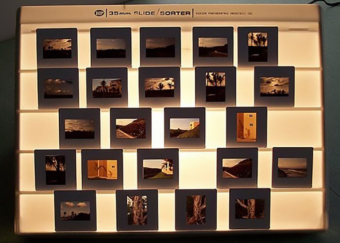
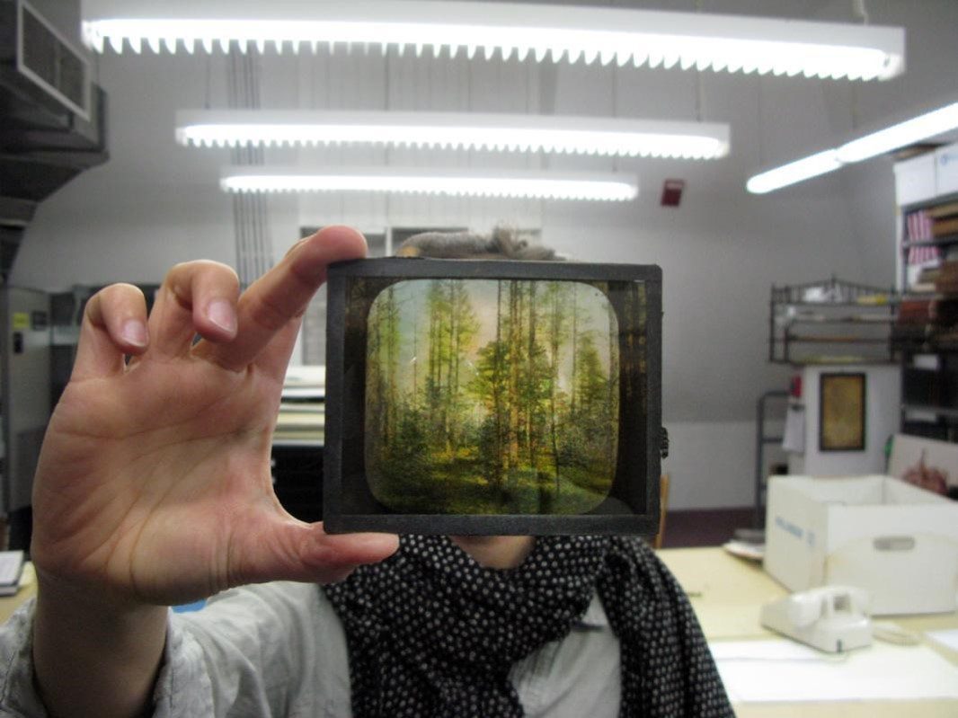
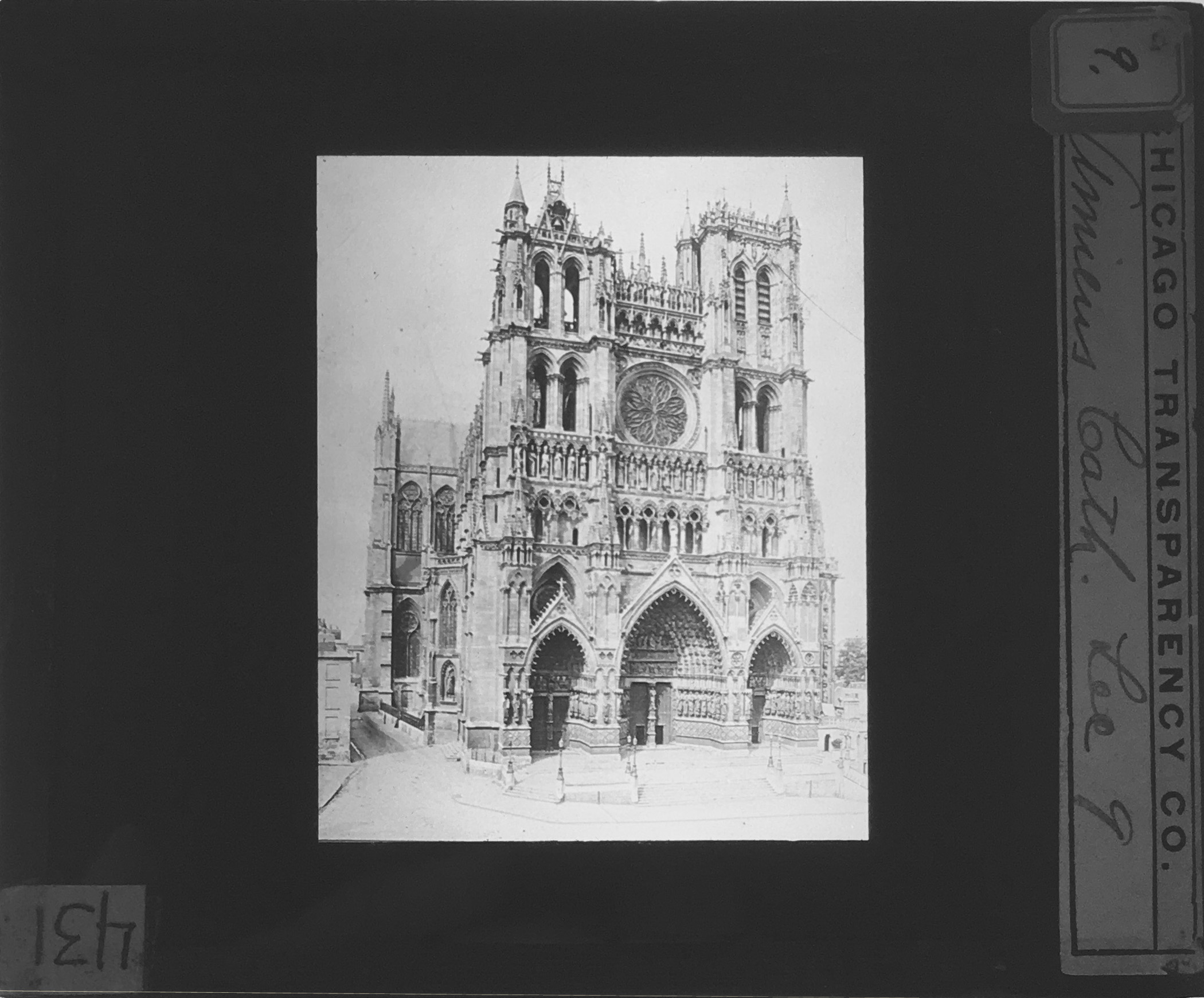

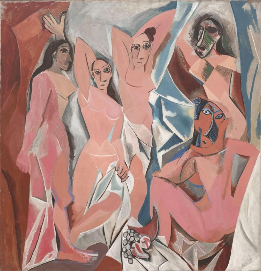

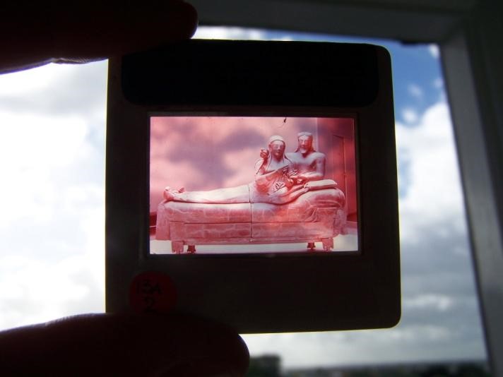
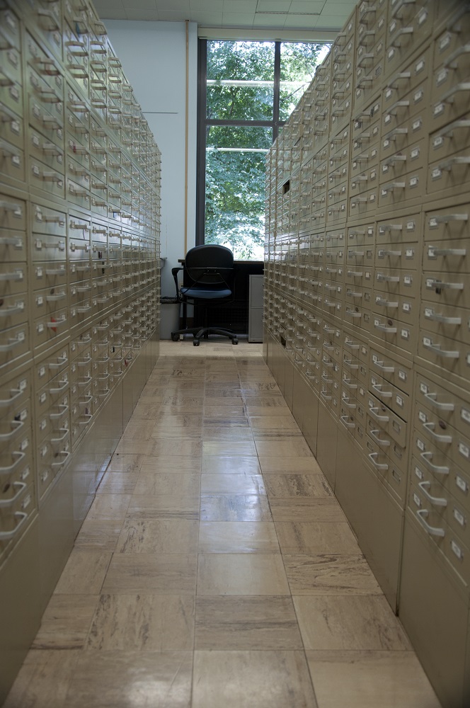
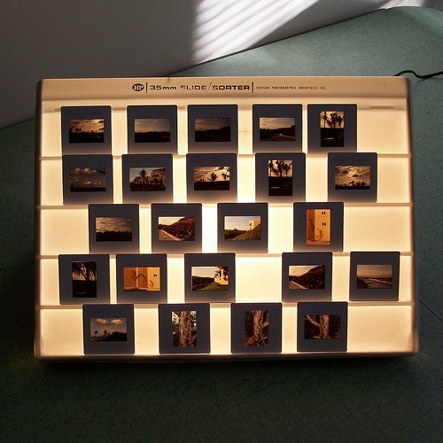
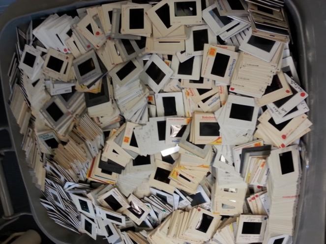
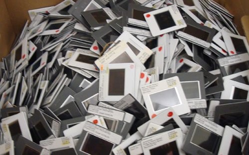

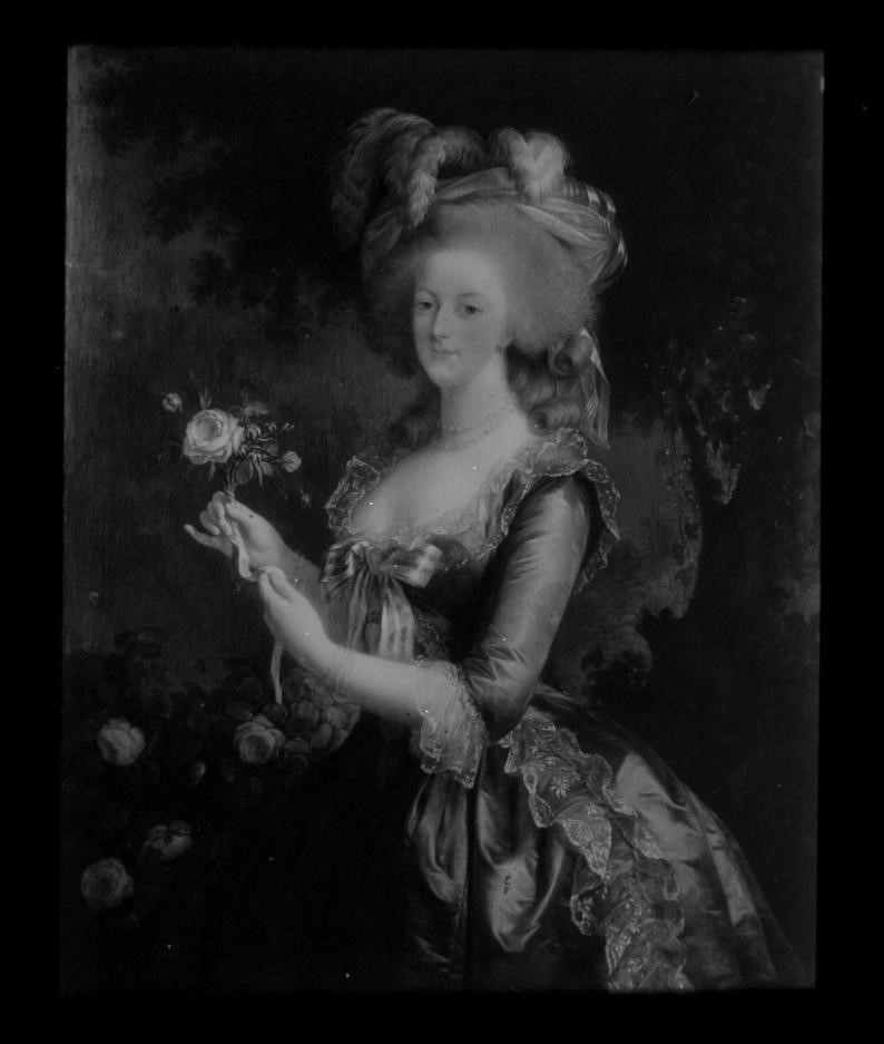
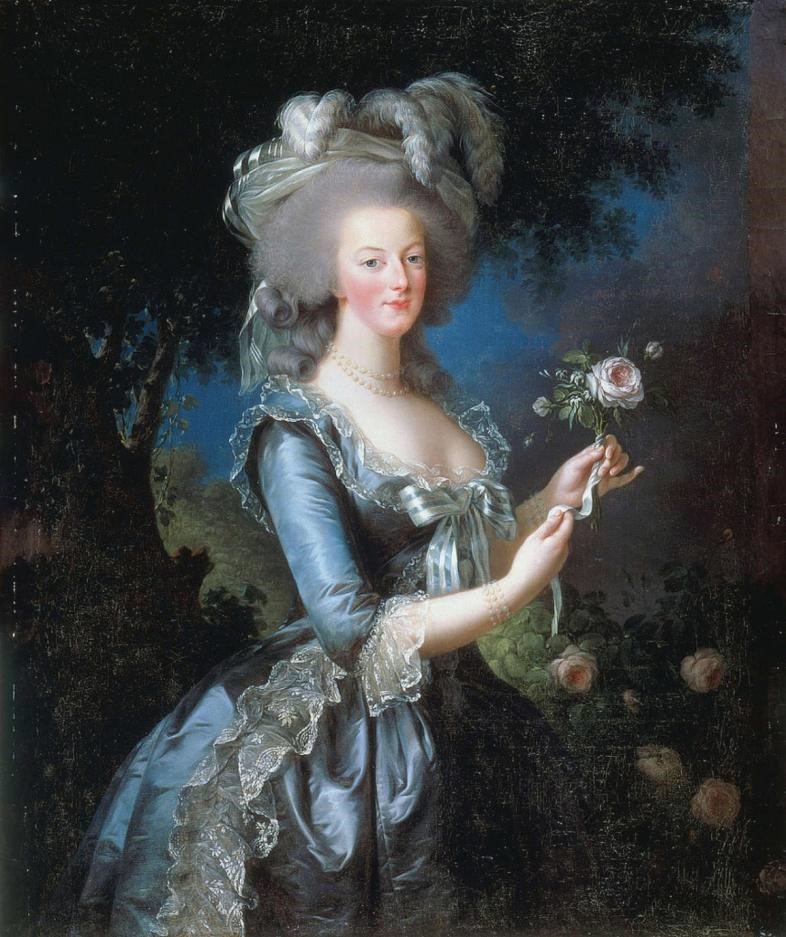
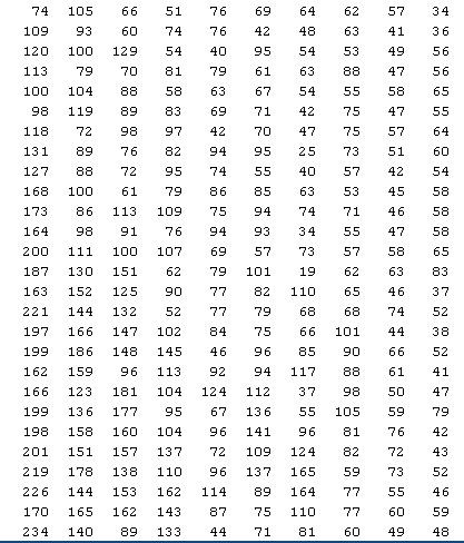


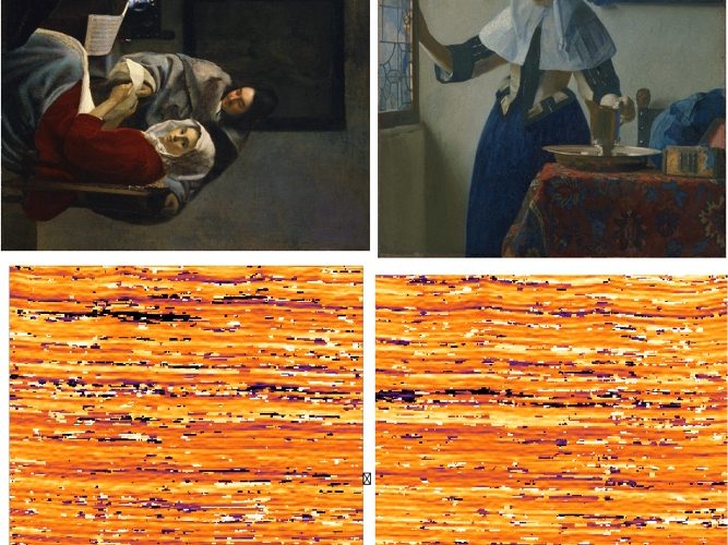
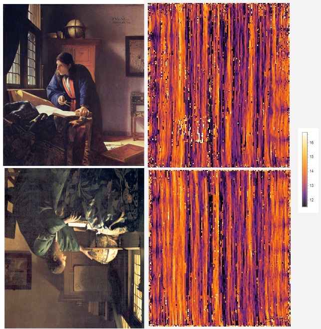
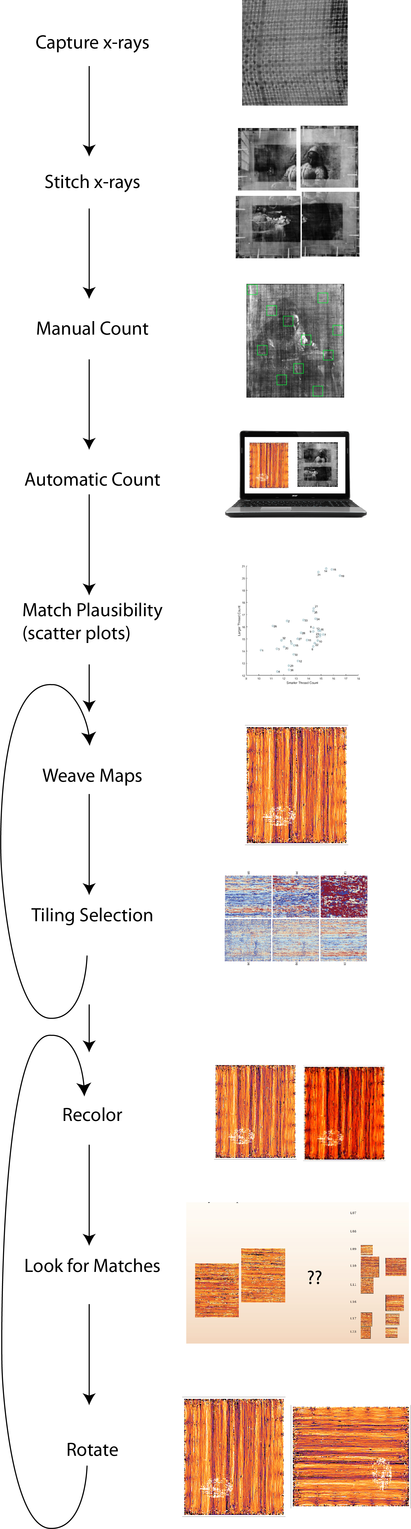

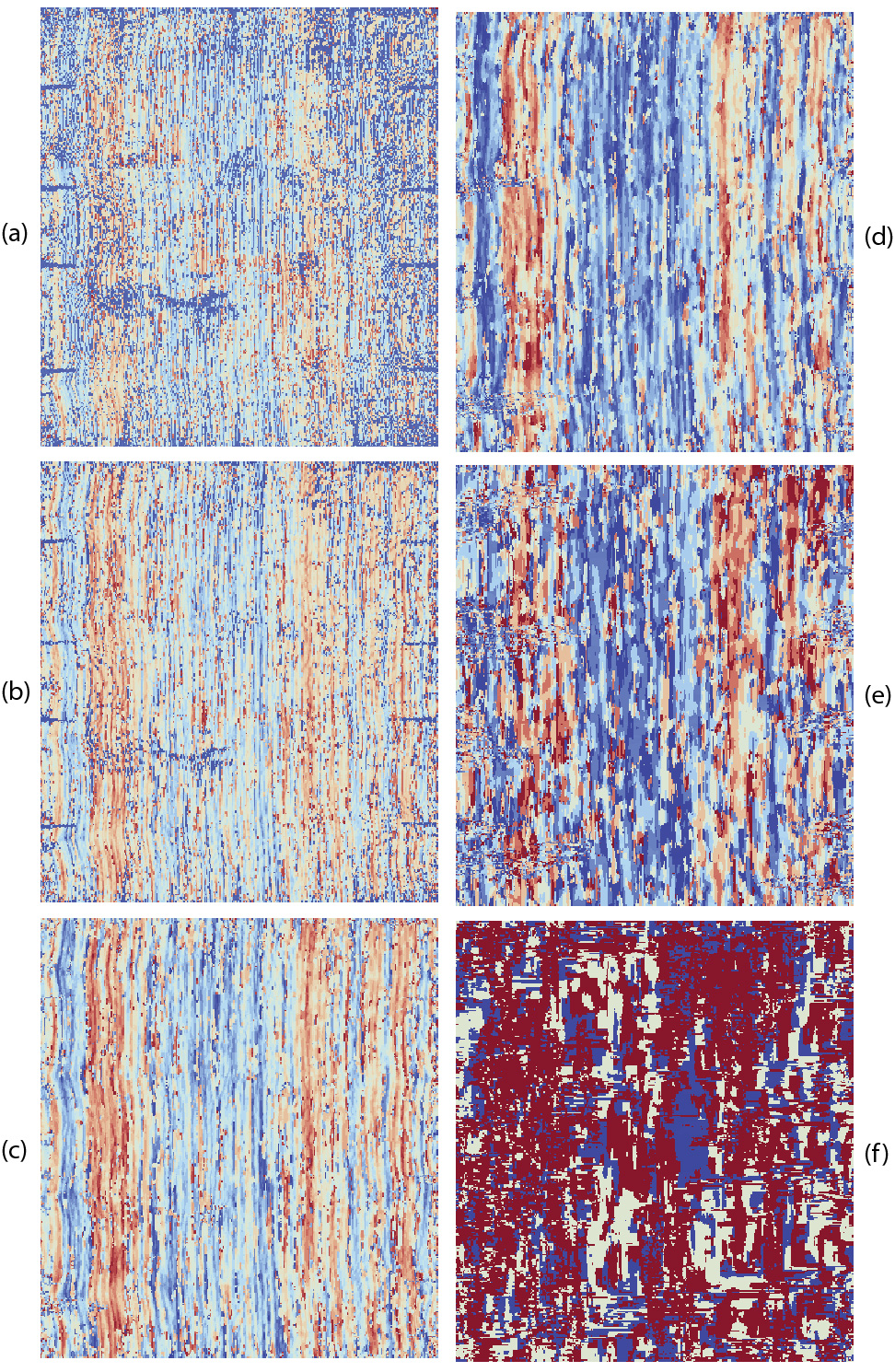
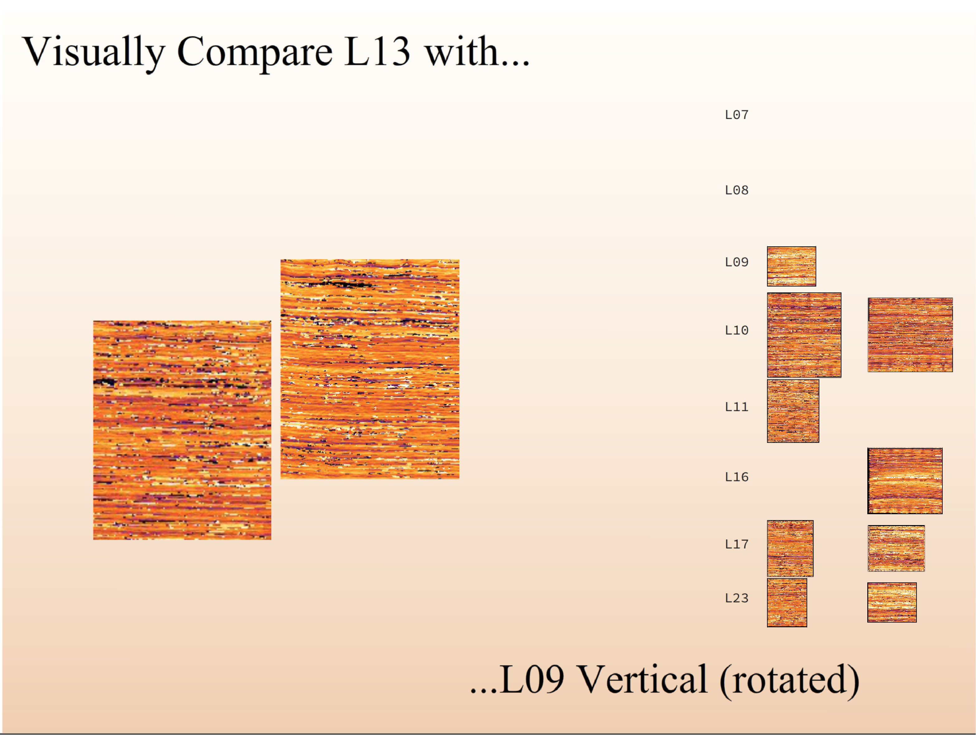
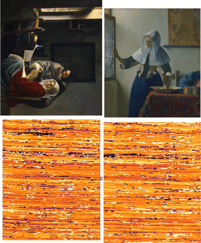
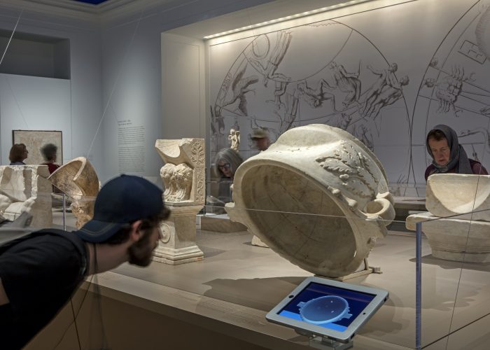
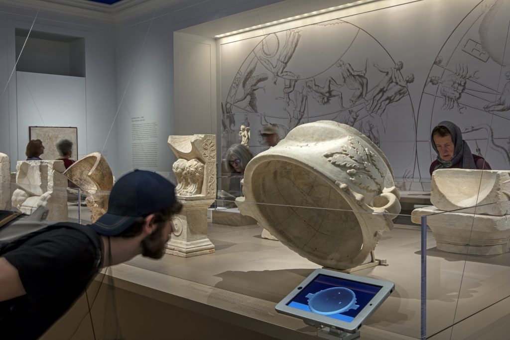
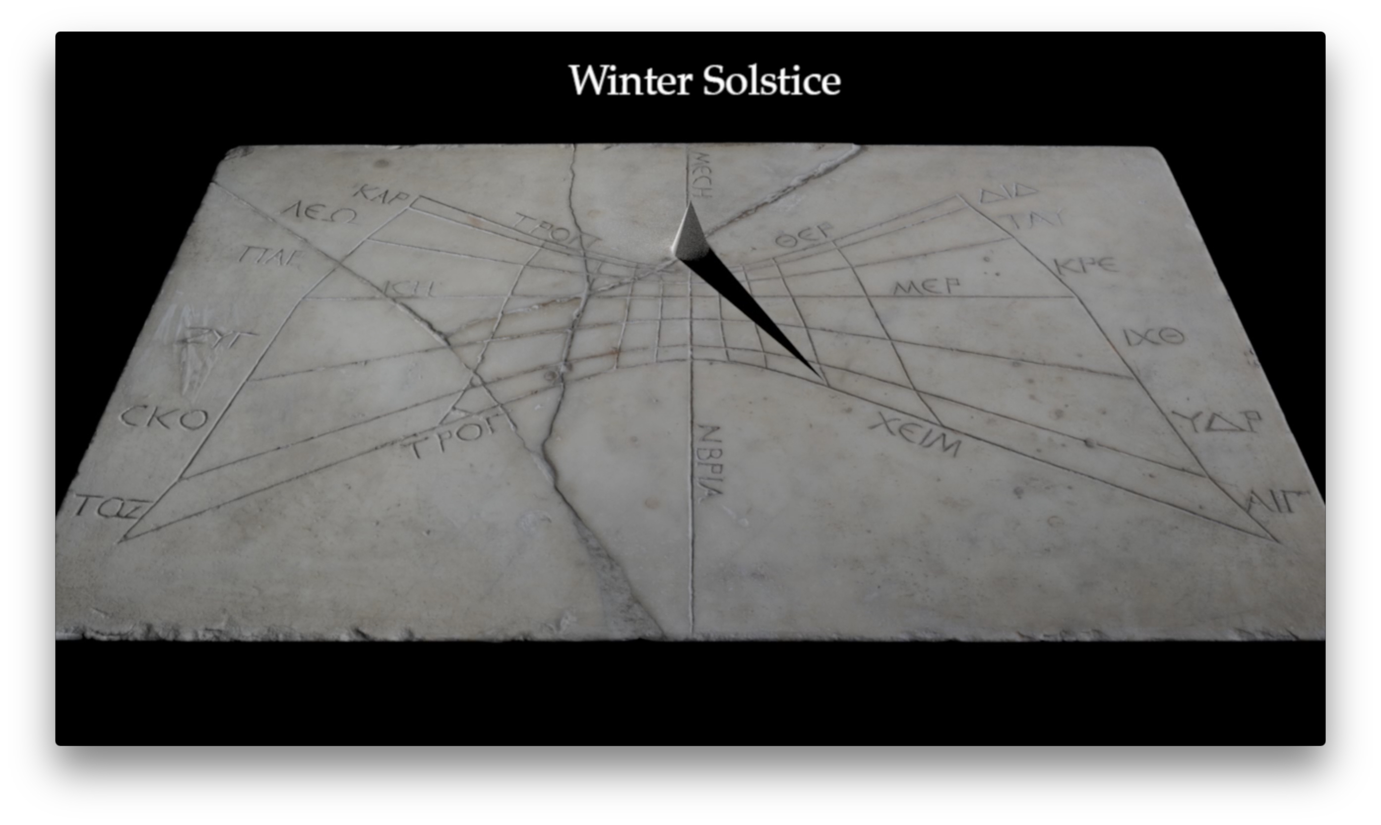

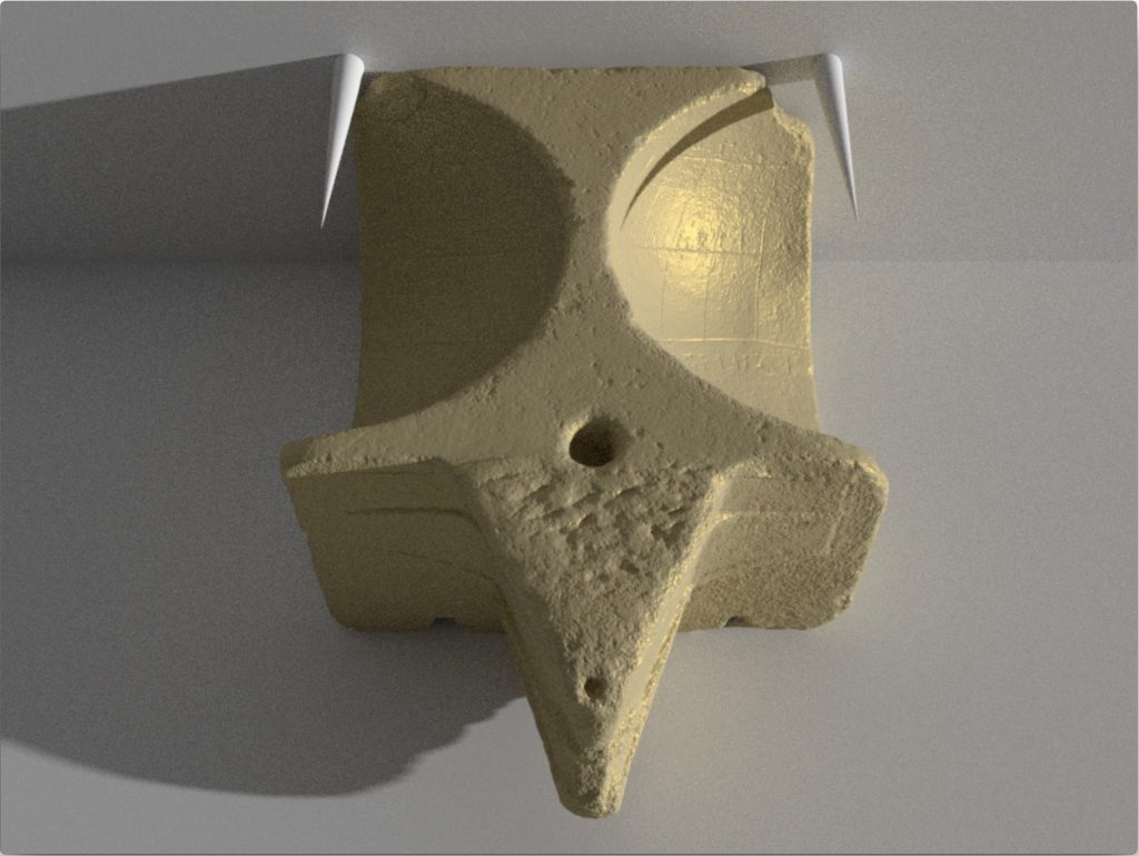
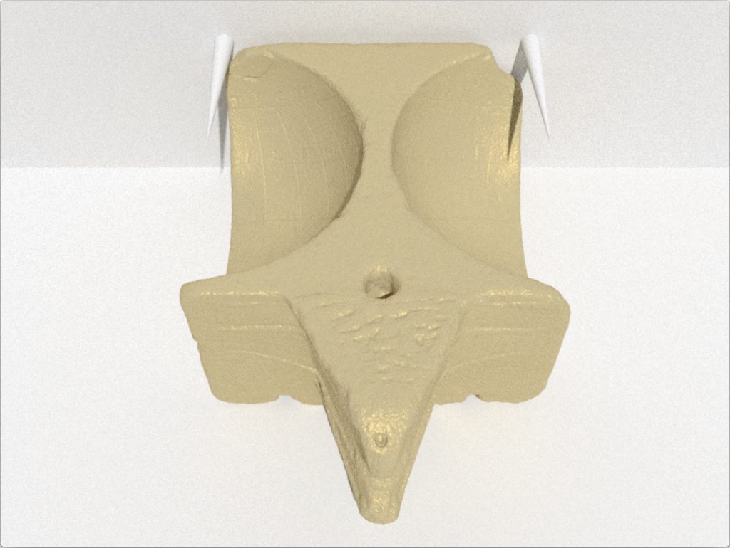

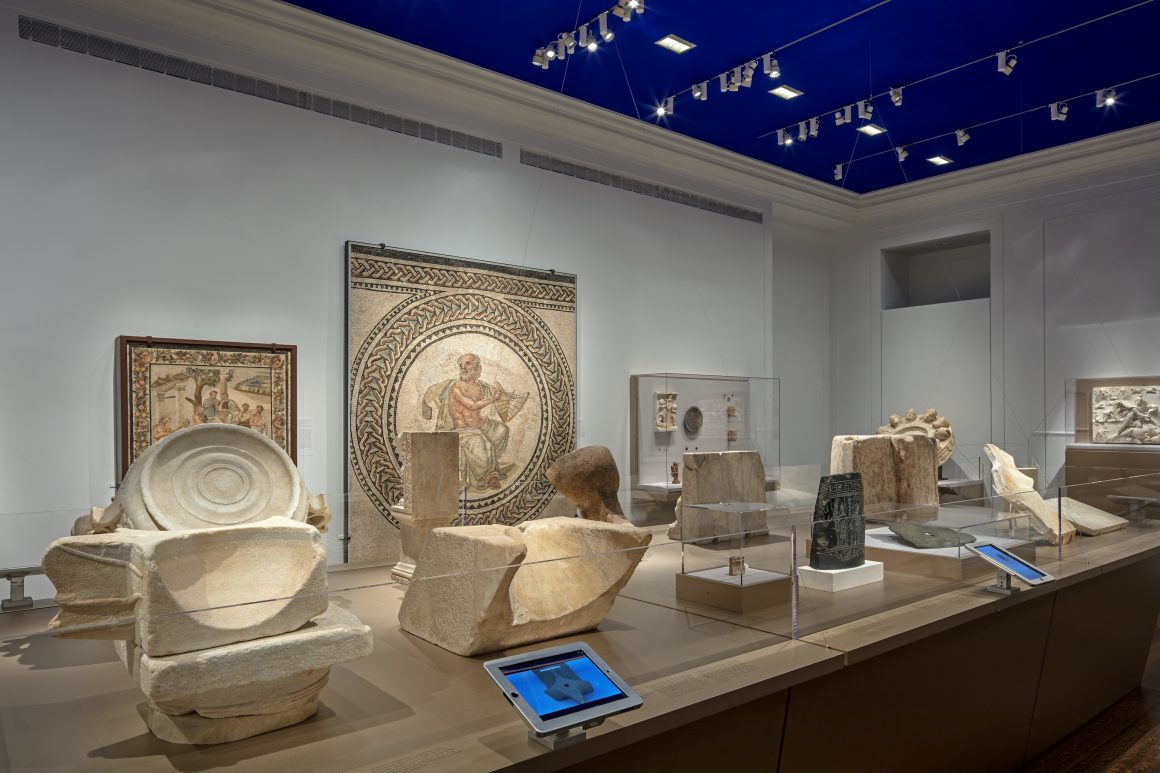
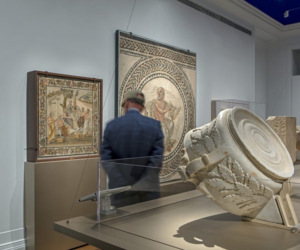
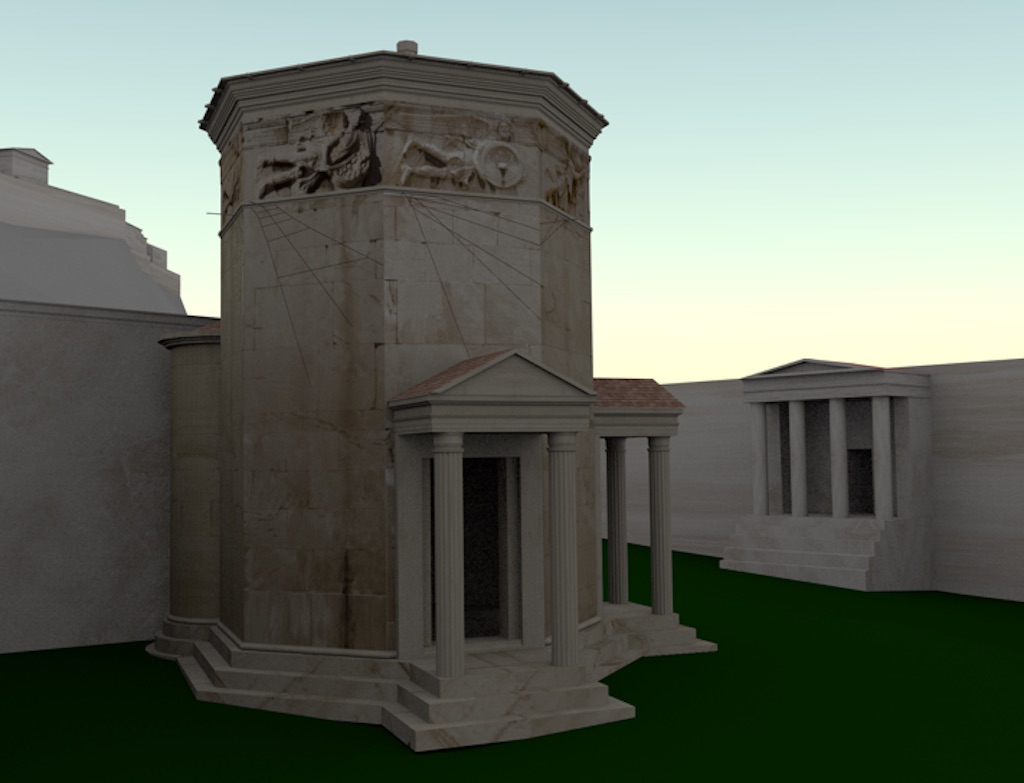

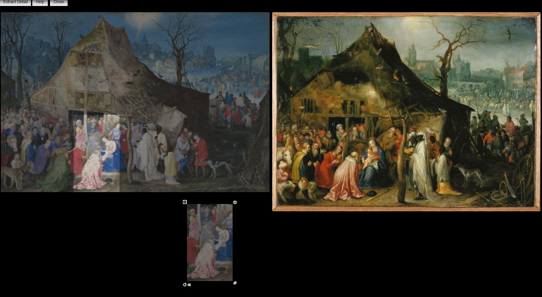

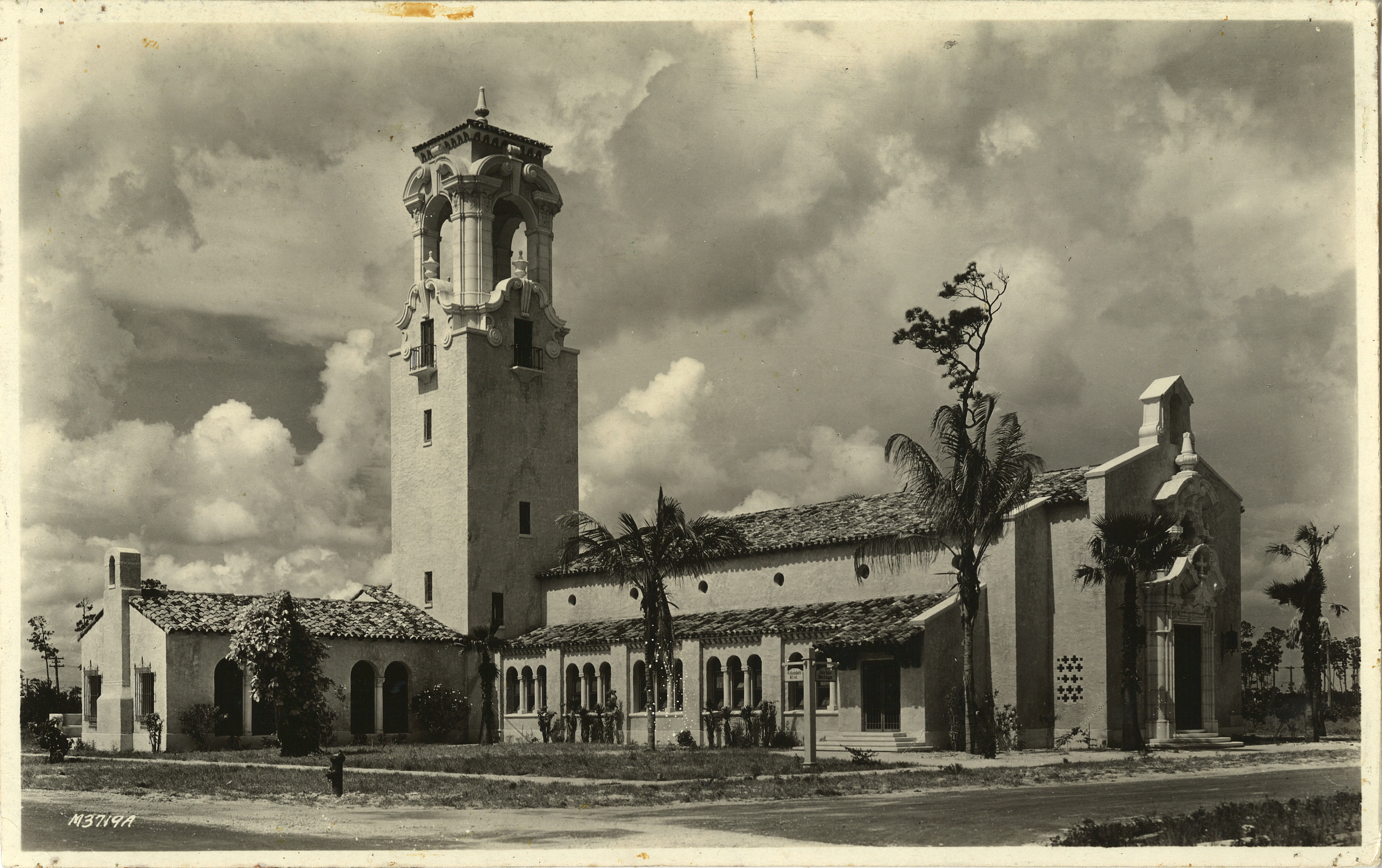
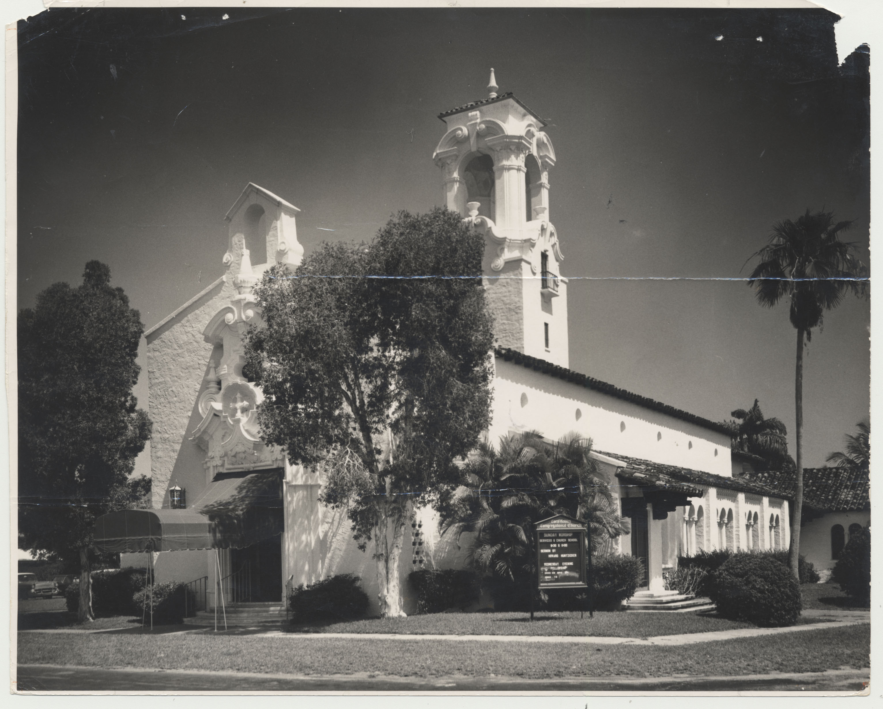

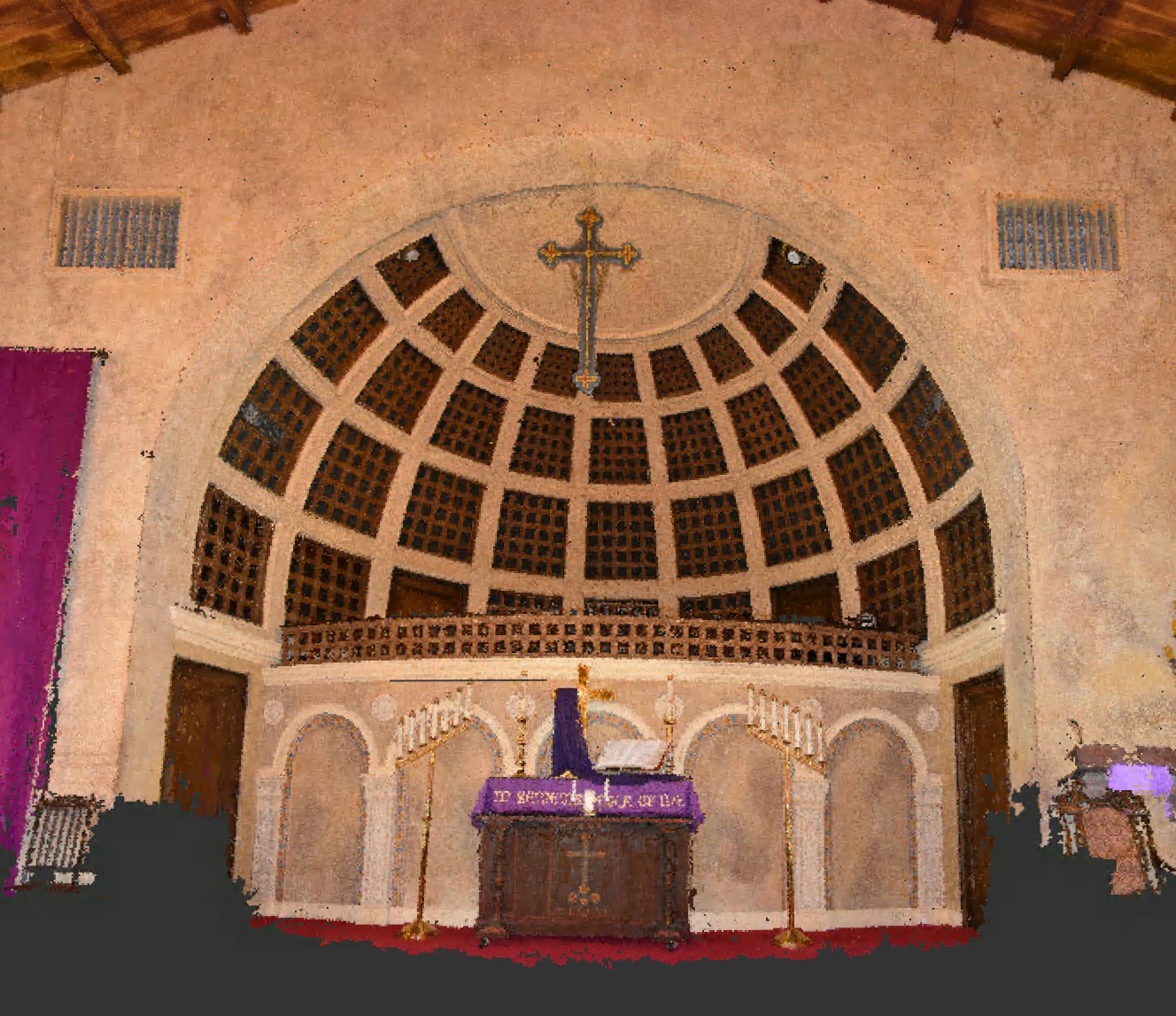

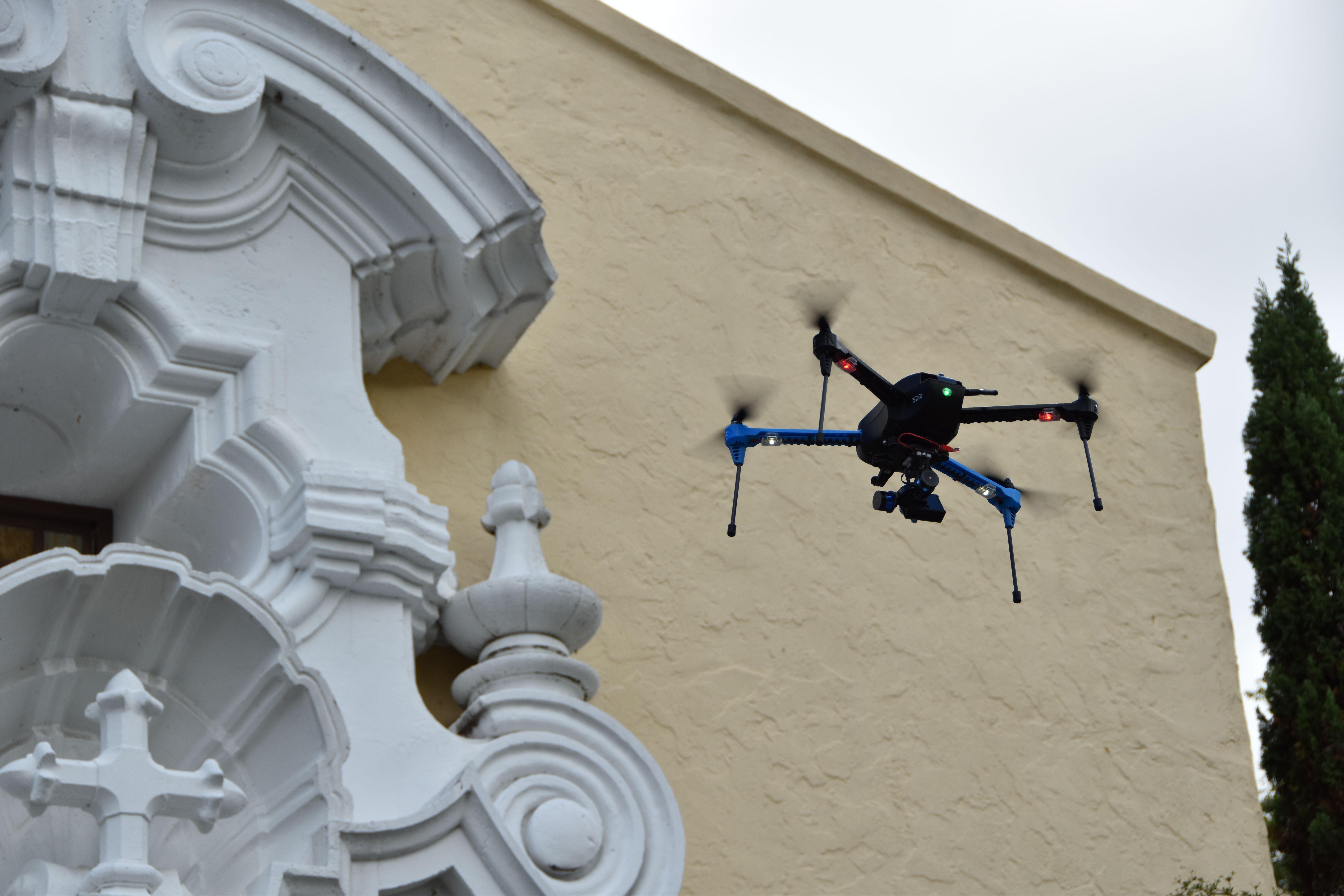