Tagged Data Visualization

A spiral of books on library shelves appears almost as though a pie chart.
5

Supporting Data Visualization Services in Academic Libraries

Abstract

Data visualization in libraries is not a part of traditional forms of research support, but is an emerging area that is increasingly important in the growing prominence of data in, and as a form of, scholarship. In an era of misinformation, visual and data literacy are necessary skills for the responsible consumption and production of data visualizations and the communication of research results. This article summarizes the findings of Visualizing the Future, which is an IMLS National Forum Grant (RE-73-18-0059-18) to develop a literacy-based instructional and research agenda for library and information professionals with the aim to create a community of praxis focused on data visualization. The grant aims to create a diverse community that will advance data visualization instruction and use beyond hands-on, technology-based tutorials toward a nuanced, critical understanding of visualization as a research product and form of expression. This article will review the need for data visualization support in libraries, review environmental scans on data visualization in libraries, emphasize the need for a focus on the people involved in data visualization in libraries, discuss the components necessary to set up these services, and conclude with the literacies associated with supporting data visualization.

Introduction

Now, more than ever, accurately assessing information is crucially important to discourse, both public and academic. Universities play an important role in teaching students how to understand and generate information. But at many institutions, learning how to effectively communicate findings from the research process is considered idiosyncratic for each field or the express domain of a particular department (e.g. applied mathematics or journalism). Data visualization is the use of spatial elements and graphical properties to display and analyze information, and this practice may follow disciplinary customs. However, there are many commonalities in how we visualize information and data, and the academic library, at the heart of the university, can play a significant role in teaching these skills. In the following article, we suggest a number of challenges in teaching complex technological and methodological skills like visualization and outline a rationale for, and a strategy to, implement these types of services in academic libraries. However, the same argument can be made for any academic support unit, whether college, library, or independently based.

Why Do We Need Data Visualization Support in Libraries?

In many ways the argument for developing data visualization services in libraries mirrors the discussion surrounding the inclusion and extension of digital scholarship support services throughout universities. In academic settings, libraries serve as a natural hub for services that can be used by many departments and fields. Often, data visualization (like GIS or text-mining) expertise is tucked away in a particular academic department making it difficult for students and researchers from different fields to access it.

As libraries already play a key role in advocacy for information literacy and ethics, they may also serve as unaffiliated, central places to gain basic competencies in associated information and data skills. Training patrons how to accurately analyze, assess, and create data visualizations is a natural enhancement to this role. Building competencies in these areas will aid patrons in their own understanding and use of complex visualizations. It may also help to create a robust learning community and knowledge base around this form of visual communication.

In an age of “fake news” and “post-truth politics,” visual literacy, data literacy, and data visualization have become exceedingly important. Without knowing the ways that data can be manipulated, patrons are not as capable of assessing the utility of the information being displayed or making informed decisions about the visual story being told. Presently, many academic libraries are investing resources in data services and subscriptions. Training students, faculty and researchers in ways of effectively visualizing these data sources increases their use and utility. Finally, having data visualization skills within the library also comes with an operational advantage, allowing more effective sharing of data about the library.

We are the Visualizing the Future Symposia, an Institute of Museum and Library Services National Forum Grant-funded group created to develop instructional and research materials on data visualization for library professionals and a community of practice around data visualization. The grant was designed to address the lack of community around data visualization in libraries. More information about the grant is available at the Visualizing the Future website. While we have only included the names of the three main authors; this work was a product of the work of the entire cohort, which includes: Delores Carlito, David Christensen, Ryan Clement, Sally Gore, Tess Grynoch, Jo Klein, Dorothy Ogdon, Megan Ozeran, Alisa Rod, Andrzej Rutkowski, Cass Wilkinson Saldaña, Amy Sonnichsen, and Angela Zoss.

We are currently halfway through our grant work and, in addition to providing publicly available resources for teaching visualization, are also in the process of synthesizing and collecting shared insights into developing and providing data visualization instruction. This present article represents some of the key findings of our grant work.

Current Environment

In order to identify some broad data visualization needs and values, we reviewed three environmental scans. The first was carried out by Angela Zoss, who is one of the co-investigators on the grant, at Duke University (2018) based on a survey that received 36 responses from 30 separate institutions. The second, by S.K. Van Poolen (2017), focuses on an overview of the discipline and includes results from a survey of Big Ten Academic Alliance institutions and others. And the final report by Ilka Datig for Primary Research Group Inc (2019) provides a number of in-depth case studies. While none of the studies claim to provide an exhaustive list of every person or institution providing data visualization support in libraries, in combination they provide an effective overview of the state of the field.

Institutions

The combined environmental scans represent around thirty-five institutions, primarily academic libraries in the United States. However, the Zoss survey also includes data from the Australian National University, a number of Canadian universities, and the World Bank Group. The universities represented vary greatly in size and include large research institutions, such as the University of California Los Angeles, and small liberal arts schools, such as Middlebury and Carleton College.

Some appointments were full-time, while others reported visualization as a part of other job responsibilities. In the Zoss survey, roughly 33% of respondents reported the word “visualization” in their job title.

Types of activities

The combined scans include a variety of services and activities. According to the Zoss survey, the two most common activities (i.e. activities that the most respondents said they engaged in) were providing consultations on visualization projects and giving short workshops or lectures on data visualization. After that other services offered include: providing internal data visualization support for analyzing and communicating library data; training on visualization hardware and spaces (e.g. large scale visualization walls, 3D CAVEs); and managing such spaces and hardware.

Resources needed

These three environmental scans also collectively identify a number of resources that are critical for supporting data visualization in librarians. One of the key elements is training for new librarians, or librarians new to this type of work, on visualization itself and teaching/consulting on data visualization. They also mention that resources are required to effectively teach and support visualization software, including access to the software, learning materials, but also ample time is required for librarians to learn, create and experiment themselves so that they can be effective teachers. Finally they outline the need for communities of practice across institutions and shared resources to support visualization.

It’s About the People

In all of our work and research so far, one important element seems worth stressing and calling out on its own: It is the people who make data visualization services work. Even visualization services focused on advanced instructional spaces or immersive and large scale displays, require expertise to help patrons learn how to use the space, maintain and manage technology, schedule events to create interest, and, especially in the case of advanced spaces, create and manage content to suggest the possibilities. An example of this is the North Carolina State University Libraries’ Andrew W. Mellon Foundation-funded project “Immersive Scholar” (Vandegrift et al. 2018), which brought visiting artists to produce immersive artistic visualization projects in collaboration with staff for the large scale displays at the library.

We encourage any institution that is considering developing or expanding data visualization services to start by defining skill sets and services they wish to offer rather than the technology or infrastructure they intend to build. Some of these skills may include programming, data preparation, and designing for accessibility, which can support a broad range of services to meet user needs. Unsupported infrastructure (stale projects, broken technology, etc.) is a continuing problem in providing data visualization services, and starting any conversation around data visualization support by thinking about the people needed is crucial to creating sustainable, ethical, and useful services.

As evidenced by both the information in the environmental scans and the experiences of Visualizing the Future fellows, one of the most consistently important ways that libraries are supporting visualization is through consultations and workshops that span technologies from Excel to the latest virtual reality systems. Moreover, using these techniques and technologies effectively requires more than just technical know-how; it requires in-depth considerations of design aesthetics, sustainability, and the ethical use and re-use of data. Responsible and effective visualization design requires a variety of literacies (discussed below), critical consideration of where data comes from, and how best to represent data—all elements that are difficult to support and instruct without staff who have appropriate time and training.

Services

Data visualization services in libraries exist both internally and externally. Internally, data visualization is used for assessment (Murphy 2015), marketing librarians’ skills and demonstrating the value of libraries (Bouquin and Epstein 2015), collection analysis (Finch 2016), internal capacity building (Bouquin and Epstein 2015), and in other areas of libraries that primarily benefit the institution. 

External services, in contrast, support students, faculty, researchers, non-library staff, and community members. Some examples of services include individual consultations, workshops, creating spaces for data visualization (both physical and virtual), and providing support for tools. Some libraries extend visualization services into additional areas, like the New York University Health Sciences Library’s “Data Visualization Clinic,” which provides a space for attendees to share and receive feedback on their data visualizations from their peers (Zametkin and Rubin 2018), and the North Carolina State University Libraries’ Coffee and Viz Series, “a forum in which NC State researchers share their visualization work and discuss topics of interest” that is also open to the public (North Carolina State University Libraries 2015).

In order to offer these services, libraries need staff who have some interest and/or experience with data visualization. Some models include functional roles, such as data services librarians or data visualization librarians. These functional librarian roles ensure that the focus is on data and data visualization, and that there is dedicated, funded time available to work on data visualization learning and support. It is important to note that if there is a need for research data management support, it may require a position separate from data visualization. Data services are broad and needs can vary, so some assessment on the community’s greatest needs would help focus functional librarian positions. 

Functional librarian roles may lend themselves to external facing support and community building around data visualization outside of internal staff. A needs assessment can help identify user-centered services, outreach, and support that could help create a community around data visualization for students, faculty, researchers, non-library staff, and members of the public. Having a community focused on data visualization will make sure that services, spaces, and tools are utilized and meeting user needs. 

There is also room to develop non-librarian, technical data visualization positions, such as data visualization specialists or tool-specific specialist positions. These positions may not always have an outreach or community building focus and may be best suited for internal library data visualization support and production. Offering data visualization support as a service to users is separate from data visualization support as a part of library operations, and the decision on how to frame the positions can largely be determined by library needs. 

External data visualization services can include workshops, training sessions, consultations, and classroom instruction. These services can be focused on specific tools, such as Tableau, R, Gephi, and so on. They can be focused on particular skills, such as data cleaning and normalizing, dashboard design, and coding. They can also address general concerns, such as data visualization transparency and ethics, which may be folded into all of the services.

There are some challenges in determining which services to offer:

  • Is there an interest in data visualization in the community? This question should be answered before any services are offered to ensure services are utilized. If there are any liaison or outreach librarians at your institution, they may have deeper insight into user needs and connections to the leaders of their user groups.
  • Are there staff members who have dedicated time to effectively offer these services and support your users?
  • Is there funding for tools you want to teach?
  • Do you have a space to offer these services? This does not have to be anything more complicated than a room with a projector, but if these services begin to grow, it is important to consider the effectiveness of these services with a larger population. For example, a cap on the number of attendees for a tool-specific workshop might be needed to ensure the attendees receive enough individual support throughout the session.

If all of these areas are not addressed, there will be challenges in providing data visualization services and support. Successful data visualization services have adequate staffing, access to the required tools and data, space to offer services (not necessarily a data wall or makerspace, but simply a space with sufficient room to teach and collaborate), and community that is already interested and in need of data visualization services. 

Literacies

The skills that are necessary to provide good data visualization services are largely practical. We derive the following list from our collective experience, both as data visualization practitioners and as part of the Visualizing the Future community of practice. While the following list is not meant to be exhaustive, these are the core competencies that should be developed to offer data visualization services, either from an individual or as part of a team. 

A strong design sense: Without an understanding of how information is effectively conveyed, it is difficult to create or assess visualizations. Thus, data visualization experts need to be versed in the main principles of design (e.g. Gestalt, accessibility) and how to use these techniques to effectively communicate visual information.

Awareness of the ethical implications of data visualizations: Although the finer details are usually assessed on a case by case basis, a data visualization expert should be able to interpret when a visualization is misleading and have the agency to decline to create biased products. This is a critical part of enabling the practitioner to be an active partner in the creation of visualizations. 

An understanding, if not expertise, in a variety of visualization types: Network visualizations, maps, glyphs, Chernoff Faces, for example. There are many specialized forms of data visualization and no individual can be an expert in all of them, but a data visualization practitioner should at least be conversant in many of them. Although universal expertise is impractical, a working knowledge of when particular techniques should be used is a very important literacy.

A similar understanding of a variety of tools: Some examples include Tableau, PowerBI, Shiny, and Gephi. There are many different tools in current use for creating static graphics and interactive dashboards. Again, universal expertise is impractical, but a competent practitioner should be aware of the tools available and capable of making recommendations outside their expertise.

Familiarity with one or more coding languages: Many complex data visualizations happen at the command line (at least partially) so there is a need for an effective practitioner to be at least familiar with the languages most commonly used (likely either R or Python). Not every data visualization expert needs to be a programmer, but familiarity with the potential for these tools is necessary.

Conclusion

The challenges inherent in building and providing data visualization instruction in academic libraries provide an opportunity to address larger pedagogical issues, especially around emerging technologies, methods, and roles in libraries and beyond. In public library settings, the needs for services may be even greater, with patrons unable to find accessible training sources when they need to analyze, assess, and work with diverse types of data and tools. While the focus of our grant work has been on data visualization, the findings reflect the general difficulties of balancing the need and desire to teach tools and invest in infrastructure with the value of teaching concepts and investing in individuals. It is imperative that work teaching and supporting emerging technologies and methods focus on supporting the people and the development of literacies rather than just teaching the use of specific tools. To do so requires the creation of spaces and networks to share information and discoveries.

Bibliography

Bouquin, Daina and Helen-Ann Brown Epstein. 2015. “Teaching Data Visualization Basics to Market the Value of a Hospital Library: An Infographic as One Example.” Journal of Hospital Librarianship 15, no. 4: 349–364. https://doi.org/10.1080/15323269.2015.1079686.

Datig, Ilka. 2019. Profiles of Academic Library Use of Data Visualization Applications. New York: Primary Research Group Inc.

Finch, Jannette L. and Angela R. Flenner. 2016. “Using Data Visualization to Examine an Academic Library Collection.” College & Research Libraries 77, no. 6: 765–778. https://doi.org/10.5860/crl.77.6.765.

Micah Vandegrift, Shelby Hallman, Walt Gurley, Mildred Nicaragua, Abigail Mann, Mike Nutt, Markus Wust, Greg Raschke, Erica Hayes, Abigail Feldman Cynthia Rosenfeld, Jasmine Lang, David Reagan, Eric Johnson, Chris Hoffman, Alexandra Perkins, Patrick Rashleigh, Robert Wallace, William Mischo, and Elisandro Cabada. 2018. Immersive Scholar. Released on GitHub and Open Science Framework. https://osf.io/3z7k5/.

LaPolla, Fred Willie Zametkin and Denis Rubin. 2018. “The “Data Visualization Clinic”: a library-led critique workshop for data visualization.” Journal of the Medical Library Association 106, no. 4: 477–482. https://doi.org/10.5195/jmla.2018.333.

Murphy, Sarah Anne. 2015. “How data visualization supports academic library assessment.” College & Research Libraries News 76, no. 9: 482–486. https://doi.org/10.5860/crln.76.9.9379.

North Carolina State University Libraries. “Coffee & Viz.” Accessed December 4, 2019. https://www.lib.ncsu.edu/news/coffee–viz

Van Poolen, S.K. 2017. “Data Visualization: Study & Survey.” Practicum study at the University of Illinois. 

Zoss, Angela. 2018. “Visualization Librarian Census.” TRLN Data Blog. Last modified June 16, 2018. https://trln.github.io/data-blog/data%20visualization/survey/visualization-librarian-census/.

About the Authors

Negeen Aghassibake is the Data Visualization Librarian at the University of Washington Libraries. Her goal is to help library users think critically about data visualization and how it might play a role in their work. Negeen holds an MS in Information Studies from the University of Texas at Austin.

Matthew Sisk is a spatial data specialist and Geographic Information Systems Librarian based in Notre Dame’s Navari Family Center for Digital Scholarship. He received his PhD in Paleolithic Archaeology from Stony Brook University in 2011 and has worked extensively in GIS-based archaeology and ecological modeling.  His research focuses on human-environment interactions, the spatial scale environmental toxins and community-based research.

Justin Joque is the Visualization Librarian at the University of Michigan. He completed his PhD in Communications and Media Studies at the European Graduate School and holds a Master of Science in Information (MIS) from the University of Michigan.


Network of Erasmus’s network, visualized using Cytoscape. Both nodes and edges are colored, and the nodes are sized, so that more information about centrality, edge weight, and clustering coefficient can be seen.
2

Thinking Through Data in the Humanities and in Engineering

Abstract

This article considers how the same data can be differently meaningful to students in the humanities and in data science. The focus is on a set of network data about Renaissance humanists that was extracted from historical source materials, structured, and cleaned by undergraduate students in the humanities. These students learned about a historical context as they created first travel data, and then the network data, with each student working on a single historical figure. The network data was then shared with a graduate engineering class in which students were learning R. They too were assigned to acquaint themselves with the historical figures. Both groups then created visualizations of the data using a variety of tools: Palladio, Cytoscape, and R. They were encouraged to develop their own questions based on the networks. The humanists’ questions demanded that the data be reembeded in a context of historical interpretation—they wanted to reembrace contingency and uncertainty—while the engineers tried to create the clarity that would allow for a more forceful, visually comprehensible presentation of the data. This paper compares how humanities and engineering pedagogy treats data and what pedagogical outcomes can be sought and developed around data across these very different disciplines.

In the humanities, we train students to interpret their material within a larger context. Facts exist to be contextualized, biases uncovered, problems revealed. Students in many corners of the humanities are rarely confronted with something termed data, which they imagine as dry and quantitative and unyielding. Art history in particular is still a discipline of printed books and, especially, of material objects. Of course data do exist in our field, adhering to objects as physical information or tagged contents, or to the objects’ makers, as in the University of Amsterdam’s monumental ECARTICO project (Manovich 2015; Bok et al. n.d.). But introducing students to data is normally much less central to our work than persuading them to engage in close examination of the visual, and to use libraries to gather information.

Modern engineering is distinguished by production of massive data, most of which can be accessed from all over the world. Engineering students often take computer science and statistics classes, in addition to a curriculum in their chosen field, as a way of acquiring the expertise to deal with modern data. In the engineering realm, quantitative data are central and the context from which data arises is usually not discussed. As a result, engineering educators have devised pedagogy to motivate students to contextualize findings. One of the primary ways that engineering pedagogy has changed in the past twenty years to meet this challenge is the introduction of experiential and project-based learning (Crawley et al. 2007; Savage, Chen, and Vanasupa 2008). Both of these approaches are designed to couple the development of technical skills with increasing contextual awareness and cultural literacy. In this paper, we unpack key assumptions at the heart of the current state of pedagogy in both engineering and digital humanities by posing two questions:

  1. Does digital training in the humanities alone motivate students to consider an outward focus for their contextual learning, and
  2. Does project-based learning in engineering motivate students sufficiently to dig below the exploration of data and production of visualizations, and into context.

We implicitly challenge the notion that teaching digital humanities and the construction and meaning of “data” is enough to create a digital scholar. In engineering, we challenge the notion that a shift to project-based instruction is sufficient to motivate student learning beyond digital skills and computational methods.

To conduct this study, we consider how one data set functioned pedagogically in a humanities course taught within an art history department, and how the same data and core assignment was used in parallel in a data science course taught in engineering. In both cases, the process of working with data was meant to unsettle the ways in which students had normally been asked to work in their discipline. “Data” was framed as both a subject of analysis and a pedagogical tool to make students question their habits of thought, further empowering them to ask questions they had never thought to ask before. In both cases, students had to move back and forth between interpretability and quantification, recognizing the limitations and opportunities of approaching their data as (historical) material, and organizing their historical material as data.

The Humanities Class

The course “Humanists on the Move” introduced liberal arts undergraduates to data gathering and structuring as well as visualization and analysis. The goal of the class was to make students engage with the most fundamental humanities source material—primary written historical documents—as well as with data: the former should make the analysis of the latter meaningful. In fact, by the end of the semester, the class would not merely have learned about the early sixteenth century, about individual humanist figures, and about data and their analysis, but as a group the students would have produced new knowledge about this historical period, things that could not have been found in any published source.

Each student took on a single humanist figure for the semester. The characters ranged from Martin Luther to Isabella d’Este, Erasmus to Copernicus, Henry VIII to Cellini and Leonardo da Vinci. Students worked in groups according to the type of figure they were studying: Rulers, Artists, Scientists, and Thinkers. Every week the class read and discussed a primary source text, “met” its author, and investigated the historical context within which that figure had lived and ruled, painted, or written. Students learned enough about their own figure’s life to provide both a short written introduction and a longer oral presentation about them to the class. Having attained familiarity with their figures, other students’ figures, and a sense of the period based on contemporary writings, students then moved on to consider how the humanists’ historical roles were impacted by mobility and network-building—and, further, how other variables (gender, profession, national origin) factored into these complexities. This process required original research, and would necessitate collecting, structuring, cleaning, visualizing and analyzing data.

Using biographical sources, particularly actual printed books (which many in the class had never thought to consult before), students first gathered information on the travels of their figure: locations visited, and dates of travel. They geocoded each location so that it could be mapped, and they structured their material as data, each creating a three-sheet Excel spreadsheet. The members of each group then combined their data into a single spreadsheet, so that all Rulers, or all Artists, would eventually be visualized and analyzed together.

The class was initially held at UMD’s Collaboratory, where Collaboratory staff introduced students to OpenRefine, an open source platform created in Google Labs (originally as GoogleRefine) to clean and parse data using a simple set of tools (Muñoz 2013a; 2013b; 2014). This introduction covered installation and basic use. Each time it is opened, OpenRefine creates a server instance on the host computer, which is interfaced via a web browser. Users can open a local dataset (the default choice), as well as live data accessed via a URL (e.g., that of the City Permit Office of Toronto, Canada which is the basis for the tutorials on using Open Refine found in the Documentation section at openrefine.org).

Using a dataset contained within an Excel spreadsheet, “Sample Messy Humanist Data” provided by Professor Elizabeth Honig, Christian Cloke and Quint Gregory demonstrated the use of basic tools within OpenRefine, such as Common Transforms, Faceting, and Clustering, which allow the user quickly to reconcile data values that may be similar though not the same (such as capitalized/not-capitalized entries; misspellings; those with a space after or before a string). Through such operations, which require one to think carefully about how the data are structured, the user develops a deeper awareness of the dataset and confidence in its soundness and consistency. In addition, students were shown how different columns of data could be joined or split, depending on the desired outcome, to make new data expressions. The resulting “cleaned” dataset could be exported to a data table in any number of preferred formats (CSV/TSV, Excel, JSON, etc.).

To visualize their travel data, students were trained to use the Stanford-based platform Palladio (Humanities + Design n.d.).  Palladio is an open source tool that was originally conceived of to visualize data from the “Mapping the Republic of Letters” project, which had collected material on scholarly networks in early modern Western Europe. Its main capabilities are therefore the visualization of networks and the creation of maps. Designed to be usable by humanists, Palladio does still necessitate correctly structured data, and students explored how that structuring impacted the generation of maps in Palladio’s system. Within its map function, Palladio also allows the visualization of chronological data linked to travels as both a timeline and timespans, so that the user can see the locations mapped (with locations sized according to criteria such as number of times visited) and the years in which travels occurred (Figure 1). Palladio also allows for “faceting,” i.e. dividing and recategorizing elements of data so that it can be examined in another dimension. For example, faceting enabled students to study over what distances female humanists were able to travel, or what cities attracted the most scientists vs. the most theologians, or which figures might have been together in Rome during a given year.

The travels of artists, shown as a map overlayed with a timeline along which locations visited in each year are visualized.
Figure 1. Visualization of the travels of artists, with faceted timeline overlaying the underlying map of locations visited.

Based on the maps and faceting, and on their research on individual figures whose travels were now visualized together, the class was able to explore what life events, ambitions, and exigencies led to travel in the Renaissance, and how travel mattered differently to figures with different professions.

The Data Set

The data set shared between humanists and engineers was created in the next phase of “Humanists on the Move,” which concerned humanist networks. Historical networks have been thoroughly studied and, more recently, elegantly visualized. The vast and remarkable website The Six Degrees of Francis Bacon, hosted by the Carnegie Mellon University Libraries, is a model of what a collaborative project using humanities data can accomplish (Lincoln 2016; Moretti 2011). Nevertheless, network material as we imagined it would be considerably less clear-cut as data than travel had been. A person is or isn’t in a given location at a given time, but a connection—in network terms, an edge—is harder to define. There are obvious connections such as family, colleagues, allies, collaborators. But when a figure read a book by another humanist, did that make them connected? And if so, how deeply connected had they become? How would the importance of that connection compare to, say, attending a performance in which another figure had acted, being present at a diplomatic meeting but not as a main player, writing a letter but (as far as we know) never receiving a reply to it? Historical resources are often fragmentary, and the class tangled with how to account for that as they assembled data. These were issues that most undergraduates had never confronted as they studied history, but now, history’s lacunae were of immediate relevance to their work.

In structuring their data, students were asked first to come up with a limited set of labels that would describe relationships. These might include patronage, respect, influence, friendship, antagonism. Often they encountered an example that none of their labels seemed to fit, but which was not sufficiently different, or representative, to warrant a new label. They learned how to compromise. Next, the students had to agree on criteria by which those edges could be weighted on a scale of one to three.

Another way of thinking about this exercise entails recognizing that it involved phases of translation, from humanist ways of thinking about material into quantifiable terms and then back again (Handelman 2015; Bradley 2018). Describing relationships, even determining what makes a relationship and why it matters, is a perfect example of humanistic work. Art historians love to talk about influence, patronage, and collaboration; this is all fundamental to how we write our histories. We could all probably say who was an important patron or a minor influence. But the students were asked to take information they had gathered and make it numerically regular, working against the humanist instinct to value irregularity and to see each instance of a given relationship, whether patronage or correspondence, as essentially a unique event with its own characteristics that are not simple to equate with those of a comparable event (Rawson and Muñoz 2016). Now every relationship had to be described using a fixed term from a limited list; every edge had to have a weight, from one to three. Long discussions were involved, although the COVID pandemic was widespread and we were meeting via Zoom.

The class gathered nearly 700 connections representing the ways in which over 450 different persons were connected to our core of twenty humanist figures (Figure 2). All of the groups combined their data into one large class spreadsheet. Every person (node) was described by a profession, every relationship (edge) had a label, sometimes several, and a numerical weight. This was the data set that we passed along to the engineers.

Section of a spreadsheet showing how network connections were recorded. Each line represents an edge, or relationship between two individuals, and includes information on gender, profession, and nature and closeness of the connection.
Figure 2. Part of the network spreadsheet, in progress. Each line represents an edge, with our key figures in column C and their connected nodes in column G. Information about each figure includes profession terms and gender; relationships are characterized in terms of type of connection and edge weight.

Engineers, Data, and a Humanities Data Set

The course “Data in the Built Environment” is designed to teach data science skills to graduate engineering students. One of its main aims is to motivate students to dig deeper into context via project-based learning concepts (Hicks and Irizarry 2018). To do this, students are given a new dataset each week with which to practice a newly introduced data science technique. Students practice the technique in class in groups and then use new data (also in groups) for homework as a way of deepening and solidifying their understanding (Paul Alexander Horton, Weiner, and Lande 2018; Neff et al. 2017).  In short, each week students are challenged to synthesize the technical knowledge and then apply this learning through a practical data application with questions relevant to the data rather than to the technique. This approach is designed to create a tension between data as viewed by engineers and problems that require a deeper analysis to really understand the contextual story. Throughout the semester, the class pedagogy (and grading) emphasized the importance of characterizing data analysis results within the context in which data emerges. The network class was taught toward the end of the semester, so students had practice with linking data subtleties to context—but only in data reflective of the built environment (e.g., transportation, water, and housing data).

The underlying assumption of most engineering students is that data are data, mostly the same in all applications. Rarely do engineering students grapple with data that are unfamiliar to them. The Humanists on the Move data offered a completely novel opportunity to practice network visualization, motivating students to understand the underlying data in a way that they would not normally worry about.

The engineering class assignment mimicked the instructions for the humanist class, but compressed the time allocated for background research. Each student was assigned three humanists, who themselves were selected because they provided students the opportunity to uncover interesting contextual information. The engineering students prepared a one-page summary of basic background information for each figure, including important acquaintances, and any documented travel using three or more sources of information. Because the time allocated for background research was compressed, Wikipedia was an allowable source of information. It was notable that even this limited information gathering exercise threw engineering students into new terrain. Many had questions about how to decide what was important, how to find sources of information, even why they were working on these data in particular. The exercise of preparing them for the data both energized and confused them.

The engineering students were organized into groups of three. Because each student had background sheets on three humanists, groups were assigned so that each group had multiple sources of information on one or more humanists. This deliberate tactic was intended to motivate them to think more about the information that their networks were conveying. The exercise was structured so that groups started by developing standard networks and then moved to allow each group to design more elaborate or situational networks.

Visualizing Network Data

Each class now visualized the network data. For the engineering students, this was the entire point of the class: to visualize data with the implicit assumption that they would draw on the contextual information that they had gathered prior to the class. For students from art history and other humanities disciplines, this was new terrain. A map is a reasonably familiar object, even from the Renaissance, and students understood all of its basic parameters (Harley 2001). Superimposing information about travels onto it was not in itself a vast step. A network, however, was not something they were used to thinking about in visual form, nor were they adept at analyzing a network. A visible network gathers data and presents it in a way that will suggest new questions and will demand interpretation in and of itself—humanistic interpretation, that will return the uncertain and the variable while also incorporating the regular and quantified.

In engineering, visualization is essential for exploring, cleaning, understanding and explaining data. In the class, students master programming for data visualization that makes data exploration easier and more productive, and allows an engineer to both better understand the data and to present data in a way that has impact, particularly on audiences such as policy makers and the public.  Students are taught appropriate (and inappropriate) uses of different kinds of charts and graphs, graphical composition, and the design aspects of effectively conveying information such as selecting colors, minimizing chartjunk and emphasizing key features of the data. The focus in engineering is on the mechanics of visualization. As noted earlier though, the transition to project-based learning in our field has ideally involved preparing students to explore context more deeply, even contexts with which they were truly unfamiliar.

The engineering class used a variety of network packages within R, which is a language that provides an environment for statistics and visualization (R Core Team n.d.). The language is open-source, rooted in statistical computing and provides a reproducible platform for engineering calculations. One of R’s major strengths is that it can be easily extended through packages to include modern computing methods and approaches. The network packages within R that were used in the class included igraph, ggraph, tidygraph, and visNetwork.

The igraph package provides functions that implement a wide range of graphing algorithms and can handle very large graphs (Nepusz 2016). The ggraph package extends ggplot (a core package for visualization) to handle networks using the grammar of graphics approach (Wickham 2010). Next, tidygraph provides tools to manipulate and analyze networks and is a wrapper for most of the igraph capabilities (Pedersen 2020). Finally, visNetwork allows for interactive visualization.  Students were given the opportunity to work with any of these tools on this exercise.

The humanities students had started their visualization process using Palladio again. As in its mapping function, Palladio allows for faceting networks, so at this stage students could see all the connections based on friendship, for example, or isolate how and where clerics fit into the network (Figure 3).

Network of connections between rulers and other figures, visualized by humanities students using Palladio. The network is drab but readable. Nodes sized by number of connections.
Figure 3. Rulers’ network, as visualized using Palladio.

Palladio, however, is a tool for visualization and not for computational analysis. It can’t actually work with edge weights, which as humanists we had found to be such an important and complex issue. So at this point the Collaboratory stepped in again with an introduction to Cytoscape. Cytoscape would allow students to visualize the data, while at the same time furnishing a richer understanding of the underlying mathematical analysis of their networks. Cytoscape was developed for analyzing networks of data in systems biology research, as practitioners in this field were not proficient in the use of R (Shannon 2003). As a platform, however, it is discipline-agnostic: data sets of all types and from varied fields, including the humanities, can be analyzed and visualized, and as a result Cytoscape has become a platform researchers in the humanities are comfortable using.

Students were introduced to Cytoscape on the last day of class, and because it was introduced so late in the semester it was advertised as a way for interested students to build another skill and continue querying the dataset they had thus far created and visualized. Students were fascinated by the insights gained from network analyses possible in Cytoscape, but unavailable in Palladio. In addition, they responded favorably to the powerful suite of options within the visualization environment of Cytoscape. For instance, the appearance of nodes and edges can be customized prior to analysis to isolate certain types of values, or the researcher can use the results of statistical analysis to draw out nodes and connections of greater importance within the network. Also of considerable value is the ability of Cytoscape to parse larger datasets, or focus in on specific nodes to make sense of networks within networks, which can be selected and excised into separate visualizations (Figure 4).

Network of Erasmus’s network, visualized using Cytoscape. Both nodes and edges are colored, and the nodes are sized, so that more information about centrality, edge weight, and clustering coefficient can be seen.
Figure 4. Visualization in Cytoscape version 3.7.2, showing a sub-network centering on Erasmus. The nodes are scaled in correspondence with their betweenness centrality (i.e., how much a node bridges other nodes, indicating a key player in a network) and color-coded according to their clustering coefficient (the degree to which nodes cluster together, moving from light to dark as values increase), and the edges are scaled and color-coded (from light to dark) according to their weight.

Interpreting the Visualized Data

For the humanities students, it was the process and outcome of visualization that made the data intriguing to interpret. But crucially, the data had been created by them, over a period of months, before they could move ahead with visualizing and interpreting it. It was only then that they could see, for instance, that certain thinkers held key positions between powerful figures while others, extremely famous in our day, were on the margins of the main humanist network. Persons who wrote a great deal, be it sermons or conduct books or even letters, might have an enormous “degree centrality” (or number of connections), even while the edge weight of many of their connections was relatively low. Some secondary figures who we would have thought to be quite outside our network assumed rather central positions in it. What, we asked, should we make of these unexpected findings?

Because students had developed the data themselves, and had in the process become very familiar with individual figures within the network, they were better able to interpret the positions of each major person. And because of their previous experience with mapping, they had extra knowledge that informed their interpretation of the network. For instance, a figure who travelled very little—say, Raphael—was hampered in his network-building despite his enormous historical influence. This led the class to question both their art-historical preconceptions—for example, that as a superstar, Raphael would be at the center of a network—but also to pose further humanistic questions that the data could not answer. Network-building was crucial for some figures (Aretino springs to mind) but of limited importance for others. What were the alternatives? Creating, visualizing, and then interpreting data was a means of creating new knowledge and a stimulus to further thinking.  This further thinking was based on humanistic knowledge and posed  questions that would be answered through those means. The shuttle back and forth between quantifiable data and humanistic inquiry through data and its visualization was a hugely fruitful exercise (Drucker 2011).

While producing reasonably well-designed networks, the engineering students studiously avoided connecting networks to a more textual analysis. For example, Figure 5 on the left shows the most common output (from ~90% of the groups) when students were asked to portray the network (an open-ended question). When asked to focus on one or more attributes, every group produced a gender network (Figure 5 on the right). This happened despite the relative abundance of other types of attributes and of group and individual knowledge specific to each of the humanists.

Two visualizations of humanist networks made by engineering students using R. One shows all links between figures, and the other separates out networks of women from those of men.
Figure 5. Humanist networks as visualized in R by engineering students. The full network, and a network distinguished by gender.

Conclusion

Humanists were challenged by the idea of extracting data from context, taking facts (“Do we believe in facts in this class?” one student had asked) and turning them into quantifiable data.  The more they discretized and structured the data, the more resistant they became to compromise, to what they perceived as flattening out the nuance of individual relationships or even professional identities. However, once the data were visualized, class members were well prepared to read those results and return them to a humanist framework. Without caring particularly how the networks themselves looked, they approached the data with a more historically informed eye than did the engineers and moved quickly to interpretation. For instance, they already knew well the limitations on women’s travel and connections—we had read primary sources about women’s education—and so that and other historical aspects of the network were more revealing to them.

Much of engineering pedagogy focuses on design techniques to solve a problem. In the engineering R class, the design techniques were tuned toward learning about visualization (e.g., color ramps), how to code and design visualization features that draw attention to features of the visualization that are relevant to the analytical objective. This approach to the exercise resulted in networks that lacked texture, despite the interesting and often provocative information on the humanists that students gathered prior to the class. Engineers tend to gravitate toward well-produced visualizations (e.g. appropriately labeled axes, titles that are descriptive, etc.) or portray some important design feature. When the data cannot be understood without context, engineers are less able to navigate the tension between accuracy and context.

Engineers are, however, more alert to the subtleties of the visualization itself and how it communicates information about the data. The caveat here is that the engineering students seem unable to bring noted visualization subtleties back to the data context. In other words, they produce beautiful graphics but do not reflexively use these visualizations to think more about the problem from which their data emerges. Alternatively, humanists, even art historians, have not been trained to care about the aesthetic and persuasive presentation of data. Perhaps this is because humanists see themselves as talking mostly with one another, moving rather quickly from visualized data back to humanistic queries and a written argument. It may be that the humanist students need to be formally trained to make their visualizations an integral part of their textual analysis story. It might also be useful to the future of the humanities, particularly a public-facing humanities, if humanists were not only more comfortable with data, but also with using it to speak beyond the confines of the classroom or the pages of a scholarly journal.

Bibliography

Bok, Marten Jan, Harm Nijboer, and Judith Brouwer, eds. n.d. ECARTICO: Linking cultural industries in the early modern Low Countries, ca. 1475 – ca. 1725. Accessed October 17, 2020. http://www.vondel.humanities.uva.nl/ecartico/.

Bradley, Adam James. 2018. “Visualization and the Digital Humanities.” IEEE Computer Graphics and Applications 38, no. 6: 26–38.

Csárdi, Gábor, and Tamás Nepusz. 2006. “The igraph software package for complex network research.” InterJournal Complex Systems: 1695. https://igraph.org.

Crawley, Edward, Johan Malmqvist, Soren Ostlund, Doris Brodeur, and Kristina Edstrom. 2007. “Rethinking Engineering Education.” The CDIO Approach 302: 60–62.

Drucker, Johanna. 2011. “Humanities Approaches to Graphical Display.” Digital Humanities Quarterly 5, no. 1. http://www.digitalhumanities.org/dhq/vol/5/1/000091/000091.html.

Handelman, Matthew. 2015. “Digital Humanities as Translation: Visualizing Franz Rosenzweig’s Archive.” TRANSIT 10, no. 1. https://escholarship.org/uc/item/69d0g81v.

Harley, J.B. 2001. “Maps, Knowledge, and Power” and “Silences and Secrecy: The Hidden Agenda of Cartography in Early Modern Europe.” In The New Nature of Maps, 51–107. Johns Hopkins.

Hicks, Stephanie C., and Rafael A. Irizarry. 2018. “A Guide to Teaching Data Science.” The American Statistician 72, no. 4: 382–391. https://doi.org/10.1080/00031305.2017.1356747.

Humanities + Design. n.d. Accessed October 17, 2020. https://hdlab.stanford.edu/palladio/.

Lincoln, Matthew. 2016. “Social Network Centralization Dynamics in Print Production in the Low Countries, 1550–1750.” International Journal of Digital Art History 2: 134–152.

Manovich, Lev. 2015. “Data Science and Digital Art History.” International Journal for Digital Art History, no. 1 (June). https://doi.org/10.11588/dah.2015.1.21631.

Moretti, Franco. 2011. “Network Theory, Plot Analysis.” New Left Review 68: 80–102.

Muñoz, Trevor. 2013a. “What IS on the Menu? More Work with NYPL’s Open Data, Part One.” http://trevormunoz.com/notebook/2013/08/08/what-is-on-the-menu-more-work-with-nypl-open-data-part-one.html.

———. 2013b. “Refining the Problem — More Work with NYPL’s Open Data, Part Two.”
http://trevormunoz.com/notebook/2013/08/19/refining-the-problem-more-work-with-nypl-open-data-part-two.html.

———. 2014. “Borrow a Cup of Sugar? Or Your Data Analysis Tools? — More Work with NYPL’s Open Data, Part Three.”
http://trevormunoz.com/notebook/2014/01/10/borrowing-data-science-tools-more-work-with-nypl-open-data-part-three.html.

Neff, Gina, Anissa Tanweer, Brittany Fiore-Gartland, and Laura Osburn. 2017. “Critique and contribute: A practice-based framework for improving critical data studies and data science.” Big Data 5, no. 2: 85–97.

Paul Alexander Horton, S.S. Jordan, Steven Weiner, and Micah Lande. 2018. “Project-Based Learning among Engineering Students during Short-Form Hackathon Events.” In ASEE Annual Conference and Exposition, Conference Proceedings.

Pedersen, Thomas Lin. 2020. “A Tidy API for Graph Manipulation.” A Tidy API for Graph Manipulation. Accessed October 17, 2020. https://tidygraph.data-imaginist.com/.

R Core Team. n.d. Accessed October 17, 2020. https://www.r-project.org/about.html.

Rawson, Katie, and Trevor Muñoz. 2016. “Against Cleaning,” Curating Menus, July 7. http://www.curatingmenus.org/articles/against-cleaning/.

Savage, Richard, Katherine Chen, and Linda Vanasupa. 2008. “Integrating Project-Based Learning throughout the Undergraduate Engineering Curriculum.” Journal of STEM Education 8, no. 3.

Shannon, Paul. 2003. “Cytoscape: A Software Environment for Integrated Models of Biomolecular Interaction Networks.” Genome Research 13: 2498–2504.

Wickham, Hadley. “A Layered Grammar of Graphics.” Journal of Computational and Graphical Statistics 19, no. 1 (January 2010): 3–28. https://doi.org/10.1198/jcgs.2009.07098.

Acknowledgments

Thanks to Rebecca Levitan, who originally suggested to Elizabeth Honig the idea for this course, and who acted as her teaching assistant when she taught the class at UC Berkeley.

About the Author

Elizabeth Alice Honig is Professor of Northern European Art at the University of Maryland. She is the author of, most recently, Pieter Bruegel and the Idea of Human Nature (Reaktion, 2019), while her current research is about the experience of captivity in renaissance Europe. She curates the websites janbrueghel.net, pieterbruegel.net, and brueghelfamily.net, and her work in digital art history deriving from those projects has focused on mapping patterns of similarity between pictures produced in the Brueghel workshop network.

Deb Niemeier is the Clark Distinguished Chair in Energy and Sustainability at the University of Maryland, College Park and a professor in the Department of Civil and Environmental Engineering. She works with sociologists, planners, geographers, and education faculty to study the formal and informal governance processes in urban landscapes and the risks and disparities associated with outcomes in the intersection of finance, housing, infrastructure and environmental hazards. She is an AAAS Fellow, a Guggenheim Fellow, and a member of the National Academy of Engineering.

Christian Cloke specializes in the archaeology of the ancient Mediterranean world, employing a range of digital methods and technologies to do so. In service to his archaeological fieldwork (in Italy, Jordan, Armenia, Albania, and Greece), he builds and works with custom databases, Geographical Information Systems (GIS), and a wide array of imaging techniques. He holds a PhD in Classical Archaeology from the University of Cincinnati and is currently the associate director of the Michelle Smith Collaboratory for Visual Culture at the University of Maryland, College Park, where he works on varied digital research and pedagogical projects with students and faculty.

Quint Gregory specializes in seventeenth-century Dutch and Flemish art, as well as museum theory and practice. He is the creator and director of the Michelle Smith Collaboratory for Visual Culture, a center within the University of Maryland’s Department of Art History and Archaeology committed to supporting students, faculty, staff, and members of the broader community who are interested in adopting digital humanities methods and tools in their work and practice. He is especially interested in using offline and online platforms and skills in the causes of social and racial justice and to repair our relationship with the planet.

A greyscale map with circles over countries, the size and darkness of which indicate density. The US is the darkest, followed by India, Indonesia, Viet Nam, West Africa, Europe, and the Caribbean.
3

Data Fail: Teaching Data Literacy with African Diaspora Digital Humanities

Abstract

This essay examines the authors’ experiences working collaboratively on Power Players of Pan-Africanism, a data curation and data visualization project undertaken as a directed study with undergraduate students at Salem State University. It argues that data-driven approaches to African diaspora digital humanities, while beset by challenges, promote both data literacy and an equity lens for evaluating data. Addressing the difficulties of undertaking African diaspora digital humanities scholarship, the authors discuss their research process, which focused on using archival and secondary sources to create a data set and designing data visualizations. They emphasize challenges of doing this work: from gaps and omissions in the archives of the Pan-Africanism social movement to the importance of situated data to the realization that the original premises of the project were flawed and required pivoting to ask new questions of the data. From the trials and tribulations—or data fails—they encountered, the authors assess the value of the project for promoting data literacy and equity in the cultural record in the context of high school curricula. As such, they propose that projects in African diaspora digital humanities that focus on data offer teachers the possibility of engaging reluctant students in data literacy while simultaneously encouraging students to develop an ethical lens for interpreting data beyond the classroom.

What can data visualization tell us about the scope and spread of Pan-Africanism during the first half of the 20th century, and what insights does undertaking this research offer for teaching data literacy? These questions were at the heart of a directed study during the 2019–2020 academic year, where we, a professor (Roopika Risam) and two students (initially Jennifer Mahoney in Fall 2019, with Hibba Nassereddine joining in Spring 2020), examined the utility of data visualization for African diaspora digital humanities and its possibilities for cultivating students’ interest in and knowledge of data-driven research. Part of Mahoney’s participation in Salem State University’s Digital Scholars Program, which introduces students to humanities research using computational research methods, the directed study offered her the experience of undertaking interdisciplinary independent research (a rare opportunity in the humanities at Salem State University), an introduction to working with data and data visualization, and the opportunity to broaden her knowledge of African diaspora literature and history. While the process of undertaking this research included many twists and turns and, ultimately, did not yield the insights we had anticipated, it opened up new areas of inquiry for computational approaches to the African diaspora, critical insights about the value of introducing students to African diaspora digital humanities, and the pedagogical imperatives of data literacy. As we propose, data projects on the African diaspora offer the possibility of both introducing students to important stories and voices that are often underrepresented in curricula and to the ethics of working with data in the context of communities that have been dehumanized and oppressed by unethical uses of data.

The State of Data in African Diaspora Digital Humanities

In recent years, Black Digital Humanities has grown tremendously in scope. The African American Digital Humanities (AADHum) Initiative at the University of Maryland, College Park, led initially by Catherine Knight Steele and now by Marisa Parham, and the Center for Black Digital Research at Penn State, led by P. Gabrielle Foreman, Shirley Moody-Turner, and Jim Casey, attest to increased institutional investment in digital approaches to Black culture. An extensive list of projects, created by the Colored Conventions Project, demonstrates the variety of methodologies, histories, and voices being explored through Black Digital Humanities scholarship. Since Kim Gallon outlined the case for Black Digital Humanities in her essay in the 2016 volume of the Debates in the Digital Humanities series, she has, indeed, “set in motion a discussion of the black digital humanities by drawing attention to the ‘technology of recovery’ that undergirds black digital scholarship, showing how it fills the apertures between Black studies and digital humanities” (Gallon 2016, 42–43). Black Digital Humanities is, as scholars like Gallon (2016), Parham (2019), Safiya Umoja Noble (2019), and others propose, fundamentally transnational. An emphasis on the African diaspora has, thus, become an essential dimension of Black Digital Humanities. The Digital Black Atlantic (University of Minnesota Press, 2021), which Risam co-edited with Kelly Baker Josephs for the Debates in the Digital Humanities series, will be the first volume to articulate the scope and span of African diaspora digital humanities as a multidisciplinary, transnational assemblage of diverse scholarly practices spanning a range of disciplines (e.g., literary studies, history, library and information science, musicology) and methodologies (e.g., community archives, library collection development, textual analysis, network analysis).

African diaspora digital humanities, we contend, offers students opportunities to engage in active learning through participation in civically engaged scholarship. Such forms of authentic learning are “participatory, experimental, and carefully contextualized via real-world applications, situations, or problems” (Hancock et al. 2010, 38). They draw on scholarship that supports deep learning through the experiences of actively constructing knowledge (Downing et al. 2009; Ramsden 2003; Vanhorn et al. 2019). In the context of digital humanities, as Tanya Clement (2012), suggests, “Project-based learning in digital humanities demonstrates that when students learn how to study digital media, they are learning how to study knowledge production as it is represented in symbolic constructs that circulate within information systems that are themselves a form of knowledge production” (366). As Risam (2018) has argued, undertaking this work in the context of postcolonial and diaspora studies “empowers students to not only understand but also intervene in the gaps and silences that persist in the digital cultural record” (89–90). As projects like Amy E. Earhart and Toniesha L. Taylor’s White Violence, Black Resistance demonstrate, authentic learning through research-based projects in African diaspora studies “teach recovery, research, and digitization skills while expanding the digital canon” (Earhart and Taylor 2016, 252). Such projects allow undergraduate students to develop both digital and data literacy skills, which are often only implicitly taught in undergraduate courses, particularly in the humanities (Carlson et al. 2015; Battershill and Ross 2017; Anthonysamy 2020).

Approaches to the African diaspora that foreground working with data have shown particular promise as the technologies of recovery for which Gallon advocates. The Transatlantic Slave Trade Database, which aggregates data from slave ship records, was first conceived in the early 1990s by David Eltis, David Richardson, and Stephen Behrendt, researchers who were compiling data on enslavement and decided to join forces. Over the decades, the team and database expanded to include 36,000 voyages. The Transatlantic Slave Trade Database is now partnering with other projects on enslavement through Michigan State University’s Enslaved project, which is working to develop interoperable linked open data between these various databases. Projects like In the Same Boats, directed by Kaiama L. Glover and Alex Gil, with contributions from a team of scholars of the African diaspora (including Risam), demonstrate the value of a transnational, data-driven approach to more recent facets of African diasporic culture. The directors compiled data sets from their partners identifying the locations where Black writers and artists found themselves throughout the twentieth century and created data visualizations that show their intersections. While co-location of these figures at a given time does not necessarily mean they met, the project opens up new research questions about relationships and collaborations between them. The possibility of creating new avenues of transnational research is, perhaps, the most critical contribution of African diaspora digital humanities projects that focus on data.

But working with data in the context of the African diaspora is not an unambiguous proposition. Writing about the Transatlantic Slave Trade Database in her essay “Markup Bodies,” Jessica Marie Johnson argues, “Metrics in minutiae neither lanced historical trauma nor bridged the gap between the past itself and the search for redress” (2018, 62). In Dark Matters, Simone Brown notes that data has played a role in racialized surveillance from transatlantic slavery to the present and has been complicit with social control (2015, 16). COVID Black, a task force on Black health and data, directed by Kim Gallon, Faithe Day, and Nishani Frazier, along with a team, addresses racial disparities from the COVID-19 pandemic through data. Recognizing and addressing these issues is critical for African diaspora digital humanities projects that focus on data, particularly when working with undergraduate humanities students because of the twin challenges of students’ general lack of exposure to African diaspora studies and to data literacy in curricula.

Understanding Data through the Lens of Pan-Africanism

All of these issues came together in our project, Power Players of Pan-Africanism, which collects data on and develops data visualizations of attendees of Pan-Africanist gatherings from 1900 to 1959. Pan-Africanism, a social movement of great significance during the 20th century, fostered a sense of solidarity and political organization between people in Africa and African-descended people around the world. The timeframe encompasses the First Pan-African Conference in 1900, Pan-African Congresses held between 1919 and 1945, the Bandung Conference held in 1955, the Congresses of Black Writers and Artists in 1956 and 1959, the Afro-Asian Writers’ Conference in 1958, and assorted events during this time period that created space for people of Africa and its diaspora to meet and discuss their common political, social, and economic concerns. We chose to include events including Afro-Asian connections as well because they offered opportunities for Pan-Africanist connections in the broader context of Afro-Asian solidarity. Additionally, we ended in 1959 because 1960—widely known as the “Year of Africa”—saw the successes of decolonization movements in Africa and significantly changed the stakes of the conversation among Pan-Africanists.

While the idea for Power Players of Pan-Africanism emerged as a side project from Risam’s work on The Global Du Bois, a data visualization project that explores how computational data-driven research challenges, complicates, and assists with how we understand W.E.B. Du Bois’s role as a global actor in anticolonial struggles, and from her contribution of the Du Bois data set to Glover and Gil’s In the Same Boats, this project was undertaken as a collaboration between Risam and Mahoney, who together designed a plan for research, data collection and curation, and data modeling. We were joined in the Spring 2020 semester by Hibba Nassereddine, another student in the Digital Scholars Program, who collaborated with us on research for the data set, the iterative process of designing research questions based on the data, and prototyping of data visualizations.

The first challenge we encountered is that Pan-Africanism is largely unexamined within both high school and college curricula in the US. Despite its significance for understanding anti-colonial and anti-racist movements in the US and abroad, Pan-Africanism is a topic that goes largely unexplored in the classroom. However, its emphasis on global cooperation between Africa and its diaspora is poised to open up significant insights on the African diaspora, global history, political science, and literary studies, among others. The thriving network of intellectuals, artists, writers, and politicians who participated in Pan-Africanist movements reveals rich global connections and world travel that brought Black people of the US, Caribbean, Europe, and Africa into communication and collaboration during the first half of the 20th century. Thus, Mahoney, and later Nassereddine, first had to learn about an entirely new area of study in preparation for their participation in this project.

Data literacy is also a sorely missing part of curricula in high schools and colleges in the US. Therefore, both Mahoney and Nassereddine had to learn about working with data as well. We focused on the concept that data is situated, an idea that Jill Walker Rettberg has articulated (Rettberg 2020; Risam 2020). Data is not, as many think, objective and neutral but is a factor of how it is collected—who is collecting it, what terms are they using, what are their biases—and how it is represented—what choices are being made in data visualization and how does that affect how data is interpreted and received by audiences. We examined principles of data visualization, influenced by the work of Edward Tufte, Alberto Cairo, and Isabel Mereilles, to consider how data visualization risks misrepresenting or skewing data. Thus, to be prepared to undertake the project, Mahoney, and later Nassereddine, needed a firm grounding in data literacy and data ethics, which they had not received elsewhere in their education.

Recognizing the challenges of working with data in the context of the African diaspora, Risam and Mahoney set out to identify connections between attendees at Pan-Africanist events. By identifying conferences and other events that created space for Pan-Africanists to meet, we believed we could bring to life a data set that would reveal connections between figures in Pan-Africanist networks. Would network analysis reveal new key figures beyond names like Du Bois, George Padmore, Kwame Nkrumah, Marcus Garvey, Jomo Kenyatta, and Léopold Sédar Senghor?

Right away, we encountered another issue: the lack of readily available data sets for this work. The absence was not particularly surprising, as it reflects historical and ongoing marginalization of scholarship on the African diaspora more generally and Pan-Africanism specifically within academic knowledge production and archives. As Risam (2018) argues, the lack of preservation and digitization of material related to communities within the African diaspora and in the Global South is a major deterrent to undertaking digital humanities projects. Therefore, research to create a data set was a necessary precursor to data visualization.

This process turned out to be a lot more difficult than expected. We spent months digging into the history of Pan-Africanism, using monographs, journal articles, digital archives, theses and dissertations, historic Black newspapers, organization newsletters, and primary source documents from the events, such as published pamphlets listing attendees and photographs with captions to identify events where Pan-Africanism was an important focus and uncover names of delegates and other participants. Explicitly named “Pan-African” events (First Pan-African Conference, First Pan-African Congress, Second Pan-African Congress, etc.) were the easiest to identify. However, Pan-Africanist conferences went by many other names: writers’ conferences, peace conferences, and anti-colonial conferences. Furthermore, a single event often appears under multiple names, a factor of the relative lack of attention Pan-Africanism has received in academic discourse. In these cases, we labeled events by the names with which they most commonly appear in academic and archival sources. For example, we identify one event as the “All-African People’s Conference,” held in Accra, Ghana in December 1958 based on corroboration of sources, but this event is also referred to as the “Congress of African Peoples” (Adi and Sherwood 2003). Even more confusingly, Immanuel Geiss’s The Pan-African Movement (1974), arguably the first scholarly treatment of Pan-Africanism, refers to the All-African People’s Conference as the “Sixth Pan-African Congress,” while the Sixth Pan-African Congress typically refers to an event held in Dar es Salaam, Tanzania in 1974 in the lineage of earlier Pan-African Congresses but in a different mode given the acceleration of decolonization from 1960 on. Some events were also unnamed. In one such case, we learned that West-African activist, editor, and teacher, Garan Kouyauté held an event in Paris in 1934, and we internally referred to this as “Kouyauté’s Event.” While we kept running into Kouyauté’s name in other sources, we were unable to find substantially more information about that particular event. This became a common theme in our research, where individuals clearly played important roles in the Pan-African movement but do not commonly appear among the most cited figures in scholarship on Pan-Africanist thought. These omissions suggest that there is still much more research on Pan-Africanism that needs to be done, but their inclusion in our data set offers researchers new names of figures whose influence on Pan-Africanism should be pursued.

Despite this challenge, the research process often delivered moments of validation, when the simple act of locating multiple obscure sources confirming an event made us grateful that we could prove that it happened. Therefore, the work of creating the data set was itself a scholarly activity, using both primary and secondary sources to validate the existence of lesser-known Pan-Africanist gatherings that deserve better recognition. For example, in The Pan-African Movement (1974), Geiss introduces an event called, “The Negro in the World Today.” Harold Moody, a Jamaican-born physician residing in London, hosted said event in July 1934 to coincide with a visit from a Gold Coast delegation, including prince and politician Nana Ofori Atta. Geiss explains, “One of the motives given for convening was the racial discrimination which faced coloured workers and students in Britain” (1974, 357). This event, among others, led to the Fifth Pan-African Congress in October 1945 in Manchester, England. However, finding any details of who attended “The Negro in the World Today” proved fruitless, and we almost started to question if this event was significant enough to be included in the data set. A bright moment in our research occurred when we found the event named in a newspaper article titled, “Africans Hold Important Three-Day Conference in London” in the July 21, 1934 issue of The Pittsburgh Courier (ANP 1934, 2). Confirming the existence of this event was celebratory, and these exuberant moments made many excruciating hours of research where we turned up nothing worth it. All told, we identified close to seventy events within our timeframe that fit our criteria of explicitly creating space for Pan-African connections among Black participants from around the world.

More obstacles appeared as we worked to identify the names of delegates and other participants in these events. In some cases, sources only identify the names of organizations being represented and did not include the names of people from the organization who were in attendance. Often, we had much more success identifying the numbers of delegates and attendees at events than locating their names. Knowing the numbers, however, gave us a sense of the percentage of attendee names that we had confirmed. For example, we know that there were over 200 delegates and 5,000 participants at the Fourth Pan-African Congress, held in New York in 1927, but we have only successfully identified twenty-six of those names. In our most successful case, the Conference on Africa, held in New York in 1944, we identified names of all 112 delegates, as well as additional participants and observers.

Among the many names that we added to our data set, we encountered further discrepancies we had to address. Some of the same participants were listed under different names in multiple sources, requiring additional research to verify. In some cases, this was a matter of typos within the sources. For example, a participant named “William Fonaine” attended the First International Conference of Negro Writers and Artists, and a participant named “W. F. Fontaine” attended the Second International Conference of Negro Writers and Artists. We were able to confirm that William F. Fontaine attended both events. In other cases, delegates had changed their names, which was not unusual at the time. In some instances, people changed their names to embrace their African roots and resist the imposition of colonial languages on their identities. T. Ras Makonnen was born George Thomas N. Griffiths in 1900 but changed his name in 1935. Kwame Nkrumah, born Francis Nwia Kofi Nkrumah in 1909, changed his name to Kwame Nkrumah in 1945 (and later became the first Prime Minister and then first President of Ghana). In other cases, differences in non-Anglophone names reflected divergent transliteration practices. We chose to include delegates’ country or colony of origin as well, which introduced a further level of inconsistency. Of course, we encountered changes in names reflecting transitions from colony to independent nation, such as Gold Coast to Ghana. But there were more puzzling inconsistencies as well. In many cases this reflected the mobility of participants in Pan-Africanism, their shifting national allegiances, and/or their affiliation with multiple locales. For others, however, it reflects inconsistencies in archival materials. In perhaps the oddest case, we found “Miguel Francis Delanang” from Ethiopia attending the Bandung Conference and a “Miguel Francis Delanang” from Ghana at the same conference. Based on our research, this is the same person. While we have done our best to identify as many discrepancies as we could, we fully expect that others exist that we have not caught because they are less obvious, such as aliases or pseudonyms that we have not yet connected to another name. Therefore, we view our data set not as a static and finished object but a living, collaborative document for other researchers who want to contribute to it.

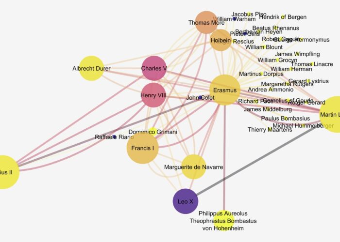
Although we could easily spend years continuing our research, we decided that we had a substantial enough amount of data for a subset of twenty-one events that we could use to begin prototyping our data visualizations. When we began the project, we were curious about the networks among the participants. Would a network show significant connections among participants? How dense would these networks be? Which figures would be the hubs in the network? Would they be the usual suspects or might new voices emerge? To explore these questions, we created a force-directed graph—and the results were virtually meaningless. There was little density in the network and few connections among attendees. Light clustering in the network appeared around W.E.B. Du Bois, widely known as the father of Pan-Africanism, which was hardly surprising.

These disappointing results prompted several teachable moments about data and research design. We looked closely at our data set to understand why the network visualization seemed little more than noise. While we had expected to find participants attending more than one event, our twenty-one events gave us over one thousand names with the majority only attending one event. Logically, it was unsurprising that better-known figures like Du Bois attended more events because they had access to the means to do so. Also, since our events spanned six decades punctuated by major events like World Wars I and II, the rise of the Soviet Union, and the beginning of decolonization, the power players in the movement changed as their investment in Pan-Africanism waxed and waned over time. We also know, based on the information we had found about the total numbers of participants, that some of our data sets were incomplete—and may always be incomplete. Without accounting for the situatedness of the data we had curated, the results simply did not make sense.

We also recognized that our initial hypothesis about the existence of a network with well-defined connections was an erroneous assumption. Engagement of delegates with an event did not necessarily imply extended participation in the global dimensions of a movement. This realization led us to reconsider how we imagine what “participating” in a social movement means. In a conversation about these challenges, digital humanist Quinn Dombrowski suggested that perhaps what is most meaningful lies not in the network but in the brokenness of the network—in what a network visualization cannot represent. There may, for example, be forms of participation that cannot be captured within the bounds of face-to-face gatherings. These might be captured, instead, through correspondence between those engaged in Pan-Africanism. There might also be local effects of an individual’s attendance at an event that similarly would not manifest in a network visualization of participants. Rather than offer a clear picture of Pan-Africanism, our data set and meaningless network visualization opened up a new set of questions about the role of digital humanities in understanding Pan-Africanism.

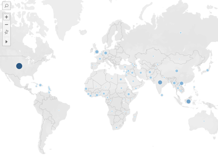
This misstep was also an opportunity to explore the iterative nature of project design with students. Digital humanists, after all, are not unaccustomed to encountering failure and pivoting with research questions and methods to see what these methods make possible (Dombrowski 2019; Graham 2019). Engaging with iterative project design and negotiating the inevitable errors offers undergraduate students the opportunity to develop both creativity and problem solving skills (Pierrakos et al. 2010; Shernoff et al. 2011; Wood and Bilsborow 2013). We began to ask new questions about our data set and continued developing prototypes to see if they offered more meaningful insight on the data. One question that emerged was how to visualize the data in a way that would make the events and delegate information more easily navigable than reading a spreadsheet. We experimented with a sunburst data visualization, which shows hierarchical relationships between data. The top level of the hierarchy focused on decades, then years, then events, and finally participants. The sunburst visualization allowed us to organize the data and provide easy access to a complex data set, while also representing the data proportionally (which decades and years included the most events and which events included the largest numbers of delegates). Another question we considered was how our data might speak to the reach of Pan-Africanism both geographically and temporally. We created two maps to examine this question. The first, a static map, simply dropped pins at the locations of the nearly seventy events we had identified, revealing a broad geographical scope for Pan-Africanist gatherings—in the US, the Caribbean, Europe, Africa, and Asia. A second map, focusing on the twenty-one events for which we had identified a significant number of participants, mapped the attendees’ colonies and countries of origin. This dynamic heat map, animated to aggregate participant data over time, demonstrated the significant geographic scope of Pan-Africanism and its growth and spread over the first sixty years of the 20th century. Critically, we understood these visualizations as representations of particular elements of our data set, each shedding light on different details within the data but none showing the entire picture. While this is a feature of digital humanities scholarship that engages with data more generally—data visualizations are representations that slice and sample data sets, showing particular aspects of the data—it is a critical way of understanding data-driven approaches to African diaspora digital humanities.

Teaching (and Learning) Data Literacy with African Diaspora Digital Humanities

Despite the challenges of this work, we came away from the experience with key insights for both scholarship of the African diaspora and pedagogy. Risam was reminded that when working in the context of a subject that has been marginalized in the broader landscape of scholarly knowledge production, we are inherently limited by what archives have preserved and what scholarship has covered. Our research is encumbered by what Risam (2018) has described as the omissions of the cultural record, and as much as we can undertake the important work—like curating data sets—to avoid reproducing and amplifying these gaps, we inevitably must contend with fragments of information and the larger question of what data can and cannot reveal about the African diaspora. Although this knowledge ultimately proved frustrating, it was profound for Mahoney and Nassereddine in their first foray into working with data. Risam also found the experience an instructive lesson in how to teach humanities students to engage with data when we miss the mark—e.g. when our presumptions about the network failed to pan out. While scientific methods in STEM prompt students to contemplate and negotiate failure, this is not typically foregrounded in humanities methodologies (Henry et al. 2019; Melo et al. 2019; Croxall and Warnick 2020). However, this project offered Risam the opportunity to encourage students to move away from assumptions and be open to the new insights that emerge from a challenge. As Mahoney and Nassereddine are both students pursuing their teaching licenses in English, Risam used this experience as an opportunity to model reflective practice for the heartbreaks we encounter in both digital humanities research and in teaching—sometimes one’s brilliant idea does not prove to be so in execution, and the appropriate response is not to shut down and yield to failure but to pivot—ask questions, reassess, and re-plan.

From this experience, Mahoney had the opportunity to delve deeply into archival research and scholarship on the African diaspora for the first time. She was also surprised to learn that many high school teachers and professors with whom she discussed her work had not heard of Pan-Africanism, reflecting the lack of coverage of this powerful movement within high school and college curricula. Conversely, projects like ours are examples of how we can engage students in addressing these gaps in both curriculum and the cultural record (Risam 2018; Hill and Dorsey 2019; Thompson and McIlnay 2019; Dallacqua and Sheahan 2020; Davila and Epstein 2020). This project also led Mahoney to realize that often we are left with more questions than answers. For example, what breakthroughs or achievements for the African diaspora did Pan-Africanist gatherings create? How were these participants, who faced travel or visa restrictions, funding their travels for these events? Mahoney also discovered the moments of serendipity, joy, and surprise that are part of the research experience, in the way it opens up a virtually limitless garden of forking paths to explore. She was particularly excited to uncover the significance of women to Pan-Africanism. The Fourth-Pan African Congress in New York in 1927, for example, was organized primarily by women. Although women’s names are not counted among the key figures of Pan-Africanism, through the curation of our data set, Mahoney identified that Amy Ashwood Garvey, the first wife of well-known Pan-Africanist Marcus Garvey, arguably played a more significant role in Pan-Africanism than her husband. Aside from one out-of-print biography, Lionel M. Yard’s Biography of Amy Ashwood Garvey, 1897–1969, there is little research focused on Ashwood Garvey, but Mahoney was able to reconstruct her role. Ashwood Garvey used her father’s credit to help Garvey found the Universal Negro Improvement Association in Jamaica, and she worked with Garvey in the US, where they were married and divorced within two years. After their separation, Ashwood Garvey committed herself to Pan-Africanism, co-founding the Nigerian Progress Union and the International African Friends of Abyssinia (later the International African Service Bureau). Additionally, she was a respected speaker at Pan-Africanist and other political events throughout Europe, the Caribbean, the United States, and Africa. After organizing the Fifth Pan-African Congress in Manchester, England in 1945, Ashwood Garvey spent several years in Africa speaking to women and children and raising money for schools, lecturing in Nigeria, residing for two years as a guest of the Asantehene in Kumasi, Ghana, and adopting two daughters in Monrovia, Liberia. Later in her life, she opened the Afro-Woman Service Bureau in London. Mahoney began to recognize the questions that emerged as a factor of the relative lack of scholarly attention that Pan-Africanism has received in spite of its significance, which is a reflection of the biases within the cultural record—and in curriculum—that favor knowledge production on canonical histories, figures, and movements of the Global North over the stories and voices of the Global South (Akua 2019; Lehner and Ziegler 2019; Span and Sanya 2019; Caldwell and Chávez 2020). This experience also led Mahoney to recognize the importance of incorporating the voices of Black writers and artists engaged in Pan-Africanism into her classroom as a high school teacher.

From her crash course in data literacy while working on the project, Mahoney also realized that digital humanities must be included in the high school English Language Arts classroom. Contextualizing her experiences in her prior coursework on English teaching methods and technology teaching methods, Mahoney came to understand digital humanities as a way of teaching data literacy to her own students. In Massachusetts, where Mahoney will be teaching, high school teachers are beholden to the Massachusetts Curriculum Frameworks, which are based on Common Core Standards. In 2016, Massachusetts released Digital Literacy Standards, but there has been no incentive, accountability, or professional development provided to support their implementation. African diaspora digital humanities, in particular, Mahoney recognized, facilitates students’ digital literacy while furthering the essential goal of expanding the canon in the classroom to ensure inclusive representation for all students. Focusing on the two together allows teachers to move past perceived barriers—such as the cost of adding new books to curriculum or lack of interest from colleagues—to work towards justice and equity through students’ engagement with data. In the context of working with informational texts in the Common Core Standards, data literacy encourages students to understand the ethics of data and data visualizations—How was data collected? Who collected the data? What questions were asked? What terminology was used to ask the questions and how might that have informed the response? What is the difference between quantitative and qualitative data? What implicit messages appear in data visualizations? What stories can they tell and what are their limits?

We, therefore, propose that African diaspora digital humanities has an essential role to play in pedagogy, particularly at the high school level. Reading and analyzing data sets and data visualization is a cross-disciplinary skill that needs to be incorporated across the curriculum, and English Language Arts teachers have a responsibility to ensure that students are prepared to understand data, as a cornerstone of literacy. Teaching data literacy holds the possibility of appealing to students who might struggle with or be less interested in literature, allowing teachers to leverage their engagement with data sets and data visualization into deeper connections to the practices of reading and analyzing texts, while building their knowledge of the social value of data literacy (Kjelvik and Schultheis 2019; Špiranec et al. 2019; Bergdahl et al. 2020). Furthermore, it acquaints students with the iterative nature of research and interpretation, while building their capacity to recognize failure and to redirect their efforts towards new avenues of inquiry that may be more fruitful. This is not a matter of “grit”—the troubling emphasis on underserved students’ attitudes towards perseverance rather than on the structural oppressions that impede learning (Barile 2014; Duckworth 2016; Stitzlein 2018)—but strengthening critical thinking skills, particularly when working with English language learners (Parris and Estrada 2019; Smith 2019; Yang et al. 2020). Working with data of the African diaspora also contributes to greater diversity within curricula, while encouraging students to recognize the power dynamics at play in whose voices and experiences are preserved in the artifacts that form our cultural record. Ensuring that students have the opportunity to learn about the Black writers and artists who were the power players of Pan-Africanism in the context of data literacy offers teachers the possibility of promoting equity in the classroom and developing students’ ability to use their knowledge to interpret data through an ethical lens beyond the classroom.

Bibliography

Akua, Chike. 2019. “Standards of Afrocentric Education for School Leaders and Teachers.” Journal of Black Studies 51, no. 2 (December): 107–27. https://doi.org/10.1177/0021934719893572.

Associated Negro Press. 1934. “Africans Hold Important Three-Day Conference in London.” The Pittsburgh Courier, July 21, 1934.

Adi, Hakim, and Marika Sherwood. 2003. Pan-African History: Political Figures From Africa and the Diaspora Since 1787. London: Routledge.

Anthonysamy, Lilian. 2020. “Digital Literacy Deficiencies in Digital Learning Among Undergraduates” In Understanding Digital Industry, edited by Siska Noviaristanti, Hasni Mohd Hanafi, and Donny Trihanondo, 133–36. London: Routledge.

Barile, Nancy. 2014. “Is “Getting Gritty” the Answer?: Can Grit Solve All Your Students’ Problems? This Urban High School Teacher Shares Her Experiences.” Educational Horizons 93, no. 2 (December): 8–9. https://doi.org/10.1177/0013175X14561418.

Battershill, Claire and Shawna Ross. 2017. Using Digital Humanities in the Classroom: A Practical Introduction for Teachers, Lecturers, and Students. London: Bloomsbury Academic.

Bergdahl, Nina, Jalal Nouri, and Uno Fors. 2019. “Disengagement, Engagement and Digital Skills in Technology-enhanced Learning.” Education and Information Technologies 25: 957–983. https://doi.org/10.1007/s10639-019-09998-w.

Brown, Simone. 2015. Dark Matters: On the Surveillance of Blackness. Durham, NC: Duke University Press.

Cairo, Alberto. 2019. How Charts Lie: Getting Smarter about Visual Information. NY: Norton.

Caldwell, Kia Lilly, and Emily Susanna Chávez. 2020. Engaging the African Diaspora in K–12 Education. New York: Peter Lang Publishing Group.

Carlson, Jake, Megan Sapp Nelson, Lisa R. Johnston, and Amy Koshoffer. 2015. “Developing Data Literacy Programs: Working with Faculty, Graduate Students and Undergraduates.” Bulletin of the Association for Information Science and Technology 41, no. 6 (August/September): 14–17.

Clement, Tanya. 2012. “Multiliteracies in the Undergraduate Digital Humanities Curriculum: Skills, Principles, and Habits of Mind.” In Digital Humanities Pedagogy: Practices, Principles, and Politics, edited by Brett D. Hirsch, 365–88. Cambridge: Open Book Publishers.

Croxall, Brian, and Quinn Warnick. 2020. “Failure.” In Digital Pedagogy in the Humanities: Concepts, Models, and Experiments, edited by Rebecca Frost Davis, Matthew K. Gold, Katherine D. Harris, and Jentery Sayers. https://digitalpedagogy.hcommons.org/keyword/Failure.

Dallacqua, Ashley K., and Annmarie Sheahan. 2020. “Making Space: Complicating a Canonical Text Through Critical, Multimodal Work in a Secondary Language Arts Classroom.” Journal of Adolescent & Adult Literacy 64, no. 1 (July/August): 67–77. https://doi.org/10.1002/jaal.1063.

Davila, Denise, and Elouise Epstein. 2020. “Contemporary and Pre–World War II Queer Communities: An Interdisciplinary Inquiry Via Multimodal Texts.” English Journal 110, no. 1 (September): 72–79.

Dombrowski, Quinn. 2019. “Towards a Taxonomy of Failure.” http://quinndombrowski.com/?q=blog/2019/01/30/towards-taxonomy-failure.

Downing, Kevin, Theresa Kwong, Sui-Wah Chan, Tsz-Fung Lam, and Woo-Kyung Downing. 2009. “Problem-based Learning and the Development of Metacognition.” Higher Education 57: 609–621.

Duckworth, Angela. 2016. Grit: The Power of Passion and Perseverance. New York: Scribner.

Earhart, Amy E. and Toniesha L. Taylor. 2016. “Pedagogies of Race: Digital Humanities in the Age of Ferguson.” In Debates in the Digital Humanities 2016, edited by Matthew K. Gold and Lauren F. Klein, 251–264. Minneapolis: University of Minnesota Press.

Eltis, David, et al. 2020. The Transatlantic Slave Trade Database. https://www.slavevoyages.org.

Gallon, Kim. 2016. “Making the Case for Black Digital Humanities.” In Debates in the Digital Humanities 2016, edited by Matthew K. Gold and Lauren F. Klein, 43–49. Minneapolis: University of Minnesota Press.

Gallon, Kim et al. 2020. COVID Black. https://www.cla.purdue.edu/academic/sis/p/african-american/covid-black/team.html.

Geiss, Imanuel. 1974. The Pan-African Movement. New York: Africana Publishing Company.

Glover, Kaiama L. and Alex Gil. 2020. In the Same Boats. https://sameboats.org.

Graham, Shawn. 2019. Failing Gloriously and Other Essays. Grand Forks, ND: The Digital Press.

Hancock, Thomas, Stella Smith, Candace Timpte, and Jennifer Wunder. 2010. “PALs: Fostering Student Engagement and Interactive Learning.” Journal of Higher Education Outreach and Engagement 14, no. 4. https://openjournals.libs.uga.edu/jheoe/article/view/798/798.

Henry, Meredith A., Shayla Shorter, Louise Charkoudian, Jennifer M. Heemstra, and Lisa A. Corwin. 2019. “FAIL Is Not a Four-Letter Word: A Theoretical Framework for Exploring Undergraduate Students’ Approaches to Academic Challenge and Responses to Failure in STEM Learning Environments.” CBE—Life Sciences Education 18, no. 1 (Spring): 1–17. https://doi.org/10.1187/cbe.18-06-0108.

Hill, Craig, and Jennifer Dorsey. 2020. “Expanding the Map of the Literary Canon Through Multimodal Texts.” In Handbook of the Changing World Language Map, edited by Stanley D. Brunn and Roland Kehrein, 77–89. Cham, Switzerland: Springer.

Johnson, Jessica Marie. 2018. “Markup Bodies: Black [Life] Studies and Slavery [Death] Studies at the Digital Crossroads.” Social Text 36, no. 4 (2018): 57–79. https://doi.org/10.1215/01642472-7145658.

Johnston, Brenda, Peter Ford, Rosamond Mitchell, and Florence Myles. 2011. Developing Student Criticality in Higher Education: Undergraduate Learning in the Arts and Social Sciences. London: Bloomsbury Publishing.

Kjelvik, Melissa K., and Elizabeth H. Schultheis. 2019. “Getting Messy with Authentic Data: Exploring the Potential of Using Data from Scientific Research to Support Student Data Literacy.” CBE—Life Sciences Education 18, no. 2 (Summer): 1–18. https://doi.org/10.1187/cbe.18-02-0023.

Lehner, Edward and John R. Ziegler. 2019. “Re-Conceptualizing Race in New York City’s High School Social Studies Classrooms.” In Handbook of Research on Social Inequality and Education, edited by Sherrie Wisdom, Lynda Leavitt, and Cynthia Bice, 24–45. Hershey, Pennsylvania: IGI Global.

Meirelles, Isabel. 2013. Design for Information. Beverly, Massachusetts: Rockport Press.

Melo, Marijel, Elizabeth Bentely, Ken S. McAllister, and José Cortez. 2019. “Pedagogy of Productive Failure: Navigating the Challenges of Integrating VR into the Classroom.” Journal of Virtual Worlds Research 12, no. 1 (January): 1–20. https://doi.org/10.4101/jvwr.v12i1.7318.

Noble, Safiya Umoja. 2019. “Toward a Critical Black Digital Humanities.” In Debates in the Digital Humanities, edited by Matthew K. Gold and Lauren F. Klein, 25–35. Minneapolis: University of Minnesota Press.

Pangrazio, Luci, and Julian Sefton-Green. 2020. “The Social Utility of ‘Data Literacy.’” Learning, Media, and Technology 45, no. 2 (June): 208–20. https://doi.org/10.1080/17439884.2020.1707223.

Parham, Marissa. 2019. “Sample | Signal | Strobe: Haunting, Social Media, and Black Digitality.” In Debates in the Digital Humanities, edited by Matthew K. Gold and Lauren F. Klein, 101–122. Minneapolis: University of Minnesota Press.

Parris, Heather, and Lisa M. Estrada. 2019. “Digital Age Teaching for English Learners.” In The Handbook of TESOL in K‐12, edited by Luciana C. de Oliveria, 149–62. Hoboken, New Jersey: Wiley-Blackwell.

Pierrakos, Olga, Anna Zilberberg, and Robin Anderson. 2010. “Understanding Undergraduate Research Experiences through the Lens of Problem-based Learning: Implications for Curriculum Translation.” Interdisciplinary Journal of Problem-Based Learning 4, no. 2 (September): 35–62. https://doi.org/10.7771/1541–5015.1103.

Ramsden, Paul. 2003. Learning to Teach in Higher Education. New York: Routledge.

Rettberg, Jill Walker. 2020. “Situated Data Analysis: A New Method for Analysing Encoded Power Relationships in Social Media Platforms and Apps.” Humanities and Social Sciences Communications 7, no. 5 (2020). https://doi.org/10.1057/s41599-020-0495-3.

Risam, Roopika. 2020. “‘It’s Data, Not Reality’: On Situated Data with Jill Walker Rettberg.” Nightingale, June 29, 2020. https://medium.com/nightingale/its-data-not-reality-on-situated-data-with-jill-walker-rettberg-d27c71b0b451.

Risam, Roopika. 2018. New Digital Worlds: Postcolonial Digital Humanities in Theory, Praxis, and Pedagogy. Evanston, Illinois: Northwestern University Press.

Shernoff, Elisa S., Ane M. Maríñez-Lora, Stacy L. Frazier, Lara J. Jakobsons, Marc S. Atkins, and Deborah Bonner. 2011. “Teachers Supporting Teachers in Urban Schools: What Iterative Research Designs Can Teach Us.” School Psychology Review 40, no. 4 (December): 465–85. https://doi.org/10.1080/02796015.2011.12087525.

Smith, Blaine E. 2019. “Mediational Modalities: Adolescents Collaboratively Interpreting Literature through Digital Multimodal Composing.” Research in the Teaching of English 53, no. 3 (February): 197–222. https://search.proquest.com/docview/2196370157?pq-origsite=gscholar&fromopenview=true.

Span, Christopher M., and Brenda N. Sanya. 2019. “Education and the African Diaspora.” In The Oxford Handbook of History Education, edited by John L. Rury and Eileen H. Tamura, 399–412. New York: Oxford University Press.

Špiranec, Sonja, Denis Kos, and Michael George. 2019. “Searching for Critical Dimensions in Data Literacy.” In Proceedings of CoLIS, the Tenth International Conference on Conceptions of Library and Information Science, Ljubljana, Slovenia, June 16–19, 2019. Information Research 24, no. 4 (December). http://informationr.net/ir/24-4/colis/colis1922.html.

Stitzlein, Sarah M. 2018. “Teaching for Hope in the Era of Grit.” Teachers College Record 120, no. 3 (March): 1–28. http://www.tcrecord.org/Content.asp?ContentId=22085.

Thompson, Riki, and Matthew McIlnay. 2019. “Nobody Wants to Read Anymore! Using a Multimodal Approach to Make Literature Engaging.” Journal of English Language and Literature 7, no. 1 (January): 21–40.
https://www.researchgate.net/publication/341312737.

Tufte, Edwards. 2001. The Visual Display of Quantitative Information, 2nd edition. Cheshire, Connecticut: Graphics Press.

Vanhorn, Shannon, Susan M. Ward, Kimberly M. Weismann, Heather Crandall, Jonna Reule, et al. 2019. “Exploring Active Learning Theories, Practices, and Contexts.” Communication Research Trends 38, no. 3 (January): 5–25.
https://search.proquest.com/docview/2308823162?fromopenview=true&pq-origsite=gscholar.

Wood, Denise, and Carolyn Bilsborow. 2015. “‘I am not a Person with a Creative Mind’: Facilitating Creativity in the Undergraduate Curriculum Through a Design-Based Research Approach.” In Leading Issues in e-Learning Research MOOCs and Flip: What’s Really Changing?, edited by Mélanie Ciussi, 79–107. United Kingdom: Academic Conferences and Publishing Limited.

Yang, Ya-Ting Carolyn, Yi-Chien Chen, and Hsui-Ting Hun. 2020. “Digital Storytelling as an Interdisciplinary Project to Improve Students’ English Speaking and Creative Thinking.” Computer Assisted Language Learning. https://doi.org/10.1080/09588221.2020.1750431.

Acknowledgments

The authors gratefully acknowledge Krista White for thoughtful feedback on this essay; Gail Gasparich, Regina Flynn, Elizabeth McKeigue, and J.D. Scrimgeour at Salem State University for supporting the Digital Scholars Program; and Haley Mallett for her support preparing the manuscript.

About the Authors

Jennifer Mahoney is an MEd student at Salem State University. She received her Bachelor of Arts in English from Salem State and is currently completing her Master’s in Secondary Education. Mahoney is currently a teaching fellow at Revere High School, an urban public school just outside of Boston, MA. She was the inaugural recipient of the Richard Elia Scholarship and her research interests include contemporary pedagogical approaches, underrepresented historical events, and digital humanities.

Roopika Risam is Chair of Secondary and Higher Education and Associate Professor of Secondary and Higher Education and English at Salem State University. Her research interests lie at the intersections of postcolonial and African diaspora studies, humanities knowledge infrastructures, and digital humanities. Risam’s monograph, New Digital Worlds: Postcolonial Digital Humanities in Theory, Praxis, and Pedagogy was published by Northwestern University Press in 2018. She is co-editor of Intersectionality in Digital Humanities (Arc Humanities/Amsterdam University Press, 2019). Risam’s co-edited collection The Digital Black Atlantic for the Debates in the Digital Humanities series (University of Minnesota Press) is forthcoming in 2021.

Hibba Nassereddine is an MEd student at Salem State University. She received her Bachelor of Arts in English from Salem State and is currently completing her Master’s in Secondary Education. Nassereddine is currently a teaching fellow at Holten Richmond Middle School in Danvers, Massachusetts.

A woman works at a laptop looking at an image of a snowy landscape.
1

Data Literacy in Media Studies: Strategies for Collaborative Teaching of Critical Data Analysis and Visualization

Abstract

This essay addresses challenges of teaching critical data literacy and describes a shared instruction model that encourages undergraduates at a large research university to develop critical data literacy and visualization skills. The model we propose originated as a collaboration between the library and an undergraduate media and cultural program, and our specific intervention is the development of a templated data-visualization instruction session that can be taught by many people each semester. The model we describe has the dual purpose of supporting the major and serving as an organizational template, a structure for building resources and approaches to instruction that supports librarians as they develop replicable pedagogical strategies, including those informed by a cultural critical lens. We intend our discussion for librarians who are teaching in an academic setting, and particularly in contexts involving large-scale or programmatic approaches to teaching. The discussion is also useful to faculty in the disciplines who are considering partnering with the library to interject aspects of data or information literacy into their program.

Learning that emphasizes data literacy and encourages analysis within multimedia visualization platforms is a growing trend in higher education pedagogy. Because data as a form of evidence holds a privileged position in our cultural discourse, interdisciplinary undergraduate degree programs in the social sciences, humanities, and related disciplines increasingly incorporate data visualization, thus elevating data literacy alongside other established curricular outcomes. When well-conceived, critical data literacy instruction engenders a productive blend of theory and practice and positions students to examine how race-based bigotry, gender bias, colonial dominance, and related forms of oppression are implicated in the rhetoric of data analysis and visualization. Students can then create visualizations of their own that establish counternarratives or otherwise confront the locus of power in society to present alternative perspectives.

As scholarship in media, communications, and cultural studies pedagogy has established, data visualizations “reflect and articulate their own particular modes of rationality, epistemology, politics, culture, and experience,” so as to embody and perpetuate “ways of knowing and ways of organizing collective life in our digital age” (Gray et al. 2016, 229). Catherine D’Ignazio and Lauren F. Klein (2020, 10) explain this dialectic more pointedly in Data Feminism, arguing, “we must acknowledge that a key way power and privilege operate in the world today has to do with the word data itself,” especially the assumptions and uses of it in daily life. Critical instruction positions undergraduates to question how data, in its composition, analysis, and visualization, can often perpetuate an unjust socio-cultural status quo. Undergraduates who are introduced to frames for interpreting culture also need to be exposed to tools—literal and conceptual—that help them critique data visualizations. The goal is to enable a holistic critical literacy, through which students can find data, structure it with a research question in mind, and produce accurate, inclusive visualizations.

However, data instruction is challenging, and planning data learning within the context of an existing course requires an array of skills. Effective data visualization pedagogy demands that instructors locate example datasets, clean data to minimize roadblocks, and create sample visualizations to initiate student engagement with first-order cultural-critical concepts. These steps, a substantial time investment, are necessary for teaching that enables data novices to contend with the mechanics of data manipulation while remaining focused on social and political questions that surround data. When charged with developing data visualization assignments and instructional assistance, faculty often seek the support and expertise of librarians and educational technologists, who are located at the nexus of data learning within the university (Oliver et al. 2019, 243).

Even in cases where librarians and instructional support staff are well-positioned to assist, the demand for teaching data visualization can be overwhelming. It can become burdensome to deliver in-person instruction to cohort courses with a large student enrollment, across many sections and in successive semesters. In order to initiate and maintain an effective, multidisciplinary data literacy program, teaching faculty, librarians, and educational technologists must establish strong teaching partnerships that can be replicated and reimagined in multiple contexts.

This essay addresses some challenges of teaching critical data literacy and describes a shared instruction model that encourages undergraduates at a large research university to develop critical data literacy and visualization skills. Although anyone engaged in teaching critical data literacy can draw from this essay, we intend our discussion for librarians who are teaching in an academic setting, and particularly in contexts involving large-scale or programmatic approaches to teaching. In addition, we believe our essay is particularly pertinent to those designing program curricula within discipline-specific settings, as our ideas engage questions of determining scale, scope, and learning outcomes for effective undergraduate instruction.

The teaching model we propose originated as a collaboration between the New York University Libraries and NYU’s Media, Culture, and Communications (MCC) department, and our specific intervention is the development of an assignment involving data visualization for a Methods in Media Studies (MIMS) course. The distributed teaching model we describe has the dual purpose of supporting the major and serving as an organizational template, a structure for building resources and approaches to instruction that supports librarians as they develop replicable pedagogical strategies, including those informed by a cultural critical lens. In this regard, we believe that collaborative instruction empowers librarians and faculty from many disciplines to develop their own data literacy competency while growing as teachers. And, it enables the library to affect undergraduate learning throughout the university.

There is already an extensive body of research about the role of critical data literacy instruction, including critical approaches to the technical elements of data visualization (Drucker 2014; Sosulski 2019; Engebresten and Kennedy 2020). While we draw from that scholarly discussion, we focus instead on the upshot of programmatic, extensible teaching partnerships between libraries and discipline-specific undergraduate programs. Along the way, we engage two crucial questions: What is the value of creating replicable lesson plans and materials, to be taught by an array of library staff repeatedly? How can the librarians who design these materials strike a balance between creating a step-by-step lesson plan that library instructors follow and structuring a guided lesson that is flexible and capacious enough for instructors to experience meaningful teaching encounters of their own?

Data Literacy in Undergraduate Education

Several curricular initiatives and assessment rubrics in higher education pedagogy recognize the need for students to develop fluidity with digital media and quantitative reasoning, a precursor to effective data visualization. In 2005, Association of American Colleges and Universities (AAC&U) began a decade-long initiative called Liberal Education and America’s Promise (LEAP), which resulted in an inventory of 21st century learning outcomes for undergraduate education. Quantitative literacy is on the list of outcomes (Association of American Colleges and Universities 2020). A corresponding AAC&U rubric statement asserts that “[v]irtually all of today’s students … will need basic quantitative literacy skills such as the ability to draw information from charts, graphs, and geometric figures, and the ability to accurately complete straightforward estimations and calculations.” The rubric urges faculty to develop assignments that give students “contextualized experience” analyzing, evaluating, representing, and communicating quantitative information (Association of American Colleges and Universities 2020). The substance of the LEAP initiative informed the development of our collaborative teaching model, for it allowed us to ground our curricular interventions within larger university curricular trends that had already emerged.

Although quantitative literacy is important, there are other structures for teaching that see data fluidity and visualization as being tied to larger information seeking practices. For this reason, we also turned to the Framework for Information Literacy for Higher Education, developed by the Association of College and Research Libraries (ACRL). The Framework embraces the concept of metaliteracy, which promotes metacognition and a critical examination of information in all its forms and iterations, including data visualization. One of the six frames posed by the document, “Information Creation as a Process,” closely aligns with data competency, including data visualization. This frame emphasizes that the information creation process can “result in a range of information formats and modes of delivery” and that the “unique capabilities and constraints of each creation process as well as the specific information need determine how the product is used.” Within the Framework, learning is measured according to a series of “dispositions,” or knowledge practices that are descriptive behaviors of those who have learned a concept. Here, the Framework is apropos, as students who see information creation as a process “value the process of matching an information need with an appropriate product” and “accept ambiguity surrounding the potential value of information creation expressed in emerging formats or modes” (ACRL 2016). The Framework recognizes that evolved undergraduate curricula must incorporate active, multimodal forms of analysis and production that synthesize information seeking, evaluation, and knowledge creation.

Other organizations and disciplines also advocate for quantitative literacy in the undergraduate curriculum. For instance, Locke (2017) discusses the relevance of data in the humanities classroom and points to ways undergraduate digital humanities projects can incorporate data analysis and visualization to extend inquiry and interpretation. And Beret and Phillips (2016, 13) recommend that every journalism degree program provide a foundational data journalism course, because interdisciplinary data instruction cultivates professionals “who understand and use data as a matter of course—and as a result, produce journalism that may have more authority [or] yield stories that may not have been told before.” In sum, LEAP, the ACRL Framework, and movements for data literacy in the disciplines influenced the Libraries’ collaboration with the Media and Cultural Communications department, and this informed the effort to create and support a meaningful learning experience for students in this major.

Learning-by-Teaching: Structured, Programmatic Instruction and Libraries

Our collaborative model evolved with the conviction that structured, programmatic teaching can foster professional growth for librarians and library technologists. In addition to creating impactful learning for students, programmatic teaching provides a structure that allows for educators to expand the contexts in which they can teach. In many cases, librarians who specialize in information literacy are less adroit regarding the concepts and mechanics of working with data. Teaching data as a form of information, then, necessarily requires a baseline technical expertise.

Several studies published within the past decade indicate that learning with the intent to teach can lead to better understanding, regardless of the content in question. One such study finds that learners who were expecting to teach the material to which they were being introduced show better acquisition than learners who were expecting only to take a test, theorizing that learning-by-teaching pushes the learner beyond essential processing to generative processing, which involves organizing content into a personally meaningful representation and integrating it with prior knowledge (Fiorella and Mayer 2013, 287). Another study finds that learners who were expecting to teach show better organizational output and recall of main points than those who were not expecting to teach, which suggests that learners who anticipate teaching tend to put themselves “into the mindset of a teacher,” leading them to use preparation techniques—such as concept organizing, prioritizing, and structuring—that double as enhancements to a learner’s own encoding processes (Nestojko, et al. 2014, 1046). This evidence boosts our belief that learning-by-teaching is a good strategy for librarians to build foundational data literacy skills, and it informed the development of our program.

Development and Implementation of the Collaborative Teaching Model

Situated in NYU’s Steinhardt School of Culture, Education, and Human Development, the MCC program covers global and transcultural communication, media institutions and politics, and technology and society, among other related fields. MCC program administrators, who were looking to incorporate practical skills into what had previously been a theory-heavy degree, approached the library to co-develop instructional content that would expose students to applied data literacy and multimedia visualization platforms. The impetus for the program administrators to reach out to the library was their participation in a course enhancement grant program, which testifies to the lasting effects that school or university-based curriculum initiatives can have on undergraduate learning. In this case, what emerged was a sustained teaching partnership. Though the support was refined over time, its core remained constant: individual sections of a media studies methods class would attend a librarian-led class session that prepares students to evaluate data and construct a visualization exploring some element of media and political economy, grounded in an assigned reading that asserts ownership of or access to media and communications infrastructure is intrinsically related to the well-being and development of countries around the world.

The class is a first-year requirement in Media, Culture, and Communication, one of NYU’s largest majors. The course tends to be taught by beginning doctoral students, and is by design a highly fluid teaching environment. In early iterations of library support, we designed a module that attempted to have students perform a range of analysis and visualization tasks. Students were introduced to basic socio-demographic datasets and were invited to create a visualization that investigates a research question of their choosing, provided that the question adhered generally to the themes of media and political economy. The assignment as initially constituted expected the student to frame a question, find a dataset and clean it, choose a visualization platform, and generate one or more visualizations that imply a causal relationship between variables that they had identified.

The learning outcomes and assignment developed in this initial sequence turned out to be too ambitious. The assignment had fairly loose parameters, which proved problematic, and the 75-minute class session could not provide sufficient preparation. Students struggled with developing viable research questions, finding data sets, and cleaning the data (the multivalent process of normalizing, reshaping, redacting, or otherwise configuring data to be ingested and visualized in online platforms without errors). Also, we had pointed them to an overwhelming array of data analysis software tools, including ESRI’s ArcMap, Carto, Plot.ly, Raw, and Tableau. We found they had great difficulty with both selecting a tool and learning how to use it, in addition to the connected process of finding a dataset to visualize within it. The Libraries tried to accommodate, but ultimately realized that the module needed significant adjustment going forward, especially since the MCC department decided to expand the project to include up to 10 sections of the course each semester.

Besides struggling with research questions, datasets, and tools, it was also apparent that students had trouble connecting this work to the broader ideas of media and political economy intrinsic to the assignment. Informed by these first-round outcomes, we came together again to revise the instructional content and assignment. Taking our advice into account, the MCC teaching faculty and program administrators refined the learning outcomes as such:

  • Become familiar with the principles, concepts, and language related to data visualization
  • Investigate the context and creation of a given dataset, and think critically about the process of creating data
  • Emphasize how online visualization platforms allow users to make aesthetic choices, which are part and parcel of the rhetoric of visualization

The librarians also created a student-facing online guide as a home base for the module and decided to distribute the teaching load by inviting Data Services specialists from the Libraries’ Data Services department to help teach the library sessions (MCC-UE 2019). And to provide a better lead-in to the library session, a preparatory lesson plan was developed for the MCC instructors to present in the class prior to the library visit.

After further feedback from program administrators and consideration, we inserted a scaffolding component into the library session lesson plan to better prepare students for their assignment. The component involved comparing four sample visualizations created from the very same data, and it included questions for eliciting a discussion about the origins and constructions of data. Scenario-based exercises for creating visualizations in Google sheets and Carto were also incorporated into the lesson, giving students practice before tackling the actual assignment. The assignment was also redesigned with built-in support. Students would no longer be expected to find their own dataset and attempt to clean extracted data, tasks that had caused them frustration and anxiety. Instead, they would choose from a handful of prescribed and pre-cleaned datasets. Data Services staff worked to remediate a set of interesting datasets to anticipate the kind of visualization students would attempt. Also, rather than having to choose from a confusing array of data visualization tools, they would be directed to use Google sheets or Carto only. Assuming the task of identifying, cleaning, and preparing datasets meant extra front-loaded work on the Libraries’ part, but it also freed students to focus on the higher order activity of investigating the relationship between visualizing information and examining social or political culture.

Instructional Support from a Wide Community of Teachers: Growing a Base

Another issue at hand was the strain the project was having on the members of the Data Services team and Communications Librarian, who taught all ten library sessions that were offered each semester. To achieve sustainability going forward, a broader group of librarians would be needed to help teach the library sessions. Moving forward, the Data and Communications librarians decided to recruit other NYU librarians to participate as instructors. Most of the recruits were data novices, but they viewed the invitation as an opportunity to learn data basics, expand their instruction repertoire, and strengthen their teaching practice. Calling on colleagues to teach outside their comfort zone is a big ask, one that requires strong support and administrative buy-in. So recruits were provided with a thorough lesson plan, a comprehensive hands-on training session, and the opportunity to shadow more experienced instructors before teaching the module solo (MCC-UE 2019).

By including a more robust roster of instructors, the structure also gave us the ability to further tie our lesson to what was planned in the MIMS curriculum. A new reading was chosen by the media studies faculty, “Erasing Blackness: the media construction of ‘race’ in Mi Familia, the first Puerto Rican situation comedy with a black family,” by Yeidy Rivero. The article grounds the students’ exploration of the relationship between media and political economy within the MIMS class, and it also provides a good entry point to explore critical data literacy concepts. According to Rivero, the show Mi Familia, deliberately represents a “flattened,” racially homogeneous “imagined community” of lower-middle class black family life that erases Puerto Rico’s hybrid racial identity. This flattening, Rivero argues, is part and parcel of multidimensional efforts to “Americanize” Puerto Rico and align its culture with the interests of the U.S. Furthermore, since the Puerto Rican media is regulated by the U.S. Federal Communication Commission (FCC) and owned by U.S. corporations, Puerto Ricans themselves had little recourse to question the portrayal of constructed racial identities in the mainstream culture (Rivero 2002).

Students were instructed to complete the reading prior to the library session. During the session, the library instructor referred to the reading and introduced a dataset with particular relevance to it. The instructor engaged students in a discussion about the importance of reviewing the dataset description and variables in order to form a question that can be reasonably asked of the data. With students following along, the instructor then modeled how to use Google sheets to manipulate the data and create a visualization that speaks to the question.

The selected dataset resulted from a study of the experiences and expressions of racial identity by young adults who lived in first and second-generation immigrant households in the New York City area during the late 1990s (Mollenkopf, Kasinitz, and Waters 2011). The timeframe of this article and the dataset line up well. The sitcom mentioned in the article first aired in 1994, but had been picked up in Telemundo’s NYC area affiliates by the late 1990s, so it is highly possible that this sitcom would have been on the air in the homes of study participants. The dataset, which is aggregated at the person level, includes variables about participants’ family and home context, patterns of socialization, exposure to media, and sense of self. In order to foreground the analytic process of looking at data, ascertaining its possibilities, and gesturing at potential visualizations, we created a simplified version of the raw data, which omits some columns and imputes other variables for easier use. To accompany this dataset, we also created some simple data visualizations in Google Sheets, ArcGIS Online, and Tableau, which are intentionally “impoverished,” thus designed to elicit discussion from students about the claims made by the visualizations.

Undoubtedly, these adjustments to the module led to students performing better on the assignment. Improvements to the lead-in session provided by the MCC instructors ensured that the students were prepared with context for the library workshop and an understanding of why the library was supporting the assignment. Basing the assignment on a specific article made it possible for librarians to model a way of bridging the theoretical concepts of the class to a question that could be asked of data. There was also more time for two pair-and-share discussions and group work in Google Sheets and Carto, which addressed a fundamental and recurring frustration in the students’ understanding of the assignment: the ability to ask an original question of a dataset, and to ask a question that would address a larger theme of media and political economy.

From the standpoint of instructors in NYU Libraries, we also found that the model provided a strengthened group of teachers. Several people who worked with sections of MIMS contributed ideas to the instructor manual and created ancillary slides and examples that are tailored to their own interest in the claims about racial and national identity that the Rivero article makes. For us, this flexibility is an important element of the collaborative teaching model; it offers both the structure for those who are new to data analysis and visualization to teach effectively, yet it also contains enough pathways for discussion to be meaningful and personal, should individual instructors want to branch out in their own teaching.

Conclusion

Despite being familiar with technology, many students arrive at college without a holistic ability to interpret, analyze, and visualize data. Educators now recognize the need to provide foundational data literacy to undergraduates, and many teaching faculty look to the library for support in instructional design and implementation. In this article, we recognize that creating integrated, meaningful data learning lessons is a complex task, yet we believe that the collaborative teaching model can be applied in various disciplinary contexts. Sustainability of this model depends on equipping a wide range of librarians with necessary data literacy skills, which can be achieved with a learning-by-teaching approach. After developing a teaching model that calls upon the expertise of teachers across the library, we gained some important insights on maintaining the communication and support to make it sustainable, building the workshop itself, and balancing the labor that all of this requires.

Good communication and organization between the MCC department and librarians was also key in maintaining the scalability of this instruction program. Given the heavy rotation of new teachers on both the library and MCC side, we needed to provide module content that was streamlined and assignment requirements that were clear cut in order to quickly on-board teachers to the goals, process, and output of the module. When recruiting library instructors, we emphasized that volunteers will not only build their data literacy skill set, but will also expand their pedagogical knowledge and teaching range. Finally, to ensure that volunteer instructors have a successful experience, we also provide support mechanisms such as a step-by-step lesson plan, thorough train-the-trainer sessions, opportunities to observe and team-teach before going solo, and a point person to contact with questions and concerns.

There is much hidden labor in all of this work. Robust student support for the course was also crucial, and really took off when the MCC department created a dedicated student support team from graduate assistants in the program. On the library side, communicating regularly with the MCC department, assessing and revising the learning objects, organizing and hosting train the trainer sessions, and scheduling all of the library visits takes many hours of time and planning. This work should not be overlooked when considering a program of this scale.

A collaboration at this level can provide rich data literacy at scale to undergraduates, while also offering the chance for instructors in the library and in disciplinary programs to develop their own skills in numeracy and data visualization as they learn by teaching. Through time, effort, and dedicated maintenance, a program like this becomes a successful partnership that has a broad and demonstrated impact on student learning, strengthens ties between the library and the departments we serve, and allows librarians and data services specialists the opportunity to learn and grow from each other.

Related to the learning objects themselves, we had the most success when we matched the scope of the assignment closely with the time and support the students would have to complete it, and preparing a small selection of data sets for the students in advance was very helpful in this regard. We also built in a full class session of preparation before the library visit, in which MCC teachers introduced the assignment, some principles of data visualization (via a slide deck prepared by the library’s Data Services department), and how this method can connect to broader concepts of media analysis. This led to more effective learning for students. These changes to the student assignment, learning outcomes, and library lesson plan were developed through regular and structured assessments of the workshop: a survey to the instructors teaching the course, classroom visits to see the students’ final projects, and in-depth conversations with instructors on which aspects of the lesson plan were successful and which fell flat. Following each assessment the MCC administrators and the librarians would get together to discuss and iterate on the learning objects. This process of gathering feedback on the workshop, reflecting on that information and then revising the assignment enabled us to improve the teaching and learning experience over the years.

Bibliography

Association of American Colleges and Universities. n.d. “Essential Learning Outcomes.” Accessed June 2, 2020. https://www.aacu.org/essential-learning-outcomes.

Association of American Colleges and Universities (AAC&U). n.d. “VALUE Rubrics.” Accessed June 2, 2020. https://www.aacu.org/value/rubrics/quantitative-literacy.

Association of College & Research Libraries. 2016. “Framework for Information Literacy for Higher Education. “ Accessed June 2, 2020. http://www.ala.org/acrl/standards/ilframework.

Berret, Charles and Cheryl Phillips. 2016. Teaching Data and Computational Journalism. New York: Columbia Journalism School. https://journalism.columbia.edu/system/files/content/teaching_data_and_computational_journalism.pdf.

D’Ignazio, Catherine and Lauren F. Klein. 2020. Data Feminism. Boston: MIT Press. ProQuest Ebook Central.

Drucker, Johanna. 2014. Graphesis: Visual Forms of Knowledge Production. Cambridge, Massachusetts: Harvard University Press.

Engebretsen, Martin and Helen Kennedy, eds. 2020. Data Visualization in Society. Amsterdam: Amsterdam University Press. Project MUSE.

Fiorella, Logan, and Richard E. Mayer. 2013. “The Relative Benefits of Learning by Teaching and Teaching Expectancy.” Contemporary Educational Psychology 38, no. 4: 281–288. https://doi.org/10.1016/j.cedpsych.2013.06.001.

Gray, Jonathan, Lillian L. Bounegru, Stefania Milan, and Paolo Ciuccarelli. 2016. “Ways of Seeing Data: Toward a Critical Literacy for Data Visualizations as Research Objects and Research Devices.” In Innovative Methods in Media and Communication Research edited by Sebastian Kubitschko and Anne Kaun, 227–252. Cham, Switzerland: Palgrave Macmillan. ProQuest Ebook Central.

Locke, Brandon T. 2017. “Digital Humanities Pedagogy as Essential Liberal Education: A Framework for Curriculum Development.” Digital Humanities Quarterly 11, no. 3. http://www.digitalhumanities.org/dhq/vol/11/3/000303/000303.html.

Nestojko, John F., Dung C. Bui, Nate Kornell, and Elizabeth Ligon Bjork. 2014. “Expecting to Teach Enhances Learning and Organization of Knowledge in Free Recall of Text Passages.” Memory & Cognition 42, no. 7: 1038–1048. https://doi.org/10.3758/s13421-014-0416-z.

Mollenkopf, John, Phillip Kasinitz, and Mary Waters M. 2011. Immigrant Second Generation in Metropolitan New York. Ann Arbor: Inter-university Consortium for Political and Social Research [distributor]. https://doi.org/10.3886/ICPSR30302.v1/.

“MCC-UE 14 Media & Cultural Analysis.” 2019. New York University. https://guides.nyu.edu/mims/.

Oliver, Jeffry, Christine Kollen, Benjamin Hickson, and Fernando Rios. 2019. “Data Science Support at the Academic Library.” Journal of Library Administration 59, no. 3: 241–257. https://doi.org/10.1080/01930826.2019.1583015.

Rivero, Yeidy. M. 2002. “Erasing Blackness: The Media Construction of ‘Race’ in Mi Familia, the First Puerto Rican Situation Comedy with a Black Family.” Media, Culture & Society 24, no. 4: 481–497. https://doi.org/10.1177/016344370202400402.

Sosulski, Kristen. 2018. Data Visualization Made Simple: Insights into Becoming Visual. London: Routledge. ProQuest Ebook Central.

Acknowledgments

This teaching partnership, data, and associated resources would not have been possible without the work of many people in NYU Libraries and Data Services, as well as the NYU Steinhardt Methods in Media Studies program including: Bonnie Lawrence, Denis Rubin, Dane Gambrill, Yichun Liu, and Jamie Skye Bianco.

About the Authors

Andrew Battista is a Librarian for Geospatial Information Systems at New York University and teaches regularly on data visualization, geospatial software, and the politics of information.

Katherine Boss is the Librarian for Journalism and Media, Culture, and Communication at New York University, and specializes in information literacy instruction in media studies.

Marybeth McCartin is an Instructional Services Librarian at New York University, specializing in teaching information literacy fundamentals to early undergraduates.

Skip to toolbar