Tagged Digital Art History

Figure 6 shows two paintings by Vermeer and their weave maps: The Girl Interrupted at Her Music from the Frick Collection and Young Woman with a Water Pitcher from the Metropolitan Museum of Art. The weave maps show that these two paintings were made from the same bolt of fabric.
1

Hunting for Weave Matches: Computation in Art Scholarship

Abstract

Manual thread counts are widely used in the technical analysis of a painting’s canvas (Franken 2017). When the average thread counts of two canvases are similar, this suggests that the two canvases are derived from the same bolt; conversely, if they differ substantially, they cannot have originated from the same roll. Yet average thread counts alone, no matter how close, are not enough to establish that two canvases were manufactured together. With the advent of computer methods, it is now possible to “count” the threads at every location in a canvas. Transforming this numerical procedure into an image produces weave maps such as in Figure 1, which display values of the thread count as colored dots. Striped patterns in the colors are local thread count variations attributable to the mechanics of the weaving process. When two canvases have similar patterns of stripes, such as the two by Vermeer in Figure 1, they can be presumed to have a common origin, thus placing the canvases (and the paintings) in the same place at the same time. This paper describes an organized procedure for carrying out the search for weave matches, includes a summary of the findings of the Counting Vermeer project, and introduces a new match between two of Johannes Vermeer’s canvases.

Johnson & Sethares (Figure 1)

Figure 1: Johannes Vermeer, The Geographer (top), ca. 1668–1669, Oil on canvas, 53 x 46.6 cm. Städelsches Kunstinstitut und Städtische Galerien, Frankfurt am Main and Johannes Vermeer, The Astronomer (bottom, rotated 180◦), ca. 1668, Oil on canvas, 50 x 45 cm. Musée du Louvre, Paris (artwork from Wikimedia Commons), and corresponding vertical weave maps (at right). Each pixel in the weave map represents the value of a thread count at a single evaluation point, which is carried out automatically over the complete canvas. To convert the similarity assessment into a visual task, the density values for each evaluation tile are transformed into colored squares that indicate the densities of the vertical threads. The immediately obvious defining feature in these two maps is the pattern of stripes. As this pattern is the result of the manufacturing process, it will be shared by bolt mates. This match was first presented in “Canvas Weave Match Supports Designation of Vermeer’s Geographer and Astronomer as a Pendant Pair” (Johnson and Sethares 2016).

Background

In March 2006, Ella Hendricks, head of painting conservation at the Van Gogh Museum, agreed to tutor Rick Johnson (the first author of this article) in the activities of a conservator with the goal of expanding the use of computer-based tools in painting analysis. At the time, thread counting was typically accomplished using x-radiograph film of a canvas posted on a light box and measured with a magnifying headset. After shadowing the department for fifteen months, the author recognized that thread counting could serve as a candidate for automated analysis via Fourier methods. Fourier analysis is a common tool taught to undergraduate electrical engineers that is useful for estimating the periodic components in a signal. In the thread counting application, the “signal” is the greyscale intensity fluctuations visible in the x-radiograph corresponding to the threads. Once the potential of Fourier analysis to automate canvas thread counting was confirmed, the Thread Count Automation Project (TCAP) was formed in 2007 to coordinate teams of experts in digital signal processing. The teams tested a variety of procedures and a variety of ways of presenting the results. One fruitful method visualizes the thread count data over a complete canvas using color to represent the varying thread densities. The resulting weave maps (such as in Figure 1) are often striped, and offer a detailed view of the small variations in the density pattern of the weave. These variations often extend over the width and breadth of the roll originally containing the canvas. A weave match occurs when the weave maps from two different canvases have the same pattern of stripes. This has become compelling forensic evidence in establishing rollmate status between two separate canvases.

When combined with information about a painter’s studio practice, material data (e.g. the range of ground layer materials used by the artist), and documentation (e.g. in letters, financial transactions, and memoirs), canvas weave matches can assist in authentication, dating, and inference of artist’s intent, as Liedtke, Johnson, and Johnson recognized in 2012 for paintings by Vermeer. That same year, document-rich studies incorporating weave matches appeared of paintings by Vincent van Gogh (Tilborgh et al. 2012) and Diego Velázquez (Pérez d’Ors, Johnson, and Johnson 2012). In the case of Vermeer, for whom substantial studio documentation is lacking, the eight weave match pairs discovered so far (Johnson Counting 2017) from among Vermeer’s thirty-four paintings on canvas (Liedtke 2008) potentially offer additional insight into unanswered questions, in particular those regarding dating. When a weave match is made between canvases that stylistic analysis dates as several years apart, this can challenge the prevailing sense that an artist would be unlikely to hoard canvas for a long period. Assembling a weave match study across the entire oeuvre of a painter can provide valuable data regarding chronology. A comparison of weave maps for paintings by different artists from the same period and place could help to establish patterns of interaction among the artists.

In the decade since the creation of the first automated thread counting procedures, researchers have used weave maps of thread density and angle to analyze Old Master European paintings from the fifteenth to the early twentieth centuries. Striped weave maps have also been produced for twelfth and thirteenth-century Chinese silk painting supports. The extension to other fabrics with periodic weave patterns can be envisioned as long as they can be imaged with resolution sufficient for a human to count the threads, this might include clothing, flags, and other woven cultural heritage objects. Thus, this decade-long project to develop procedures that use tools from digital signal processing as aids to art historical analysis of paintings on fabric demonstrates the potentials of technology and the trans-disciplinary collaboration between art historians, signal processing engineers, and the institutions that provide the support and data that enable collaborations. The objective of the present paper is to document the procedure employed in the study of Vermeer’s canvases (Johnson Counting 2017) as it advances from scanned x-radiographs, through weave maps, and onto the hunt for weave matches. The audience for this document is presumed to be the end users of the weave match reports; no knowledge of digital signal processing or computer programming is presumed, and therefore, mathematical language is avoided.

A Procedure for Finding Weave Matches

Hunting for Weave Matches presents the complete procedure for comparing possible weave matches and attempting to locate matched pairs. The procedure is accomplished in several stages. First, it is necessary to gather appropriate x-radiographs and transform them into digitized form. Second, manual thread counting is needed both to provide a ground truth and to initialize the computer methods. Third, computer methods draw the weave maps of the individual canvases. Fourth, the weave maps must be compared to each other, and plausible matches detected. Finally, possible matches must be studied by referring back to the x-ray images, to the paintings, and to the incorporation of art historical knowledge. Though it may not be immediately obvious, many of these steps require interaction between the eye of the conservator (or art historian) and the computational algorithm, between the expert and the machine.

The success of the automated thread counting project provides an example of collaboration between art history and computational science where software tools were developed to target a basic problem of interest to art historians and conservators. The human expert is an inherent part of the decision process and a crucial participant in the application of such tools. In the creation of Counting Vermeer (Johnson 2017), x-radiographs providing full-painting coverage of all thirty-four of Vermeer’s works on canvas were digitized, stitched, hand counted, weave mapped, and compared. In documenting the result of the interactions between art historians and signal processing engineers over the course of the Counting Vermeer project, and by formalizing the procedures developed in this collaboration, this paper hopes to show how such interactions can be mutually beneficial.

Compiling a formalized procedure may appear somewhat pedantic; after all, given software for drawing weave maps, what else needs to be done but to press the “run” button? There are several issues, however. First, how is the basic data to be gathered? For example, if an x-ray is scanned at too low a resolution, the evidence for existing stripes may be ambiguous or lost entirely. Secondly, when conducting the manual count, where and how many locations should be counted? Finally, when comparing weave maps, how should stripes be assessed as aligned and a match declared? By following the procedure outlined in this paper, and diagrammed as a “flow chart” in Figure 2, it is possible to carry out the procedure in a reproducible manner. This does not mean that interpretations of weave maps are indisputable; rather, it demonstrates that the basic data on which arguments are based can be re-derived in a systematic manner by any researcher. Yet the interpretation of that data will always require an experienced eye.

Johnson & Sethares (Figure 2)

Figure 2: Schematic flow chart of the complete “hunting for weave maps” procedure.

The Hunt

Digitizing

A key parameter in the study of digital x-radiographs is the size of each pixel, which is typically specified in terms of dots per inch and abbreviated dpi.

Step 1: For all canvases to be studied and compared, obtain x-radiographs digitized (scanned) at sufficiently high resolution. Ten dots (pixels) per thread is the recommended resolution.

For 10 dots per thread, the dpi is 25.4 times the thread count in threads per centimeter (th/cm). For canvas with a thread count of 12 th/cm a dpi of 300 will provide 10 dots per thread. For a thread count of 24 th/cm a resolution of 600 dpi provides 10 dots per thread. Fewer than 10 dots per thread can sometimes provide an adequate image. But fewer than 5 dots per thread typically produces images that are difficult to hand count. A simple rule of thumb is that the chosen resolution needs to be high enough to make manual thread counting feasible.

Stitching

When the canvas is too large to be covered by a single x-radiograph, it is necessary to take multiple images.

Step 2: Construct a composite of the full painting with the constituent digitized x-radiographs using computational stitching.

In order to reassemble these segments, some overlap is necessary (at least 10%) between all adjacent x-radiographs. The re-assembly process can be done in two different ways. The weave maps can be calculated first and then a drawing program (such as Photoshop) can be used to align the stripes in the constituent images, or a stitching algorithm can be used to reconstruct a full x-radiograph, from which the weave map is then calculated (Johnson, Erdmann, and Johnson 2011; Conover, Delaney, and Loew 2013). Since the stitching process is somewhat complicated, there is the possibility that a discontinuity in the stitching may introduce artifacts into the weave maps (for example, a feature may be distorted or may appear doubled). For smaller canvases where a single x-radiograph can cover the complete canvas, skip this step.

Manual Thread Counting

Given the repetitive nature of the thread counting task, it is tempting to delegate all the tedious tasks to the computer. However, there are two good reasons to conduct an initial manual count. The first is that computer-based calculations of “thread count” do not literally count individual threads the way a person might. Rather, they carry out a numerical procedure whose result closely approximates the thread count (Sethares “Automated” 2017). The second reason to conduct manually-assisted thread counts is that all current software methods for thread counting need to be initialized or trained. For example, the Fourier method (Sethares “Automated” 2017) needs to be told “approximately” what the thread count is, and it can then quite reliably fine-tune this answer. Yet if the initial guess the software is given is far from the correct value, then the resulting computed result may well also be incorrect. Thus, a manual thread count is needed to ensure that the computer-generated counts are plausible.

Step 3: For each canvas, perform a manual thread count in several (5 to 15 are suggested) patches (1 to 2 cm squares are suggested) across the painting (with no two counting the same threads as they continue through the painting canvas) of threads in both the horizontal and vertical directions (relative to the painting orientation). Software is available to assist and document this manual thread counting (Sethares “Computer-Assisted” 2017).

Automated Counting

Weave maps compute “thread counts” in square tiles of size x by x centered on a grid of points that are the same distance d apart in the vertical and horizontal directions. The separation should be no larger than the edge length of the square evaluation tiles. For example, it is common to maintain a simple integer relationship x = n d between x and d where n = 1, 2, 3, or 4. Typical choices for x range from 0.5 to 2 cm. Since radiographs are in one to one correspondence with the canvas, these blocks can be visually mapped directly onto the canvas.

Step 4: For a suitable range of values of x (e.g. 0.5, 1.0, 1.5, and 2 cm) and a suitable range of values for d (e.g. 1, 2, 3, and 4) compute the thread counts in tiles covering the composite x-radiograph.

Counting software using Fourier spectral analysis is available (Sethares “Computer-Assisted” 2017). The details of extracting accurate thread counts from peaks in the spectrum depend on the weave type, e.g. simple (also known as tabby) and twill (Johnson, Johnson, and Erdmann 2013). Most Old Master paintings are on simple weave canvas. This spectral method works well in approximating the thread count only if the threads are sufficiently regularly spaced. If the spacing is too irregular and not approximately periodic, the spectral information, while no longer necessarily providing a close match to the actual thread count, can still be used as an image feature allowing weave comparison.

Match Plausibility via Scatter Plot

If the average counts in two paintings of these manual thread counts are too different, i.e. they differ by more than 2 th/cm in both directions, then they cannot be rollmates and continuing to draw weave maps is unnecessary if the only issue to be determined is if they are rollmates. One way to organize the data from a large number of paintings is to draw a scatter plot as in Figure 3. This shows all the computed counts in both directions for all thirty-four Vermeer paintings on canvas, labeled by L number (Liedtke 2008). Canvases that are far apart need not be considered for possible matching. On the other hand, canvases that are nearby in the scatter plot deserve further consideration.

Step 5: Given the computed thread count averages (both horizontal and vertical directions) for each canvas under examination, draw the scatter plot by plotting the smallest value on the horizontal axis and the largest value on the vertical axis.

Johnson & Sethares (Figure 3)

Figure 3: Scatter plot of average thread counts. Each small circle plots the thread count (smaller direction vs. larger direction) and are labelled with the adjacent L numbers. Tight count matches of a specific painting are within a 2 cm square box centered on coordinates of a given painting.

Weave Maps

Step 6: For each painting under examination, map the thread count values into a color image using a colorbar to associate the numbers to colors. Construct one weave map for the horizontal threads and another for the vertical threads.

Software for converting the computed thread counts from each tile into weave maps is available (Sethares “Automated” 2017). The average of the computed thread counts in one thread direction should be used as the center of the colorbar for the corresponding weave map. The range of the colorbar should extend from 3 th/cm below the center value of the color bar to 3 th/cm above it. (These numerical suggestions are for the typical canvas thread counts of fifteenth to early twentieth-century European canvases, which typically range from around 6 th/cm up to the low 20s.) The weave map puts the color for the computed thread count value for each evaluation tile in a d by d sized square centered on the point on which the evaluation tile is centered.

Tiling Selection to Reveal Stripes

If the square evaluation tile side dimension x is too small (which is relative to the degree of count variability across the painting), a weave map will appear random (e.g. speckled, without stripes) and will not be useful for weave matching. If x is too large, the weave map will have a blob-like appearance with no apparent stripes. This is illustrated in Figure 4, which shows a single canvas analyzed with a variety of x and d values.

Step 7: Examine the resulting weave maps for various x and d. Select an x and a d that allow the weave maps of each canvas being counted to exhibit stripes in both of its two thread directions, if possible.

Sometimes the x-radiograph image can be of such poor quality that stripes appear in only one weave map direction— horizontal (H) or vertical (V)—no matter how x and d are chosen. The weave match hunting procedure can continue in such a case but this limits the matching test orientation options.

Johnson & Sethares (Figure 4)

Figure 4: Using different-sized regions (parameter d) examine the canvas at different scales (parameter x) and can lead to different results for thread density maps. Weave maps drawn in various color schemes display the same information, but the stripes may be easier to see in some color schemes.

Re-Coloring the Weave Maps

When comparing any two (or more) weave maps, it is necessary that they be plotted with the same color bars. This is one of the reasons why the weave-map data must be maintained in numerical form (rather than as static jpeg images, for instance).

Step 8: For the x and d chosen in the previous step (that cause stripes to appear in at least one of the two weave maps—with one of horizontal threads and the other of the vertical threads—of each canvas) use the same color bar to compose weave maps drawn to the same scale for all of the paintings to be compared for possible weave matches.

The color bar should be centered on a value that is near either the horizontal (H) or vertical (V) average count of the two canvases. If one canvas is to be compared to multiple canvases with which it has a count match, i.e. in one comparison of H to H and V to V or H to V and V to H the average thread counts computed across the entire images are close to one another, the average H and V thread counts of the one canvas to be compared to several others should be used as color bar centers. Weave maps to the same physical scale should have the same relative sizes as the (composite) x-radiographs of the canvases.

This process is illustrated in the accompanying video demonstration (at about 40 seconds, when the title is “Visually compare L13 with”). Subtle recoloring of the weave maps, originally colored about their individual average counts, occurs when they are collated to compare with L13. The group of paintings chosen for comparison to L13 have average counts within 1 th/cm of each other in both directions. Such “tight” count matches, within 1 th/cm in both directions for a H to H and V to V or H to V and V to H comparison, were chosen because the first six weave matches among Vermeer’s paintings on canvas were found to be within this degree of similarity (Johnson “Exploiting” 2017).

Looking for Matches

Step 9: Compare the horizontal thread stripe patterns of the weave maps of each pair of canvases to see if for some relative positioning the stripe patterns align. Repeat for weave maps of the vertical threads.

These weave maps must use the same x and d, the same procedure for extraction of thread counts from the spectra of the evaluation tiles, and the same color bars. Various orientations should be considered, including one on the right and one on the left of images with horizontal stripes and the reverse left-right pairing. In addition, right-left and left-right orientations should be investigated after rotation by 180 degrees of one of the maps. Furthermore, the right-left and left-right orientations should be considered after one of the weave maps has been right-left flipped. Flipping will be necessary if the ground has been applied to opposite sides of the original canvas.

This procedure is shown in the accompanying video demonstration (0:49–1:26, when comparing L13 with L07, L08, and L09). Slide the images around in all orientations until a match appears, often seeming to suddenly “lock in.” For the vertical thread weave maps of the canvases being compared, above-below and below-above configurations (rather than right-left and left-right configurations) should be examined for vertical stripes, along with the corresponding rotation and flip.

Rotating Weave Maps for Cross-Comparison

Step 10: Repeat the visual matching of Step 9 to compare the horizontal threads weave map of one canvas and the vertical threads weave map for the second canvas rotated by 90 degrees. Similarly, repeat for the vertical threads weave map of one canvas and the horizontal threads weave map for the second canvas rotated by 90 degrees.

Only one (or none) of these four orientation comparisons outlined in Steps #9 and #10, i.e. H to H, V to V, H to V, and V to H, can reveal matching stripe patterns. Stripe alignment is a judgment call to be made by the art expert.

A New Match

The accompanying video demonstration presents the process of looking for matches for L13 (Figure 5). This visual comparison procedure must be repeated for each of the plausible candidates that are nearby in the scatter plot of Figure 3. In the end, the video shows that L09 provides a good match for L13!

Johnson & Sethares (Figure 5)

Figure 5: A screen shot of the accompanying video demonstration shows the comparison procedure, which requires the eye of an expert.

These two weave matching paintings are Girl Interrupted at Her Music, The Frick Collection (L09) and Young Woman with a Water Pitcher, The Metropolitan Museum of Art (L13) (Figure 6). This discovery was welcomed by the staff of The Frick Collection as the painting surface has suffered from pigment degradation and overcleaning prior to its purchase by the institution, a situation that complicates efforts to date the painting. This match was discovered in June 2017 (after the completion of the text for Counting Vermeer (Johnson 2017)) by the process described here and illustrated in the video. If weave matching pairs among Vermeer’s paintings are assumed to imply that the two paintings were painted at around the same time, this may challenge the range of datings by various catalogers of Vermeer’s paintings based solely on stylistic analysis (Janson).

Johnson & Sethares (Figure 6)

Figure 6: Recent weave match of Girl Interrupted at Her Music, The Frick Collection (L09) and Young Woman with a Water Pitcher, The Metropolitan Museum of Art (L13). L09 is rotated 90 degrees to match its vertical thread map with the horizontal thread map of L13, as shown in the accompanying video.

Concluding Remarks

This paper presents an organized procedure for canvas analysis resulting from a decade of intense collaboration between art museum curators, conservators, and signal processing engineers (Johnson “Thread Count”). The discovery and utilization of striped weave maps required an immersion by engineers in the problems and techniques of art experts; a willingness (unusual at the start of the project in 2007) by participating museums to share high resolution scientific data with researchers outside the museum community; visualization of the numerical results in a form suited to the advanced close-looking skills of art experts; the commitment of the computational and art experts to find a common (non-mathematical) cross-disciplinary language necessary to sustain the collaboration and move into uncharted territory; and the immersion of the art experts in the interpretation of the results (rather than a futile attempt to displace experts with computer-generated “knowledge”). The results have far exceeded the preconceptions of all parties involved.


Bibliography

Conover, Devin M., John K. Delaney, and Murray H. Loew. 2013. “Automatic Registration and Mosaicking of Conservation Images.” Proceedings of the Society of Photo-Optical Instrumentation Engineers (SPIE) 8790, Optics for Arts, Architecture, and Archaeology IV. 87900A. DOI:10.1117/12.2021318.

Franken, Michiel. 2017. “Sixty Years of Thread Counting.” In Counting Vermeer: Using Weave Maps to Study Vermeer’s Canvases, edited by C. Richard Johnson, Jr. and William A. Sethares. The Hague: RKD-Nederlands Instituut voor Kunstgeschiedenis. http://countingvermeer.rkdmonographs.nl.

Janson, Jonathan. n.d. “Dating Vermeer’s Paintings.” Essential Vermeer. http://www.essentialvermeer.com/references/dates.html#.WXkKSVGQzIU.

Johnson, C. Richard Jr. n.d. “Thread Count Automation Project (TCAP) Timeline (2007–2014).” http://people.ece.cornell.edu/johnson/tcap.html.

———. 2017. “Exploiting Weave Maps.” In Counting Vermeer: Using Weave Maps to Study Vermeer’s Canvases, edited by C. Richard Johnson, Jr. and William A. Sethares. The Hague: RKD-Nederlands Instituut voor Kunstgeschiedenis. http://countingvermeer.rkdmonographs.nl.

Johnson, C. Richard Jr., and William A. Sethares. 2017. “Canvas Weave Match Supports Designation of Vermeer’s Geographer and Astronomer as a Pendant Pair.” Journal of Historians of Netherlandish Art 9, no. 1 (Winter). DOI:  10.5092/jhna.2017.9.1.17.

Johnson, C. Richard Jr., and William A. Sethares, eds. 2017. Counting Vermeer: Using Weave Maps to Study Vermeer’s Canvases. The Hague: RKD-Nederlands Instituut voor Kunstgeschiedenis. http://countingvermeer.rkdmonographs.nl.

Johnson, Don H., Robert G. Erdmann, and C. Richard Johnson, Jr. 2011. “Whole-Painting Canvas Analysis Using High- and Low-Level Features.” Proceedings of the International Conference on Acoustics, Speech, and Signal Processing. DOI: 10.1109/ICASSP.2011.5946567.

Johnson, Don H., C. Richard Johnson, Jr., and Robert G. Erdmann. 2013. “Weave Analysis of Paintings on Canvas from Radiographs.” Signal Processing (Special Issue on Image Processing for Art Investigation) 93 (March): 527–40.

Liedtke, Walter. 2008 Vermeer: The Complete Paintings. Ghent, Belgium: Ludion Press.

Liedtke, Walter, C. Richard Johnson, Jr., and Don H. Johnson. 2012. “Canvas Matches in Vermeer: A Case Study in the Computer Analysis of Fabric Supports.” Metropolitan Museum Journal 47: 99–106.

Pérez d’Ors, Pablo, C. Richard Johnson, Jr., and Don H. Johnson. 2012. “Velázquez in Fraga: a New Hypothesis about the Portraits of El Primo and Philip IV.” The Burlington Magazine CLIV (September): 620–25.

Sethares, William A. 2017. “Automated Creation of Weave Maps.” In Counting Vermeer: Using Weave Maps to Study Vermeer’s Canvases, edited by Johnson, C. R. Jr. and W. A. Sethares. The Hague: RKD-Nederlands Instituut voor Kunstgeschiedenis. http://countingvermeer.rkdmonographs.nl.

———. 2017 “Computer-Assisted Manual Thread Marking.” In Counting Vermeer: Using Weave Maps to Study Vermeer’s Canvases, edited by Johnson, C. R. Jr. and W. A. Sethares. The Hague: RKD-Nederlands Instituut voor Kunstgeschiedenis. http://countingvermeer.rkdmonographs.nl.

Van Tilborgh, Louis, Tieo Meedendorp, Ella Hendriks, Don H. Johnson, C. Richard Johnson, Jr., and Robert G. Erdmann. 2012. “Weave Matching and Dating of Van Gogh’s Paintings: An Interdisciplinary Approach.” The Burlington Magazine CLIV (February): 112–22.

1

Of Software and Sepulchers: Modeling Ancient Tombs from Oaxaca, Mexico

Abstract

More and more frequently, digital art history is a course on offer, or even required, in graduate and undergraduate art history programs. There are a burgeoning number of ways of “doing digital art history,” from narrative mapping with Omeka-Neatline[1] and other tools, to creating Wikis on art history topics,[2] to using or even creating virtual tours of museums or historic sites.[3] Yet one of the most valuable, although often daunting tools available to the art historian interested in working digitally, is that of 3D digital modeling. This article will discuss a long-term foray into 3D digital modeling conducted over the course of two summers by the authors—former Assistant Professor of Art History at Cornell College Ellen Hoobler and three undergraduate students who worked with her, Ve’Amber Miller and Catherine Quinn (summer 2014) and Arturo Hernández, Jr. (summer 2015).

This paper offers suggestions and information for professors who seek to use 3D modeling for their own work, particularly in conjunction with undergraduate students. Overall, the paper argues that the greatest benefits of many 3D modeling projects that involve students and faculty are achieved as the pedagogical “byproducts” gleaned through the process of working through a digital humanities product rather than the actual digital artifacts or “products” of the investigation. These pedagogical “byproducts” of 3D modeling are potentially the greatest benefits particularly for those projects undertaken with modest budgets or with less technical expertise (i.e. not in institutions with highly developed digital support programs, or undertaken by professors in computer science). This is not to negate such products; this work generated several dozen 3D models of ancient objects as .stl files; a visualization of an entire section of a tomb including some of those models; an interactive visualization of a tomb with several models inside it; a video illustrating the position of objects within a different tomb; and a website to highlight some of the findings of the two summers’ work. All of those would be usable by specialists in the field of Mesoamerican art history or potentially even professors teaching a survey course on the topic. However, the skills that the participants took away from this were myriad, and very likely more important than these products themselves. Even in an imperfectly realized project in 3D modeling, digital art history (or possibly digital humanities more broadly), students learned art-historical skills, such as close looking, archival research, and in this case, particularly how recreation of context will draw upon multiple fields of investigation and methodologies, which they may choose for themselves. The project also fostered important life skills including the basics of project management, forming and fostering relationships for collaboration, and learning how to begin and drive a project when there is no clear way forward.

This idea is influenced by a seminal article by Lisa Snyder of University of California, Los Angeles’s Visualization and Modeling team “Virtual Reality [VR] for Humanities Scholarship.” She discusses the important issue, one that the team kept returning to over and over again, of understanding whether one is working on a more process-based or product-based mode. “Process-based questions are addressed through the analytical act of creating the virtual artifact or environment with little or no expectations for the longevity of the data beyond the life of the project. Product-based questions may include process-based elements during the construction of the VR environment, but are more focused on interaction with the finished product and long-term public dissemination of the research” (Snyder 2012, 396). Hoobler began the project and outlined it to her collaborators with confidence that it would yield an important product, and did not fully understand the value of working through the process of making the 3D models when, in fact, process and the opportunities for thinking through ancient spaces ultimately was equally or more important than the models themselves. It is true that all projects are to some degree a balance between these two modes, as much as there is greater emphasis on process rather than product when students (and professors) are new to the software necessary to carry out such projects. Obviously, neither of these collaborations yielded enormous products on the scale of Snyder’s own interactive VR reconstruction of the 1893 Chicago World’s Fair (http://www.ust.ucla.edu/ustweb/Projects/columbian_expo.htm) or other well-funded large universities’ projects. However, work from the two summers’ projects did ultimately yield permanent products that will be helpful in future research.

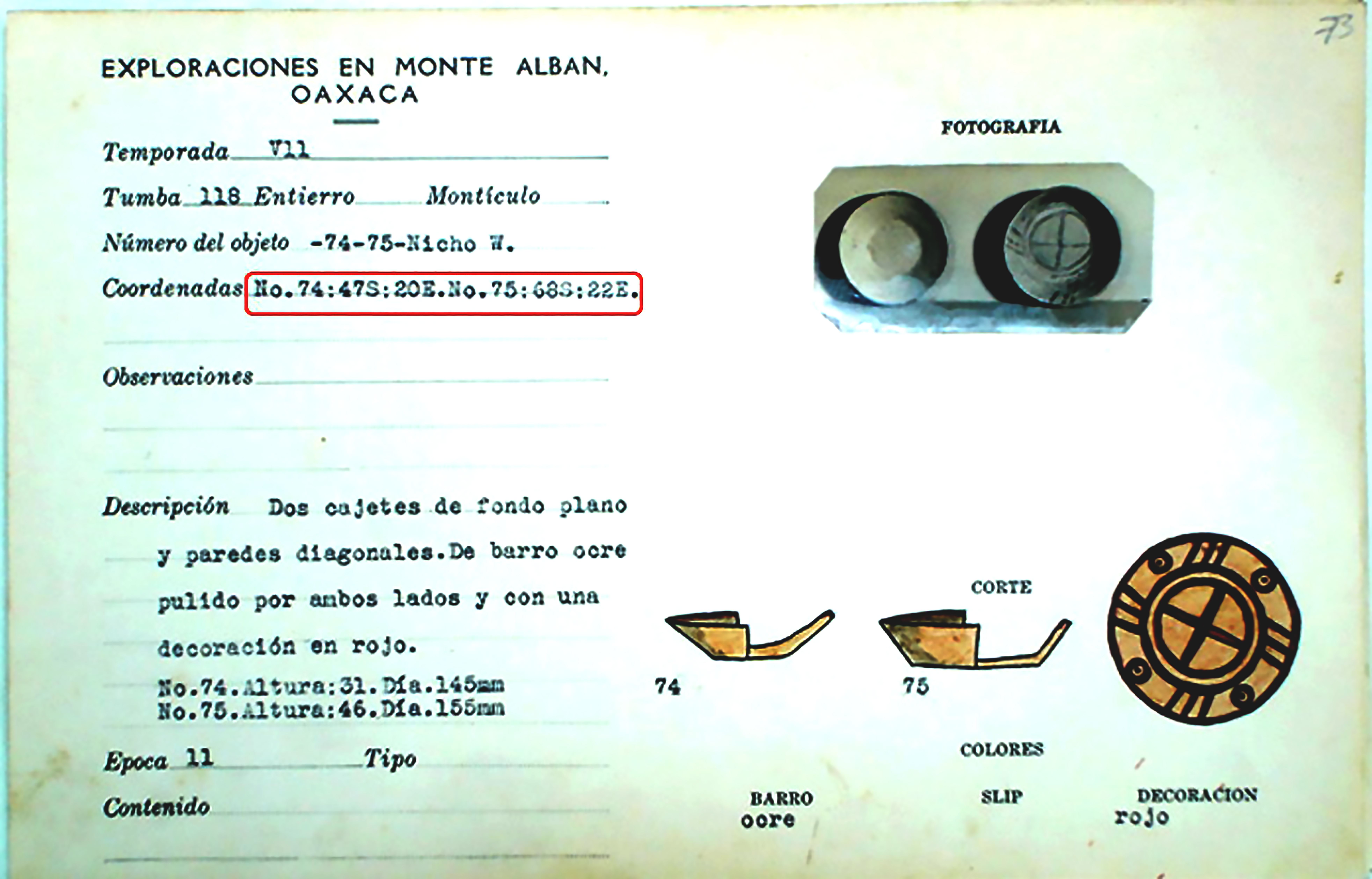
The project that the collaborators undertook grew out of Hoobler’s dissertation research focused on tombs of the site of Monte Albán in Oaxaca, southern Mexico, built by the Zapotec peoples of the area from ca. 500 BCE–850 CE (see Figure 1, and Hoobler 2011 for more information). The tombs had never been fully published by their excavator, the archaeologist Alfonso Caso. During extensive archival research, Hoobler discovered and then digitized a trove of some 8,000 catalogue cards made by Caso and his collaborators in the 1930s and ‘40s. The cards detailed the position of all the objects Caso and his collaborators had excavated from a given tomb in centimeters from the back and side walls of the tomb (see Figure 2). (At the time Caso was working, all objects were removed from the tombs and ultimately sent to the National Museum of Anthropology in Mexico City.) Using these cards, Hoobler created two-dimensional diagrams of the tombs for her dissertation (see Figure 3). At the time when she finished graduate school at Columbia University in the Department of Art History and Archaeology in 2011, the free 3D modeling program Google Sketchup (now Trimble Sketchup) did exist, but there was no training and certainly no mandate for working on software for graduate students in art history at that time.

Fig. 1 – Large open plaza of archaeological site of Monte Albán, pyramid mounds close by and mountains visible in the distance.

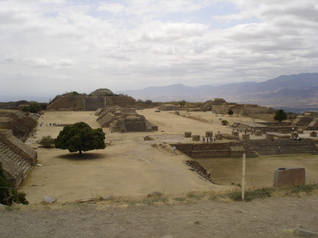
Figure 1: Large open plaza of archaeological site of Monte Albán.


Fig. 2 – Large index card with typed information about an object – photograph of a bowl at top right and a watercolor of the same object below it.

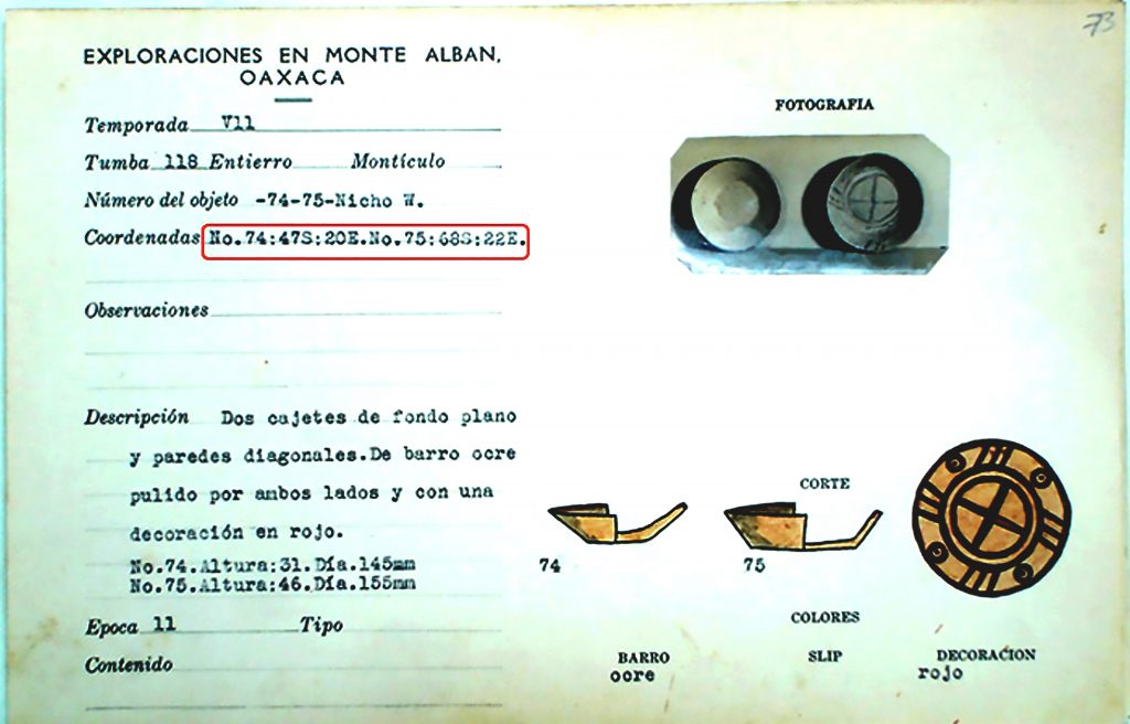
Figure 2: Large index card with typed information about an object.


Fig. 3 – Simplified diagram of floor plan of a tomb with side niches. Numbered dots on plan show location of objects.

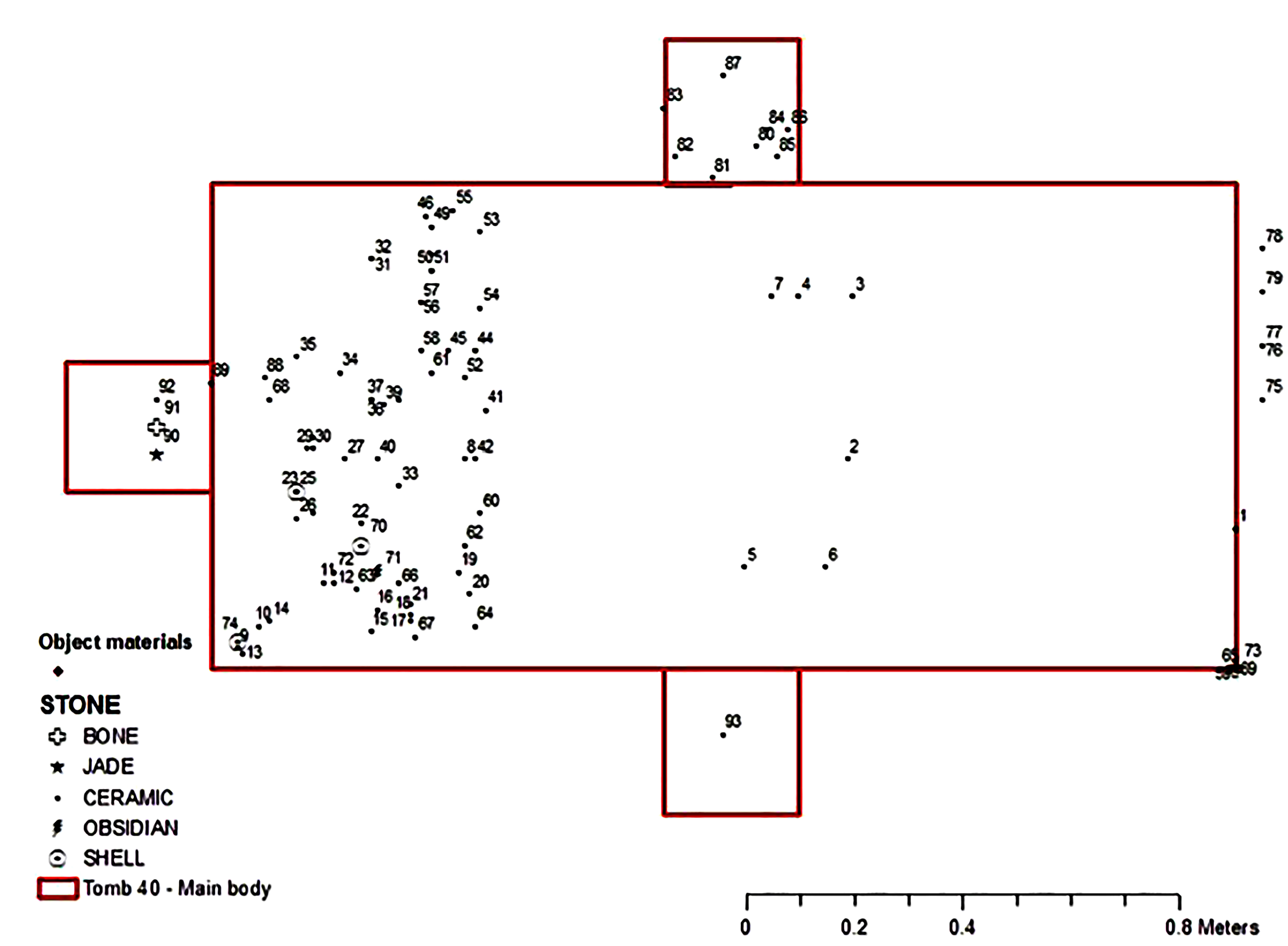
Figure 3: Simplified diagram of floor plan of a tomb with side niches. Numbered dots on plan show location of objects.


In summer 2013, after becoming an Assistant Professor at Cornell College in Iowa, Hoobler attended an NEH Advanced Topics in the Digital Humanities Summer Institute on Humanities Heritage 3D Visualization: Theory and Practice,[4] where she experimented with some of the many tools by then readily available, free or at low-cost, to those interested in 3D modeling. Based on working with the University of Arkansas’s dedicated, well-funded, and well-developed Center for Advanced Spatial Technologies (CAST) lab,[5] Hoobler’s original, perhaps overly ambitious goal for the project was fully product-based: to allow users a phenomenological experience of one of these burial chambers by creating a virtual tomb, including all its contents, with which the user would be able to interact. This goal proved unattainable during the two summers of work because it required computers with much greater computing power than were available on a typical small liberal arts college campus. Furthermore, such a project would have required much greater technological skill on the part of Hoobler and probably thousands of hours of work on the part of the team. Still, a great deal of progress was made. Not only did all participants learn a great deal about working with 3D modeling software (including Maxon Cinema4D), the process was enlightening in regard to the important role that 3D scanning and modeling might play in cultural heritage in the future. From a scholarly standpoint, it was very clear to Hoobler that the process of modeling the tomb and its contents, and virtually placing them, allowed—and even forced—the modeler to engage in the art-historical technique known as close looking in dealing with the objects. Experiencing this process also made apparent many characteristics of the burial chambers that the creation of two-dimensional diagrams had not.

Based on the NEH Summer Institute training, Hoobler sought and received grants from Cornell College and the McElroy Fund/Iowa College Foundation for Ve’Amber Miller and Catherine Quinn to work with her in summer 2014.

Ve’Amber Miller (Cornell College ’15) comments:

“As an Archaeology major—and someone who already had an interest in how to engage technology with the past—there was no hesitation in wanting to join this team. At first it was daunting even as I was going into my final year of undergraduate studies because I did not have experience in 3D modeling, but over the course of our work I found the support from everyone and the story these artifacts told was more than enough to push me through. Being able to place the items that had been recreated back into a virtual tomb made the history even more real; 3D printing those same objects–some that had been destroyed decades ago–so that others could hold them in their hands made it more real for them as well. The most important thing is that I learned from this project, and will only do better in the future so that history becomes an interactive and engaging experience for everyone.”

As of this writing, Miller is working as a Park Guide at the Pullman National Monument in fall 2017. Prior to working in this position, she worked at Weir Farm Historic Site, where she put her skills and experience acquired during this project to use in creating a virtual gallery of art[6] and an ESRI StoryMap based on “Julian Alden Weir’s Student Years in Europe,” using digitized documents and artifacts from Weir Farm’s collection.

Her collaborator that summer, Catherine Quinn, Cornell College ’15, was an art history major who had been interested in technology for years, having gained experience through graphic design courses in high school and customizing a gallery website while interning at the Center on Contemporary Art. Quinn said:

“Working on this project with Dr. Hoobler was exciting for a number of reasons. It was one of the first opportunities I had as an art history major to apply what I had learned in the classroom while contributing to a real world, ongoing, body of research. In addition, I was able to combine multiple fields of interest (art history and technology) while being introduced to others (archaeology), and building extensively on my existing knowledge through hands-on learning. Finally, being able to work on this particular site was especially meaningful due to the fact that we were working with the intention of offering our research to the Community Museum in Oaxaca. As one of my first forays into ‘digital humanities,’ this project has left me inspired by all the ways I see technology providing not only new insight but also accessibility to people, and I foresee it having a beneficial influence on how we curate museum collections, design interactive exhibits, and present research.”

Quinn is currently based in Seattle and applying for graduate programs in digital cultural heritage and related disciplines.

That first summer, predictable challenges ensued. The software had been updated between 2013 and 2014 and many functions had changed. In addition, due to the vicissitudes of funding, the two students were starting at different times, with Miller beginning several weeks after Quinn. Thus, Quinn and Hoobler struggled together with the Maxon software, and Quinn largely trained herself on the finer points of working with it, using tutorials and message boards she found on the Internet. Quinn then trained Miller when she joined the team. (One counterintuitive point about working with students on summer research is that it is much easier to have two or perhaps three students working in collaboration: when there is a question on how to do something, they work through it together, usually showing their professor how to do it once they have figured it out.)

Miller, Quinn, and Hoobler then worked through the challenges of free-hand modeling of objects illustrated in profile on the catalogue cards (see Figures 4 and 5). This was exciting work, since some of the objects shown on the cards were made out of unfired clay or stucco and apparently were destroyed in transit to Mexico City. For this reason, many of the objects documented in the tombs cannot be found in the warehouse of the National Museum of Anthropology and History in Mexico City. Thus, while virtual, these proxies, derived from catalogue cards, are the only place where these objects “exist” in the world.

Fig. 4 – Screengrab showing the Maxon Cinema4D software program with a bowl modeled in the active window.

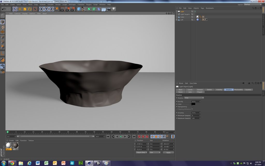
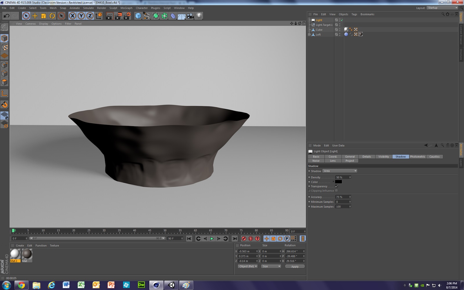
Figure 4: Screengrab showing the Maxon Cinema4D software program with a bowl modeled in the active window.


Fig. 5 – Screengrab showing the Maxon Cinema4D software program with a stone beads modeled in the active window.

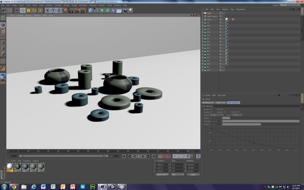
Figure 5: Screengrab showing the Maxon Cinema4D software program with a stone beads modeled in the active window.

While a broader discussion of the theorization of replicas is beyond the scope of this article, two points are worth noting. One is regarding copyright issues. Unlike a project involving modern or contemporary art or creations, the objects found in tombs were created over a thousand years ago and have no clear author whose descendants could be traced to seek permission for the replication. Even if one considers the archaeologist Alfonso Caso who led the team that conducted the excavations as the author of these objects, these were “reactivated” some 70–80 years ago. The National Museum of Anthropology and History might also assert its rights to the objects, since it is their physical repository. However, as per the College Art Association’s Code of Best Practices in Fair Use for the Visual Arts, the modeling of such works would be well within the furthering of “… the teacher’s substantive pedagogical objectives,” as described in Section Two, Teaching About Art (College Art Association 2015, 10).

The second point has to do with the ontological status of the replica. Many scholars have written eloquently about replication, that moment “when ideality and reality touch each other,” as the philosopher Søren Kierkegaard put it (Kierkegaard 1983, 131). Probably the most influential text on this topic is Walter Benjamin’s 1935 essay “The Work of Art in the Age of Mechanical Reproduction.” Benjamin discussed in depth the concept of authenticity in copying works of art, arguing that there is a unique authority to the original that he called its “aura,” which would be dissipated in an age of mechanical reproduction (Benjamin [1935] 1968, 224). However, given the number of visitors to the Louvre yearly, it seems the elusive aura has not withered away, but is never inherent to a copy no matter how perfect its mode of replication. Scholars have generally asserted that the original work of art will not be replaced by digital facsimiles, and in fact these copies may increase the desire to experience the original (Hall 1999, 277; Cuno 2014). The topic of replication will continue to be the subject of debate and discussion in art history. However, the team was working from originals that in many cases were ceramic vessels mass-produced in workshops, minimally decorated and similarly sized and shaped for stacking and transport, and thus fit much more easily within the sphere of “visual culture” than fine art. Therefore, such questions, while fascinating, are less relevant to the argument at hand.

Moving from Process to Product: Manage Your Expectations

During the process of making the models, students and teacher alike were learning many skills. Some of these were art historical. Many art historians have described art history, like many other humanities disciplines, as having a toolkit of methods from which to choose rather than a prescribed set of steps to follow as in the sciences (Long and Schonfeld 2014, 10). In general, art historians’ methods are informed by the kind of research questions they seek to answer, which may vary depending on their project. Three methods used for this project were close looking, library and archival research, and a contextual analysis methodology. Close looking, or viewing and analyzing objects through very close and sustained study is the basis of connoisseurship and authentication as well as formal and iconographic analysis. Even with objects of the type that the team were working with (i.e., bowls and stone objects made by anonymous artisans hundreds of years ago), patterns and insights about them emerge through careful looking. Small wonder then that many art historians also execute their own illustrations, and many seasoned professors encourage their students to draw works in order to commit their contours to memory. The use of 3D modeling demands a similar quality of focused attention to replicating an object or space, although one is now “drawing” with a mouse rather than a pencil. Since the team was working largely from photographs of catalogue cards, it was very important for all concerned that the students were able to see originals of the kinds of objects being modeled, even if not necessarily the exact work, at the Museo de las Culturas de Oaxaca, Santo Domingo, in Oaxaca City during the research period.

In terms of archival research, while there was no time to do additional research since so little of this material has been digitized, students had to dig through several large and unwieldy archaeological publications published in Spanish in the 1950s and ‘60s. This acquainted them with basic but less-discussed principles of archival research such as figuring out which sections of the text were essential to translate versus those that could be skimmed.

Finally, the team was certainly undertaking a contextual analysis of the tombs, trying to understand the original placement (and by extension, use) of the objects in these spaces. All the collaborators discussed how these tombs were in a sense similar to ritual caches excavated and documented by Leonardo López Luján at the Aztec Templo Mayor in Mexico City. There, López Luján has been able to show how the intentional deposition of objects in a specific sequence in different parts of the site was the result of ritual actions undertaken in support of concrete purposes related to propitiation of the gods. Yet, the Zapotec case is less clear, given that tombs were filled some seven centuries or more before the invasion of the Spanish, and deities worshipped in one way in the sixteenth century may have been venerated in an altogether different one centuries earlier. However, reconstructing the tombs and their contents does bring us closer to understanding the lives of ancient peoples that we know comparatively little about.

While the processual byproducts related to art history were quickly realized, the products were not. The original plan was for the objects in the tomb to be modeled in Maxon Cinema4D, the tomb itself would be built in the Unity game engine software, and then, the object models would be imported into the tomb.[7] However, the version of Unity we were working with was not compatible with webGL, becoming difficult to view on most browsers shortly after the model was created, a frustrating but very common experience in digital humanities projects.

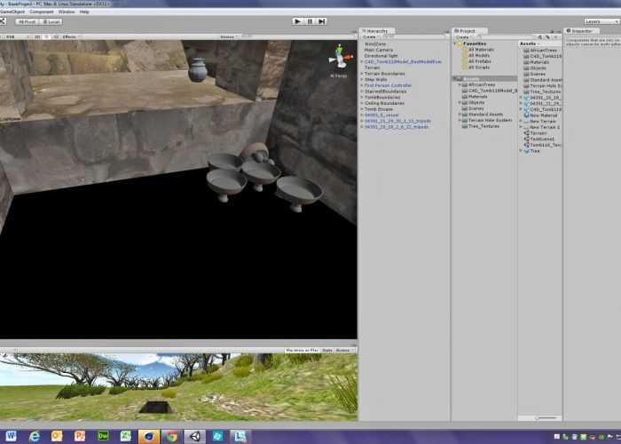
Quinn did in fact create a very satisfactory model of the tomb in Unity, but at this point, more challenges emerged. While the resulting models of the objects in the tombs were excellent, their high resolution meant that there were no on-campus computers that could handle both the tomb model as well as the virtual versions of all the objects in the tomb. Later, in summer 2015, Arturo Hernández modeled objects in the same data-heavy manner, but then realized that the models could be made workable by removing details not obvious to the naked eye. The team determined that it should have more carefully sought out a best practices statement for getting around the issue of large file sizes (see Figure 6 and online gallery[8]). Ultimately, Quinn was able to determine how many objects could be loaded into the model so that the digital reconstruction could be interacted with without crashing the program. Reaching this more process-based objective provided us with a better understanding of how the interior of tombs were illuminated. Unity allows the user to move the sun across the sky, and although previous scholars had insisted that there was almost no illumination in the tombs, and that the Zapotecs would have had to use torches (Martha Carmona Macías 2007, personal communication), the virtual model made it clear that for much of the day there was sufficient light in the tomb for mourners to conduct simple rituals. In the future, a more complete model that takes into account the height of ancient house walls might disprove this idea, but for now, it seems likely that rituals might have started during the day. The Unity model also had the benefit of offering a product, a kind of “proof-of-concept” for the whole project. Even with the thoroughly modern, overall-clad default Figure Unity offers for interacting with the scene (no stock characters fit for ca. 300 CE Mesoamerica, surprisingly!), there was invariably a great deal of interest and admiration for the video of the tomb as modeled in Unity. This shows how important it is to build in some degree a visual aid, particularly in art history.

Fig. 6 – Screengrab showing the Unity game engine, with several panes open – at the top, the interior of a structure, with several vessels visible.

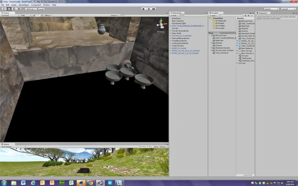
Figure 6: Screengrab showing the Unity game engine, with several panes open.

Miller also completed a section of one of the tombs as a final iteration of the project during an independent study with Hoobler. When she made the original 2D tomb models, Hoobler noted that objects of particular importance were placed in niches in the side and back walls. It was particularly important to try to visualize these privileged spaces, yet the diagrams Hoobler produced in 2011 were extremely crude (see Figure 7). During the summer, Miller and Quinn modeled perhaps the most curious and unusual object that was dealt with, a hardstone “billy club” found in one of the niches of Tomb 118 that is extremely atypical of the tombs. In a later independent study, Miller continued work on shedding light on the niches. In particular, she 3D modeled an entire niche of a different tomb, Tomb 104, which held quite a few of the most elaborately decorated ceramics from the site. Some of these were plates, but others were odd pitcher-like vessels. Miller accomplished a great deal with this, even giving their surfaces the appearance of the painted glyphs that were present on these vessels. Despite the imprecise information on the catalogue cards related to this space, Miller was able to generate decent models for the bone needles likely used for ritual bloodletting that were found in conjunction with the vessels. The much more naturalistic representation of the niche that Miller was able to generate is the product from these projects that is most easily transferable to traditional scholarship about the Zapotec (see Figure 8).

Fig. 7 -- Simplified diagram of floor plan of a tomb with overlaid diagram of niche, several line drawings crudely showing placement of contents.

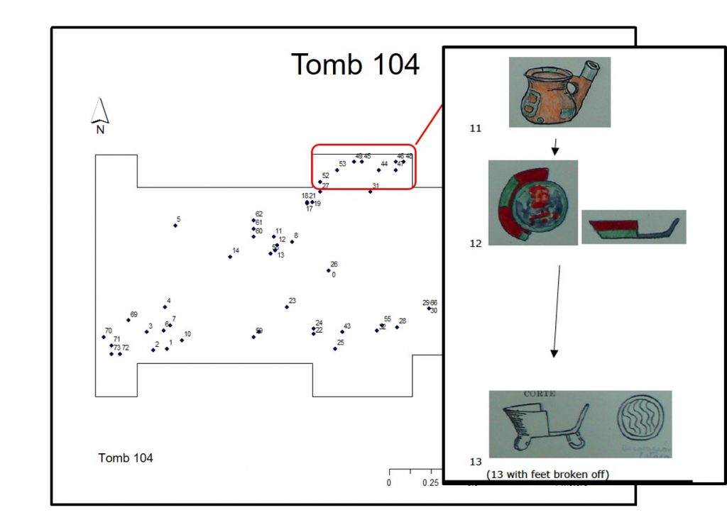
Figure 7: Simplified diagram of floor plan of a tomb with overlaid diagram of niche.


Fig. 8 – Realistic image of a niche within the tomb, showing several vessels inside of it, some brightly painted.

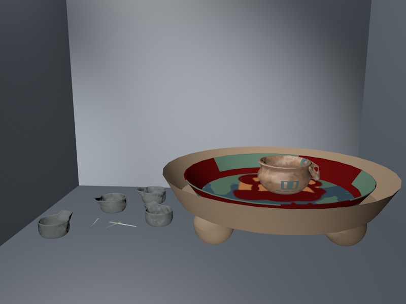
Figure 8: Realistic image of a niche within the tomb, showing several vessels inside of it, some brightly painted.


Both of these examples show how important it is to have realistic ideas and goals of what can be produced in a single summer, particularly by people who are new to working with the software in question. Upon reflection, it is clear that it was unrealistic to expect that the team could model a whole tomb and 30+ objects as well as make such a model interactive and functional. However, even if the original goal to have a highly detailed model containing all the objects from that tomb was not achievable, three significant products were created: models of individual objects; a mimetic model of a portion of a tomb holding iconographically rich materials; and the modeling of an interactive tomb, albeit without many objects in it. Additionally, a tremendous amount was learned with regard to the development of processes that can result in better products in the future (see Figure 9).

Fig. 9 – Screenshot of a video, marked “Before” at lower left, and showing an empty stone chamber.

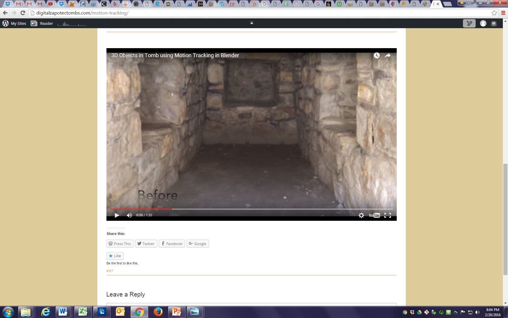
Figure 9: Screenshot of a video, marked “Before” at lower left, and showing an empty stone chamber.

Projects are Iterative–But Preparation Is Crucial

In Summer 2015, Hoobler teamed up with Arturo Hernández, Jr. (Cornell College ’16), a studio art and computer science double major. Arturo commented that:

“I joined the Digital Humanities Zapotec Tomb Project because I was thrilled about learning how to use new pieces of software and hardware; additionally, I wanted to further explore and learn about my culture and heritage. This project and team allowed me to contribute ideas and learn more about the importance of digitizing artifacts.

I woke up always looking forward to creating objects and exploring different techniques during the process, as well as researching different applications. One of the rewarding feelings was seeing results from 3D printing some of the objects and analyzing their past or their functionality.”

Before starting his research with Hoobler, Arturo had taken a computer graphics class where he programmed some tools for a small 3D modeling program. Consequently, going from dealing with back-end to user-end 3D space helped him to see the bigger picture of 3D applications. Since graduation from Cornell, Hernández has continued to be involved in projects related to technology and Latin America. He worked for a year at Abriendo Mentes, a non-profit organization, teaching basic computer skills to rural and underserved populations in Costa Rica. He is currently based in Los Angeles and is getting further computer training and certification to continue in technology, ideally with a focus on international work.

Hernández learned the software extremely quickly. He was able to model asymmetrical and eccentrically shaped pieces very effectively, and ultimately was able to solve one of the most difficult problems of the previous year: the question of how to add multiple objects into a virtual tomb.

This came about partially by chance and completely on Hernández’s own initiative. In summer 2015, the funding for Hoobler and Hernández to work together came through the Cornell Summer Research Institute (CSRI) sponsored by Cornell College, which offered newly formalized ways for students and faculty to collaborate, with students receiving various opportunities to showcase their work to participants from across all departments. In one workshop that included Professor of Physics Derin Sherman, Hernández explained the problem with the models, which could not hold the digital models of vessels and be interacted with, for the file size became unmanageable for any computer on campus. Sherman commented offhand that perhaps Hernández could just use video software to make the concept clear, as Sherman had done to make a particular physics concept more understandable for students. This sparked Hernández’s imagination, and after some research, he found Blender,[9] a free, open-source software that allows for importing models and video and integrating them together in a process known as motion tracking. This can be seen online,[10] or in Figures 10 and 11. However, even though initial use of the Blender software suggested a possible way to work with the tombs, prior planning was still necessary to use this new tool in the most productive way.

Fig. 10 – Screenshot of a video, marked “After” at lower left, showing a stone chamber with small ceramic figures and vessels inside.

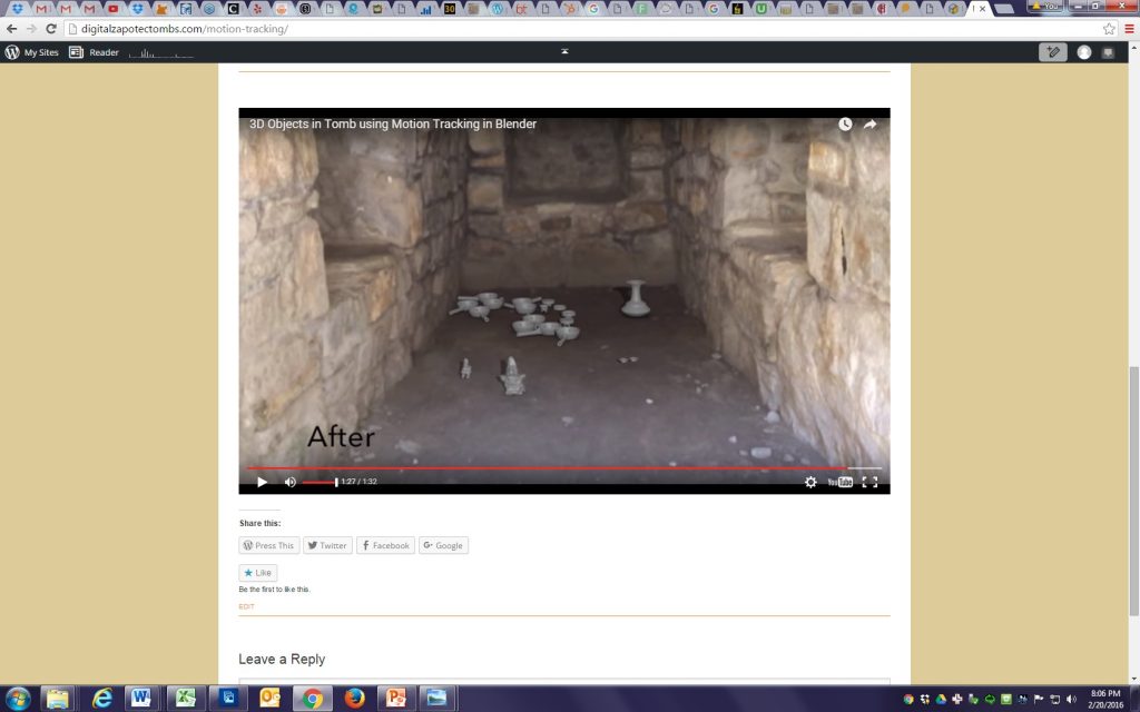
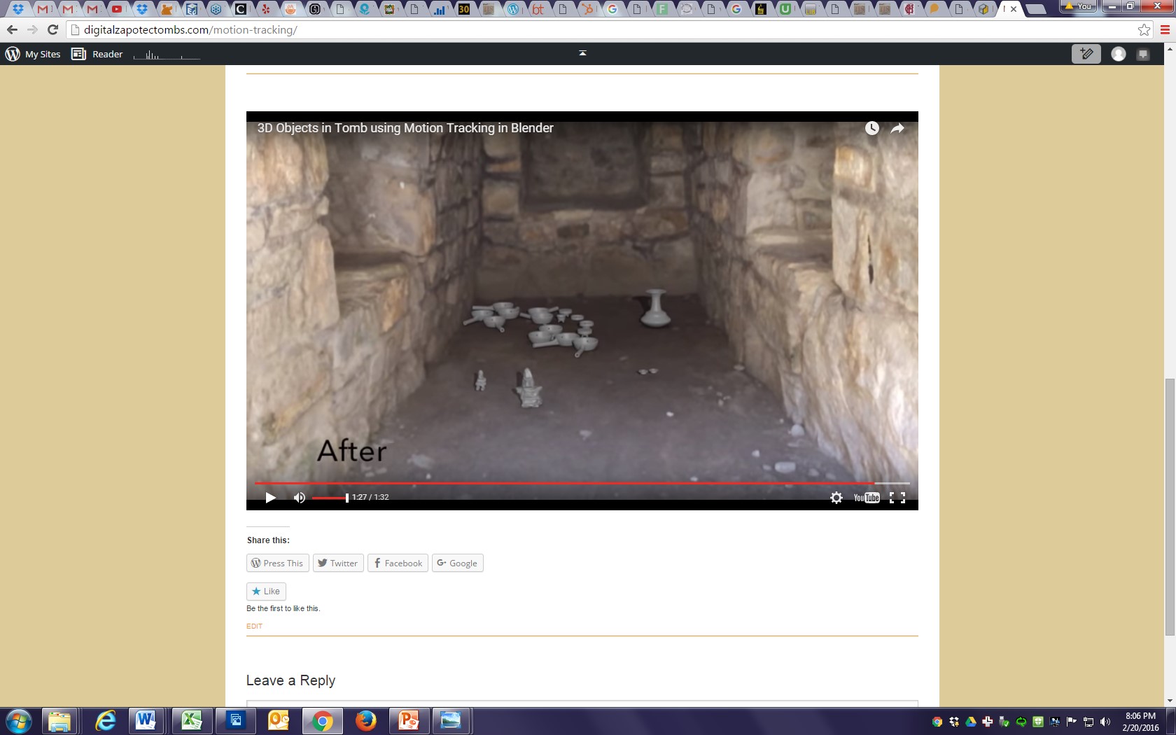
Figure 10: Screenshot of a video, marked “After” at lower left, showing a stone chamber with small ceramic figures and vessels inside.


Fig. 11 – Young man with a camera kneels by a table with several plastic objects on it, taking a photograph of them.

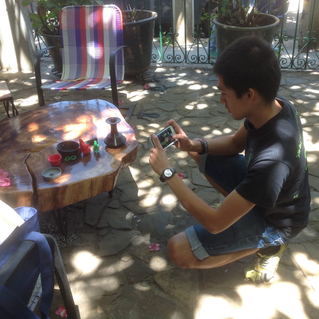
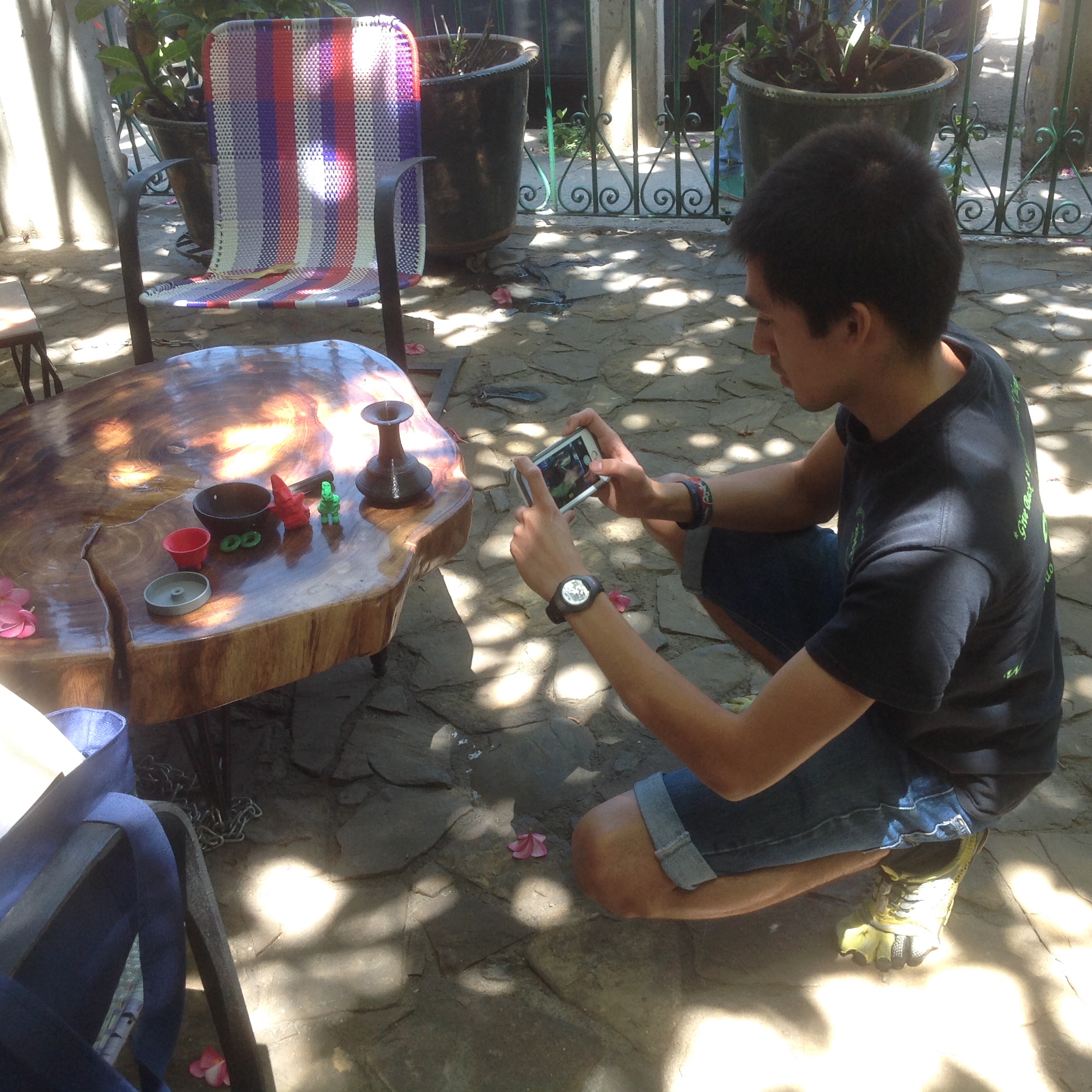
Figure 11: Young man with a camera kneels by a table with several plastic objects on it, taking a photograph of them.

Technology and Community Engagements: 3D Modeling to Printing

It is important to note that the precise limits of the site of Monte Albán were in fact set in the 1930s by several towns surrounding the core of the site, each of which donated some of their communal landholdings to create an archaeological zone. As a result, there is an inherent conflict, even putting aside all national legislation, as to how the artifacts of Monte Albán might be shared simultaneously with all these communities. This includes villages further out from the site’s core, which in ancient times helped to make some of the vessels and other offerings found in the tombs. It is possible, as has been discussed by other scholars, that digital versions of heritage objects might offer the possibility for their sharing by different stakeholders. (This has been discussed in various articles from a 2012 issue of the Journal of Material Culture, particularly Brown and Nicholas 2012 and Newell 2012 as well as Bell et al., Hennessy et al., and the entire 2013 special issue of Museum Anthropology Review titled “After the Return: Digital Repatriation and the Circulation of Indigenous Knowledge.”)

One of the ultimate goals for work on the tombs has been to return, at least virtually, some of the material culture of Oaxaca taken from the state’s small communities after the archaeological excavations of the 1930s. It was during this period that most of the excavated objects were sent to the warehouses of the National Museum of Anthropology and History in Mexico City. As a response to this loss of their local culture, since the 1980s some of the towns have sought to keep this kind of material from leaving their towns by creating local community museums (Hoobler 2006). While efforts to create virtual versions of the community museums had been discussed by the team in summer 2014, it was ultimately not undertaken. However, because Hernández is fully fluent in Spanish and fully bicultural with knowledge of Mexican and even specifically Oaxacan culture, a community engagement component could be added during the 2015 portion of the project.

Interested in testing these possibilities, Hoobler decided that she could make a test case for virtual sharing with one community by working with the Community Museum of the town of San Juan Guelavía close to Oaxaca City. Knowing that a large segment of the town’s population was fluent in Zapotec languages and/or English, (the town has had a large number of migrants to the United States, see Cohen and Browning 2007), Hoobler decided to offer some materials that might help facilitate increased understanding of the ancient ancestors of the Zapotecs. Such materials included coloring sheets with line drawings of actual ancient vessels. Hernández created trilingual Zapotec-Spanish-English game boards for a version of the Lotería game that is similar to Bingo, but with images and words. Hernández also created models for and supervised the 3D printing of replicas of artifacts found in the tombs (see Figures 11 and 12), including some plastic vessels, “ear flares,” ornaments like those made of jadeite found in the tombs fitted with clip earring backs, and an incense burner. This last object was particularly satisfying because when Hernández and Hoobler visited the community museum, they found a case holding actual pre-Columbian objects found in the town. It included the handle for such an incense burner, but the bowl of the burner had been broken off. (See Figure 13 for a contrast between the ancient and modern objects.) This 3D model was an object that young people in the town could actually handle without fear of causing it damage, allowing them to understand better the purpose of a formerly innocuous object in their museum.

Figure 12 - Closer view of the table in figure 11, showing different 3D printed objects, including vessels and small figurines.

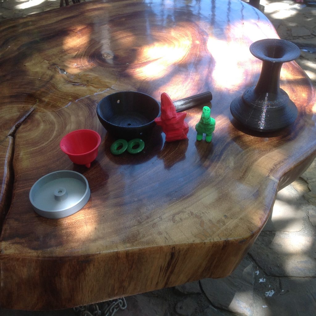
Figure 12: Closer view of the table in figure 11, showing different 3D printed objects, including vessels and small figurines.


Fig. 13 – Photograph of a display case with a glass top, and ceramic fragments inside. Inset with second image, a plastic vessel similar to one of the ones seen inside the case.

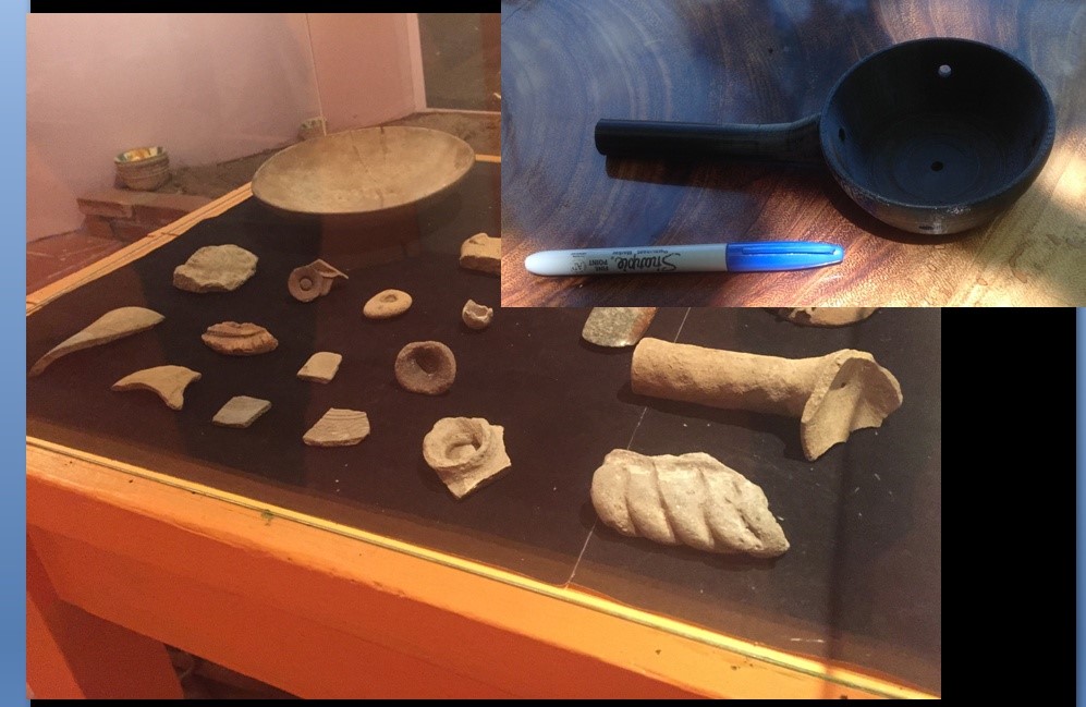
Figure 13: Photograph of a display case with a glass top, and ceramic fragments inside. Inset with second image, a plastic vessel similar to one of the ones seen inside the case.

While this was a gratifying episode, the interaction largely ended there because Hoobler had not undertaken long-term planning for a continuous relationship with the museum. There had been discussion between Hernández and Hoobler at the beginning of the summer about training young people in the community to work with digital 3D modeling themselves, but as it was unclear at that point what the capabilities of the computer at the community museum were, this idea was discarded. However, as Pohawpatchoko et al. (2017) discuss, this would likely be the richest option for receiving useful input regarding the value of reproducing ancient objects for the community. As has happened in past collaborations with indigenous groups, there were “good intentions” on the part of the North American university team but not many actual solutions (La Salle 2010). Community engagement is incredibly rewarding, but can be difficult or feel awkward when not executed within a longstanding relationship. Without an already-established personal relationship with the town and community museum committee, this attempt was limited in its success. However, this experiment provided Hernández with valuable experience working with local communities that he would use in his subsequent work in Costa Rica, a project that did prove to be more successful.

This episode brings up a final point about 3D modeling and its use in art-historical scholarship and teaching. It can be an end unto itself, and as the price of 3D printers becomes more affordable, it can be used in conjunction with 3D printing effectively. This is helpful information in many ways. First, it allows us to rethink traditional methods of studying art. Within art history, primacy has been given to the visual qualities of a work of art, yet sculpture and many objects were very much prized for their tactile qualities as well. Theoretically, 3D modeling and 3D printing would allow students to recapture some of the tactile experience of an object. There may be some exceptions—one being that the tomb modeled by Miller in 2014 was particularly hard to model with digital means since it had asymmetrical walls that curved irregularly; yet those walls also referenced the fingers that had shaped it (see Figure 4). Thus, though it was printed in plastic filament on a CubePro printer and the fine-grained texture was in no way accurate, in general terms even the plastic proxy in some way called attention to the hands that had shaped it. Unfortunately, in practice, many smaller schools are not buying the kind of high-end 3D printers that can print texture similar to that of the original and, at larger universities, there is sometimes a siloing of resources, with the result that “less technological” departments such as art history might not be able to use this sophisticated equipment, whose raw materials are similarly quite costly.

Secondly, 3D modeling and printing gives students a sense of the scale of objects when they are printed at full size. Just as viewers of the Mona Lisa are always surprised by how small the painting is, it is also helpful to understand, in a phenomenological sense, the contents of tombs at a human level. For example, in summer 2015, one of the objects given to the community museum was a “mystery vessel” found in several of the tombs. (See gray object at left of Figure 13.) Its side walls are so low that it is hard to imagine what it could have been used for—it is not an incense burner or other easily recognizable artifact. The hope in giving it to the community museum was that an older member of the community might recognize it, as has happened previously (Lind and Urcid 2010, 276–77). However, because low-end 3D printers are usually only capable of printing objects that can fit within a 10” square, it is nearly impossible to recreate the sense of scale one experiences from a huge pre-Columbian olla jugs. Low-end printers also create plastic objects that are aggressively monochromatic and very toy-like. More sophisticated, expensive printers can generate objects in materials such as ceramic, metal, or paper with very delicate tints mimicking the original object, but lower-end printers create models that look very Lego-like (Figure 13) and can even run the risk of seeming disrespectful when working with cultural heritage objects.

The Importance of Reflection in the Process

Since Hoobler originally conceived of the project as more product-based and was focused on the end result, she had not built in as much time and opportunity as she later would have wanted for self reflection on the part of the students (or herself). This is important on the one hand because it is increasingly clear how metacognition, or reflecting on the process of learning itself, is crucial to learning. Self-reflection is helpful for a number of reasons. First, as Paige Morgan notes, it allows participants to broaden the question of whether a project is “done” beyond a yes/no binary (Morgan 2014). A team can recognize and acknowledge progress even if they do not realize all that they plan to do. Second, progress can be measured in real time, perhaps weekly. Since digital work is new for many professors, they may find that they were optimistic about what the team can accomplish in the time allotted. Third, writing and documentation may help explicitly describe and justify the choices made at different points where available data may not be available.

Interestingly, although self-reflection was not structured as part of the project, all the students sought out the opportunity to reflect on the process and showcase their work. Miller created a website for the project (www.digitalzapotectombs.com) that Hernández added to and Hoobler has maintained. Professors who work with undergraduates on academic projects should provide them with this opportunity, which allows them to keep track of how they arrived at certain solutions, maintain a record of challenges they have surmounted, and chart the progress they have made. A website or other public venue also allows them to have a permanent record of their work, accessible by potential employers or graduate school admissions personnel. In general, professors should build this kind of periodic reflection into the project timeline, perhaps by encouraging blogging. This would allow the students (and the professor) to reflect more effectively on how much progress they were actually able to make in a single summer, semester, independent study period, or over the course of a longer-term project.

Despite not keeping an ongoing record of progress in a blog format, the lessons learned by both the students and the professor throughout the process are evident. Working collaboratively with peers from such diverse fields meant each team member was able to bring their own set of skills and background knowledge to the project, and that others were able to learn from them. By extension, cross-disciplinary relationships were formed with other students and staff on campus as well as at other institutions as they were brought in to consult on various issues. Hernández, Miller, and Quinn were able to take ownership of their contributions to the project, each utilizing their “very particular set of skills,” and working more as collaborators with Professor Hoobler. Hoobler would argue that it was a good and productive experience for the students to see their professor not as the “sage on the stage” but as a coworker, not infallible— sometimes not even the authority on the project. All participants saw first hand how important project management and planning skills are, and yet how one discrete portion of a project can be completed in a relatively short time.

Why Use 3D Modeling in Art History?

To conclude, there are many affordances of 3D modeling for art historians. Current modeling technologies allow for what Johanna Drucker has called digitized, rather than digital art history, the latter being defined as “analytic techniques enabled by computational technology” (Drucker 2013: 7). The use of 3D modeling is the digital equivalent of sketching the objects you are studying—it forces sustained close looking and a quality of focused attention to representing a given object or space. However, it does obligate you to be much more concrete than sketches are in representing your understanding of the physical context of objects and buildings as you think through their placement and surroundings, sometimes including terrain, neighboring structures, etc. This type of modeling is particularly helpful for considering ancient spaces where context is unclear: a 3D environment allows the scholar to reunite fragments that are lost, dispersed, or damaged. When printed, 3D models also afford the user a physical object that gives them the experience of scale and basic tactile qualities, opening up questions of use and function for mystery objects. As technology for 3D printing continues to improve, 3D printing will likely also offer a very close proxy for the object in terms of colors and textures.

However, the pedagogical benefits of 3D modeling projects may actually outweigh these digital “products.” The opportunity for students to form close working relationships with each other and faculty in a setting where their professor is not an infallible authority and they may well have to “teach the teacher” at points is important. In this particular case, students also gained valuable international experience, confronting cultural differences and communication barriers at times. In general, students learn about and then grapple with thorny problems to which there are no easy solutions. It is important that they complete at least one aspect of the project, perhaps a prototype that can act as a future “calling card” for them, and ideally it should be part of a broader process of reflection on the project. Such a “proof of concept” has broader pedagogical value too—the professor can then use it in their classes, discussing how it was made by students, and making such processes feel manageable and “relatable” for other students.

Of course, the main takeaway of this article for professors is to choose incredibly smart, positive, conscientious students who are much better than you are with software as your collaborators and then—just get out of the way. Your students will find ways to take ownership and make the project, or at least parts of it, happen in ways you never expected, but which will teach you about technological (and other) solutions you never dreamed existed.

Acknowledgments

Many thanks are due by the authors to: The Cornell College Summer Research Institute, Cornell College Student-Faculty Research Fund, the RJ McElroy Fund / Iowa College Foundation grant. At Cornell College, we would like to thank Brooke Bergantzel, Instructional Technology Librarian at Cornell College, Amy Gullen, Consulting Librarian for the Sciences and Technology, Christina Penn-Goetsch, Professor of Art History, Joe Dieker, Vice President for Academic Affairs and Dean of the College, Ben Greenstein, Professor of Geology and Associate Dean of the College, and Derin Sherman, Professor of Physics. We would also like to thank the committee of the Museo Comunitario San Juan Guelavía, and particularly Juan Manuel Martínez García.

Ellen Hoobler would also like to thank Mandar Sharad Banavadikar for his patience and understanding during these two summers of work, as well as Angel David Nieves, Ph.D. Associate Professor at Hamilton College for his wise counsel and support during this process.

Bibliography

Bell, Joshua, Kimberly Christen and Mark Turin. 2013. “Introduction: After the Return.” Museum Anthropology Review, special issue “After the Return: Digital Repatriation and the Circulation of Indigenous Knowledge” 77, nos. 1–2: 1–21.

Benjamin, Walter. (1935) 1968. “The Work of Art in the Age of Mechanical Reproduction.” In Illuminations: Essays and Reflections, edited by Hannah Arendt, translated by Harry Zohn, 217–51. New York: Schocken.

Brown, Deidre, and George Nicholas. 2012. “Protecting Indigenous Cultural Property in the Age of Digital Democracy: Institutional and Communal Responses to Canadian First Nations and Māori Heritage Concerns.” Journal of Material Culture 17, no. 3: 307–24.

Cohen, Jeffrey, and Anjali Browning. 2007. “The Decline of a Craft: Basket Making in San Juan Guelavía, Oaxaca.” Human Organization 66, no. 3: 229–39.

College Art Association. 2015. “Code of Best Practices in Fair Use for the Visual Arts.” February 2015. Accessed November 25, 2017. http://www.collegeart.org/pdf/fair-use/best-practices-fair-use-visual-arts.pdf.

Cuno, James. 2014. “Beyond Digitization—New Possibilities in Digital Art History.” The Iris: Behind the Scenes at the Getty (January 29, 2014). Accessed November 1, 2017. http://blogs.getty.edu/iris/beyond-digitization-new-possibilities-in-digital-art-history/.

Drucker, Johanna. 2013. “Is there a ‘Digital’ Art History?” Visual Resources: An International Journal of Documentation 29, nos. 1–2: 5–13.

Hennessy, Kate, Natasha Lyons, Stephen Loring, Charles Arnold, Mervin Joe, Albert Elias, and James Pokiak. 2013. “The Inuvialuit Living History Project: Digital Return as the Forging of Relationships Between Institutions, People, and Data.” Museum Anthropology Review 77, nos. 1–2: 44–73.

Hall, Debbie. 1999. “The Original and the Reproduction: Art in the Age of Digital Technology.” Visual Resources 15, no. 2: 269–78.

Hoobler, Ellen. 2003. “‘To Take Their Heritage In Their Hands’: Indigenous Self-Representation and Decolonization in the Community Museums of Oaxaca, Mexico.” American Indian Quarterly 30, no. 3: 441–60.

———. 2011. “The Limits of Memory: Alfonso Caso and Narratives of Tomb Assemblage from Monte Albán, Oaxaca, Mexico, 500–800 and 1931–49 CE.” PhD diss., Columbia University.

La Salle, Marina J. 2010. “Community Collaboration and Other Good Intentions.” Archaeologies 6, no. 3: 401–22.

Lind, Michael, and Javier Urcid. 2010. The Lords of Lambityeco Political Evolution in the Valley of Oaxaca During the Xoo Phase. Boulder, Co.: University Press of Colorado.

Long, Matthew P., and Roger C. Schonfeld. 2014. “Preparing for the Future of Research Services for Art History: Recommendations from the Ithaka S R Report.” Art Documentation: Journal of the Art Libraries Society of North America 33, no. 2: 192–205. doi:10.1086/678316.

Morgan, Paige. 2014. “How to Get a Digital Humanities Project Off the Ground” (June 5, 2014). Accessed November 1, 2017. http://www.paigemorgan.net/how-to-get-a-digital-humanities-project-off-the-ground/.

Nagata, Wayne, Hera Ngata-Gibson and Amiria Salmond. 2012. “Te Ataakura: Digital Taona and Cultural Innovation.” Journal of Material Culture 17, no. 3: 229–44.

Newell, Jenny. 2012. “Old Objects, New Media: Historical Collections, Digitization and Affect.” Journal of Material Culture 17, no. 3: 287–306.

Pohawpatchko, Calvin, Chip Colwell, Jami Powell and Jerry Lassos. 2017. “Developing a Native Digital Voice: Technology and Inclusivity in Museums.” Museum Anthropology 40, no. 1: 52–64.

Snyder, Lisa M. 2012. “Virtual Reality for Humanities Scholarship.” New Technologies in Medieval and Renaissance Studies 3: 396.

About the Authors

Since February 2017, Ellen Hoobler is the William B. Ziff, Jr. Associate Curator of the Art of the Americas at the Walters Art Museum in Baltimore, MD. Prior to becoming a curator, she was from 2012–2017 an Assistant Professor of Art History at Cornell College in Mount Vernon, IA. A specialist in art of ancient Oaxaca, she is interested in the possibilities of digital technologies to further understanding of ancient cultures and cultural heritage monuments. She can be reached by email at emh2104@gmail.com.

Catherine Quinn graduated from Cornell College in 2015 with honors in Art History. A native of Seattle, she currently works in corporate America while serving as a docent for the Seattle Art Museum’s SAMbassador program, where she enjoys interacting with visitors, discussing art, and keeping her art history skills sharp. She is planning to attend graduate school in fall 2018 to continue learning about digital humanities, with the goal of pursuing a career in digital humanities and cultural heritage. Catherine can be reached by email for comments or questions at Catherine.j.quinn@gmail.com.

Ve’Amber Miller graduated from Cornell College in 2015 with a degree in both Archaeology and English and Creative Writing. As of early 2018, she works as a Park Guide at Pullman National Monument, and enjoys telling history through tours and educational outreach programs of a historic neighborhood in Chicago, IL. She is hoping to attend graduate school in fall 2018 to learn more about how technology and cultural institutions are part of the future of public history. To know more about Ve’Amber and her qualifications, please visit her LinkedIn profile at: https://www.linkedin.com/in/ve-amber- miller-b37b2255/

Arturo Hernández, Jr. is a freelance designer, technologist, and visual artist living in Los Angeles. He graduated from Cornell College in 2016 with majors in Computer Science and Studio Art, and was from 2016–2017 a teacher with the non-profit organization Abriendo Mentes in Costa Rica. There, he taught basic technology skills to rural Costa Ricans. For comments and opportunities, Arturo can be reached via his website: http://www.arturohernandezjr.com/. Samples of his technology work related to this project can be seen at https://github.com/ahernandez16/Monte-Alban-Zapotec-Tombs.

Single folio from Codex Zouche-Nuttall showing Lord 8 Deer Jaguar Claw
6

Doing Digital Art History in a Pre-Columbian Art Survey Class: Creating an Omeka Exhibition Around the Mixtec Codex Zouche-Nuttall

Abstract

This article describes the development of an Omeka student project in a Pre-Columbian art history survey class that also acquaints students with digital art history (DAH). The course incorporates daily activities intended to help students create a collaborative Omeka exhibition focused on the Mixtec Codex Zouche-Nuttall (CZN). These activities, which include annotating images, creating metadata for images, discussions of image copyrights and fair use, sourcing images, and assessing online resources, introduce some of the important tools, skills, and methodologies of DAH to students largely unfamiliar with the digital humanities. They also prepare students to create an Omeka exhibition framed around the CZN and comparative images. Both the classroom activities and Omeka project help students to think about digital visual culture, non-linear storytelling, and public art history as well as the opportunities afforded by DAH to shape new narratives about the history of art in the ancient Americas.

Many in the humanities—whether they consider themselves digital humanists or not—employ digital technology to engage students within and outside the classroom. One of my colleagues in the English Program at Pepperdine University, where I teach, asks students to create a blog to share reading responses, but considers herself “tech-averse.” She simply uses the blogging platform because she feels it appeals to students who are more familiar with digital environments. Another English colleague asks students to use WordSmith (a textual analysis program that examines word patterns and frequency) to analyze primary source documents located in our Special Collections as part of a process of producing a website on George Pepperdine’s writings; she considers her pedagogical approach as one that bridges machine learning with humanistic inquiry. These two approaches represent a general spectrum of digitally mindful pedagogy, from the digitally inflected to the digitally centered; in this essay, I am more interested in the latter. A vast literature exists on how such digitally centered pedagogy can benefit (or not) students in English, History, Classics, Philosophy, and Information Literacy/Library Studies (or some combination thereof) by helping them to ask discipline-specific questions using digital tools. For instance, Chris Johanson and Elaine Sullivan (2015) have discussed creating a class focused on digital cultural mapping as a way to “develop students’ critical thinking skills and visual sophistication” (123). T. Mills Kelly’s Teaching History in the Digital Age (2013) considers how digital tools and methods encourage students to “produce either new knowledge about the past, or old knowledge presented in new ways.” Kelly also offers guidance and narratives intended to promote reflection on how historians can use digital media in the classroom to “create active learning opportunities.” In other words, he makes suggestions about how historians can embrace digitally inflected technologies to create new methods of historical inquiry (“Introduction”; see also Iantorno 2014, and the various essays within the issue; Mourer 2017; Silva 2016).

Discussions of digitally inflected or digitally centered art history pedagogy are more recent, as are attempts to define digital art history (DAH) and its unique practices.[1] However, a steadily growing literature attests to the interest in such pedagogical strategies, such as the use of data visualization to explore artists’ relationships to one another to reveal gender bias within the field (Ross 2013). What is DAH pedagogy? This question is at the heart of recent discussions, among them an insightful Smarthistory.org blog entry by Beth Harris and Steven Zucker (founders of Smarthistory) titled “Where is the pedagogy in digital art history?” (2017).[2] Noting that articles focused on DAH pedagogy are often valued less than those focused on research (e.g., Fletcher 2015), they argue that DAH can be used in the classroom and beyond “to ask new questions, model new collaborative working methods, embrace new methodologies, and gain new skills.”[3] Among their recommendations: inform students about the importance of speaking to a broad, public audience; teach them about copyrights, licensing, and fair use; collaborate; and open up the classroom and teaching strategies. In a similar vein, Art Historians Interested in Pedagogy and Technology organized a panel at the 2016 College Art Association meeting that addressed how new technologies have potentially transformed the art history classroom, moving beyond the now deeply ingrained digitized slide lecture. At a time when the Scholarship of Teaching and Learning (SoTL) has become a topic of greater interest among art historians, in part due to the rapid changes in technology that have impacted learning as well as the looming threats to the humanities at large, considerations of pedagogy and DAH seem apt and timely (e.g., Spivey and McGarry 2016).[4]

What these discussions reveal is that DAH pedagogy builds on the broader applications and investigations of DH pedagogy yet differs in several key ways. For instance, DAH pedagogy stresses how visual culture (or “art”) is uniquely suited to ask different types of questions from written texts, revealed in processes like how we create data about imagery that cannot be tagged or annotated using the same methods or tools as that produced for alphabetic texts. Art historians (and our students) are also positioned to think critically about digital visuality and analyze how digital visual environments encode ideas. Discussions about “visuality and the digital,” or simply digital visuality, form an important cornerstone within these considerations about DAH pedagogy. The Nordic Network for Digital Visuality defines digital visuality as “the production and consumption of digitally mediated expressions of selfhood and society through visual and audio-visual interfaces (images, photos, video, TV, etc.).” With all these discussions in mind, how then can we explore digital visuality with students in the art history survey classroom?

This essay describes the development of a joint DAH and Pre-Columbian art survey class that will run in Fall 2017.[5] Specifically, through the semester-long activities and Omeka course project students complete to explore digital visuality, I discuss how DAH can transform the practice of traditional art history and the production of knowledge in this digital age. At Pepperdine, a new digital humanities minor was approved for Fall 2017. One of the first classes to be offered as an elective is my Pre-Columbian art history class, an ambitious survey that explores some of the cultures of what is today Latin America prior to the arrival of Europeans [for an overview, see Appendix A]. Most students enter with little to no background in the subject matter, so it functions as a general survey course. I have taught this class for many years (not at Pepperdine), but never as one that also introduces students specifically to DAH. Knowing that it fulfills the digital humanities minor elective means I have had the opportunity to reconceptualize the class to both introduce some DAH methods and tools and focus on pre-Columbian art and history. What does DAH look like in the survey classroom? More specifically, how do I introduce the methodologies and tools of DAH to undergraduates of all levels in an art history survey class, or even what do I choose to introduce within a single semester? How do I reconfigure a class I typically teach in a slide-style lecture format to incorporate DAH as I have done with some of my other art history classes?

In my Renaissance and Spanish Colonial art history classes, I have found that an effective way of introducing students to some core DAH methods and tools is asking them to produce an Omeka exhibition. The creation of this type of project relates to broader issues in art history and digital humanities, including classifications or labels, digital versus print sources, reading and interpreting images, access, collaboration, and visuality.[6] It also introduces students to “digitization, organization, presentation, exhibition, [and] metadata creation,” as Jeffrey McClurken (2010) notes in his article on teaching with Omeka. Omeka is a content management system (CMS) available on the web that allows users to curate digital archives and exhibitions, providing students with opportunities to think like a curator or archivist. I prefer Omeka to other CMSs, such as Drupal, because it allows my class to create both an archive of items and a narrative exhibition even if students have no programming skills. In addition, I agree with teachinghistory.org regarding Omeka’s potential to help students gain certain skills transferable to many careers (Roy Rosenzweig Center 2010–2018). In some of the classes in which I have introduced Omeka (or something similar to it), students often felt unease with a DAH project rather than the traditional research paper of approximately 8–10 pages. This unease largely stemmed from their unfamiliarity with using Omeka and presenting art-historical arguments in a non-linear fashion, but it also sometimes resulted from my own missteps: not introducing Omeka early enough in the semester, forming ineffective teams, or not scaffolding activities to help them understand how and why Omeka is an important manner in which to present knowledge.[7]

Learning from these earlier experiences, I decided that in my Pre-Columbian art survey class, students would work in teams to create an Omeka exhibition centered on the Codex Zouche-Nuttall (CZN), a Mixtec (or Ñudzavui) codex dating to ca. 1450 that partly relates to the epic narrative of the hero Lord 8 Deer “Jaguar Claw” (Figure 1). While the specific content of this codex is largely unfamiliar to students, it generally appeals to them because it focuses on genealogical history and an epic hero story—concepts that are familiar in relation to other cultures and eras. Each student will choose one folio from the CZN related to Lord 8 Deer to complete an individual component of the project before choosing a larger theme around which to frame their chosen folios within their teams. Teams will decide on the theme that each member will explore using his or her folio and compare it to a few additional images and objects to expand on the thematic focus. For instance, a team might explore pigments used to color the CZN or how women are depicted. Teams will write a collaborative introduction to their exhibition, but will also write individual pages as part of the exhibition that elaborate on the theme with their chosen folio. The goal of the class is to introduce students to important DAH ideas, skills, and methods such as creating clear metadata, annotating digital images, evaluating digital art history projects, and understanding what content management systems can do. This must be accomplished early in the semester so that they will use this knowledge to construct the Omeka CZN exhibition, creating repeated opportunities “to ask new questions, model new collaborative working methods, embrace new methodologies, and gain new skills,” as Harris and Zucker (2015) urge.

Codex Zouche-Nuttall Open
Figure 1. Codex Zouche-Nuttall (source: Michel Wal, GFDL, via Wikimedia Commons).

In earlier iterations of this class, to develop students’ visual literacy skills and historical knowledge, I often assigned students a local museum object from Mesoamerica or the Andes around which they developed a project. The first component of this more traditional project was a formal analysis paper (approximately 2–3 pages) that asked students to study the object in person and analyze its composition, lines, color, texture, and shapes. They then researched a broader topic (such as gender, mythology, or rulership) with this object as their primary focus. Until I became more interested in DAH as a scholar and teacher in 2013, these assignments were the cornerstones of my classroom. Since early 2014, I have continued to transform my pedagogy and course assignments for several of my classes, but have not yet had the opportunity to do so for my Pre-Columbian course. Given my success with creating Omeka exhibitions in other classes—although none that fulfilled any major or minor requirement in DH—I will make this project and the requisite skills and tools needed to construct it a key thread for my new pre-Columbian art course. While I am replacing the traditional formal analysis/research paper model, the Omeka project still asks students to look closely at images and to interpret them asking new types of questions.

In my experience, students are often intrigued but overwhelmed learning about Mesoamerican pictorial codices, including the CZN. The very idea that the codex has no written text, only visual imagery to tell a story, can present a real challenge, as can the non-linear visual storytelling. Apart from the Maya, Mesoamerican peoples did not have fully developed writing systems akin to our own system of writing. However, complex forms of visual writing are found throughout Mesoamerican history. The Mixtec are but one group who produced complex pictographic codices that relayed genealogies and dynastic histories, calendrical information, or ritualistic details.[8] By their very nature, the codices are read differently than a book with written text, and anyone unfamiliar with the visual signs or pictographic symbols will find these codices challenging and possibly impenetrable. This is also true when the manner (or style) in which the imagery appears is unfamiliar to most students. They have to develop new visual literacy skills and become more familiar with Mesoamerican sign systems to decode what they see. Feedback from student evaluations and in-class discussions suggests that students enjoy learning about Mixtec codices because once they know how to read them they recognize how similar they are to more contemporary visual storytelling modes, such as comic books.

DAH—and Omeka in particular—provides a new way of engaging with the CZN that allows my class to broach a variety of topics: collaboration, writing without words in Mesoamerica, storytelling within the codex and in digital formats, metadata and classification, and engaging with a public audience (not just the professor). It also presents an opportunity for students to think in a non-linear fashion about how to present their ideas, arguments, and evidence using a CMS like Omeka, in the process becoming more aware of DAH and digital visuality in general. The non-linear construction of Omeka also mimics, to some degree, the non-linear pictorial writing of the CZN.

Introducing DAH in a Pre-Columbian Art History Survey Class

Before describing the Omeka project in greater detail, I will outline some of the activities students will complete during class time to introduce them to DAH methods and tools—those that they will need to complete their project. Because some students will take other DH classes to fulfill the minor requirement, I want this class to highlight what makes DAH potentially different from DH. I have selected a few methods and tools that build on one another and allow students to learn about pre-Columbian art and DAH simultaneously. They include image analysis and annotation, locating and analyzing online resources, creating metadata, collaboration, understanding fair use and image copyright permissions, and finding ways to engage with a broader audience (“public art history”). All of these tools and methods we will initially explore together in class, either with me introducing them or as a team activity related to the day’s material. The opportunity to use the classroom as a lab for experimentation permits students to gain some level of mastery over the skills and tools they will be expected to use in their final Omeka project.

Collaboration will be stressed from the beginning of the semester. On the first day of class students will be arranged into permanent teams; to hold them accountable to their team, students will provide peer evaluations at the midterm and end of the semester, both of which factor into their final grade.[9] All students at Pepperdine have access to Google Apps, providing an easy way for teams to collaborate and organize their assignments and research. Each team will create a folder in Google Drive that is accessible to all of the team members and me. Any assignment they complete as an individual or team will be located here. To familiarize students with the collaborative writing process, I will also ask them to create a document in their folder labeled “lecture notes” that the team can use simultaneously during lecture to produce one set of cohesive notes to help them review material. For students unfamiliar with this process, it can be disorienting, so we will brainstorm ways to organize the notes or divide the work fairly between team members. I have used crowd-sourced lecture notes in my large lecture humanities class (200+ students) with great success, and I imagine similar success in this smaller class of 20. Also on day one, a collaborative icebreaker activity will act as an entry point to the topic of pre-Columbian art and its significance as a field of study. Each team will complete a poll/scavenger hunt that includes locating a definition and map of Mesoamerica and an image of the Maya calendar, tagging a few images that I provide and listing associations they have with certain terms, including “Aztec,” “Inka,” “Moche,” and “Pre-Columbian.” This activity will allow teams to bond while adjusting to working collaboratively as well as raise important issues about perceptions or misperceptions of pre-Columbian cultures, art, and history.

On the second day of class (or during the first full lecture), each student will receive the same black-and-white photocopied image showing the Aztec ritual of human sacrifice in the early colonial Codex Magliabechiano (fol. 70) (Figure 2). They will be asked to annotate it (with a pen) in any manner they see fit, using information from the previous night’s reading (e.g., Boone 1980, 1–5; Taube 1993, 18–30) about the validity of using early colonial ethno-historical manuscripts and codices to understand pre-Columbian cultures.[10] Having done this exercise in the past, I know that student-generated annotations range from pure formal description (e.g., a heart, a person, a knife) to cultural biases about Aztec sacrifice (e.g., murderous peoples, bloodlust). After students share and describe their annotations, we will discuss what these annotations exclude—in other words, how does the very act of annotating an image potentially skew an individual’s engagement with what is displayed?

Cropped image of Aztec Heart Sacrifice on temple platform from sixteenth-century Codex Magliabechiano 70r
Figure 2. Folio 70r of the Codex Magliabechiano, 16th century. [Public domain], via Wikimedia Commons.

The same image will then be displayed on the screen using Thinglink, a tool that allows digital annotation (or tagging) of images. My annotated Codex Magliabechiano image will include links to other sources, maps, and videos to demonstrate for students the possibilities afforded by this manner of framing images. Students are asked to compare this manner of annotating images with the paper version they completed. This activity motivates students to look closely as well as think about how annotations affect our reception and interpretation of images on paper or in the digital environment. It also allows us to address the issue of the physical context of the image, cropped and disassociated from the manuscript’s other images and text—in other words, the process of decontextualization that occurs when images are printed in books or placed on the web. This is especially important to consider in the digital environment, and the ways in which we can work to provide better contextualization.

Students are often unprepared or unfamiliar with how to assess digital resources, which is a crucial skill as more students turn to information online. In a following lecture, each team will assess information online about a topic with which they now have some familiarity: Aztec human sacrifice. The sources include webpages like Wikipedia’s entry and Aztec-history.com. Each team will receive a rubric [Appendix B] to use in assessing the resource. The critical reading activity opens a conversation about how we know what we know about Aztec sacrificial rituals—a topic that receives a disproportionate amount of attention in the past and present, not all of it valuable or accurate. Assessing digital resources permits students to think about knowledge and information, digital sources, and digital narratives (visual and textual). It also raises the importance of accountability, especially when publishing material accessible to the general public via a web search. This activity prepares students for the research they will complete about the CZN, and for which they will be asked to draw on print and digital sources.

Introducing students to metadata early in the semester is important because for their Omeka project they will need to input metadata for each item as it relates to the Dublin Core (used by Omeka). Initial conversations with students about metadata often reveal their unfamiliarity with the concept, even if in practice they do know something about it. In a few class periods, we consider metadata specifically: What is it? How is it created? How is it used? Why does it matter?[11] “A Gentle Introduction to Metadata” by Jeff Good (2002) serves as the launching point for our discussion about creating metadata for objects and images versus written texts. Students today are familiar with tagging, especially on social media, which serves as a useful starting point for creating metadata. After our initial discussion, and during a lecture on Aztec art, I will project for students the famous Coyolxauhqui monolith and ask them to create metadata, specifically as it relates to the Dublin Core. They will complete this activity in a team Google Doc so they can see the metadata generated by other students—and how this might differ greatly from their own choices. Time pending, I will also introduce students to the Getty’s Cultural Objects Name Authority® Online, or CONA (still in development), which provides metadata about visual culture specifically. In other classes where I have used Omeka, one of the biggest hurdles for students has been learning the language of Dublin Core. My intention with this assignment is to introduce it before students even begin to interact with Omeka so they develop familiarity with metadata and how to create it.

For the Omeka site, students will also need to locate images that have a Creative Commons license or are not protected by certain copyrights. To prepare them for this need, in a lecture about the Aztecs, students will complete a team scavenger hunt, an activity adapted from the 2014 DAH institute “Rebuilding the Portfolio.”[12] The scavenger hunt includes finding three copyright-free images from the Templo Mayor, finding an object from the Templo Mayor in a U.S. museum, locating a high quality image of an object associated with the Templo Mayor, and sourcing a video about some aspect of the Aztecs that seems accurate. This activity provides a low-stakes opportunity for them to think about where to find images or multimedia content for their Omeka exhibition. It also begins a longer conversation about who owns images and objects, why copyrights exist, and the need to identify how best to use copyrighted materials. Students will be introduced, for instance, to the College Art Association’s “Code of Best Practices in Fair Use for the Visual Arts.” Students rarely consider fair use or image copyrights, but it is important information for them to have in our digital era.

While none of these activities focuses on the CZN or Omeka specifically, each one introduces students to key aspects of the project from the class’s beginning. Scaffolding these low-stakes activities helps students digest new tools and skills before learning about Omeka and the CZN in more detail. My goal is to help students feel more confident about using Omeka because they will recognize the similarities with earlier activities completed during class. They will also understand that experimenting with a new tool or skill does not always mean mastery of it, and that struggling or even “failing” is an important part of the learning experience.

The Codex Zouche-Nuttall Project

Up to this point, students have not engaged explicitly with the Codex Zouche-Nutall. Over the next several lectures, they will have the opportunity to use DAH methods and tools in relation to Mixtec codices, helping them begin to think about their project in greater detail. Prior to the first class on Mixtec codices, students will receive a folio from the CZN (e.g., Figure 3) that they will narrate in written form and read to the class. Students will certainly have some creative readings because they have no deep familiarity with the CZN. This activity is intended to spark their visual interest in the CZN and to demonstrate the complexity of putting pictographic writing into words. It is a basic activity that embodies the post-structuralist notion of the incommensurability of language and images (or even vision), summed up by the philosopher-historian Michel Foucault (1973, 9): “the relation of language to painting is an infinite relation. It is not that words are imperfect, or that, when confronted by the visible, they prove insuperably inadequate. Neither can be reduced to the other’s terms: it is in vain that we say what we see; what we see never resides in what we say.”

Once students have shared their written narratives, we will discuss how to “read” and understand the complex imagery in the CZN. A main resource is John Pohl’s detailed discussion of the CZN available on FAMSI, or the Foundation for the Advancement of Mesoamerican Studies Institute. With the folio projected on the screen, students will begin to read day and year signs, place signs, the people displayed, specific gestures, and other visual signs after engaging with some of these resources. I will also provide them with another annotated image on Thinglink for future reference (in addition to a Google Doc that includes useful information). Students will then break into their teams and browse through the CZN to select their individual folios and begin brainstorming the team theme for their Omeka project. They will record their ideas on a Google Doc as well as paste images of their chosen folios into the same document for the team’s easy reference. At this point, they will begin to conduct research on the CZN, and more specifically their chosen theme. A librarian will visit one class to discuss available resources on campus and beyond (e.g., Interlibrary Loan, online resources, databases, local resources like UCLA and the Getty) as well as to discuss information literacy more broadly.

Single folio from Codex Zouche-Nuttall showing Lord 8 Deer Jaguar Claw
Figure 3. Codex Zouche-Nuttall folio. By Anonymous (British Museum) [Public domain], via Wikimedia Commons.

An entire day is devoted to a tour and overview of Omeka, with us working through two posts from The Programming Historian (“Up and running with Omeka.net” [Posner 2016] and “Creating an Omeka Exhibit” [Posner and Brett 2016]). After introducing them to Omeka specifically, they will have the opportunity to upload their chosen folio as an item. At this point, students are aware that Omeka uses the Dublin Core metadata element for its records. Earlier class conversations and activities about metadata will help students recognize how Omeka is structured to create an item. Students will be prompted to add their chosen folio from the CZN to Omeka as an item, allowing them to practice inputting metadata using Dublin Core. Omeka also allows for specific Item Type Metadata, adding files (like images), and tags. Adding this one item is the first step on Omeka toward completing their larger team exhibition.

Paired with the earlier exercises, the creation of the Omeka items encourages students to think further about how images and objects are categorized, including the potential challenges and problems that arise in the process of categorization. This issue of categorization is one I often wrestle with in teaching and practicing art history, and one that many of my courses and research address. In my Renaissance art class, for instance, we often return to the question of what falls under the category of “Renaissance” and why. What chronological or geographical boundaries do we use to describe something as “Renaissance art”? Does a sixteenth-century colonial Mexican featherwork modeled on a Flemish print belong to the Renaissance? What stylistic label(s) do we use to describe something as “Renaissance,” and is it even important that we do so? Why is an Italian maniera artist like Bernardo Bitti, who moved to colonial Peru, often excluded from discussions of the reach of the Italian Renaissance outside of those focused on colonial Latin America? Inputting this one folio image from the CZN into Omeka, students are further exposed to the challenges that art historians face, and the subjectivity that arises when ascribing labels to artworks—or anything for that matter. This stage of the project not only helps students to look more closely at one single folio but also presses them to think about the potential impact digital resources can have on our understanding of a single image.

Students will be given the freedom to explore their team theme in any way they see fit, provided they locate comparative images and complete documented research to support their ideas. Once teams have developed a thematic focus for their larger exhibition, each individual student will decide how to analyze their chosen folio with this theme in mind. Students will be asked to find comparative images, objects, or architecture that connects to their folio and theme. For instance, one team might decide to focus on places depicted in the CZN, with each individual team member then focusing on a place depicted in a single folio. One student might realize the images associated with Tilantongo (Ñuu Tnoo) appear similar to architectural frieze remains of Mitla that we discussed. She could decide to include a photograph of the palace of Mitla as an item to Omeka and develop this comparison in her individual exhibition page. Another student in the same team might have an interest in topography of the Oaxaca region of Mexico and find photographs of some of the large, prominent hills (like Black Hill, or Yucu Tnoo) that are sometimes associated with specific places in the CZN. Yet another student might show interest in mapping, deciding to compare the representation of places in a specific folio of the CZN with another Mesoamerican codex that shows the same place or perhaps a different manner of mapping geography. This comparative component asks students to place the imagery and narrative of the CZN in a broader context, thereby making connections to other material discussed in class.

The exhibition is where teams will be able to offer more analytic discussions and ideas about specific items, guiding anyone who visits the site through a curated narrative. Teams will write an introduction (approximately 250–400 words) about their theme in a Google Doc initially before adding it to their exhibition’s first page. In other words, this introduction helps to connect each of their individual items and pages that expand on the items. For their individual pages (approximately 800–1200 words, including notes), the narrative is both textual and visual, pairing their CZN folio with their comparative images as well as the student’s research on and interpretation of the theme. Each student will be asked to link to an annotated Thinglink image of their chosen folio. In addition, similar to the earlier Templo Mayor scavenger hunt, students will need to locate high quality images in the public domain for their comparative images. A specific Google Doc in their team folder will include this information, and any necessary links, to ensure they are working with images that can be publicly posted on their Omeka site.

The ultimate goal is to produce a dynamic exhibition that emphasizes the complexity of the pictorial narrative in the CZN and its relationship to broader visual and material realms in Mesoamerica. Moreover, the final product is intended to demonstrate for students how users can successfully navigate through a non-linear narrative about the CZN—not unlike the process of “reading” the CZN itself. Unlike the traditional research paper, this project encourages students to think about creating an argument both visually and textually in a digital environment. They will have to consider how navigating their narrative online via a screen is different from reading a typed paper, and the different creative and analytic choices that are involved in this form of knowledge production.[13]

The Impact of DAH on the Practice of Art History In and Out of the Classroom

Ideally, each team will create beautiful, well-thought-out, detailed exhibitions. In my experience, however, having students create Omeka exhibitions can be messy, complicated, and frustrating for them. This is because the assignment not only requires them to use a new platform with which they are unfamiliar but also demands that they see the responsibility placed on them: the metadata they create, including tags, affects how people find their images or even understand them. Similarly, the exhibition they create—the images they select, how they interpret them, what they choose to include or exclude, how they discuss their research for a public audience—forms a new narrative similar to other digital resources they are familiar with navigating, but about which they may never have thought about critically.

Yet here is the catch: I see the messy or less cohesive Omeka exhibition as a success, provided students recognize the complexity of digital visuality, information available on the web, and the responsibility they have interpreting the CZN on a public CMS like Omeka. There is inherent value in making mistakes or recognizing where there is need for improvement. If students become anxious that there are errors in information on the website, then we can discuss how we can alter or address them (now or in a future semester). This process also highlights the ongoing nature of historical research, that it is not some finite, clear, linear “thing” that exists in a vacuum—in other words, the process highlights the notion that history is produced, not simply recovered. Furthermore, students learn that the classification systems used by art historians are not objective, and they often find this idea illuminating yet unsettling. It disrupts what they are often taught earlier in their education, but I believe that this process of slow dismantling of preconceived notions is useful, thoughtful, and integral to their development as thinkers. Finally, showcasing student work in a public digital environment demonstrates to the students the responsibility we have as historians to share our research and ideas with people in general, not just other academics.

The Omeka projects I have assigned (and will assign) also provide students with other important skills and ideas, most notably collaborating with peers, being able to communicate with a wide audience, and thinking about how digital images tell stories, all of which are important within any work environment today. As with all collaborative projects, some individuals will find the process frustrating, associating it with the dreaded “group work.” Yet if conflicts arise, they will be coached on how to resolve them in a professional manner, a useful skill on the job market as well. They will also quickly grasp how collaboration allows for a richer, more complex, expansive project that would be impossible to plan and construct as a lone individual—in other words, the potential of crowd-sourcing data and interpretations to revolutionize knowledge production. Even in more traditional art history classes that do not use DAH tools or methodologies, students can use the skills and approaches they have developed to engage with visual culture more deeply. Lastly, students will recognize the power of digital images to construct new narratives and to alter perceptions depending on how this imagery is framed. In the digital world in which we live, students spend a great deal of their time on various social media platforms and encounter digital images in increasingly high numbers. Yet they do not often spend time reflecting on the constructed nature of these digital visual environments. I hope that they will leave the class realizing the significant impact the digital can have on the practice of art history using non-traditional methods and tools, and on the very ways we produce visual and textual knowledge.

Notes

[1] Digital art history, like the broader digital humanities, is challenging to define. Recent attempts by Johanna Drucker (2013), Pamela Fletcher (2015), Murtha Baca and Anne Helmreich (2017), Diana Zorich (2012), and others highlight what a thorny term it is. Fletcher notes that “Defining digital art history and its relationship to the larger fields of digital humanities and art history is . . . a collaborative work in progress.” I prefer to keep the term as broad as possible, so perhaps it is summed up as the use of new media technologies and computational methods to study and practice art history. For more on what DAH is or how we might define it, see Baca and Helmreich’s special issue on DAH for Visual Resources (2013) as well as Drucker, Helmreich, Matthew Lincoln, and Francesca Rose’s essay on DAH and the American scene (2017).

[2] Smarthistory offers a dynamic resource for students, scholars, and the general public to learn about the history of art. I disclose here that I am a board member, content editor, and author for Smarthistory.

[3] Fletcher, for instance, offers an insightful overview of digital art history research methods and practices, but does not discuss the SoTL or pedagogy (2015). There are also clearer methods of evaluating digital scholarship, but little has been published or discussed about methods of evaluating digital art history pedagogy. For the former, see Fisher 2016. For more on pedagogy and the digital humanities more generally, see Brier 2012.

[4] Art History Teaching Resources (AHTR) is an example of greater interest in art history pedagogy resources, with the AHTR weekly journal sometimes addressing specifically digital art history pedagogy concerns. Art History Pedagogy and Practice (AHPP) is affiliated with AHTR.

[5] This essay was written prior to the Fall 2017 semester.

[6] Omeka has three main categories to curate: items, collections, and exhibitions. Items are created and then arranged into collections. Exhibitions are formed around items paired with text and possibly even other visualizations (such as maps).

[7] For a wonderful essay discussing some of the challenges of using Omeka in the classroom, see Allred 2017. For more on students’ possible resistance to new technologies introduced in the classroom, see Keramidas 2012.

[8] For more on the Codex Zouche-Nuttall, see Williams 2013 and the general introduction and tutorial resources on mesolore.org.

[9] This strategy is one related to Team-Based Learning (TBL). See Ball and Kilroy-Ewbank 2014; and Kilroy-Ewbank 2014.

[10] Students will also read short excerpts from several of these ethno-historic sources during class.

[11] For a thoughtful discussion of the importance of introducing students to why metadata matters, see Colburn 2017.

[12] I was a participant of this institute, hosted by the Roy Rosenzweig Center for History and New Media and sponsored by the Getty Foundation.

[13] For more on pedagogy, exhibitions, digital media, and interactive design, see Keramidas and Sharratt 2013.

Bibliography

Allred, Jeffrey. 2017. “A Professor Goes Overboard with Omeka and DH Box.” Journal of Interactive Technology and Pedagogy, Teaching Fails, March 13. Accessed May 2, 2017. https://jitp.commons.gc.cuny.edu/a-professor-goes-overboard-with-omeka-and-dh-box/.

Baca, Murtha, and Anne Helmreich. 2013. “Introduction.” Visual Resources 29, nos. 1–2 (March–June): 1–4.

———. 2017. “Introducing Three Digital Art History Case Studies.” The Getty Iris, February 15. http://blogs.getty.edu/iris/dah_baca_helmreich/.

Ball, Jennifer, and Lauren Kilroy-Ewbank. 2014. “Team-based Learning for Art Historians.” Art History Teaching Resources. Accessed April 17, 2017. http://arthistoryteachingresources.org/2014/04/team-based-learning-for-art-historians/.

Boone, Elizabeth. 1980. “How Efficient Are Early Colonial Manuscripts as Iconographic Tools?” Research Center for the Arts Review 2: 1–5.

Brier, Stephen. 2012. “Where’s the Pedagogy? The Role of Teaching and Learning in the Digital Humanities.” Debates in the Digital Humanities. Accessed April 18, 2017. http://dhdebates.gc.cuny.edu/debates/text/8.

Colburn, Alston. 2016. “Spreading Awareness of Digital Preservation and Copyright via Omeka-based Projects.” Journal of Interactive Technology and Pedagogy, Assignments, March 28. Accessed April 29, 2017. https://jitp.commons.gc.cuny.edu/spreading-awareness-of-digital-preservation-and-copyright-via-omeka-based-projects/.

Drucker, Johanna. 2013. “Is There a ‘Digital’ Art History?” Visual Resources, special issue on Digital Art History, edited by Murtha Baca and Anne Helmreich, 29, nos. 1–2 (Spring): 5–13.

Drucker, Johanna, Anne Helmreich, Matthew Lincoln, and Francesca Rose. 2015. “Digital Art History: The American Scene.” Perspective 2, December 7. Accessed October 18, 2017. http://perspective.revues.org/6021.

Fisher, Michelle Millar. 2016. “Case Studies and Examples for Evaluating Digital Scholarship.” CAA News Today, February 23. Accessed April 30, 2017. http://www.collegeart.org/news/2016/02/23/case-studies-and-examples-for-evaluating-digital-scholarship/.

Fletcher, Pamela. 2015. “Reflections on Digital Art History.” caa.reviews, June 18. Accessed April 15, 2017. doi: 10.3202/caa.reviews/2015/73.

Foucault, Michel. 1973. The Order of Things: An Archaeology of Human Sciences. New York: Vintage. OCLC 234203336.

Good, Jeff. 2002. “A Gentle Introduction to Metadata.” Accessed April 17, 2017. http://linguistics.berkeley.edu/~jcgood/bifocal/GentleMetadata.html.

Harris, Beth, and Steven Zucker. 2015. “Where is the pedagogy in digital art history?” Smarthistory Blog, July 13. Accessed 20 April 2017. https://smarthistoryblog.org/2015/07/13/where-is-the-pedagogy-in-digital-art-history/.

Iantorno, Luke A. 2014. “Introducing Digital Humanities Pedagogy.” CEA Critic 76, no. 2 (July): 140–146. https://doi.org/10.1353/cea.2014.0015.

Johanson, Chris, and Elaine Sullivan, with Janice Reiff, Diane Favro, Todd Presner, and Willeke Wendrich. 2012. “Teaching Digital Humanities through Digital Cultural Mapping.” In Digital Humanities Pedagogy: Practices, Principles and Politics, edited by Brett D. Hirsch, 121–150. Open Books Publishers. https://www.openbookpublishers.com/reader/161#page/1/mode/2up.

Kelly, T. Mills. 2013. Teaching History in the Digital Age, Digital Humanities Series. Ann Arbor, MI: University of Michigan Press. http://dx.doi.org/10.3998/dh.12146032.0001.001.

Keramidas, Kimon. 2012. “WikiFAIL: Students and the Orthodoxy of Practice in the Classroom.” The Journal of Interactive Technology and Pedagogy, Teaching Fails, May 7. Accessed May 2, 2017. https://jitp.commons.gc.cuny.edu/wikifail-students-and-the-orthodoxy-of-practice-in-the-classroom/.

Keramidas, Kimon, and Nicola Sharratt. 2013. “Weaving Stories Between the Material, Immaterial and Ephemeral: Designing Digital Interactives for Socially Complex Objects in an exhibition Setting.” Mediacommons, The New Everyday, September 29. Accessed May 5, 2017. http://mediacommons.futureofthebook.org/tne/pieces/weaving-stories-between-material-immaterial-and-ephemeral

Kilroy-Ewbank, Lauren. 2014. “Team-Based Learning in Art History: Pros and Cons.” lkilroyewbank.com. Accessed April 17, 2017. http://lkilroyewbank.org/lke-blog/team-based-learning-in-art-history-pros-and-cons/.

McClurken, Jeffrey W. 2010. “Teaching with Omeka.” Chronicle of Higher Education, August 9. Accessed April 20, 2017. http://www.chronicle.com/blogs/profhacker/teaching-with-omeka/26078.

Mourer, Marissa. 2017. “A Subject Librarian’s Pedagogical Path in the Digital Humanities.” College and Undergraduate Libraries: 1–15. http://dx.doi.org/10.1080/10691316.2017.1336506.

Nordic Network for Digital Visuality (NNDV). [2014?] Accessed April 17, 2017. https://www.nordforsk.org/en/programmes-and-projects/projects/nordic-network-for-digital-visuality-nndv.

Posner, Miriam. 2016. “Up and Running with Omeka.net.” The Programming Historian. February 17. Last modified August 6, 2017. https://programminghistorian.org/lessons/up-and-running-with-omeka.

Posner, Miriam and Megan R. Brett. 2016. “Creating an Omeka Exhibit.” The Programming Historian. February 24. Last modified May 25, 2017. https://programminghistorian.org/lessons/creating-an-omeka-exhibit.

Ross, Nancy. 2013. “Teaching Twentieth Century Art History with Gender and Data Visualizations.” The Journal of Interactive Technology and Pedagogy, Issue 4, December. Accessed October 12, 2017. https://jitp.commons.gc.cuny.edu/teaching-twentieth-century-art-history-with-gender-and-data-visualizations/.

Roy Rosenzweig Center for History and New Media. [2017?] “Omeka.” Accessed April 17, 2017. http://teachinghistory.org/digital-classroom/tech-for-teachers/25115.

Silva, Andie. 2016. “Digital Literacies and Visual Rhetoric: Scaffolding a Meme-Based Assignment Sequence for Introductory Composition Classes.” The Journal of Interactive Technology and Pedagogy, Assignments, December 19. Accessed October 10, 2017. https://jitp.commons.gc.cuny.edu/digital-literacies-and-visual-rhetoric-scaffolding-a-meme-based-assignment-sequence-for-introductory-composition-classes/.

Spivey, Virginia B., and Renee McGarry. 2016. “Editor’s Introduction: Advancing SoTL-AH.” Art History Pedagogy and Practice 1, no. 1. Accessed February 28, 2017. http://academicworks.cuny.edu/ahpp/vol1/iss1/1.

Taube, Karl. 1993. Aztec and Maya Myths. Austin: University of Texas Press. OCLC 693779222.

Williams, Robert Lloyd. 2013. The Complete Codex Zouche-Nuttall: Mixtec Lineage Histories and Political Biographies. Linda Schele Series in Maya and Pre-Columbian Studies. Austin: University of Texas Press. OCLC 811591352.

Zorich, Diane M. 2012. “Transitioning to a Digital World: Art History, Its Research Centers, and Digital Scholarship.” A Report to The Samuel H. Kress Foundation and The Roy Rosenzweig Center for History and New Media, George Mason University. May. http://www.kressfoundation.org/research/transitioning_to_a_digital_world/.

Appendix A: Brief Overview of Pre-Columbian Survey for Fall 2017

The idea to teach the class like an archaeological dig (in other words, backwards, beginning with the cultures we know most about that are closest to us in time) was borrowed and adapted from Dr. Cecelia F. Klein, Professor Emerita of Pre-Columbian Art History at UCLA.


Basic class info: The class meets for 110 minutes twice a week. It is capped at 20 students. There is no designated computer lab for the class, so students will bring their own laptops to complete activities.


Week 1: Introduction, General Cultural Overviews, the Spanish Conquests and the Problems with Using Mesoamerican Ethno-historical (Early Colonial) Sources

Activities:

  • Formation of Teams and Google Drive folders
  • Introduction to Crowdsourcing
  • Icebreaker/scavenger hunt activity on Pre-Columbian Art
  • Aztec human sacrifice annotation activity
  • Introduction of Thinglink


Week 2: Origins of the Aztecs and Their Capital City, Tenochtitlan

Activities:

  • Evaluation of online sources (example: websites on Aztec human sacrifice)


Week 3: The Aztec Templo Mayor and Imperial Ideologies

Activities:

  • Introduction to Metadata
  • Creating metadata for the Coyolxauhqui monolith
  • Templo Mayor scavenger hunt and discussion of copyrights and fair use


Week 4: The Post-Classic International Style and the Epiclassic; introduction to Omeka; trip to the Getty Center to View “Golden Kingdoms: Luxury and Legacy in the Ancient Americas,” on view 16 Sep 2017–28 January 2018.

Activities:

  • Introduction to the Codex Zouche-Nuttall
  • Introduction to Omeka
  • Creating metadata for single folio of the CZN


Week 5: Teotihuacan; Maya Divine Kingship

Activities:

  • Teotihuacan scavenger hunt and second discussion of copyrights and fair use
  • Thinglink Image Annotation exercise with Stela 16 at Tikal


Week 6: Maya Courtly Arts; the Olmecs

Activities:

  • Creating metadata for a Maya painted vessel
  • Creating of crowd-sourced study guide


Week 7: Midterm; Problems with Using Andean Ethno-historical (early colonial) Sources

Activities:


Week 8: Origins of the Inka and Their Capital City, Cusco; Inka Stonework and Textiles

Activities:

  • Thinglink Image Annotation exercise with Inka Textile/Stonework
  • Librarian Visits Classroom


Week 9: Tiwanaku and Chimu; the Moche; Trip to LACMA to view Ancient Americas Collection

Activities:

  • Scavenger Hunt at LACMA
  • Project Planning/Creation


Week 10: Moche Cont.; Paracas and Nazca.

Activities:

  • Creating metadata for a Moche portrait vessel
  • Revisiting Omeka in the Classroom


Week 11: Chavín; Indigenous Peoples After the Spanish Conquests

Activities:

  • Project Planning/Creation
  • Revisiting Omeka in the Classroom


Week 12: Pre-Columbian Cultures in Modern Times

Activities:

  • Creating of crowd-sourced study guide


Week 13: Work on Omeka Project

Activities:

  • Work on Omeka Project in class with team and individually


Week 14: Presentations

Activities:

  • Team and individual presentations

Appendix B. Rubric for Assessing the Usefulness and Validity of Online Sources


Dr. L. Kilroy-Ewbank


Adapted from several online sources, including http://library.unk.edu/assistance/rubric.pdf; http://libguides.snhu.edu/c.php?g=92303&p=2104295.
3 2 1
What is the purpose of the site? To inform and educate its audience. Bias free. To persuade the audience to think a certain way. Reveals a bias. To sell a product or idea for the author’s personal gain.
Who is the author? Author’s name is easy to locate. Author is clearly an authority on the subject (i.e. his or her credentials are sufficient). Author’s name is there, but s/he may or may not be an authority on the subject. Unclear credentials. Unknown author.
What organization is it affiliated with (if any)? A well-known respectable organization (e.g., NEH) is clearly identified as a sponsor of the site. Sponsoring organization identifiable, but its association or reputation with topic is questionable/unclear. No sponsoring organization identified.
Who is the intended audience of the site? Clearly scholars or experts in a specific field (e.g., pre-Columbian archaeology, Renaissance art history). Appears to be the general public, ranging from experts to novices. Unclear who the intended audience is.
Is the website factual? Many facts provided. Website free from opinions or bias. Appears to be factual, but the author’s opinions are frequently revealed. Seems potentially propagandistic. Facts are questionable, based mostly on the author’s opinions. Explicitly propagandistic.
Is the evidence clearly cited, and drawn from a variety of sources? Are captions provided for images, with source information? Evidence is clearly cited, and draws from both primary and secondary sources (or a mixture of relevant sources). Clear where most information came from. The sources are from credible places (reputable journals, libraries, digital platforms). Direct links to original information/sources. Images are captioned, with their source identifiable. Evidence is somewhat clear, and the author draws from variety of sources. The sources seem to be from credible places, but it is not entirely clear. Does not provide direct links to original information/sources. Images have captions, but it is not clear what their source is. Evidence is unclear, and the sources are unclear, if cited at all. No explanation or identification of the sources of evidence. Images have no clear captions of sources.
How would you describe the writing style and organization of the site? Written with clarity and simplicity. Organized effectively. Uses professional language. No advertisements. Written mostly with clarity and simplicity. Organization is effective in most areas. 1-2 advertisements. Writing style is embarrassing, with many errors. Many typos. Haphazard organization. Lots of advertisements.
When was it created? Is it current? Date of creation included.

Current Event: updated within the last month.

Historical Topic: updated within the last year.

Date of creation maybe included.

Current Event: updated 1–6 months ago.

Historical Topic: updated 1–2 years ago.

No date is shown or information is outdated.

Current Event: more than 6 months old.

Historical Topic: more than 2 years old.

Score:

21–24 pts: Excellent source for your project. 16–20 pts: Good source for your project, but might need further verification with other sources (in print). 11–15 pts: OK source that could help you generate ideas, but not good enough to cite for your project or to use as a reputable source. 0–10 pts: Questionable source, do not use for your project.

First and foremost, I would like to thank my students over the years who have offered valuable feedback on either my Pre-Columbian art history class or my use of and experimentation with digital art history tools and methods. Special thanks are also offered to Jennifer Smith, Kristen Chiem, Lisa Boutin, and Elena Fitzpatrick Sifford, all of whom read and commented on drafts of this article.

About the Author

Lauren G. Kilroy-Ewbank is an Associate Professor of Art History at Pepperdine University. She teaches a wide range of subjects, including Pre-Columbian, Latin American, Medieval, Early Modern, and Native American art history. Her research focuses on devotional imagery and portraiture in the Spanish Americas, digital art history pedagogy, and successful strategies for teaching large-lecture courses. She is also a contributing editor for Mesoamerican, Spanish Colonial, and Native American art and board member for Smarthistory.org.

One Day This Kid… is an image of the artist as a young boy is surrounded by text. The prose is a moving and poignant description of the oblique feeling of difference he felt as an innocent child coming to terms with how the world perceives homosexuals and him. The feeling of otherness is quickly transformed into discrimination, fear, and violence.
0

Digital Developments in the 2010s for an Art History Student and David Wojnarowicz

Abstract

This article is both a personal response to and review of the digital resources created by Fales Library and Special Collection, New York University (NYU), for the David Wojnarowicz Papers, MSS.092 during the 2010s. It discusses the digitization of Wojnarowicz’s journals and the David Wojnarowicz Knowledge Base, which is the first digital resource to come out of the Artist Archives Initiative at New York University. The author details his experience learning to use new technologies to undertake art-historical research as an undergraduate and graduate student as well as his relationship to the artist’s work. He concludes that although the David Wojnarowicz Knowledge Base is an excellent resource for research and a model for digital art history, nothing can replace primary research in an artist’s archive.

Seven years ago, while reading the powerful and beautiful memoir Close to the Knives, I saw the author’s name pop up in the news. I was not sure how to pronounce it, but I definitely recognized it: Wojnarowicz. I was familiar only with his written work at the time, but I knew enough to understand the issues at play in the headlines accruing with each new Google News search: controversy, censorship, religion. Little did I know when I decided that this would be the topic of my senior seminar research in art history as an undergraduate that this was an echo of the Culture Wars twenty-some years earlier.

David Wojnarowicz (1954–1992) was a man of many talents. In addition to being a writer, Wojnarowicz was a visual artist, filmmaker, and musician who was active in New York City’s Lower East Side during the 1980s (McCormick 1984, 18–19). With the AIDS crisis escalating in the city, and many of his own friends, loved ones, and peers falling ill and dying, Wojnarowicz received his own diagnosis in spring of 1988, just six months after losing his friend and mentor Peter Hujar (Carr 2012, 391). After seeing his lover suffer from the disease—and ultimately die of AIDS-related complications—Wojnarowicz began exploring the pains and anxieties tied to loss and his own diagnosis through his art. He eventually stated, “Everything I made, I made for Peter” (Carr 2012, 179). The last few years of his life, Wojnarowicz was able to synthesize aspects of his private and public life to produce some of the most poignant work of his career amidst the Culture Wars. Before Wojnarowicz died of AIDS-related complications in 1992, he was challenged by a number of conservative groups that attempted to silence or distort his voice and art. I learned all of this as I followed the events unfolding in 2010 surrounding the removal of Wojnarowicz’s video A Fire in My Belly (1986–87) from the Smithsonian National Portrait Gallery exhibition HIDE/SEEK: Difference and Desire in American Portraiture and read more on the artist himself.[1]

The process of researching and writing for this undergraduate capstone project was unlike any other academic work I had done previously. Instead of going to the library and checking out books and searching JSTOR as I had learned to do, I was Googling different keyword combinations and reading online comment sections. In some ways it felt very rudimentary, yet that was where the story was unfolding. I have since returned to these resources and looked at Twitter posts starting on November 30, 2010 containing the name “Wojnarowicz.” I knew that these events would later be looked at by art historians, cultural theorists, and politicians since the controversies that developed around Wojnarowicz’s work in 1989 and 1990 were touchstones for his career and the Culture Wars during the AIDS crisis.[2]

Yet one can glean only so much from mass media outlets, the blogosphere, and social media during a time of social and cultural upheaval. Knowing that I wanted to learn more about Wojnarowicz’s work and life beyond the published materials available and the shouting match of publicized controversies, I decided to head to New York City. Leaving my quiet, rural, liberal arts bubble, I found myself in Manhattan for the first time trying to navigate Chelsea in order to find an exhibition called Spirituality: Works by David Wojnarowicz, 1979-1990 at P∙P∙O∙W Gallery, which manages the David Wojnarowicz Estate. For me, this exhibition was a revelation and an affirmation that I was on the correct path with my research and writing. I was able to speak with a few people at the opening who had known the artist, experienced the world he lived in, and survived. These scattered conversations were glimpses into the past as well as an insight into the worldview of artists from the period. Everything I had been reading online hinted at the depth of Wojnarowicz’s work but failed to explore it fully before moving on to important but tangential issues. Moreover, from talking to people at the opening, I sensed the chaos of the 1980s in New York City and realized how poignant and concise Wojnarowicz’s work was back then—and remains today.

I lingered in New York for a few days attempting to soak up the atmosphere of the city that had helped shape who Wojnarowicz was. Eventually, I stumbled into the Whitney Museum of American Art and encountered Untitled (One Day, This Kid…) (1990). This powerful self-portrait depicts Wojnarowicz as a child surrounded by text describing difference, discrimination, fear, and the violence directed toward the young homosexual boy. Leaving the city, I returned to school full of passion to finish my project. Unbeknownst to me at the time, Fales Library and Special Collections at NYU held The David Wojnarowicz Papers, an unbelievably rich and complex collection of the artist’s journals, photographs, and objects.

One Day This Kid… is an image of the artist as a young boy is surrounded by text. The prose is a moving and poignant description of the oblique feeling of difference he felt as an innocent child coming to terms with how the world perceives homosexuals and him. The feeling of otherness is quickly transformed into discrimination, fear, and violence.

Figure 1. David Wojnarowicz, Untitled (One Day This Kid…), 1990. Photostat, 30 ¾ x 41 inches. Courtesy of the Estate of David Wojnarowicz and P·P·O·W, New York. ©Estate of David Wojnarowicz

A year later, in 2012, I eagerly awaited the opportunity to read Fire in the Belly: The Life and Times of David Wojnarowicz by Cynthia Carr. Thinking that I had written a thorough and carefully researched paper on Wojnarowicz for my senior seminar project, I was skeptical that I would learn anything I did not already know. I had fancied myself a writer and expert on Wojnarowicz, but after about twenty pages, I realized I was wrong. Carr’s biography is stunningly beautiful. Not only is it supported by astoundingly thorough research, Carr shared the world in which Wojnarowicz lived and knew things I could never have dreamed of discovering through research alone. The richness of this book cannot be understated, and ultimately I knew I needed to visit Fales Library to explore the David Wojnarowicz Papers.

It would be another year before I returned to New York, but in 2013, Fales Library completed digitally scanning Wojnarowicz’s journals and made them available online. As I perused the documentation, I realized once again that I had no idea who Wojnarowicz really was as a person. I certainly knew things about him and could talk for extended lengths of time about his work, but I started considering new aspects of the artist’s life beyond where and when Wojnarowicz dated his journal entries. For example, where in Berlin and at what time of day on January 8, 1984 did he complete the entry “I leave down the road feeling slightly sad but good at last—removed from the handcuffs of taste and dictation of critics—free to make anything or nothing”?[3] Did he close the notebook emphatically and take a large sip of coffee thinking of his career as an artist? Alternatively, did he roll back over and go to sleep? With Wojnarowicz’s journals, I could piece together some of Carr’s insights more clearly than when I first read her account of Wojnarowicz’s life and career, but there was even more life present in these journals than even she could condense into a 600+ page biography.

A scanned journal page from David Wojnarowicz’s notebooks which are held at Fales Library and Special Collections in the David Wojnarowicz Papers.

Figure 2. Scan #7 from Box: 1 Folder: 17, “1984: Berlin, journal fragment” (1984), The David Wojnarowicz Papers; MSS 092; Box 1, Folder 17; Fales Library & Special Collections, New York University

Although I had been thinking about graduate school since completing my undergraduate studies, it was not until that summer that I began applying. I knew that I wanted to continue my education in art history, but I also felt that it would be beneficial to pair that knowledge with some technical skills. Library school was the most attractive option, and I received an acceptance letter from Pratt Institute in New York to enter their dual-master’s program in the History of Art and Design and Library and Information Science.

When I began the program in the fall of 2014, I did not intend to continue my academic research on Wojnarowicz, but I made plans to visit Fales Library to see the David Wojnarowicz Papers in person since I had been following their endeavors for the past three years. I eventually visited the collection and was able to study objects and documents I had only encountered in photographs or descriptions of Wojnarowicz’s work. The decision to come to Pratt was based on both a desire to study in a big city and the notion that art history and the rapidly developing digital world were bound to intersect in profound ways.

By the spring of 2016, I was taking a course titled “Installation Art: Design and Change” that would lead me to my thesis research on the installation and ephemeral art created by Wojnarowicz. The primary function of my thesis was to describe and collect documentation on this aspect of the artist’s creative output since many of these projects and works no longer exist. Believing that Wojnarowicz’s installations were emblematic of his biography, corpus, and culture, I began organizing my research. In an attempt to catalog and quantify Wojnarowicz’s intricate installations from photographs, exhibition checklists, and journal entries, I created an Omeka website that acted as a hierarchical collection management system (CMS) for the installations (Collection Level) and the objects therein (Item Level) assembled by Wojnarowicz throughout several periods in his career as an artist (Exhibit Level). Using an online platform was a way for me not only to organize my research but also to share it with others. This was by no means a “digital art history” project, but rather a digital tool that would help facilitate my analysis and interpretation of this aspect of Wojnarowicz’s work.

An installation shot of the Untitled (Burning Child) Installation from Gracie Mansion Gallery. This elaborate installation included a mannequin of a child covered in maps with paper flames coming off its arms as it runs on a sandy floor amid aquatic plants made of paper. Above the child is a taxidermied shark, also covered in maps. The windows are blacked out with heavy curtains and a large painting, Dad’s Ship, hangs on the wall behind the child. There was also an audio element in this multimedia installation.

Figure 3. Untitled (Burning Child) Installation (1984), The David Wojnarowicz Papers; MSS 092; Box 80, Slide Box 48; Fales Library & Special Collections, New York University

I soon became aware that a project related to my thesis work was developing at NYU. The NYU project, known as the Artist Archives Initiative (AAI), shared some similarities to my own work, but was being executed on a far grander scale. Using the fabulously rich collection in the David Wojnarowicz Papers, a team led by Deena Engel, Marvin Taylor, and Glenn Wharton was undertaking the task of creating an interdisciplinary digital resource for scholars, curators, and conservators of Wojnarowicz’s work (Wharton, Engel, and Taylor 2016, 241–47). Having a finding aid is essential for a large collection like The David Wojnarowicz Papers and creating an HTML and single-webpage version allows for easier searching. However, this project went far beyond simple digitization. By populating this Wiki-based platform with data, text, images, audio, and newly created content, Fales was not only creating a tool that facilitated scholarly research but also providing a space for dialogue and contributions from the community. This was an ambitious project in digital art history that provided new pathways and models for academic research. After reaching out to the organizers, I joined the project as a researcher/student worker and was granted access to the David Wojnarowicz Knowledge Base prior to its launch in April 2017.

While consulting the finding aid for the David Wojnarowicz Papers, I requested materials for my thesis research, carefully taking detailed notes to make recommendations to the AAI team. I knew as well as anyone in today’s increasingly digital world that the user experience (UX) was almost as important as the content. In addition to subject research and content organization, I provided the AAI team feedback on the functionality and intuitiveness of the Knowledge Base. Not only would this resource be scalable and grow the more scholars used it, it could also provide a model for other organizations seeking to develop similar projects.

Although the notion that digital art history might replace the old ways of researching and learning about art and artists through direct experience and time spent in libraries persists, I would argue that we can rule out that possibility. Digital art history will never be a solution to all of the problems inherent in researching and speculating about the artist’s intent, meaning, and purpose in creating their art. Nor will it replace the individual achievements of scholars producing original interpretations. Rather, digital art history is one tool among many that we must use with respect, always acknowledging its limitations. With the technology and resources available to us today, we enjoy ever more opportunities to access material instantly regardless of geographic borders or traditional academic hierarchies. The necessity to sit quietly with a work of art in addition to careful consultation of related documents and resources is still paramount. We as art historians, curators, and conservators do not want to fall into the illusion that because we saw something online, or gathered new evidence from a digital algorithm, we know the “truth.” That being said, there are new opportunities and methodologies we can develop alongside these digitized resources. The David Wojnarowicz Knowledge Base and the Artist Archives Initiative at NYU are more than datasets, yet they are not traditional art-historical interpretations of an artist or their work. This is an endeavor in digital art history that grants access to digitized information and images while providing pathways for research and outlines frameworks for education. Computational tools and analytic techniques can be leveraged to our advantage. Collaboration and information sharing on a public yet vetted platform reflects the strengths and appeal of the internet. These are the first steps into digital art history, but it is up to us where we take our research and resources in the field of digital art history and what innovations we produce therein.

When I put my hands on your body on your flesh I feel the history of that body. Not just the beginning of its forming in that distant lake but all the way beyond its ending. I feel the warmth and texture and simultaneously I see the flesh unwrap from the layers of fat and disappear. I see the fat disappear from the muscle. I see the muscle disappearing from around the organs and detaching itself from the bones. I see the organs gradually fade into transparency leaving a gleaming skeleton gleaming like ivory that slowly resolves until it becomes dust. I am consumed in the sense of your weight the way your flesh occupies momentary space the fullness of it beneath my palms. I am amazed at how perfectly your body fits to the curves of my hands. If I could attach our blood vessels so we could become each other I would. If I could attach our blood vessels in order to anchor you to the earth to this present time I would. If I could open up your body and slip inside your skin and look out your eyes and forever have my lips fused with yours I would. It makes me weep to feel the history of your flesh beneath my hands in a time of so much loss. It makes me weep to feel the movement of your flesh beneath my palms as you twist and turn over to one side to create a series of gestures to reach up around my neck to draw me nearer. All these memories will be lost in time like tears in the rain.

When I Put My Hands on Your Body is a photograph of exposed skeletons in a Native American burial ground with a silkscreen text layer on top of the image. The text reflects the artist’s struggle with finding an honest and true connection in the world and realizing how precious life is during the AIDS crisis.

Figure 4. David Wojnarowicz, When I Put My Hands On Your Body, 1990. Gelatin silver print and silk screened text on museum board, 26 x 38 inches. Courtesy of the Estate of David Wojnarowicz and P∙P∙O∙W, New York ©Estate of David Wojnarowicz

Notes

[1] The version presented in HIDE/SEEK was a four-minute excerpted version from the original “work in progress.”
[2] See the 1989 fiasco at Artists Space when the National Endowment for the Arts pulled its funding from the exhibition Witnesses: Against Our Vanishing and then reinstated the funds, and the 1990 court case with the American Family Association—that Wojnarowicz won—over the misuse of the artist’s images.
[3] David Wojnarowicz, “1984: Berlin, journal fragment” 1984; The David Wojnarowicz Papers; MSS 092; Box 1, Folder 17; Fales Library & Special Collections, New York University.

Bibliography

Carr, Cynthia. 2012. Fire in the Belly: The Life and Times of David Wojnarowicz. New York: Bloomsbury.

McCormick, Carlo. 1984. “David Wojnarowicz: A Man of Many Talents.” East Village Eye, July 1984.

Wharton, Glenn, Deena Engel, and Marvin J. Taylor. 2016. “The Artist Archives Project—David Wojnarowicz.” Studies in Conservation, London: International Institute for Conservation 61.

About the Author

John B. Henry is a writer, editor, and archivist working with art and literary texts. He is interested in museum archives, art-historical research, art librarianship, curatorial practice, collections and information management, and art education. John holds an MS in History of Art and Design and an MSLIS from Pratt Institute and a BA in Art History from Hiram College.

Teaching Twentieth Century Art History with Gender and Data Visualizations

Nancy Ross, Dixie State University

Abstract

In this article, the author draws on her experience teaching an undergraduate art history course using student-built interactive data visualizations to explore the social relationships of 20th century women artists. This approach increased student engagement despite the conservative environment of Dixie State University. Students learned to critique secondary sources, used digital tools to find results, and engaged in transformative learning advocated by critical pedagogy (Freire et al. 2000). This evidence supports the argument that digital tools and methods should be used not only in advanced scholarly research, but in undergraduate classrooms as well.


Art history, in my opinion, is a surprisingly traditional field. Art history textbooks are full of Western European men who were deified by later Western European men employing some variant of the Great Man theory (Carlyle 1888, 2). Today, many art historians employ contemporary methodologies that move art history away from its past, but some art historians still teach the gender biases of the past.

The discipline of art history has a lot to gain from employing digital methods, but has not yet reached a level of digital sophistication. In his blog post on the future of digital art history, Bob Duggan (2013) asks, “Can the study of art history stop looking like ancient history itself?” Murtha Baca and Anne Helmreich (2013) believe that it can and outline five phases of development in digital humanties, which they offer as inspiration for digital art history. Phase one began with digitizing works of art and texts related to art. Phase two involved building new tools like Zotero and Omeka. The third phase focused on using new technology to create visualizations and recreations and the fourth phase implemented open peer review. In the fifth phase, scholars have engaged in research enabled by “computational analytics.”

Many institutions are diligently working on the first phase. A good example of this is The Getty, which recently released a number of high-resolution images of works of art in its collections to the public domain (Cuno 2013). There are some second phase tools available, such as ARTstor and the Google Art Project, but digital art history has stalled in the third phase.

Perhaps the fastest way to change the discipline of art history is to teach the change you want to see, to rephrase Gandhi. Art historians need to embrace digital tools, but they also have other challenges, such as addressing long-held gender biases. Critical pedagogy in a university setting addresses the question, “How can university teachers practice pedagogy which is attentive to how their students might as citizens of the future influence politics, culture and society in the direction of justice and reason?” (McLean 2006, 1). In approaching the teaching of Twentieth Century Art at Dixie State, a conservative university in southern Utah, this question was foremost in my mind. I knew most of my students before the semester started, having had them in previous classes. These students openly and privately expressed concerns over issues of gender and sexuality. Many reported that they had experienced outright discrimination or social or family difficulty when their actions did not match the traditional gender roles or heterosexual norms to which many in southern Utah subscribe. In the community and in the university, there were too few venues for students to discuss these issues. I decided that the class would tackle these topics with an unconventional approach to the art history of the twentieth century. I thought that if I could put their personal issues with gender and sexuality into a larger context, that would validate their experiences. Students might even begin having further conversations about gender and sexuality in our conservative community, closing the loop of critical pedagogy.

A typical class on twentieth century art would normally focus on the canon of that century, meaning the major works that appear in most textbooks on the topic. A good example of such a textbook is Arnason and Mansfield’s History of Modern Art (2013). Unfortunately, the canon of twentieth century art, like the canon of every other period in art history, contains very few works of art by women. “Most schools continue to run a male-centered curriculum, and a survey showed work by women artists makes up only 3%-5% of major permanent collections in the US and Europe” (Chicago 2012). I changed the focus of the course from the canon to works of art by women, who had also experienced discrimination on the basis of gender and sexuality.

The main text for the new and revised course was Whitney Chadwick’s Women, Art, and Society (2012). Using that book, we traced the development of women artists’ careers and experiences in the art world. Statements made by male artists, art dealers, and critics about women artists and their work were often very negative. Comments such as the following were typical of art critics throughout history. “The woman of genius does not exist. When she does, she is a man” (quoted in Chadwick 2012, 31). Many male artists in the early twentieth century viewed male sexual energy as the main source of their creative power, leaving no room for the creative power of women artists (ibid., 279). Chadwick tries to rectify the imbalance by focusing on works of art by women. My students reported that they liked Women, Art, and Society and found that it was an engaging text.[1]

This text sensitized my students to issues of gender. At the beginning of the semester, a few students reported that they had not witnessed discrimination based on their gender or sexuality. After two months of reading the Chadwick text, these same students described a shift in their view and reported seeing gender bias in action in their lives.

Early in the course, I was pleased with student engagement. The majority of the class members regularly contributed to in-class discussions. As I had anticipated, students wanted to discuss issues of gender in art and we periodically discussed issues of gender in the lives of the students.

Beyond the indirect measure of the quality and participation levels of class discussions, I had some further evidence that students were engaging with the course material. I set the first major assessment, a slide test, one month into the course. The results of the first major assessments in upper-division classes are often broadly scattered as students try to find their footing in the class, shown in the table below. In the Twentieth Century Art class, the results were still scattered, but the average was high. Moreover, several students’ written answers showed a level of art historical and gender analysis that went beyond class discussions and assigned reading material. This demonstrated a level of student engagement I had not previously seen at that early stage of the semester.

Ross1

In the second month of the course, I travelled to New York to attend THATCamp CAA, where I also visited The Museum of Modern Art (MoMA). At MoMA, I was most interested in seeing works of art from the early Modern period in the exhibition Inventing Abstraction, 1910-1925, which overlapped with the content of my Twentieth Century Art class. At the entrance to the exhibit, there was a large wall showing the social connections between Early Modern artists. This data visualization is reproduced in the exhibition’s interactive website, with photos of the artists and short biographies, and explained in The Modern Art Notes Podcast (Green and Dickerman 2013). I knew that the interactive online material would interest my students and I was interested in this example of Phase Three digital art history (Baca and Helmreich 2013).

My excitement about the MoMA visualization was reinforced by a talk I heard a few days later at THATCamp CAA. Paul B. Jaskot (2013) spoke about “Digital Visualizations as Art Historical Research: The Question of Scale.” Jaskot works on the Spatial History Project in the area of Holocaust Geographies. I was intrigued by how data visualizations gave him insight into the building activities at concentration camps, insights he had not gained through conventional study.

Ted Underwood (2013) has had similar insights, but claims that his colleagues in English literature “just don’t think it’s plausible that quantification will uncover fundamentally new evidence, or patterns we didn’t previously expect.” I think it is fair to say that many art historians would agree with Underwood’s colleagues. Underwood employs text mining in his work, a new methodology that uses computers and algorithms to analyze large bodies of texts. He asks a simple question of literary history, for which there are no answers in current scholarship, and shows how text mining can begin to answer the question. Using data-driven methodologies, he argues, scholars can make new discoveries in the humanities that can reshape our understanding of our disciplines.

Underwood’s work is the literary equivalent of Baca and Helmreich’s Phase Five. Jaskot’s work is part of Phase Three digital art history. It is at this phase that digital tools no longer serve as organizational assistants, but as real drivers of research outcomes. If only scholars could see their work represented differently, not as an extensive series of notes but as data visualizations, they could understand their work differently.

Before attending THATCamp, I did not think about my academic work as data collection or interpretation. I thought of my work, as a medieval art historian, as a matter of identifying and connecting written sources with works of art in a conventional way using my memory. I saw how reliance on my memory was a limited method, as I forgot important details, only to rediscover them later. I was primarily trying to hold tables of information in my mind and making only minimal use of tables in spreadsheets.

As a graduate student, I saw many of my peers approaching humanities research in the same way. I thought about my work in this conventional way even though I regularly used and created lists and tables in the process of research. I was using these tools in a Phase Two way, as organizational assistants, instead of in a Phase Three way, to help me reach new conclusions. My computer scientist husband even helped me create a diagram for my PhD dissertation, technically a data visualization. This visualization summarized my research but did not enhance it. When I heard Jaskot’s talk, I realized that I was missing out on a new and interesting approach to art history. I had previously used technology to record, organize, and even represent my work as part of a larger conventional framework. I had not used technology to help me better understand my work or to help me draw new conclusions.

After visiting THATCamp and MoMA, I was interested in seeing if data visualizations could help my students further engage in the course content. I hypothesized that through research and using graphics to visualize their research, I could help my students better understand gender bias in art history. They were already aware of it, having learned about it through our textbook, but I wanted to see if they could further internalize these lessons and detect it on their own. The data visualization would be the visible proof of their conclusions.

I returned to my Twentieth Century Art class and showed them the MoMA visualization. Fully immersed in Chadwick’s book, my students quickly noted that few female artists were included, even though the New York Times reviewer, Roberta Smith, praised the show for its inclusion of female artists (Smith 2012). My students counted a total of 88 artists and only 10 were women. They were not as impressed with the gender balance of the exhibit.

At this point in the semester, we were anticipating another major assessment. In the middle of the semester, I typically let the upper-division students collectively set the essay, while I make the rubric. The students decided to create their own visualization in response to the MoMA one. The student data visualization would show the social connections of women artists to other artists (men and women) from about 1910 through to the 1970s. Each of my fifteen students chose a woman artist covered in Women, Art, and Society, investigated their social circles, and wrote a brief biography.

To create the visualization, each student entered their artist’s social connections into a spreadsheet, pictured below. They used Google Docs because of the ease of sharing and editing as a group. The names of the women artist are in the first column and each of their artistic friends or acquaintances are in the columns to the right. Each individual’s gender is labeled on the spreadsheet, and the sexual orientations of our fifteen primary individuals are also labeled (straight, lesbian, bisexual). Primary individuals are also numbered, both in the first column and wherever else they appear on the spreadsheet.

Ross2

In creating the visualization, we were trying to figure out how women artists worked and socialized compared with the men, who met and socialized with each other in clubs and cafés. The men directly influenced each other’s work, inviting each other to their studios. These social relationships became the means by which artistic influence spread. Women artists sometimes participated in these circles, often as partners or spouses of male group members.

We wanted to know if women had parallel artistic networks, meeting together in clubs and cafés, or if they were they isolated from each other. In Women, Art, and Society, Chadwick discusses female artists’ relationships to major movements in the twentieth century. Some women clearly worked independently, such as Romaine Brooks, and rejected the influence of the larger movements that did not accept women. Some worked within movements but struggled to have their work accepted on its own merits, as was the case with Lee Krasner who was married to the superstar Jackson Pollock. We wanted to understand if and how women artists worked with each other and hoped that a data visualization would offer insight into this question.

Even though this assessment involved writing an essay, an activity that does not normally excite students, the level of student engagement increased with the visualization component. I think that the prospect of creating a digital tool was an exciting and novel idea for my arts and humanities-focused students. They demonstrated their increased engagement in a variety of ways. Essay instructions always suggest that students use the library, library databases, and interlibrary loan to find appropriate readings for essays, but students rarely do these things or only do the absolute minimum. For this assessment, many students in the class interlibrary loaned books, all of them used the physical library, and all of them used library databases. I know that they did these things because we dedicated some class time to working on this project and students brought the library and interlibrary loan books with them to class. After reading these outside resources, students shared a number of amusing stories and information that they thought would interest the rest of the class. One student came to class and shared the exhibition reviews she had found on the New York Times website, both of contemporary and historical exhibitions. In the end, several students wrote essays that were in excess of twelve pages, above and beyond the essay requirements.

One problem that students encountered was that the secondary literature mainly discussed women’s artistic production in relation to men’s artistic production. Secondary sources were quick to point out meetings between a female artist and a more famous male artist, but few authors were interested in detailing relationships between female artists, failing a kind of art-historical Bechdel test (Stross 2008). The Bechdel test is a list of three questions that are normally applied to works of fiction to determine whether or not the work of fiction shows significant gender bias. So much of art history, as my students discovered, reveals gender bias and skewed the results for the project.

Students reported that some of the secondary sources they encountered fell into typical traps of interpreting female artists’ work in relation to their biography while ignoring larger social and political contexts (Chadwick 2012, 302). One student researching Georgia O’Keeffe came to the conclusion that views on the artist’s sexuality varied widely. Male authors tended to think she had lesbian relationships, where female authors came to other conclusions. Through these discussions, I saw my students demonstrate a depth of critical thinking I had not previously seen in my upper-division classes.

This project ended at the end of the semester, and left little time for students to draw larger conclusions about patterns of interaction. Nevertheless, we did get to see the interactive data visualization. One of my students was working on an Integrated Studies degree with Art and Visual Technologies. He used the spreadsheet and Flash to create the new data visualization, pictured below.

Ros3

It is not as fully interactive as the MoMA visualization, but it’s well-developed for a class project. The gray links are our fifteen primary individuals and the colored lines represent the social connections between artists, with each artist having her own color. If you click on one of the gray links, you can see all of other artists that that person knows. Each individual on the chart has a blue or pink bar next to their name to indicate their gender.

Like many undergraduate projects, it has its problems, including a wide focus, incompleteness, too many spelling errors, mistaken gender caused by unfamiliar French names, and the repetition of the blue/pink gender colors in the line colors. Nevertheless, it was an instructive exercise and my students expressed pride in their contributions and in the resulting visualization. I think that the experience affirmed their ability to conduct research in art history and to engage in meaningful conversations about gender, which was a direct result of the application of critical pedagogy.

In using critical sources on data visualization to evaluate the class project after the semester, there are some clear problems. Jeffrey Heer and Ben Shneiderman (2012) created “a taxonomy of tools that support the fluent and flexible use of visualizations,” which outlines goals, methods, and skills sets necessary for different kinds of projects. Their article serves as a kind of guide book and rubric for data visualization projects. First, we attempted to visualize the entire data set in a single visualization, pictured above. This resulted in a visual mess that makes the larger visualization difficult to use, although this flaw is present in the initial MoMA visualization. It does allow users to select a single artist and filter out the rest, but does not offer other types of filters, as suggested by Heer and Schneiderman. The lack of filters and different views is limiting, as the visualization does not present clear patterns to the viewer.

It is telling that in a visualization attempting to understand the relationships between women artists, there is still an overwhelming amount of blue. This study did detect one female artist network, which involved several female artists living in Mexico, including Remedios Varo, Leonora Carrington, and Kati Horna. Female artists living in Paris knew each other, but the male-dominated artistic groups formed the focal point of artistic and social activity. It would have been possible to show this visually with additional filters that showed the geographic locations of female artists and their locations over time. I am also certain that a better-executed project could show further patterns that were not addressed in the scholarship on these women. This would have allowed the class to fully achieve Phase Three digital art history.

Ross4

Students learned that the women we studied were generally connected to lots of other male artists, but not necessarily to many other women. Louise Bourgeois was the best-connected woman artist, closely followed by Remedios Varo, who is still relatively unknown. Perhaps Varo was disadvantaged in art history texts by having a higher percentage of women contacts. It would be possible to build on this project, correcting the existing errors and expanding the number of women artists included. This would allow a more thorough exploration of the relationships between women artists and would lead to clearer conclusions.

The project uncovered a lot of sexual scandal: heterosexual affairs, including those with male artists, homosexual affairs, sham marriages, and incest (thank you, Claude Cahun). Still, students revealed a lot of holes in scholarship, especially with Sonia Delaunay and Remedios Varo. Undergraduates often think of scholarship as complete, but my students now know that its not. They learned about the research process, the benefits of visualizing data, biased scholarship, and the problems of gender in the twentieth century.

At the end of the semester, many of the students reported that they thought about gender and twentieth century art differently than they had previously, that they had engaged in transformative learning. Specifically, many reported being more sensitive and aware of issues of gender. One student reported that she no longer assumed that all artists are or were heterosexual. Another student is constructing a senior project that addresses gender and the arts. A third student reported being unhappy with the secondary material on his artist, Meret Oppenheim, and is interested in researching and writing better material about her.

There were a number of successes with this class that I hope to repeat in future courses. Before the semester began, I knew that a group of students in the class were interested in issues of gender and as a result, I changed the focus of the class. Most importantly, the students were involved in shaping the class project, which stemmed from their own observations. Many students expressed interest in the digital and interactive nature of the project. When the students began the project, the outcomes were not clear. Students felt like they were engaging in real research instead of just learning prescribed course materials. All students reported positive experiences with this kind of research-based learning. Many students reported that they did not normally like working on group projects, but each student’s contribution formed a distinct and individual part of the larger project that allowed for full ownership of his or her part. This made group work more engaging and removed the stress that normally accompanies it. As a result of all of this, I will be looking to construct future class projects that are an intersection of digital humanities, course content, and gender studies.

Just as Underwood (2013) suggests that we “don’t already know the broad outlines of literary history,” I would suggest that we don’t already know the broad outlines of art history, in part because of gender bias. Students learned this first from their textbook and then applied their knowledge to a research project, where a data visualization confirmed gender bias in the history of female artists and in the scholarship on them. In class, we talked about art history in terms of data, tables, quantities, and graphics in addition to the more traditional terms of social movements, stylistic trends, and pivotal figures. Art history is changing and adapting to new technology, but this transition will be faster and smoother if digital tools and methods are introduced in undergraduate classrooms and not just in scholarly inquiry.

Bibliography

Ames, Carole. 1992. “Classrooms, goals, structures, and student motivation.” Journal of Educational Psychology 84:261-271. OCLC 425487180.

Arnason, H. Harvard and Elizabeth C. Mansfield. 2013. History of Modern Art. Boston: Pearson. OCLC 828721991.

Baca, Murtha, and Anne Helmreich. 2013. “Introduction.” Visual Resources: An International Journal of Documentation 29 (1-2): 1–4. doi: 10.1080/01973762.2013.761105. OCLC 844360251.

Bromley, Hank, and Michael W. Apple. 1998. Education/Technology/Power: Educational Computing As a Social Practice. Ithaca, NY: State University of New York Press. OCLC 42855540.

Carlyle, Thomas. 1888. On Heroes, Hero-Worship and the Heroic in History. New York: Fredrick A. Stokes & Brother. OCLC 18009935.

Chadwick, Whitney. 2012. Women, Art, and Society. New York: Thames and Hudson. OCLC 21141190.

Chicago, Judy. 2012. “We women artists refuse to be written out of history.” The Guardian. October 9. http://www.guardian.co.uk/commentisfree/2012/oct/09/judy-chicago-women-artists-history. OCLC 60623878.

Committee on Increasing High School Students’ Engagement and Motivation to Learn. 2003. Engaging Schools: Fostering High School Students’ Motivation to Learn. Washington, DC: National Academies Press. OCLC 61521032.

Cuno, James. 2013. “Open Content, An Idea Whose Time Has Come.” The Getty Iris (blog). August 12. http://blogs.getty.edu/iris/open-content-an-idea-whose-time-has-come/.

Duggan, Bob. 2013. “What Would Digital Art History Look Like?” Big Think: Picture This (blog). April 16. http://bigthink.com/Picture-This/what-would-digital-art-history-look-like.

Freire, Paulo, Myra Bergman Ramos, and Donaldo Macedo. 2000. Pedagogy of the Oppressed, 30th Anniversary Edition. New York: Bloomsbury Academic. OCLC 834096737.

Green, Tyler and Leah Dickerman. 2013. “Episode No. 60.” The Modern Art Notes Podcast. February 27. http://manpodcast.com/post/44160970344/episode-no-60-of-the-modern-art-notes-podcast.

Heer, Jeffrey, and Ben Shneiderman. 2012. “Interactive Dynamics for Visual Analysis.” Queue 10 (2). http://queue.acm.org/detail.cfm?id=2146416. OCLC 4809433462.

Hopkins, David. 2000. After Modern Art 1945-2000. New York: Oxford University Press. OCLC 43729118.

Jaskot, Paul B. 2013. “Digital Visualizations as Art Historical Research: The Question of Scale.” February 12. Paper presented at ThatCamp CAA, February 11-12, 2013.

Linnenbrink, E., and Pintrich, P. 2000. “Multiple Pathways to Learning and Achievement: The Role of Goal Orientation in Fostering Adaptive Motivation, Affect, and Cognition.” In Intrinsic and Extrinsic Motivation: The Search for Optimal Motivation and Performance, edited by Carol Sansone and Judith M. Harackiewicz, 195-227. San Diego, CA: Academic Press. OCLC 44852065.

McLean, Monica. 2006. Pedagogy and the University: Critical Theory and Practice. London: Continuum International Publishing. New York: Continuum. OCLC 229410256.

Meece, Judith L. 1991. “The Classroom Context and Student’s Motivational Goals.” In Advances in Motivation and Achievement, vol. 7, edited by Martin Maehr and Paul Pintrich, 7:261-285. Greenwich, CT: JAI Press. OCLC 40489787.

Newmann, Fred M. 1992. “Introduction.” Student Engagement and Achievement in American Secondary Schools. New York: Teachers College Press. OCLC 25833147.

Nicholls, John G. 1983. “Conception of Ability and Achievement Motivation: A Theory and its Implications for Education.” In Learning and Motivation in the Classroom, edited by Scott Paris, Gary M. Olson, and Harold Stevenson, 211-237. Hillsdale, NJ: Lawrence Erlbaum. OCLC 9575425.

Smith, Roberta. 2012. “When the Future Became Now: ‘Inventing Abstraction: 1910-1925’ at MoMA.” The New York Times, December 20. http://www.nytimes.com/2012/12/21/arts/design/inventing-abstraction-1910-1925-at-moma.html?pagewanted=all

Stross, Charles. 2008. “Bechdel’s Law.” Charlie’s Diary (blog). July 28. http://www.antipope.org/charlie/blog-static/2008/07/bechdels_law.html

Underwood, Ted. 2013. “We Don’t Already Understand the Broad Outlines of Literary History.” The Stone and the Shell (blog). February 8. http://tedunderwood.com/2013/02/08/we-dont-already-know-the-broad-outlines-of-literary-history/


[1]In the second half of the course, we read David Hopkins’ After Modern Art (2000). This text applies a more traditional, or masculine, approach to art history, which covers the canon with few references to women artists and their work. Unlike Chadwick, Hopkins references many ideas and historical events that he does not explain. Some students liked the change in style, but many reported that it seemed like the author was trying to pitch the material over their heads in an effort to show off his knowledge. Nevertheless, using the two different texts showed my students two different approaches to the same material. Next time I teach this class, I plan to assign parallel readings from both texts instead of reading them consecutively.


About the Author

Nancy Ross graduated from the University of Cambridge in 2007 with a Ph D in the History of Art. She is an Assistant Professor of Art History at Dixie State University in St. George, Utah. She led the TICE ART 1010 development team in 2011-12 and is the Contributing Editor for Medieval Art for Smarthistory at Khan Academy. She blogs about teaching art history at Experiments in Art History.

Skip to toolbar